Enhance Investment Banking
Enhance Investment Banking
American Century Investments is a small money-management firm based out of the Midwest.
They needed an enhanced mobile banking experience for their customers.
American Century Investments is a small money-management firm based out of the Midwest. They needed an enhanced mobile banking experience for their customers.
American Century Investments is a small money-management firm based out of the Midwest. They needed an enhanced mobile banking experience for their customers.
GOALS
Enhance ACI’s OLB customer login and security, accounts, and mobile check deposit experience in order to help OLB customers reach all their financial goals.
CHALLENGES
No existing user research or researcher to utilize which required larger scope of work.
Keeping client from going off on a tangent in areas outside the scope of work.
Poor and lack of existing functionality and information showed a lack of trust from customers.
Coordinating goals and design outputs from client project with client's external partner working on the secondary system.
MY ROLE
Conduct surveys on 12 remote users to identify key issues.
Build low and high fidelity wireframes to be utilized to convey end-to-end OLB experience.
Co-design three separate concepts with another designer.
Visually design the final mockups.
Build two interactive prototypes for presentation purposes.
Build basic users flow for key areas of focus.
WHAT I DELIVERED
24 Wireframes for accounts and check deposit
15+ High-fidelity mockups
2 User flows
12 Customer surveys
2 Interactive prototypes
1 Client presentation
RESEARCH
PRELIMINARY RESEARCH
The primary challenge was that there was no researcher to rely on for a good repository of information. To solve this challenge, I would focus on surveying customers through Survey Monkey, and the other designer would help coordinate gathering customers for phone interviews.
SURVEYS
My co-designer and I had a limited amount of time to gather our initial information and there was a gambit of questions we wanted to ask. Rather than asking dozens of questions, I narrowed it down to the most important ones that would provide the best context for our inquiry.
CUSTOMERS
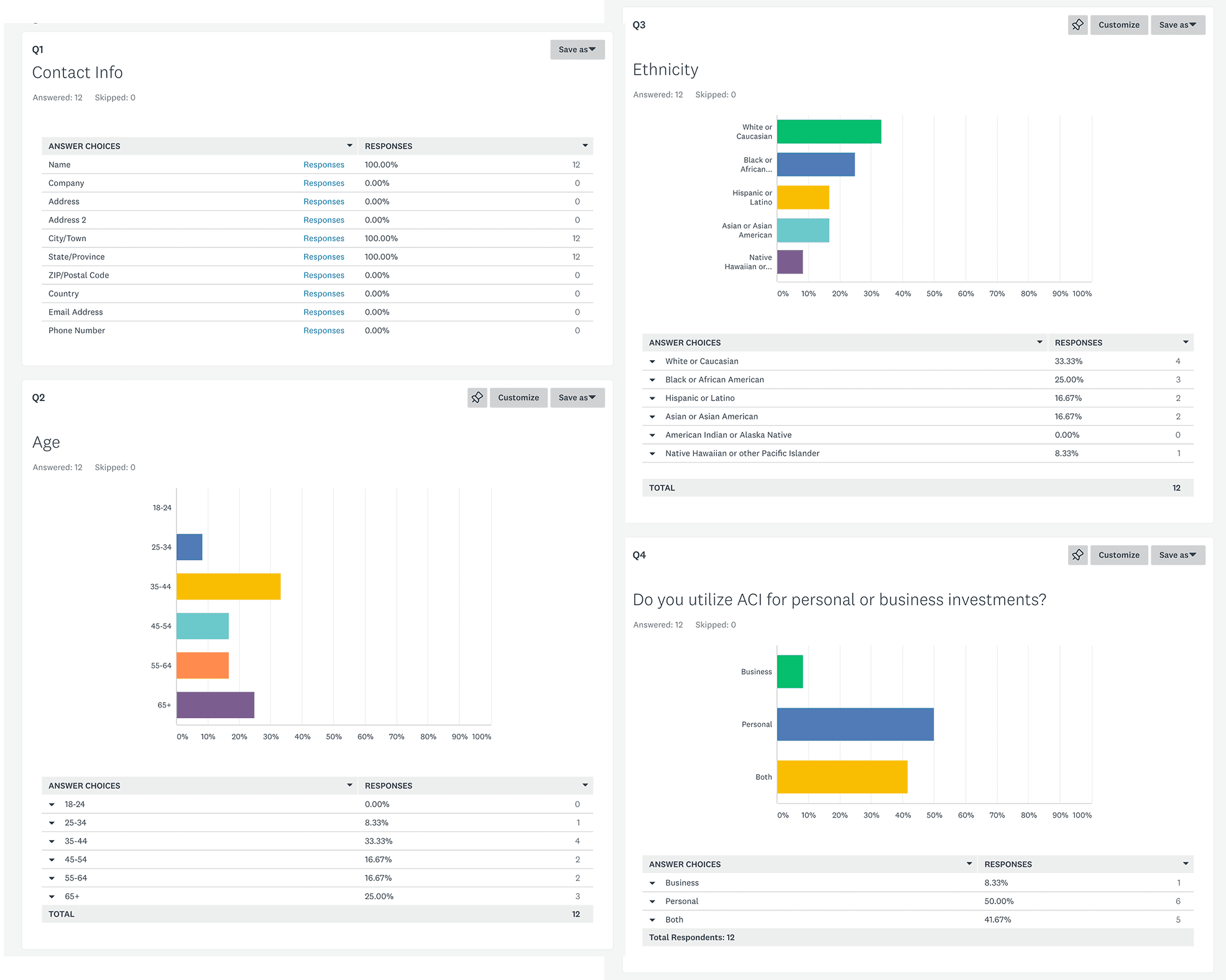
I wanted a good sample set of data to help me solve primary issues for the business and its customers. In total, I surveyed 12 customers through Survey Monkey. These surveys were facilitated by the client and conducted with customers from different regions through a remote setting. We began with demographic questions, i.e., the customer’s name, age, ethnicity, and whether they utilize ACI for their personal or business needs. The next series of questions were regarding the customer and user experience.
questions
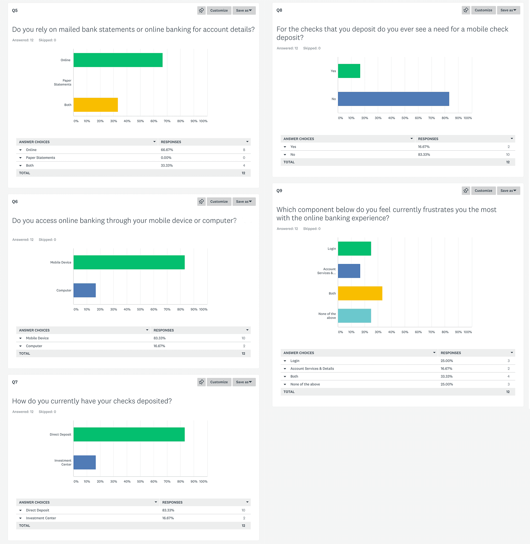
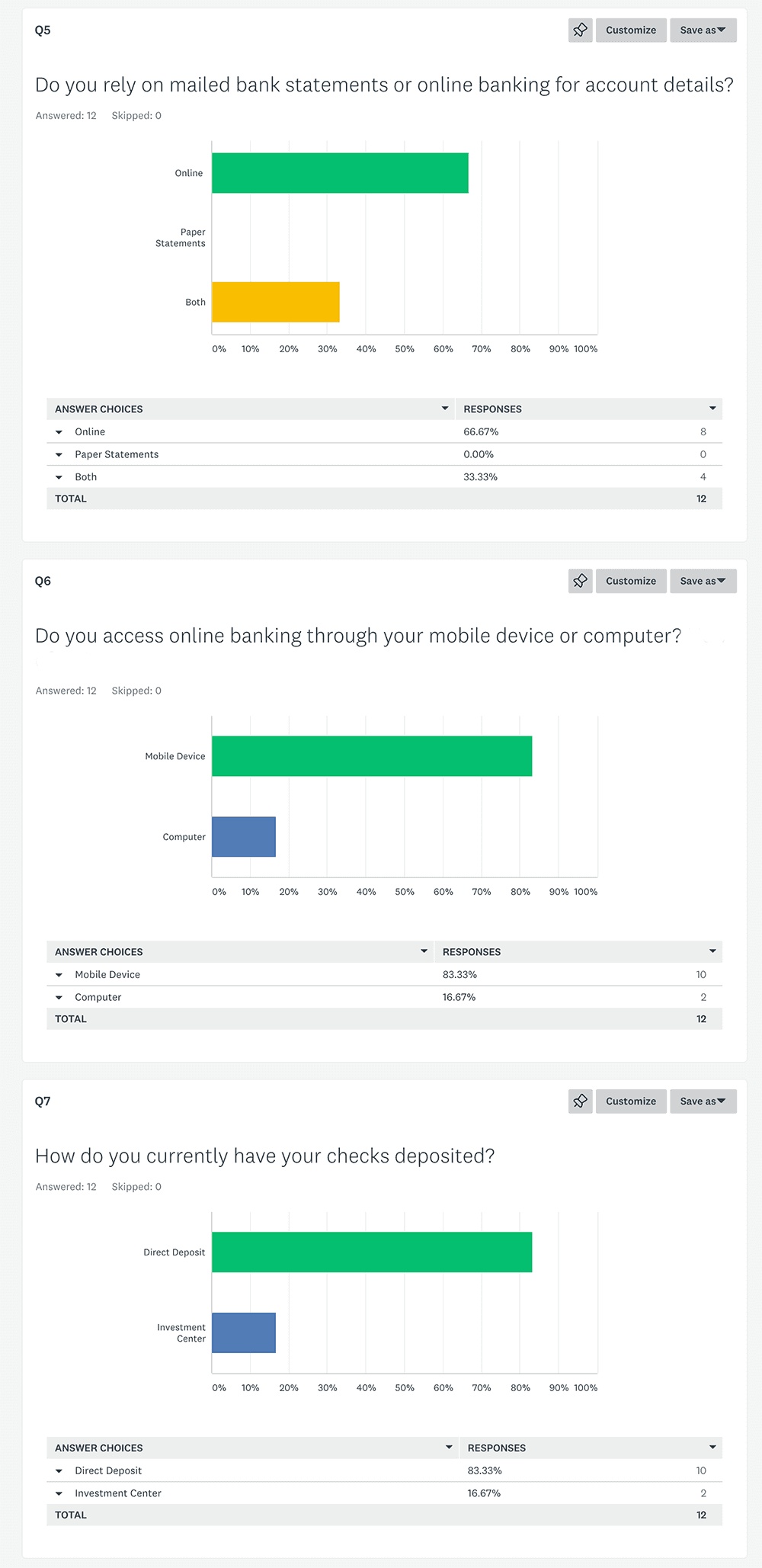
Do you rely on mailed bank statements or online banking for details?
Do you access online banking through your mobile device or computer?
How do you currently have checks deposited?
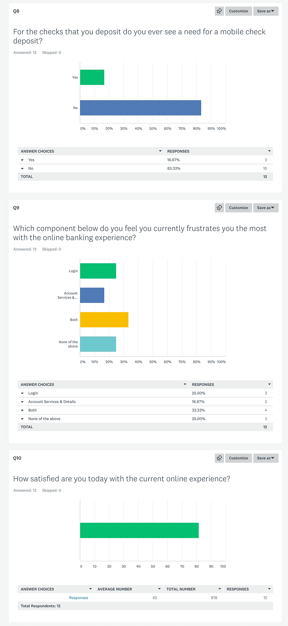
For the checks that you deposit do you ever see a need for a mobile check deposit?
Which component do you feel currently frustrates you the most with the online banking experience?
questions
Do you rely on mailed bank statements or online banking for details?
Do you access online banking through your mobile device or computer?
How do you currently have checks deposited?
For the checks that you deposit do you ever see a need for a mobile check deposit?
Which component do you feel currently frustrates you the most with the online banking experience?
Top Takeaways
Customers saw a need for an improved mobile check deposit.
Most customers were already using direct deposit and online access.
Customers were not fully satisfied with the login and account services.
Some found it hard to navigate and find the information they sought.
From additional information provided, not all customers felt they were reaching their financial goals.
The Goals
Enhance ACI’s OLB experience in key areas, specifically: customer login and security, accounts, and mobile check deposit.
Improve the OLB experience in terms of reliability of information and insight in order to help customers reach their financial goals.
Make the experience navigable and give users the ability to find information quickly.
establishing need
Refactor the structure and information for the base account and account summary screens to give a better overview of financial information and insights that correlate with the goals set by users in "My Financial Insights."
Streamline and create a simplified workflow for the mobile OLB experience through the primary use cases. Enhance the OLB experience in identified key areas.
Additionally, recommend a better aesthetic.

OLB customer vs traditional
Most OLB investment customers want a quick seamless way to view their accounts online and see how their assets are performing. They will often utilize other online features such as check deposit. They are usually paperless and choose to bypass conventional banking methods, whereas traditional investment customers rely on physical locations for most of their banking needs. Traditional customers rely on a face-to-face interaction as opposed to a technological one. Both types of customers may or may not prefer a physical check depending on their method of deposit (direct deposit, physical check, OLB, etc).
the target persona: Brian
Lives in a city dwelling.
Age 24-44.
Is very comfortable with technology, especially smartphones.
Understands and utilizes OLB technology to view and access necessary banking information to reach and maintain financial goals.
Relies less on investment centers or physical locations.
RESEARCH
PRELIMINARY RESEARCH
The primary challenge was that there was no researcher to rely on for a good repository of information. To solve this challenge, I would focus on surveying customers through Survey Monkey, and the other designer would help coordinate gathering customers for phone interviews.
SURVEYS
My co-designer and I had a limited amount of time to gather our initial information and there was a gambit of questions we wanted to ask. Rather than asking dozens of questions, I narrowed it down to the most important ones that would provide the best context for our inquiry.
CUSTOMERS
I wanted a good sample set of data to help me solve primary issues for the business and its customers. In total, I surveyed 12 customers through Survey Monkey. These surveys were facilitated by the client and conducted with customers from different regions through a remote setting. We began with demographic questions, i.e., the customer’s name, age, ethnicity, and whether they utilize ACI for their personal or business needs. The next series of questions were regarding the customer and user experience.
questions
Do you rely on mailed bank statements or online banking for details?
Do you access online banking through your mobile device or computer?
How do you currently have checks deposited?
For the checks that you deposit do you ever see a need for a mobile check deposit?
Which component do you feel currently frustrates you the most with the online banking experience?
Top Takeaways
Customers saw a need for an improved mobile check deposit.
Most customers were already using direct deposit and online access.
Customers were not fully satisfied with the login and account services.
Some found it hard to navigate and find the information they sought.
From additional information provided, not all customers felt they were reaching their financial goals.
The Goals
Enhance ACI’s OLB experience in key areas, specifically: customer login and security, accounts, and mobile check deposit.
Improve the OLB experience in terms of reliability of information and insight in order to help customers reach their financial goals.
Make the experience navigable and give users the ability to find information quickly.
establishing need
Refactor the structure and information for the base account and account summary screens to give a better overview of financial information and insights that correlate with the goals set by users in "My Financial Insights."
Streamline and create a simplified workflow for the mobile OLB experience through the primary use cases. Enhance the OLB experience in identified key areas.
Additionally, recommend a better aesthetic.
OLB customer vs traditional
Most OLB investment customers want a quick seamless way to view their accounts online and see how their assets are performing. They will often utilize other online features such as check deposit. They are usually paperless and choose to bypass conventional banking methods, whereas traditional investment customers rely on physical locations for most of their banking needs. Traditional customers rely on a face-to-face interaction as opposed to a technological one. Both types of customers may or may not prefer a physical check depending on their method of deposit (direct deposit, physical check, OLB, etc).
the target persona: Brian
Lives in a city dwelling.
Age 24-44.
Is very comfortable with technology, especially smartphones.
Understands and utilizes OLB technology to view and access necessary banking information to reach and maintain financial goals.
Relies less on investment centers or physical locations.
PLAN
next focus
Once I had finished compiling the survey results, I shared them with the senior researcher. He agreed with my findings and asked my co-designer and I to begin planning the design phase. We split our efforts into separate workloads. I would focus on the enhanced account experience and check deposit. The other designer would focus on login and security login (PIN). At this point, I began to establish use cases and build key considerations around them.
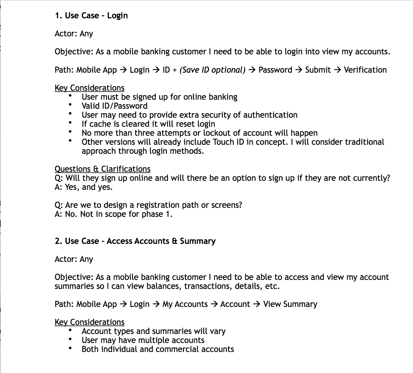
INITAL USE CASE
The current login experience had basic features such as security questions and PIN; however, the mobile PIN would need to be refactored for a mobile app. While I wanted the other designer to include 2FA and Face ID login for this concept, the product team felt it was more of a preference setting and would be out of the scope of this project. Previous considerations such as prior sign-up, max attempt limit, and valid login credentials would be considered.
second USE CASE
The second use case I built was for accounts. The caveat was that the user could have multiple accounts, and some could have both personal and business accounts. Still, the stated focus of this project was the personal account experience and that focus would need to be reflected in this module.
LAST USE CASE
The last use case was for check deposit. I built excellent considerations for the requirements needed, such as valid pictures, signature, and manual verification. In addition, there were thoughts around notifications to communicate with the user regarding the processing, delay, and completion of their deposit.
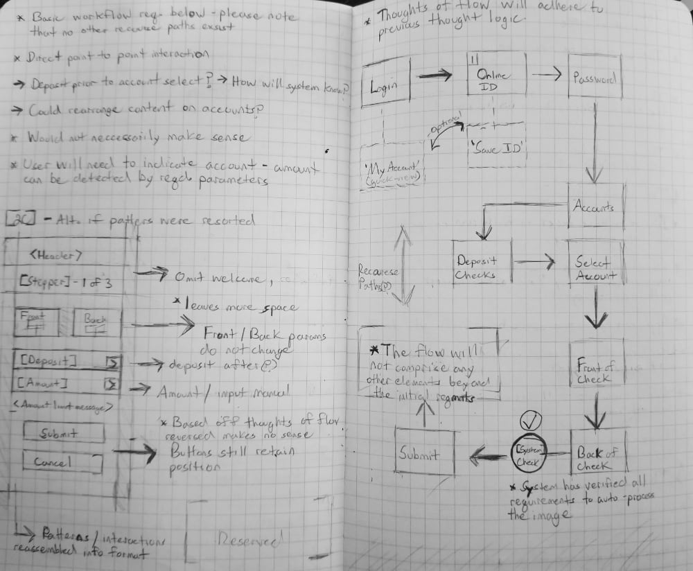
BUILDING WORKFLOW
I took the use cases I had established and shared them with the team. Overall, they were satisfied with the objective of each use case and had minimal feedback. One suggestion, however, was to include additional screens to show a complete happy path from login to conclusion of check deposit.
I incorporated their feedback into a couple of basic workflows. These new workflows would make the experience more navigable by following a simpler and more modern approach to logging in, viewing account information, and performing additional actions such as check deposit (if needed).
PLAN
next focus
Once I had finished compiling the survey results, I shared them with the senior researcher. He agreed with my findings and asked my co-designer and I to begin planning the design phase. We split our efforts into separate workloads. I would focus on the enhanced account experience and check deposit. The other designer would focus on login and security login (PIN). At this point, I began to establish use cases and build key considerations around them.
INITAL USE CASE
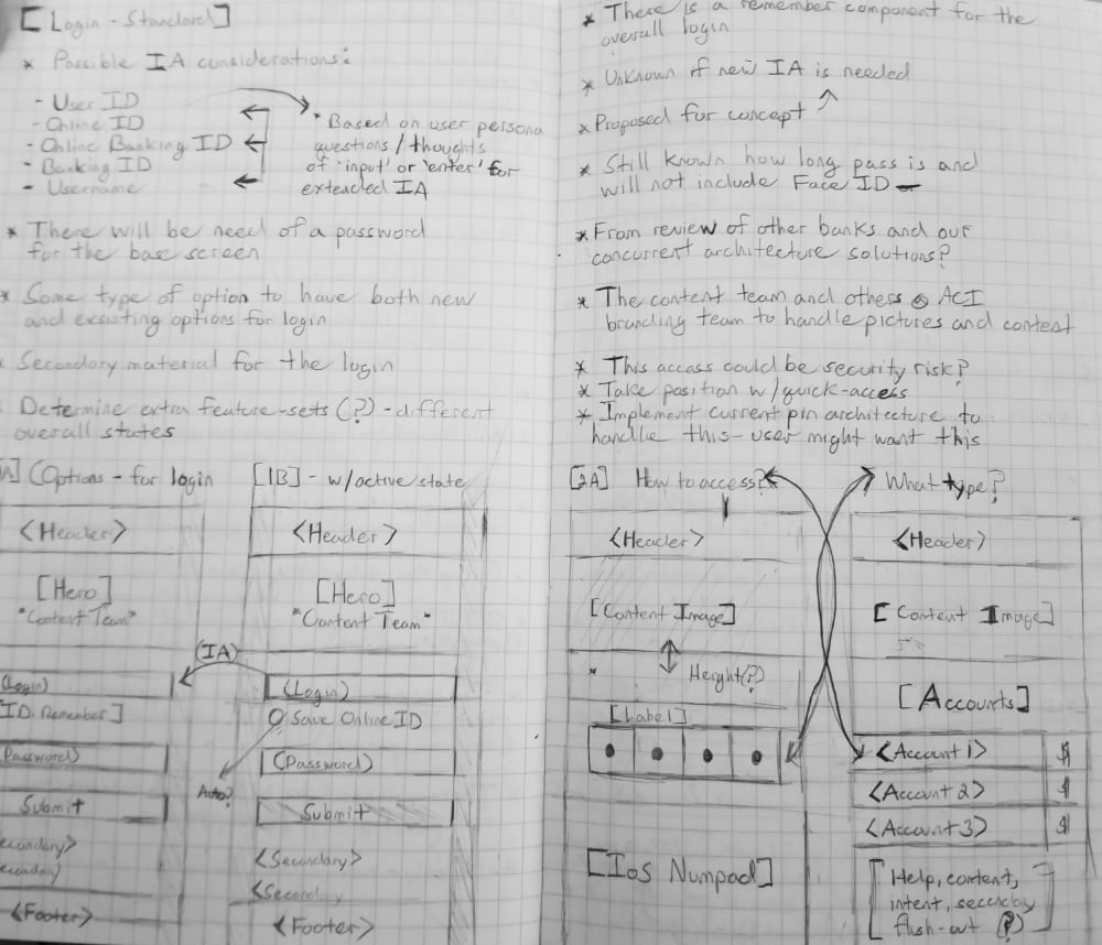
The current login experience had basic features such as security questions and PIN; however, the mobile PIN would need to be refactored for a mobile app. While I wanted the other designer to include 2FA and Face ID login for this concept, the product team felt it was more of a preference setting and would be out of the scope of this project. Previous considerations such as prior sign-up, max attempt limit, and valid login credentials would be considered.
second USE CASE
The second use case I built was for accounts. The caveat was that the user could have multiple accounts, and some could have both personal and business accounts. Still, the stated focus of this project was the personal account experience and that focus would need to be reflected in this module.
LAST USE CASE
The last use case was for check deposit. I built excellent considerations for the requirements needed, such as valid pictures, signature, and manual verification. In addition, there were thoughts around notifications to communicate with the user regarding the processing, delay, and completion of their deposit.
BUILDING WORKFLOW
I took the use cases I had established and shared them with the team. Overall, they were satisfied with the objective of each use case and had minimal feedback. One suggestion, however, was to include additional screens to show a complete happy path from login to conclusion of check deposit.
I incorporated their feedback into a couple of basic workflows. These new workflows would make the experience more navigable by following a simpler and more modern approach to logging in, viewing account information, and performing additional actions such as check deposit (if needed).
DESIGN
CONCEPT & COLLABORATION
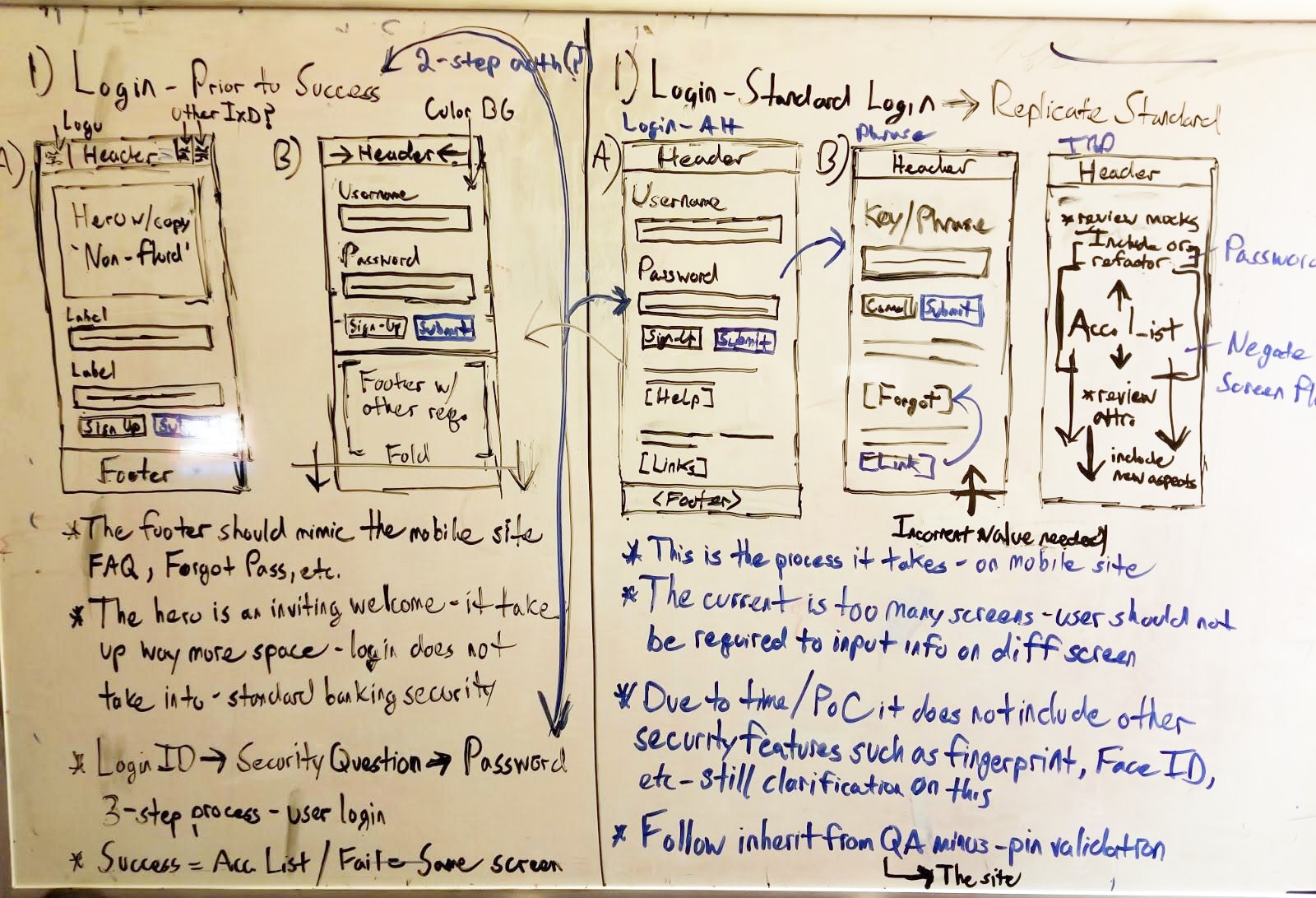
Once the workflow had been established, my co-designer and I started to concept ideas through a remote series of whiteboard exercises. We came together on the actual concept phase because we wanted this to be a truly collaborative effort. I began by designing a number of ideas for accounts and mobile check deposit based on the research we did on other OLB competitors that were non-physical banks.
The other designer started with basic account login using standardized best practices of OLB. I suggested that we keep the structure consistent but experiment with a variety of labels, sub-labels, and secondary login verbiage.
ADDING IN DETAILS
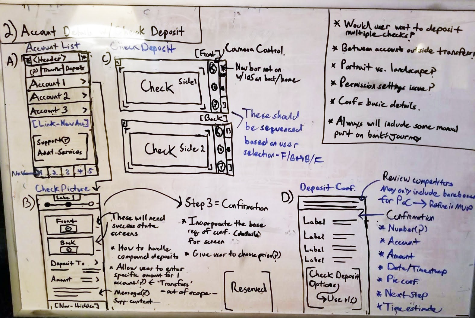
The next step was to draw up more details for a mobile check deposit and account experience. Inherit architecture was applied from the existing account system. The research found multiple methods by which OLB companies handled the steps of this process.
I chose to go with a simple three-step process of select, deposit, and confirm. I utilized the backend system for validation for the check deposit. The idea for the summary of accounts was to simplify it and give customers an easy way to view account information and access support.
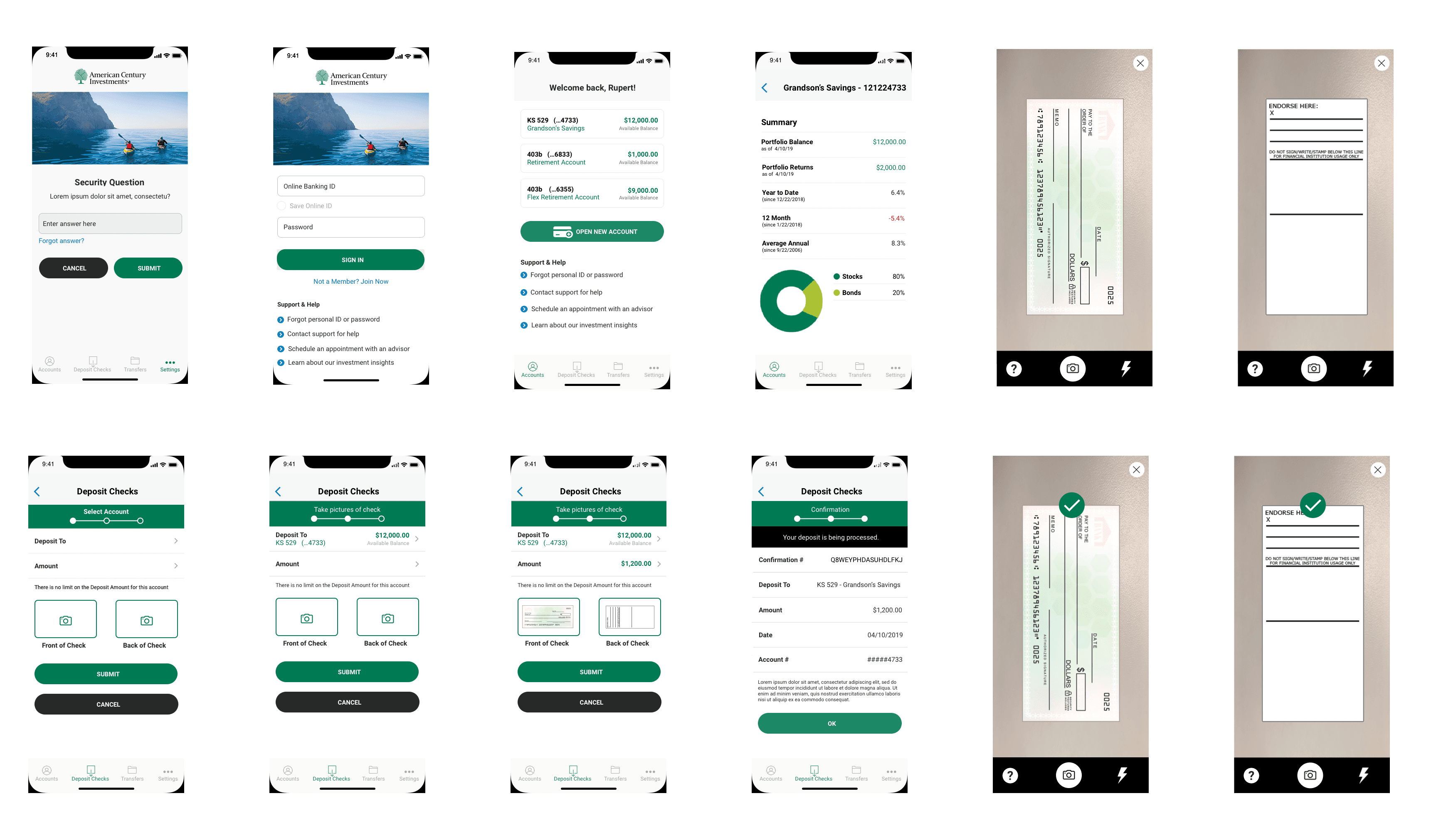
EARLY WIREFRAMES
The first set of wireframes I created were medium-fidelity and static screens. They did not include the security pin due to time constraints. The first set of wires only included login, summary of accounts, and check deposit.
As in the previous concept phase, I started with a basic account screen. This first set of wireframes also included what my co-designer had concepted for a login experience.
adding to early WIREFRAMES
The next step was to complete the check deposit wireframes. This process would include taking pictures of the check and then receiving a confirmation. These screens were enhanced to communicate additional details and let the user know their submission was a success. My co-designer and I shared the wireframes with the rest of the team for feedback.
Their feedback was positive, and they mentioned they would like to see the inclusion of the PIN and eventually an end-to-end clickable prototype.
SECONDARY WIREFRAMES
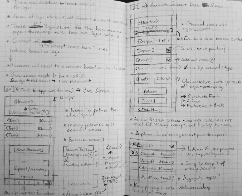
The secondary set of wireframes that was created were higher fidelity. I cleaned up the previous wires and included a more enhanced account summary along with quick access to customers' different investment accounts. This summary would provide a quick view of the most important information a customer might require without them having to access in-depth details in "My Financial Insights" (which was the responsibility of a separate team).
My co-designer cleaned up the screens for PIN setup and login. I then combined all the screens into a cohesive UI flow. It was at this time that the team brought in the visual designer to help us compose three full visual concepts to be shared with the client.
VISUAL TREATMENTS
The visual designer came up with three unique visual treatments utilizing the client’s branding and recommending more modern visual styles. The most bottom visual concept was a collaboration between the visual designer and myself. This option would become the preferred choice for the prototype.

PROTOTYPE V1
I met with the team and showed them the second version of wireframes, as well as the visual design examples. They liked everything they saw but wanted to share a click-through prototype with the client in addition to the other visual treatments.
The other designers and I decided to go with visual treatment #3, as it was good blend of their brand guidelines and styles. The account team's goal was to see if we could eventually build the client an enhanced visual library for additional business. This was the primary reason the first version deviated from their standard branding.
The team and I then came together for one final design session, and I created a quick clickable prototype that only included the happy path. I shared the prototype link with the team. There was no additional feedback to incorporate into the prototype.
DESIGN
CONCEPT & COLLABORATION
Once the workflow had been established, my co-designer and I started to concept ideas through a remote series of whiteboard exercises. We came together on the actual concept phase because we wanted this to be a truly collaborative effort. I began by designing a number of ideas for accounts and mobile check deposit based on the research we did on other OLB competitors that were non-physical banks.
The other designer started with basic account login using standardized best practices of OLB. I suggested that we keep the structure consistent but experiment with a variety of labels, sub-labels, and secondary login verbiage.
ADDING IN DETAILS
The next step was to draw up more details for a mobile check deposit and account experience. Inherit architecture was applied from the existing account system. The research found multiple methods by which OLB companies handled the steps of this process.
I chose to go with a simple three-step process of select, deposit, and confirm. I utilized the backend system for validation for the check deposit. The idea for the summary of accounts was to simplify it and give customers an easy way to view account information and access support.
EARLY WIREFRAMES
The first set of wireframes I created were medium-fidelity and static screens. They did not include the security pin due to time constraints. The first set of wires only included login, summary of accounts, and check deposit.
As in the previous concept phase, I started with a basic account screen. This first set of wireframes also included what my co-designer had concepted for a login experience.
adding to early WIREFRAMES
The next step was to complete the check deposit wireframes. This process would include taking pictures of the check and then receiving a confirmation. These screens were enhanced to communicate additional details and let the user know their submission was a success. My co-designer and I shared the wireframes with the rest of the team for feedback.
Their feedback was positive, and they mentioned they would like to see the inclusion of the PIN and eventually an end-to-end clickable prototype.
SECONDARY WIREFRAMES
The secondary set of wireframes that was created were higher fidelity. I cleaned up the previous wires and included a more enhanced account summary along with quick access to customers' different investment accounts. This summary would provide a quick view of the most important information a customer might require without them having to access in-depth details in "My Financial Insights" (which was the responsibility of a separate team).
My co-designer cleaned up the screens for PIN setup and login. I then combined all the screens into a cohesive UI flow. It was at this time that the team brought in the visual designer to help us compose three full visual concepts to be shared with the client.
VISUAL TREATMENTS
The visual designer came up with three unique visual treatments utilizing the client’s branding and recommending more modern visual styles. The most bottom visual concept was a collaboration between the visual designer and myself. This option would become the preferred choice for the prototype.
PROTOTYPE V1
I met with the team and showed them the second version of wireframes, as well as the visual design examples. They liked everything they saw but wanted to share a click-through prototype with the client in addition to the other visual treatments.
The other designers and I decided to go with visual treatment #3, as it was good blend of their brand guidelines and styles. The account team's goal was to see if we could eventually build the client an enhanced visual library for additional business. This was the primary reason the first version deviated from their standard branding.
The team and I then came together for one final design session, and I created a quick clickable prototype that only included the happy path. I shared the prototype link with the team. There was no additional feedback to incorporate into the prototype.
NEXT STEPS
client presentation
After I created a slide deck, my allocation was complete. The team and I presented the prototype and visual concepts to the client. They enjoyed everything that was presented. They requested some minor structural changes as well as additional adjacent screens. While they appreciated the visual design thinking and approach in the first prototype, they wanted the next prototype to match their branding exactly.
PROTOTYPE V2
I made the visual changes they requested in the form of a new prototype. As with the first, this version only included the happy path. I shared this prototype through a virtual meeting with the client. They were delighted with what they saw, and they approved the new prototype. I sent the final design assets to their in-house development team and made sure that the developers had everything they required to build it out to the specifications. They had an external partner that would conduct testing; they would share the results with the team and I down the road.
OUTCOMES
increased enrollment
ACI was able to see an increase in enrollment for online banking services by more than 70% (both new and existing customers). Specifically, 50% increase in online banking (and all related services) and 20% enrollment increased in "My Financial Insights."
increased enrollment
ACI was able to see an increase in enrollment for online banking services by more than 70% (both new and existing customers). Specifically, 50% increase in online banking (and all related services) and 20% enrollment increased in "My Financial Insights."
financial goals
ACI interviewed and surveyed a panel of clients after the launch of the new application. Based on customer feedback, ACI customers found the information quicker to find and the experience more navigable. In addition, the customers enjoyed the account experience, and the new refactored "My Financial Insights," a separate team had developed.
OUTCOMES
increased enrollment
ACI was able to see an increase in enrollment for online banking services by more than 70% (both new and existing customers). Specifically, 50% increase in online banking (and all related services) and 20% enrollment increased in "My Financial Insights."
financial goals
ACI interviewed and surveyed a panel of clients after the launch of the new application. Based on customer feedback, ACI customers found the information quicker to find and the experience more navigable. In addition, the customers enjoyed the account experience, and the new refactored "My Financial Insights," a separate team had developed.
LEARNINGS
traditional vs online banking
Most of the ACI customers still required the ability to have physical copies of their checks for tax reasons. The customers who required a physical check did not utilize online check deposits and would run into problems with limited access to physical locations.
OLB methods
Due to the types of checks and accounts that were being accessed through ACI often had limitations and restrictions to which type of checks could be used through online banking. For the types of checks that could not be deposited online. These checks would need to be made payable and mailed or directly deposited through an ACI investment center.
LEARNINGS
traditional vs online banking
Most of the ACI customers still required the ability to have physical copies of their checks for tax reasons. The customers who required a physical check did not utilize online check deposits and would run into problems with limited access to physical locations.
OLB methods
Due to the types of checks and accounts that were being accessed through ACI often had limitations and restrictions to which type of checks could be used through online banking. For the types of checks that could not be deposited online. These checks would need to be made payable and mailed or directly deposited through an ACI investment center.