Design Library & Process
Design Library & Process
Daikin, the world's largest air conditioner manufacturer headquartered in Japan, required a new and improved library, along with an updated process, to make production updates more seamless.
GOALS
Establish a process for requesting, adding and implementing new additions to the component library. Build a new and improved design library utilizing an atomic design approach. Implement any missing variants, states and visuals that were not present in existing components.
CHALLENGES
Aligning designers and engineers on a new process for
publishing library updates.Moving designers away from creating their own local components.
Teaching junior designers about the more advanced Figma features.
Creating an entirely new library to be published and adopted to existing UIs.
Little to no information about library requirements (assigned to the project when most stakeholders were out on holiday).
MY ROLE
Conduct an audit for all design library assets.
Partner with the visual designer and create new visuals that were not present in current library.
Mentor other designers on utilization and process for using the library.
Teach and demo Figma’s advanced features (such as nested
instances) to other designers.As a senior designer, I led the design and process efforts for creating the new library.
WHAT I DELIVERED
3 Library audit and analysis
1 Atomic design library
2 Training and demo workshops
1 Streamlined process for creating and adding library updates
RESEARCH
Project familiarization and analysis
I was tasked with this project when most stakeholders were out on holiday. I had no prior knowledge of this client, their process or existing design library. I reviewed their existing documentation and design components. I analyzed and made a list of components that currently existed and did not exist in their design library. In addition, I conducted a deeper analysis into the designer’s files and design library process.
Key pain points:
Their current library was not current to the production environment version.
Designers detached existing components and created their own local components.
There was no formal process for requesting and publishing design updates.
No atomic structure to the current components.
PLAN
Library audit
I concluded my analysis and proceeded with a plan to formally begin auditing each of the components I had notated in my list. Additionally, I created Jira tickets for each of the existing and missing components to track progress. My plan was to complete an audit of the design components, local styles, fonts and colors.
For each of the existing components in the library I conducted a thorough review. I had quite a few questions for the visual designer on if the current components had the updated styles.

Completing my component audit
I completed my audit of the existing library components and found quite a few inconsistencies in their current design library file.
Key takeaways
Most design components did not make use of nested instances
or auto-layout.No formal documentation or guidance of component use.
Minimal use of variables.
No associated design tokens for engineers.
Certain components had missing states and incomplete variants.
Color and font audit
Next, I conducted my audit of the existing library colors and fonts. Some colors were assigned to variables and others were local styles. I was not sure which colors were current or not. I compiled some additional questions for the visual designer. The fonts seemed to be all there, however, there was no label or categorization. For example, fonts contained font-size and line-height but no mention if it was a heading or a paragraph
Articulating a plan
After finishing my audits, I came up with a strategy for building the new library and process. I decided to start by creating variables and local styles, followed by developing the core atoms and molecules for the base components. Once those were in place, I planned to move on to organisms and then complete the pages, templates, and any remaining library assets. Finally, I would focus on bringing designers and engineers together to align on the process.
Sync with the team
When the team returned to the office, I met with them to share my analysis, plan, and the current status of tickets. They had some questions about whether the new library would be applied to the existing features once it was completed. I explained that creating the new library would take some time, and the product manager confirmed that it would be used for future features.
With everyone on the same page, they gave me the green light to start working on my plan. I first connected with the visual designer to clarify the questions I had noted during my audit and analysis. Once the designer provided the answers I needed, I moved forward with creating the variables.

PLAN
Library audit
I concluded my analysis and proceeded with a plan to formally begin auditing each of the components I had notated in my list. Additionally, I created Jira tickets for each of the existing and missing components to track progress. My plan was to complete an audit of the design components, local styles, fonts and colors.
For each of the existing components in the library I conducted a thorough review. I had quite a few questions for the visual designer on if the current components had the updated styles.
Completing my component audit
I completed my audit of the existing library components and found quite a few inconsistencies in their current design library file.
Key takeaways
Most design components did not make use of nested instances
or auto-layout.No formal documentation or guidance of component use.
Minimal use of variables.
No associated design tokens for engineers.
Certain components had missing states and incomplete variants.
Color and font audit
Next, I conducted my audit of the existing library colors and fonts. Some colors were assigned to variables and others were local styles. I was not sure which colors were current or not. I compiled some additional questions for the visual designer. The fonts seemed to be all there, however, there was no label or categorization. For example, fonts contained font-size and line-height but no mention if it was a heading or a paragraph
Articulating a plan
After finishing my audits, I came up with a strategy for building the new library and process. I decided to start by creating variables and local styles, followed by developing the core atoms and molecules for the base components. Once those were in place, I planned to move on to organisms and then complete the pages, templates, and any remaining library assets. Finally, I would focus on bringing designers and engineers together to align on the process.
Sync with the team
When the team returned to the office, I met with them to share my analysis, plan, and the current status of tickets. They had some questions about whether the new library would be applied to the existing features once it was completed. I explained that creating the new library would take some time, and the product manager confirmed that it would be used for future features.
With everyone on the same page, they gave me the green light to start working on my plan. I first connected with the visual designer to clarify the questions I had noted during my audit and analysis. Once the designer provided the answers I needed, I moved forward with creating the variables.
DESIGN
Primitive colors and charting
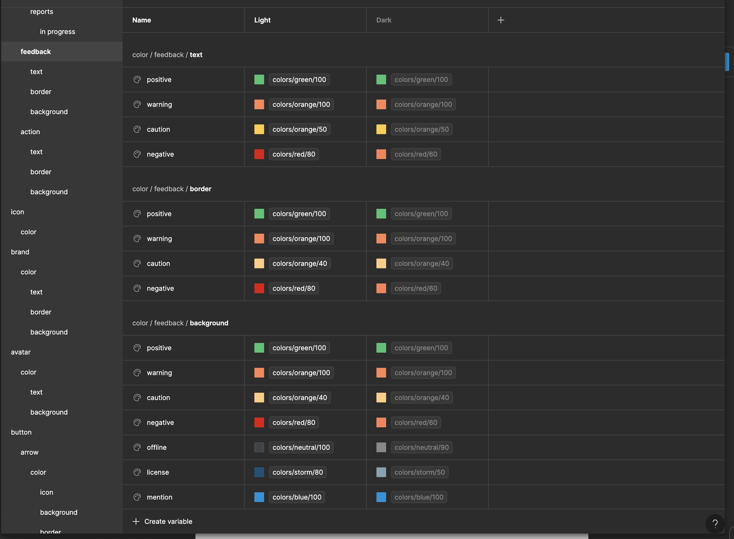
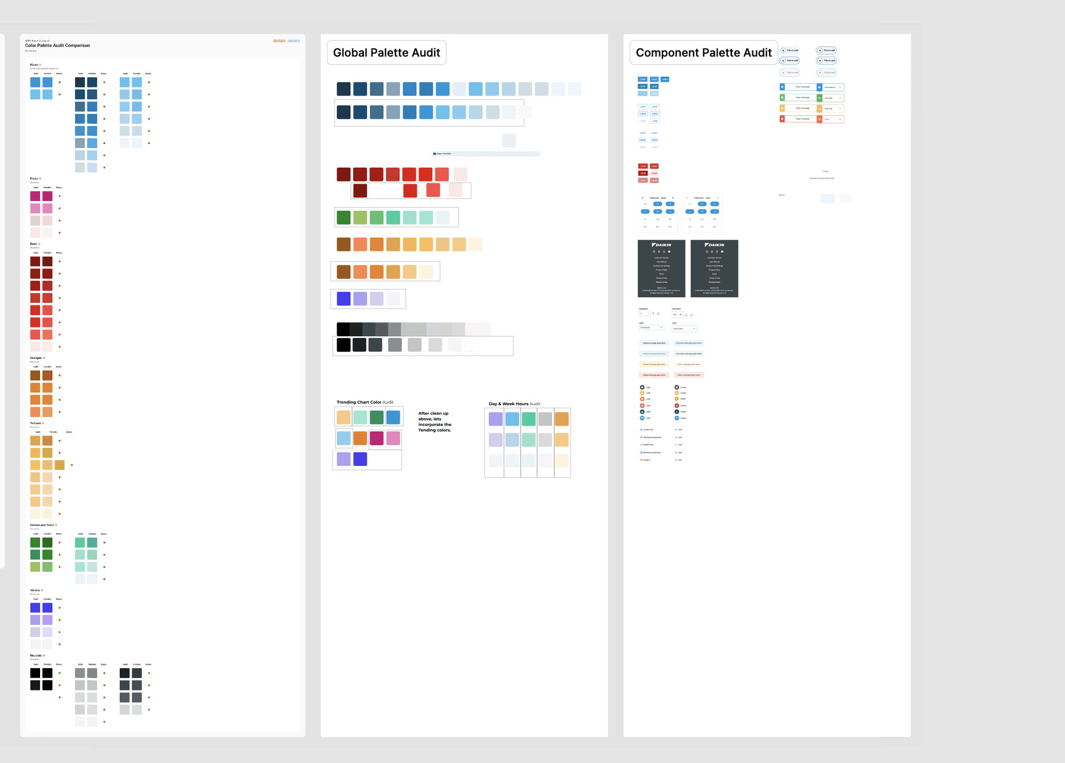
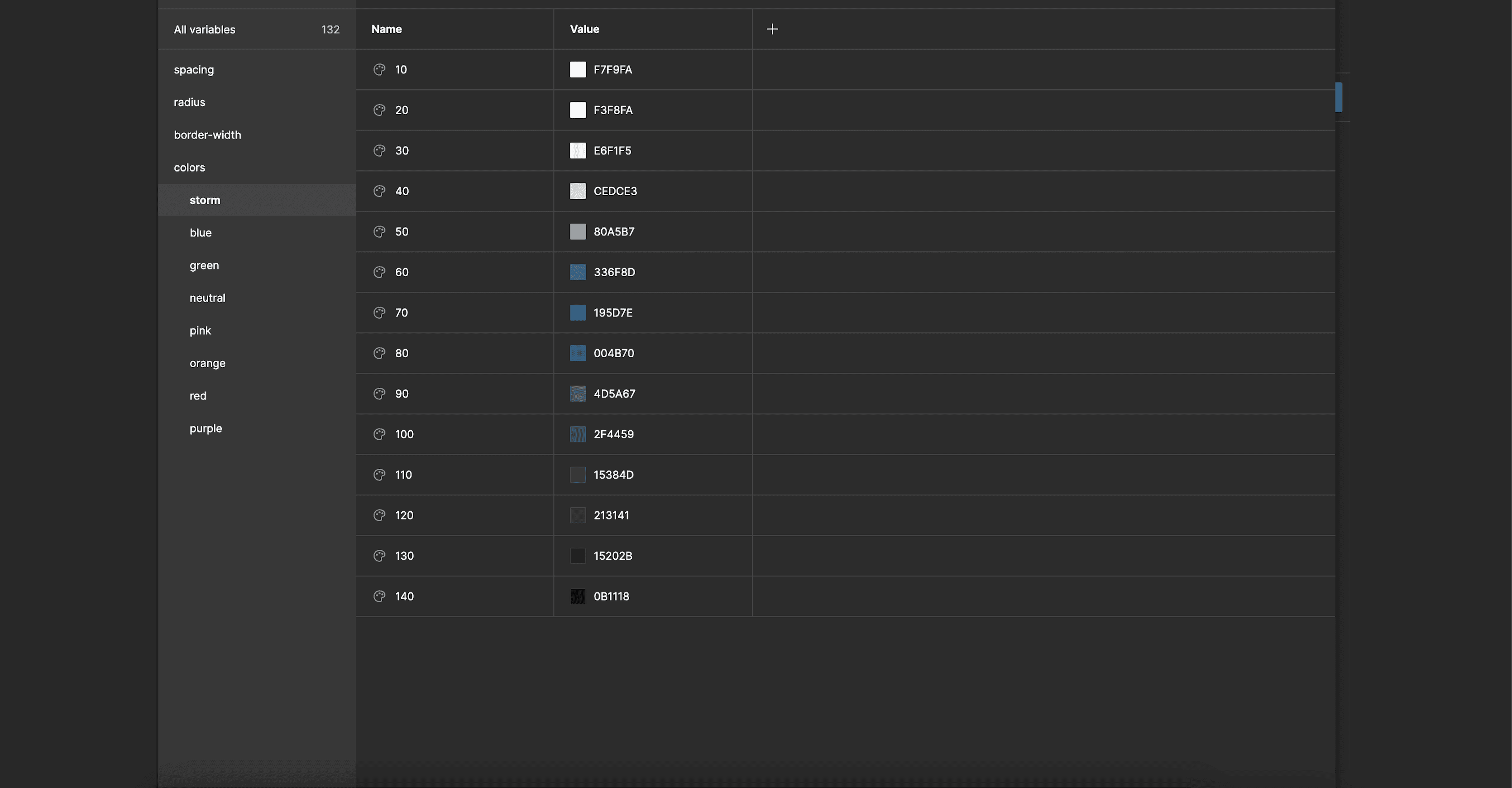
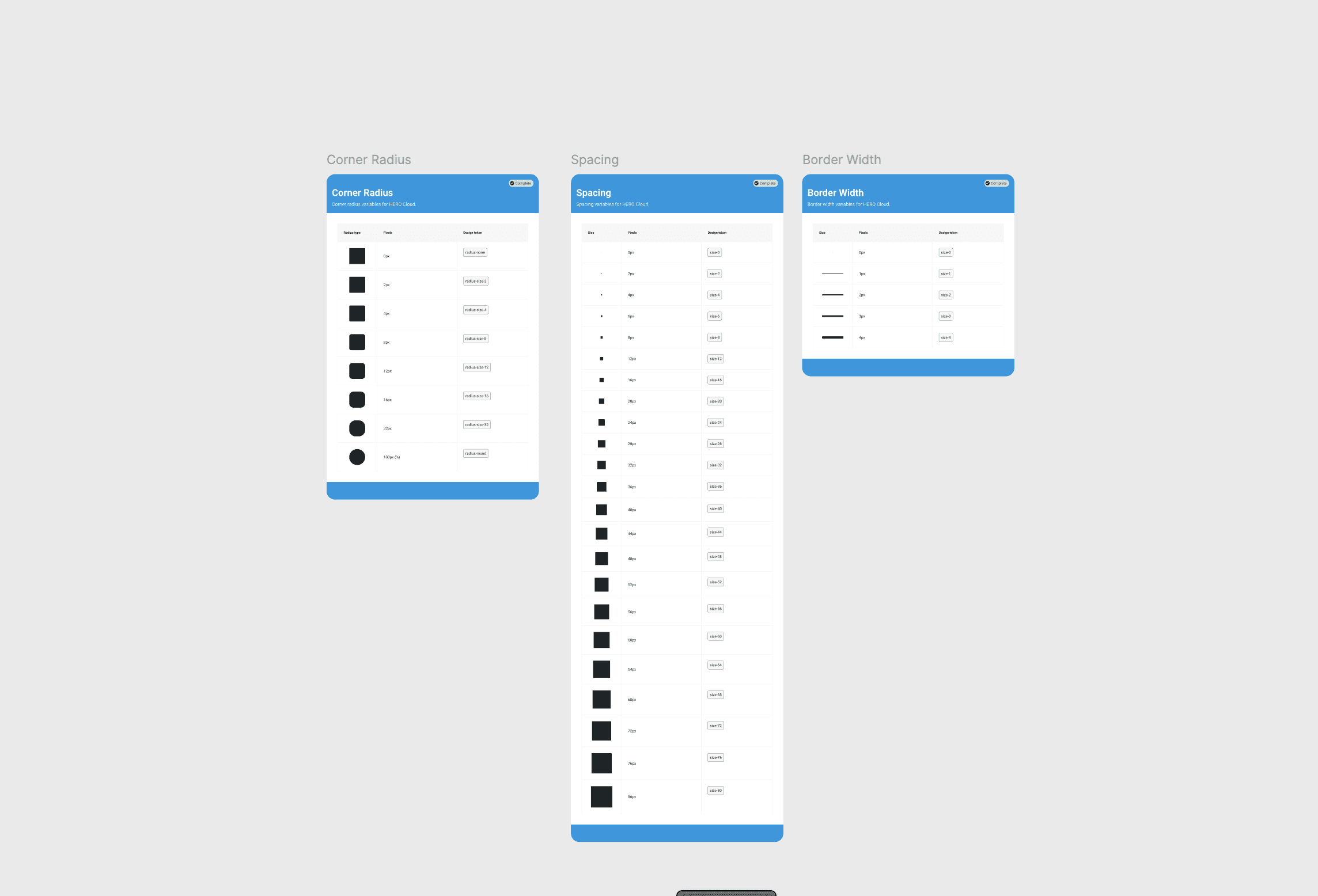
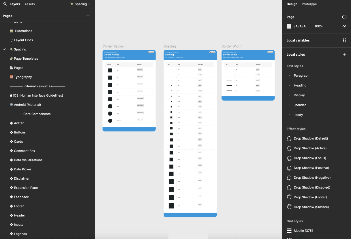
The existing library did not fully utilize primitive variables or aliasing. The existing variables did not use a token naming structure. I communicated I was going to use a defined token taxonomy. First, I created a well defined color chart of all the colors utilized within the library. I confirmed these colors with the visual designer. The primitive variables also included spacing, radius and border-width.
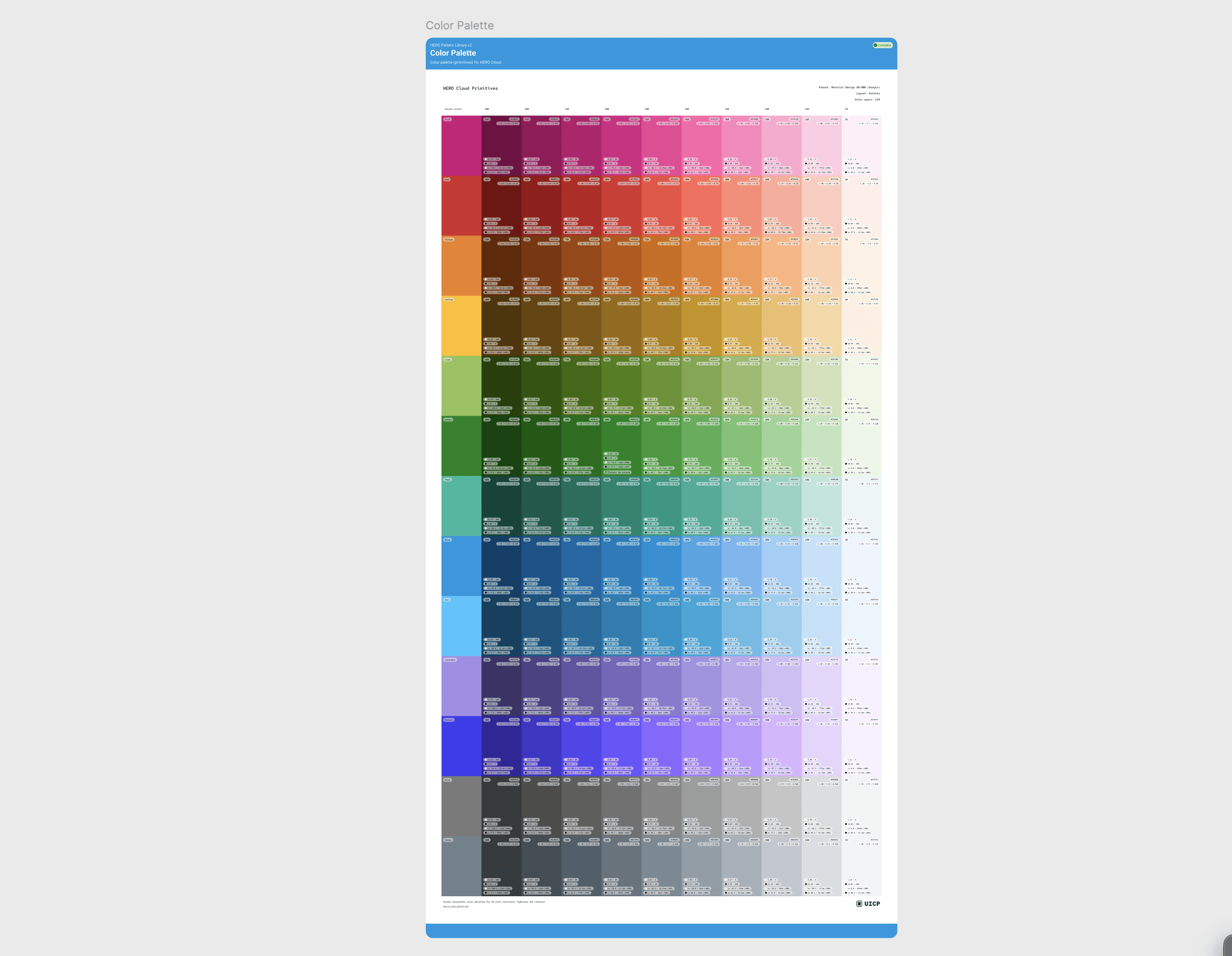
Primitive variables
The primitive variables were the foundation for color, spacing, radius and border-width. I created the primitive variables for the primary colors. Then I completed the variables for spacing, radius and border-radius. I created several visual references explaining the different values and widths that correlated to the variables. Next I shared my update with the rest of the team and went over how each of the specific variables could be utilized in the design library.
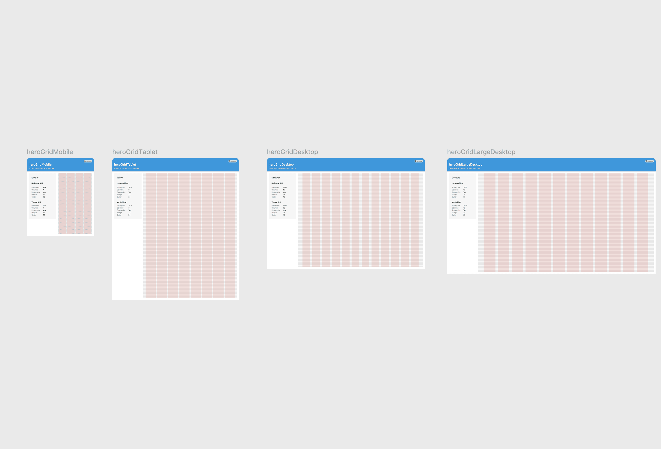
Grid
The existing grid had been designed on a 4px grid, but there was no reference to the different responsive view margins, padding and columns. I created a local component and visual reference for the grids.
New and improved components
The existing components had to be recreated with the new variables and styles. I applied auto-layout and made use of nested instances. I used an atomic design approach and started with the atoms and molecules.
Atoms and molecules
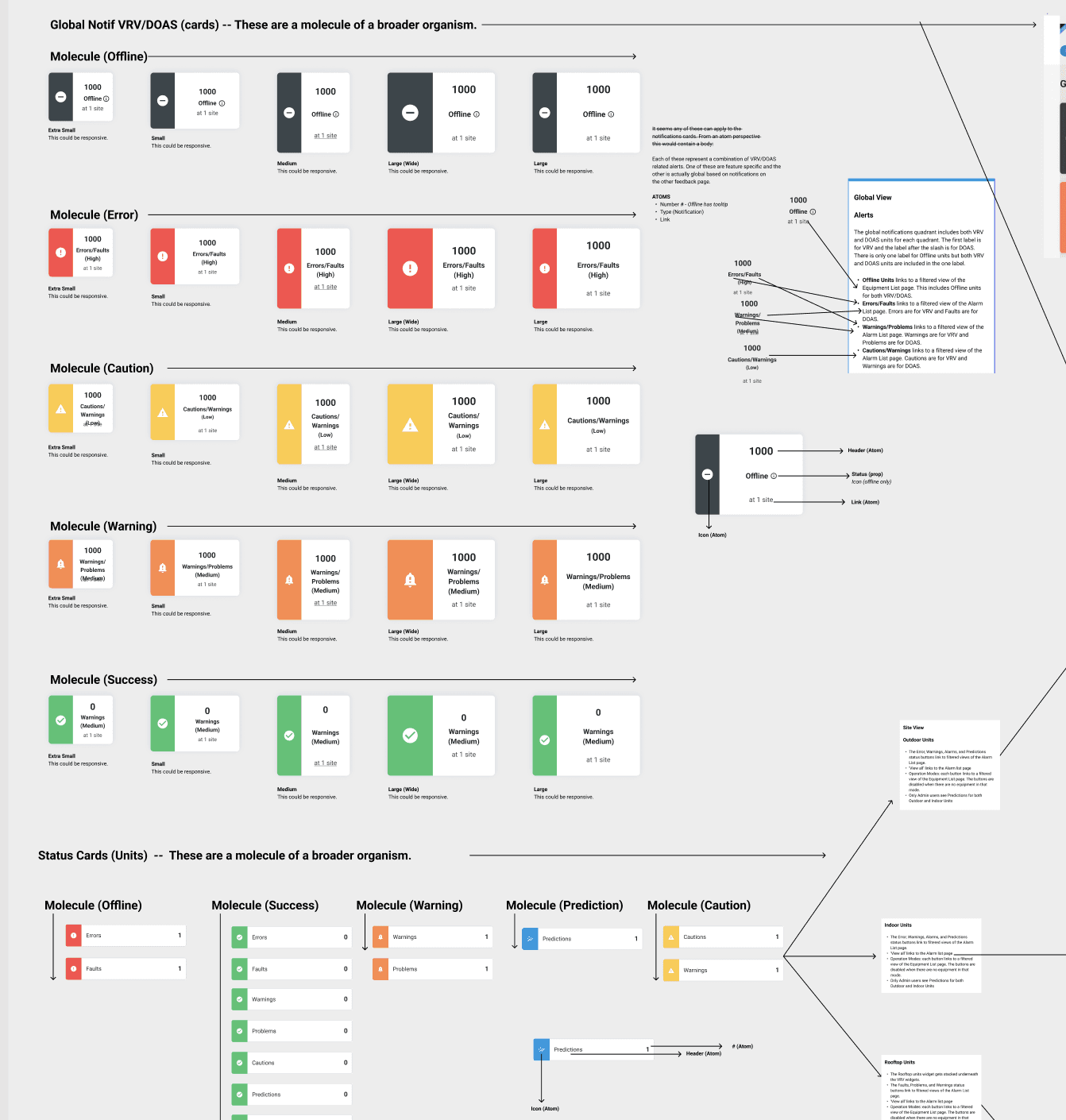
Atoms and molecules were the foundation for all components. The atoms included icons, labels, radios, checkboxes, inputs and more. The atoms were essential in building the molecules. Molecules included buttons, counters, dropdowns, search and more.
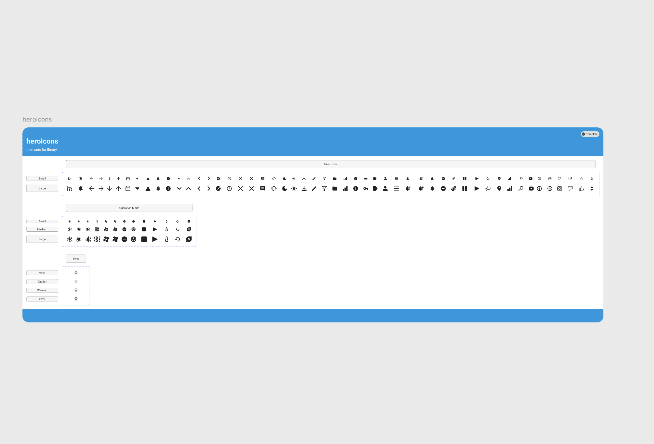
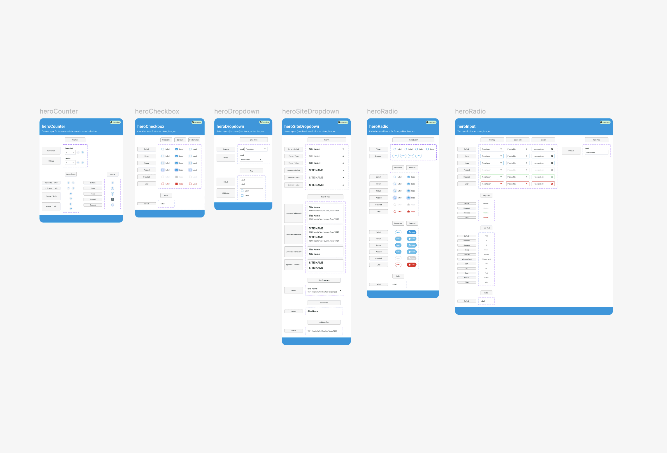
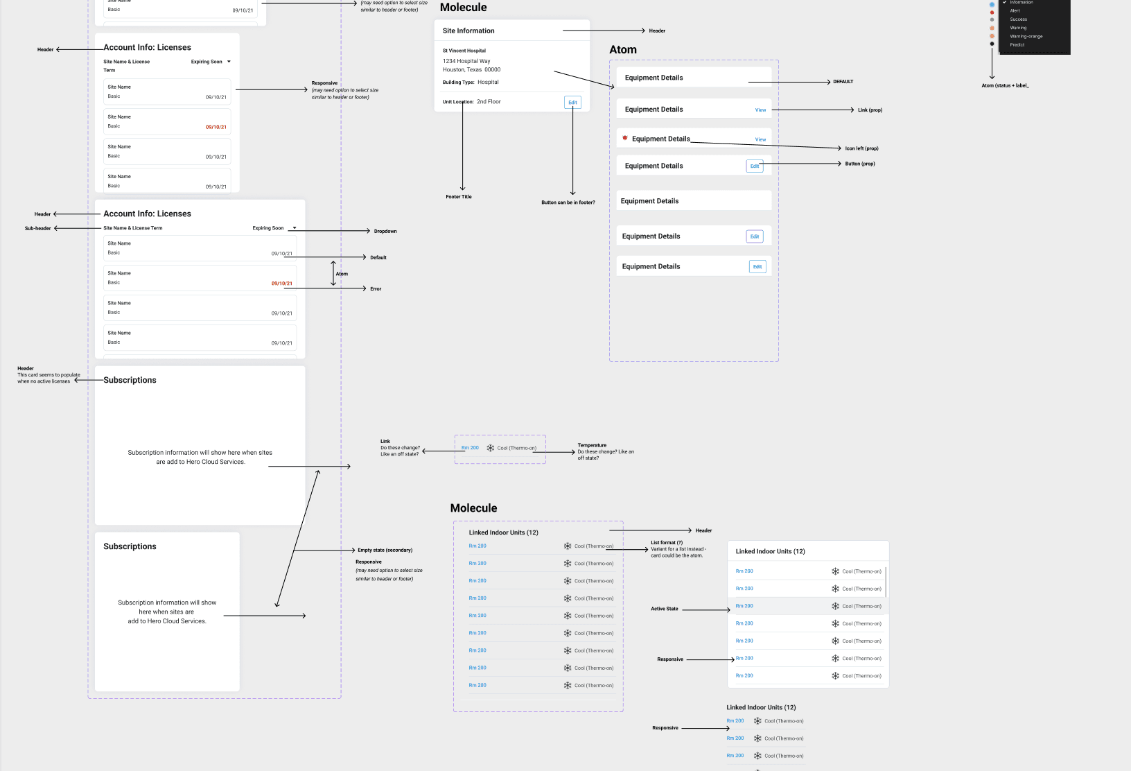
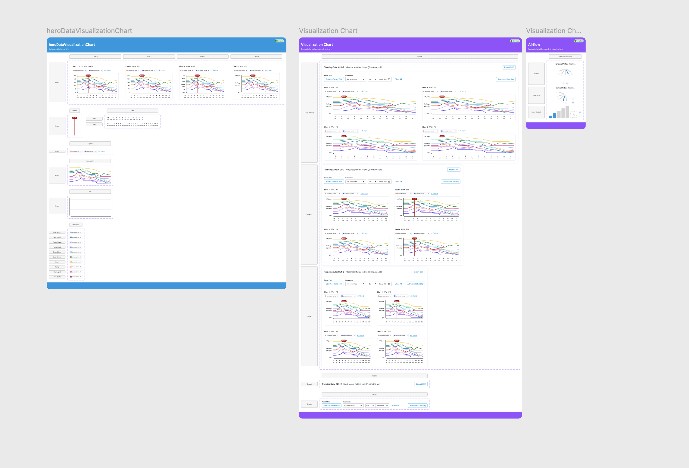
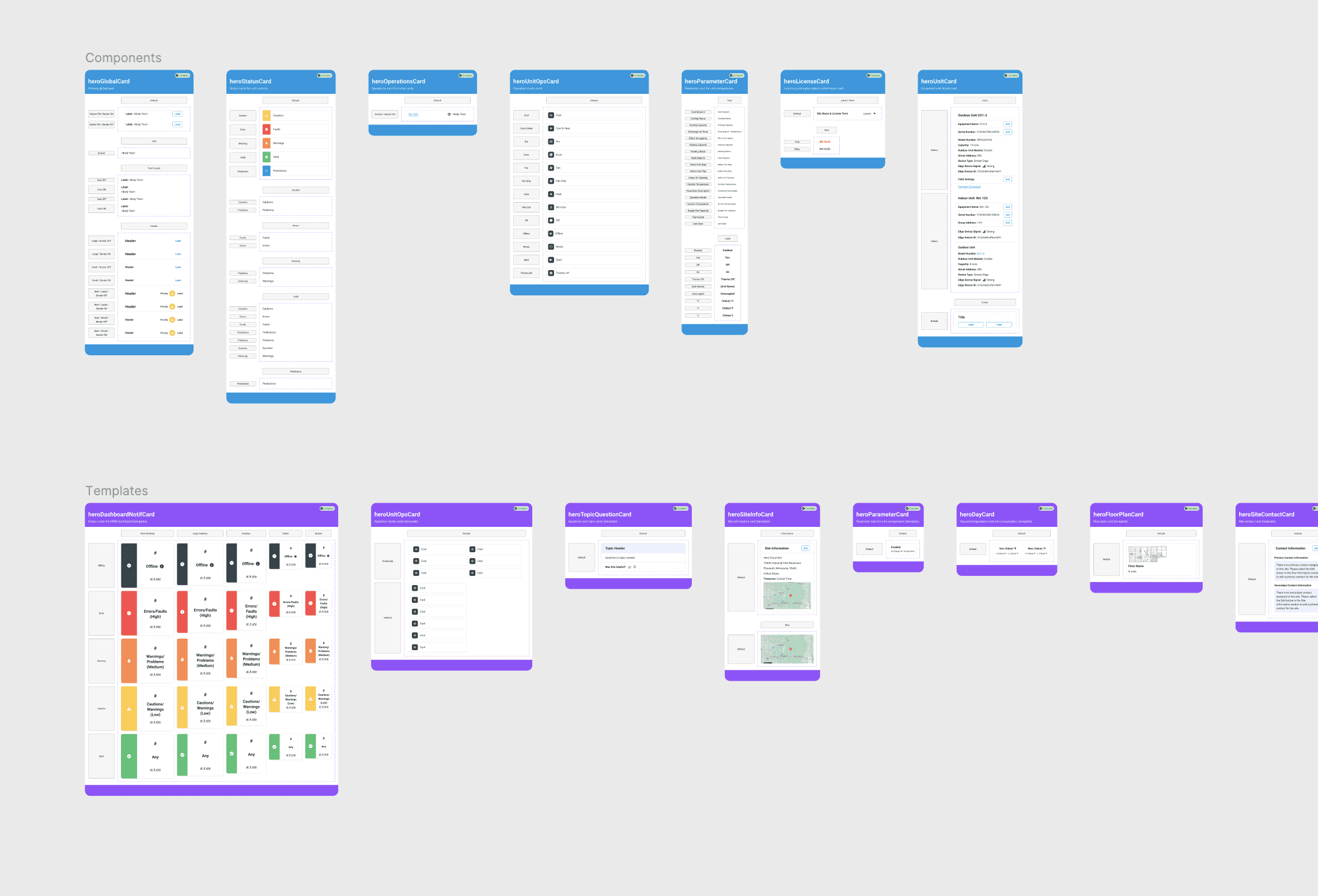
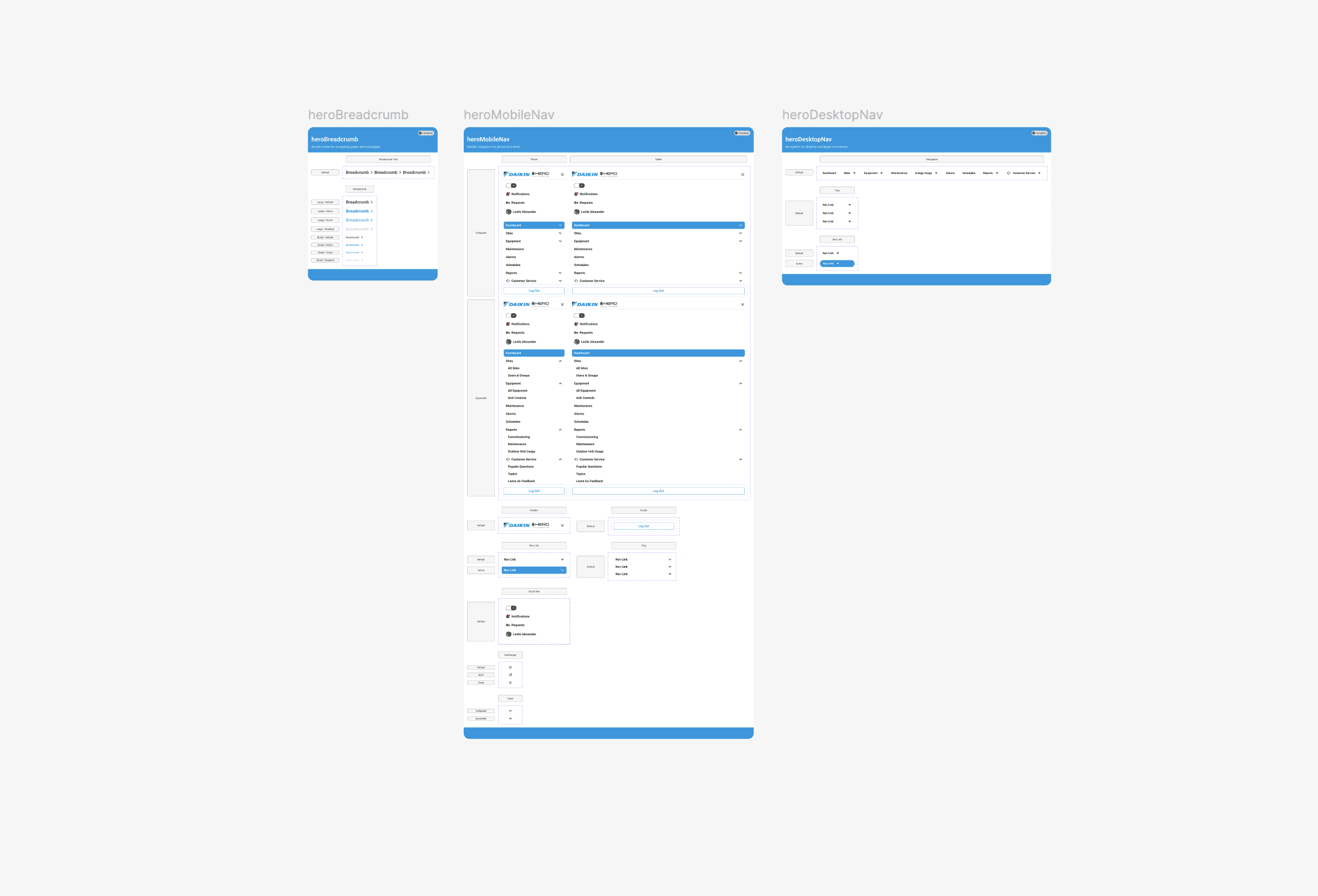
Organisms and templates
Organisms were complex components and critical in shaping the user experience. The organisms I created included the header, footer, navigation and the various cards utilized throughout the UI. I created numerous templates for the cards that were repeatedly used. These cards could be quickly added into the different features.
Completing missing states and variants
I previously discovered that multiple components had missing states and incomplete variants. The visual designer and I scheduled some design sessions to ideate on new styles for the new component states. In these sessions we conceptualized various ideas to include focus, selected, pressed, error and valid states. These new states were mainly applicable to atoms and molecules (inputs, buttons, selects, etc.). I added the new states and variants to the components.
Review with the team
I connected with the team and went over the updated components and styles. There were questions about how to use the components. I explained I would schedule some demos and training to go over how to utilize the library. The new components would not be applied to old feature sets.
Demos and training
I setup two workshops with demos. In these workshops I explained the new component structure and file setup. I went over the variables and presented the different visual references they could refer to for the properties and values. In addition, I created some Confluence documentation. Additionally, I demoed some of Figma's more advanced features to the design team.
Request and update process
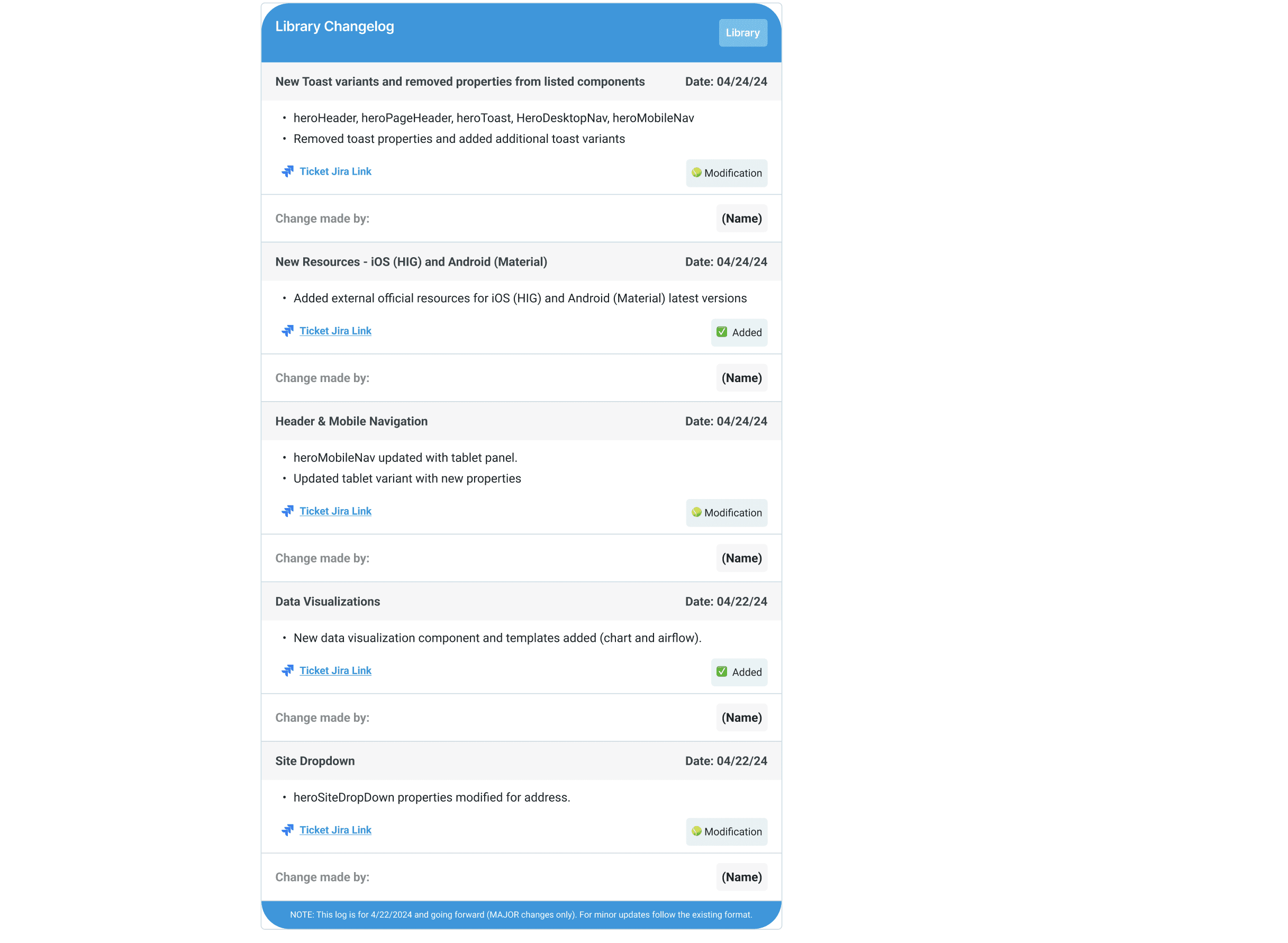
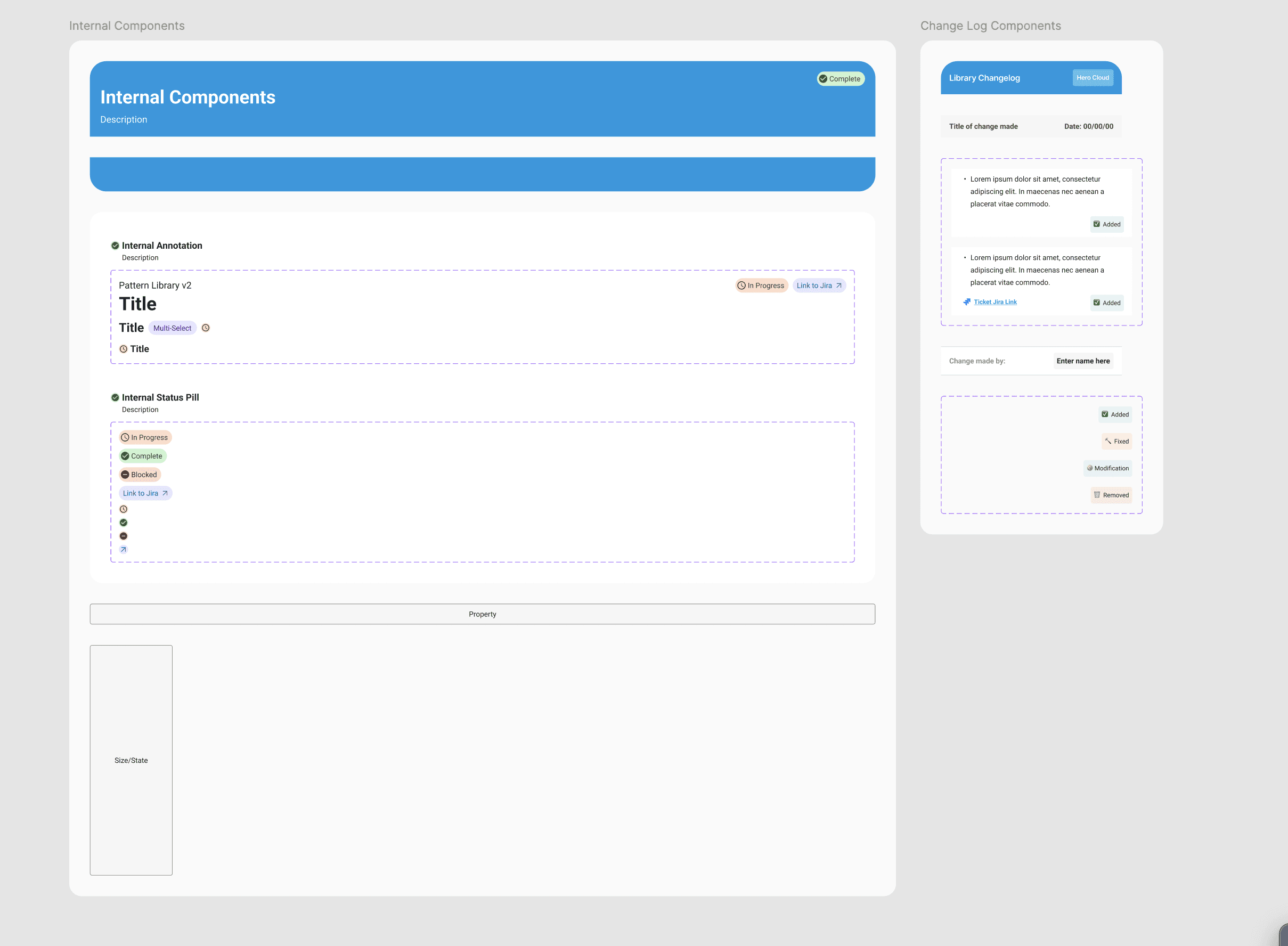
There was no existing process to request, update and publish new components to the production environment. This caused a bottleneck between the design team and engineering. To help rectify this, I formed a process that would track when the request was completed and implemented. This process required updating Jira component tickets and the change log. Additionally, making the engineering team aware the update was ready for production.
I created a local change log in the library which tracked the updates.The change log information included the name, date, link, change type and the details for the changes that were made. The change log was directly linked to Jira. Engineers were notified of the change once the ticket was complete. Engineering and the product manager decided on priority and when to implement the change. This process took some time for the designer and engineers to become acclimated with.
DESIGN
Primitive colors and charting
The existing library did not fully utilize primitive variables or aliasing. The existing variables did not use a token naming structure. I communicated I was going to use a defined token taxonomy. First, I created a well defined color chart of all the colors utilized within the library. I confirmed these colors with the visual designer. The primitive variables also included spacing, radius and border-width.
Primitive variables
The primitive variables were the foundation for color, spacing, radius and border-width. I created the primitive variables for the primary colors. Then I completed the variables for spacing, radius and border-radius. I created several visual references explaining the different values and widths that correlated to the variables. Next I shared my update with the rest of the team and went over how each of the specific variables could be utilized within and outside the components.
Fonts
I created local styles for the fonts and confirmed the correct font-size and line-height with the visual designer. Once I had confirmation on the correct font properties I created the local font styles and typograph visual reference. Once the variables and local styles were created for the local environment I confirmed the new grid and started working on the local components.
New and improved components
The existing components had to be recreated with the new variables and styles. I applied auto-layout and made use of nested instances. I used an atomic design approach and started with the atoms and molecules.
Atoms and molecules
Atoms and molecules were the foundation for all components. The atoms included icons, labels, radios, checkboxes, inputs and more. The atoms were essential in building the molecules. Molecules included buttons, counters, dropdowns, search and more.
Organisms and templates
Organisms were complex components and critical in shaping the user experience. The organisms I created included the header, footer, navigation and the various cards utilized throughout the UI. I created numerous templates for the cards that were repeatedly used. These cards could be quickly added into the different features.
Completing missing states and variants
I previously discovered that multiple components had missing states and incomplete variants. The visual designer and I scheduled some design sessions to ideate on new styles for the new component states. In these sessions we conceptualized various ideas to include focus, selected, pressed, error and valid states. These new states were mainly applicable to atoms and molecules (inputs, buttons, selects, etc.). I added the new states and variants to the components.
Review with the team
I connected with the team and went over the updated components and styles. There were questions about how to use the components. I explained I would schedule some demos and training to go over how to utilize the library. The new components would not be applied to old feature sets.
Demos and training
I setup two workshops with demos. In these workshops I explained the new component structure and file setup. I went over the variables and presented the different visual references they could refer to for the properties and values. In addition, I created some Confluence documentation. Additionally, I demoed some of Figma's more advanced features to the design team.
Request and update process
There was no existing process to request, update and publish new components to the production environment. This caused a bottleneck between the design team and engineering. To help rectify this, I formed a process that would track when the request was completed and implemented. This process required updating Jira component tickets and the change log. Additionally, making the engineering team aware the update was ready for production.
I created a local change log in the library which tracked the updates.The change log information included the name, date, link, change type and the details for the changes that were made. The change log was directly linked to Jira. Engineers were notified of the change once the ticket was complete. Engineering and the product manager decided on priority and when to implement the change. This process took some time for the designer and engineers to become acclimated with.
NEXT STEPS
CLIENT PRESENTATION
I presented the library and process to Daikin. The product manager and I explained how the library would be applied to the existing production UIs.
The plan included incorporating the library in the next set of features and archiving the old library. The feedback was very positive and well received from Daikin.
CLIENT PRESENTATION
I presented the library and process to Daikin. The product manager and I explained how the library would be applied to the existing production UIs. The plan included incorporating the library in the next set of features and archiving the old library. The feedback was very positive and well received from Daikin.
NEXT STEPS
CLIENT PRESENTATION
I presented the library and process to Daikin. The product manager and I explained how the library would be applied to the existing production UIs.
The plan included incorporating the library in the next set of features and archiving the old library. The feedback was very positive and well received from Daikin.
OUTCOMES
New process
The new process eliminated the disconnect between the design and engineering teams in requesting and publishing library updates to production. It established a unified communication method to ensure that production and Figma files were aligned and up to date.
Robust and improved library
The new library saved the design team time in completing their designs by eliminating the habit of breaking and creating redundant components. It established a documented process for utilizing the library and informed the team about advanced capabilities within Figma. Finally, it was fully integrated into all applicable Daikin HERO user interfaces.
LEARNINGS
Individual processes
It was fascinating to understand how designers set up and arranged their design files. Each designer had their own method and process for building out design features, providing insight into their approach and problem-solving strategies.
Client appreciation
It was rewarding to see how appreciative the client was of the new process, which allowed designers and engineers to collaborate more easily on the library. They also found the new library to be effective and intuitive for their other teams.