Dashboard & Collaboration Hub
Dashboard & Collaboration Hub
Create a real-time data rate transfer dashboard and collaboration system for Evil Eye Pictures.
An award winning visual effects studio that uses Unreal Engine to capture facial movements and transposes them on a virtual character in real time.
Create a real-time data rate transfer dashboard and collaboration system for Evil Eye Pictures. An award winning visual studio This visual effects studio uses Unreal Engine to capture facial movements and transposes them on a virtual character in real time.
Create a real-time data rate transfer dashboard and collaboration system for Evil Eye Pictures. An award winning visual studio This visual effects studio uses Unreal Engine to capture facial movements and transposes them on a virtual character in real time.
GOALS
Develop a unique system that allows actors, directors, and creative professionals to come together as digital human characters to create animated productions. Design an administration hub and dashboard where users could access all of their required tools.
Implement real-time data visualization to capture live data stream information from Unreal and communicate it to technical teams so they can troubleshoot. Introduce governance to give directors the ability to easily manage their actors and creative teams.
CHALLENGES
Learn and understand the extensive technical process of transposing facial-capture (audio, video, and animation) data from Unreal to the application.
New and deep technical industry with complex use cases and scenarios.
Small timeframe to research, plan, and deliver a fully designed and developed application.
Multi-view application with strict compliance rules that had to be rendered in real-time for the Unreal Engine.
Proposing an alternative color scheme instead of the client color palette which did not meet ADA and WCAG standards.
Creating a custom pattern and component library in addition to the original design brief (this work was not part of the original scope of work).
MY ROLE
Conduct workshops with product and client teams to narrow down their feature list to create a streamlined application for their initial launch.
Assess and create heuristics on the client's existing color palette.
Create multiple user flows for admin and dashboard workflows.
Develop annotated wireframes for the engineers and technical producers.
Design pixel-perfect high-fidelity wireframes for prototype and engineering purposes.
Build UI flows to illustrate the various admin and dashboard workflows.
Worked closely with the studio’s engineers to bring the actors to a virtual stage that was easy to access and use.
WHAT I DELIVERED
1 Discovery and research documentation
4 Heuristic analysis
1 Component and pattern library
14 User flows
5+ UI flows
1 Prototype
70+ Medium-fidelity wireframes (grayscale)
70+ High-fidelity annotated mockups
RESEARCH
Introductions and meeting the client team
The first step was introductions and meeting the client team. The client team consisted of two studio engineers, director and several creative members (actor, technical producers and animators). My team consisted of myself, the product manager and two engineers.
Scheduling and conducting workshops
My team and I scheduled and conducted three workshops. The first workshop was a discovery workshop to understand more about the client, their industry, market and underlying thoughts. From this first workshop I took notes about their industry and market that helped outline their thoughts and questions we needed to clarify.

Second workshop
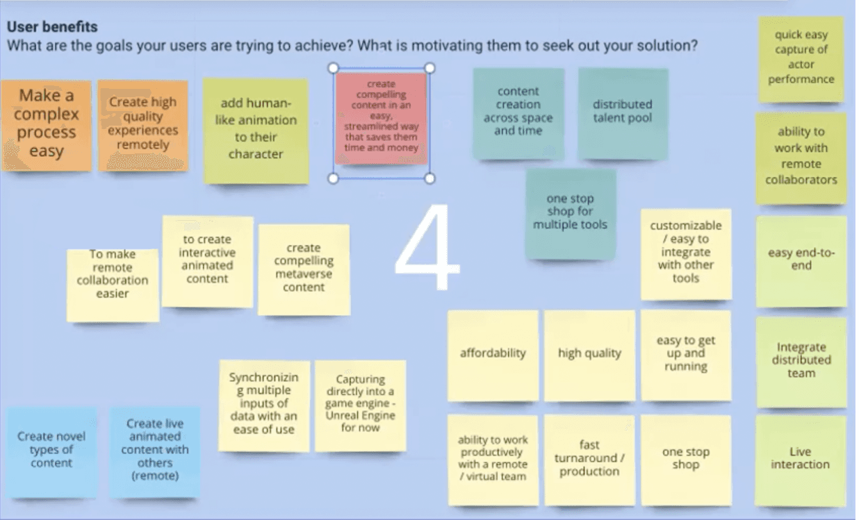
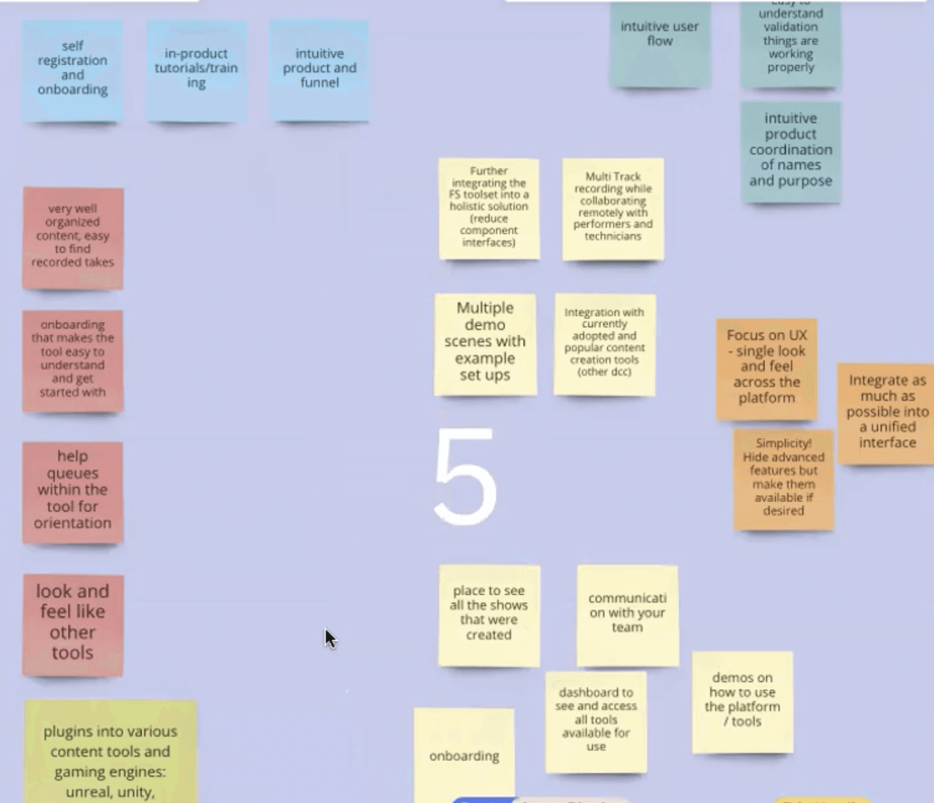
The next workshop was to understand more about the client’s business outcomes, user types, pain points, benefits and focus on potential solution ideas for their target audience. I proposed using a Kanban board exercise for collaborating ideas. From this exercise each participant made sticky notes and posted them to the board. This exercise helped start the process of working together and to define and better understand the requirements.
Final workshop
The final workshop was to understand the priority and narrow down on the most common use cases and goals. The team and I utilized a red dot exercise to help prioritize which cards were considered a priority (in terms of need) and started to group the notes into categories. The product manager and I took the information and consolidated it into a more readable format. The product manager and I started to prioritize user stories and assign them to the various personas. The final personas were narrowed down to directors, actors, technical directors, and audio engineer and operators.

RESEARCH
Introductions and meeting the client team
The first step was introductions and meeting the client team. The client team consisted of two studio engineers, director and several creative members (actor, technical producers and animators). My team consisted of myself, the product manager and two engineers.
Scheduling and conducting workshops
My team and I scheduled and conducted three workshops. The first workshop was a discovery workshop to understand more about the client, their industry, market and underlying thoughts. From this first workshop I took notes about their industry and market that helped outline their thoughts and questions we needed to clarify.
Second workshop
The next workshop was to understand more about the client’s business outcomes, user types, pain points, benefits and focus on potential solution ideas for their target audience. I proposed using a Kanban board exercise for collaborating ideas. From this exercise each participant made sticky notes and posted them to the board. This exercise helped start the process of working together and to define and better understand the requirements.
Final workshop
The final workshop was to understand the priority and narrow down on the most common use cases and goals. The team and I utilized a red dot exercise to help prioritize which cards were considered a priority (in terms of need) and started to group the notes into categories. The product manager and I took the information and consolidated it into a more readable format. The product manager and I started to prioritize user stories and assign them to the various personas. The final personas were narrowed down to directors, actors, technical directors, and audio engineer and operators.
PLAN
Planning phase
The first task was to define the roles in the system based on the role of the studio team member (permissions would come later). I worked with the product manager and engineers to define the user roles. There were four primary roles: “Super Admin,“ Admin,” “Members” and “Viewers.”
The super admin were a few of the top level senior directors who managed multiple shows. The admins had almost the same authority as the super admin, but were slightly limited; admins were associate directors or technical directors.
The members were primarily the technical crew; the technical crew members had permission to do anything at the show management level. However, nothing at the organizational level. Lastly, viewers were either an audience or actor and were limited to view-only access.
Learning their process
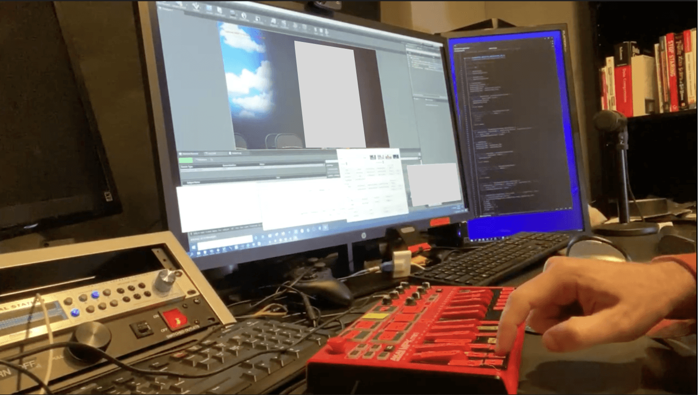
One of my goals (and the client) was to understand their technical setup and learn more about Unreal and the process for creating motion capture animations. I watched their technical and creative crews in real time. I spent a week participating in test shows, script reviews and animation workshops.
This resulted in a holistic view of the studio’s technical and creative team process and setup. I set up a local environment to learn and create some test takes. This helped me understand the type of data and information passed to and from the Unreal Engine.
Key takeaways
I learned how involved the technical and creative process is to create test takes and complete a finished animated show.
How each of the key team members perform their role in the technical and creative operations.
The type information and data each persona looks for when completing their tasks.
More insight from the studio team members on how they would like to benefit from this new application.
Key takeaways
I learned how involved the technical and creative process is to create test takes and complete a finished animated show
How each of the key team members perform their role in the technical and creative operations
The type information and data each persona looks for when completing their tasks
More insight from the studio team members on how they would like to benefit from this new application

Scope and planning
Once I completed my local environment setup, I started to answer the clarifying questions that were asked during the workshops with the new insights I learned. User story related questions were answered as the planning and scope began. The product manager and I met to discuss the phases and features. The phases were divided into four succinct phases of work. There would be three phases of discovery and design. The final phase covered the design library, finalized visual mockups, annotations and hand off to engineering.
Phase one
Phase one consisted of the dashboard for both technical and non-technical team members. This included pre-recording and recording (live) for the dashboard. I met with key members of the technical and creative team to finalize the other phases.
Phase two
Phase two included account management, show management, take management, and post-recording (playback) in the application.
Phase three
Phase three would cover governance, navigation, help and support for studio team members, their collaborators and partners.
Phase four
The final phase would consist of any outstanding topics, the finalized annotated visual mockups and handoff to engineering. In addition, any design work that required additional scope.
PHASE ONE
Creating the initial workflow
I created the first workflow for the local-environment setup. This workflow showed the necessary steps a user completed to set up a working instance for Unreal Engine and Stage.HUB in order to login into the application.
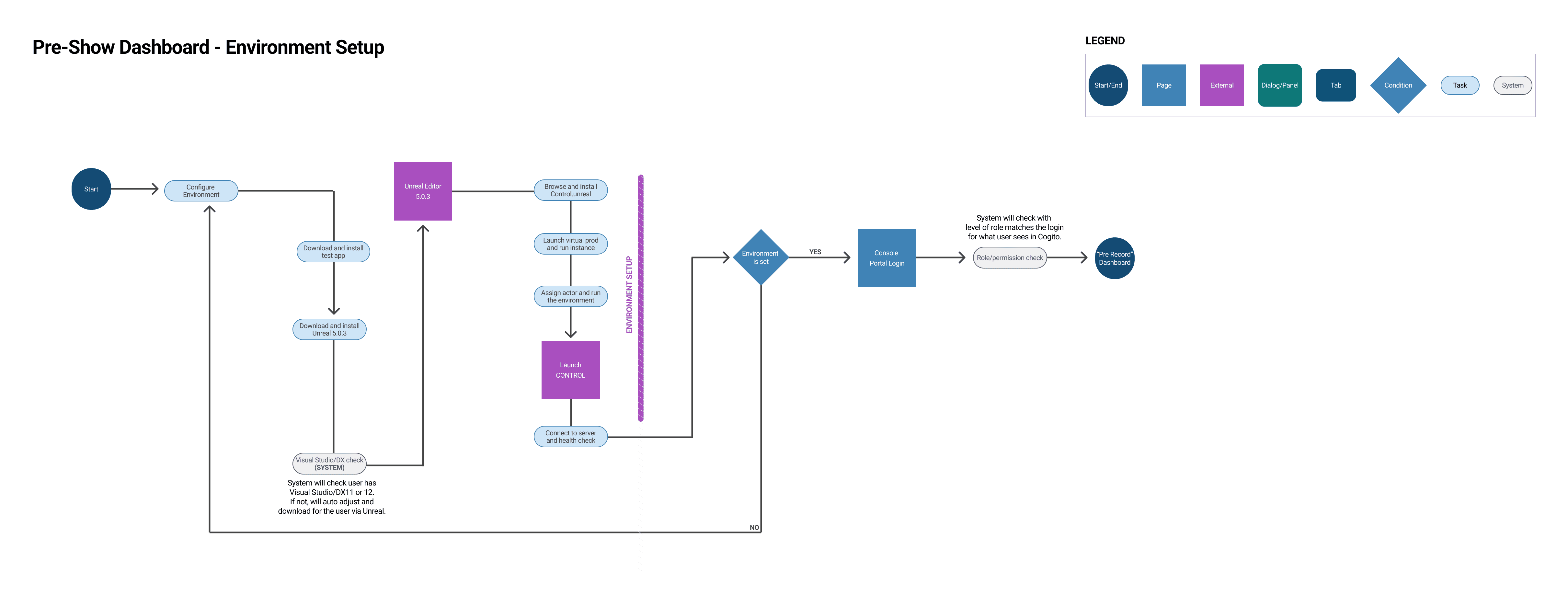
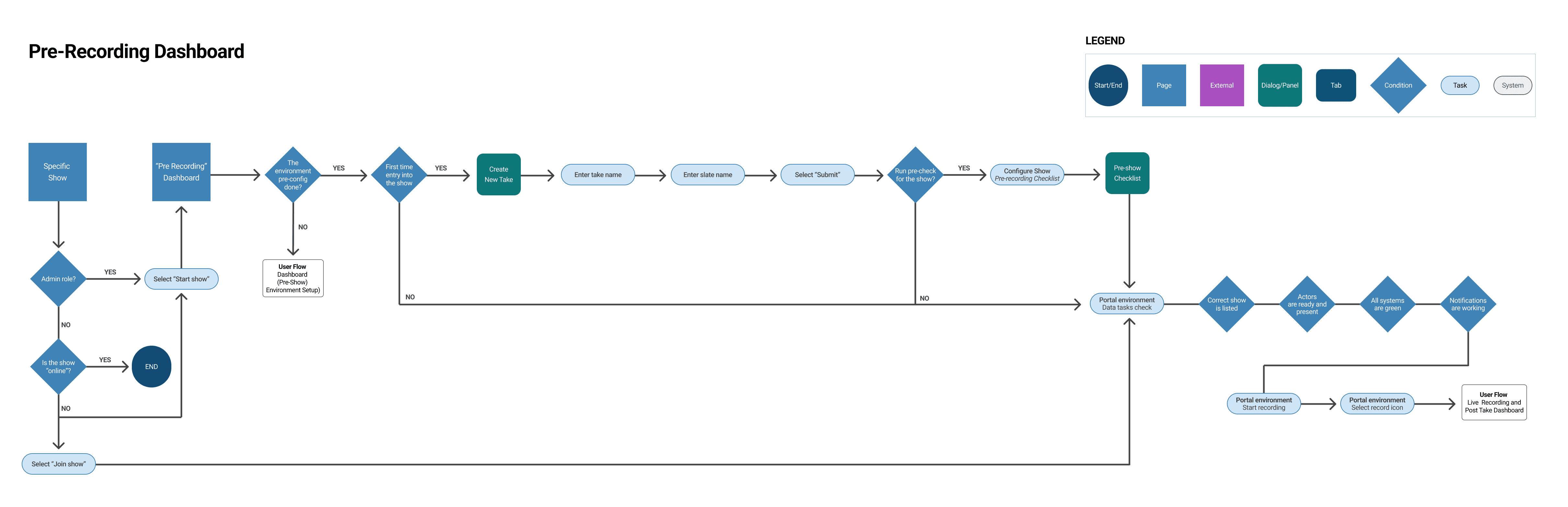
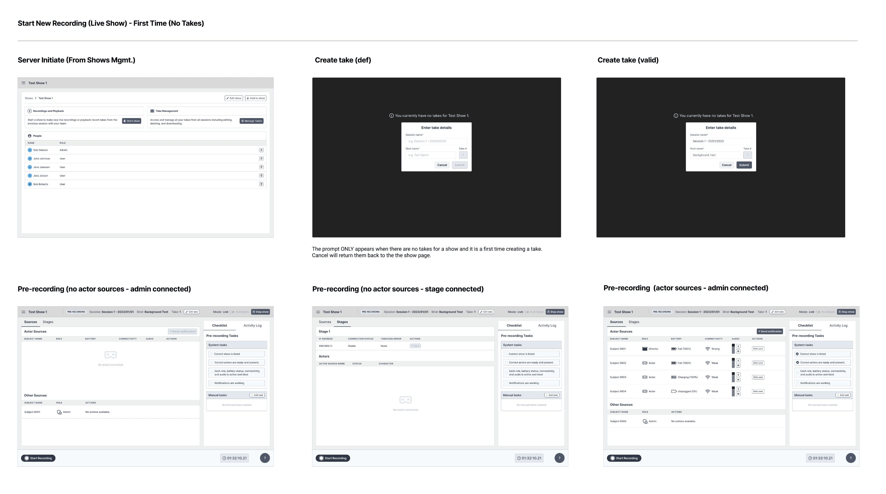
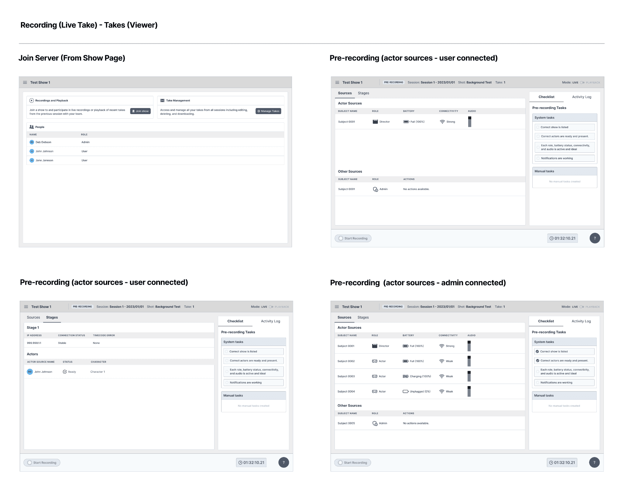
Pre-recording
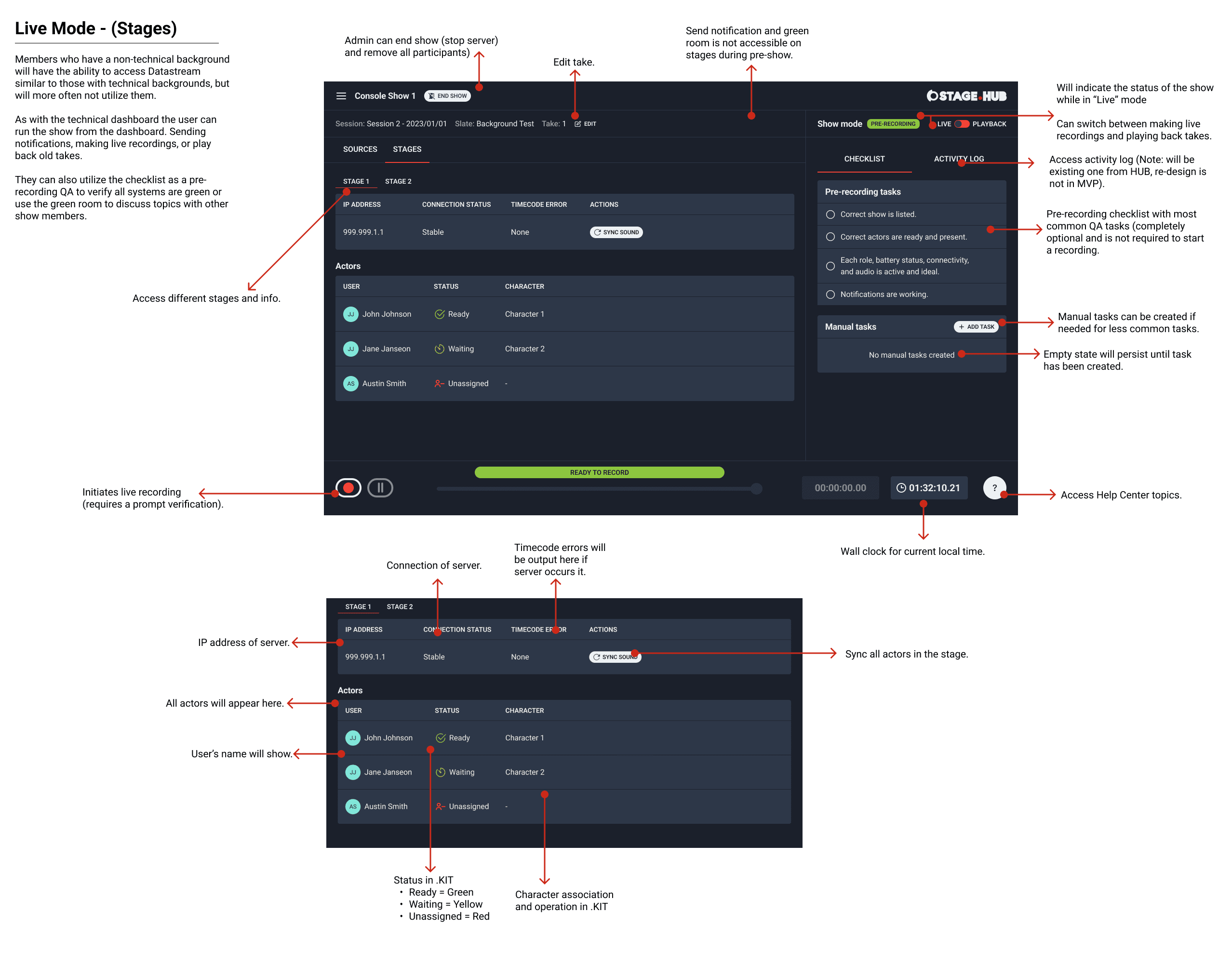
Next, I conducted a meeting with key members of the technical and creative team to confirm the goals for the pre-recording dashboard. The goals included: configure the show, conduct a pre-show checklist (if needed), test the system, run connectivity checks and recording tests. I completed the user flow to outline the steps to achieve these goals.
Live-recording
I met with more members of the technical and creative team to confirm the goals for the live-recording dashboard. The goals included: show all connected crew members, ensure source and stage data is being captured correctly by detecting and fixing errors, pre-check, communicate with team members and record test takes. I created the user flow for the live-recording dashboard. I shared the first three user flows with the client team and there were no updates requested.

Concepts and ideas
The client team requested wireframes for the dashboard. These wireframes illustrated the features for pre-recording and live-recording from a technical and non-technical perspective.
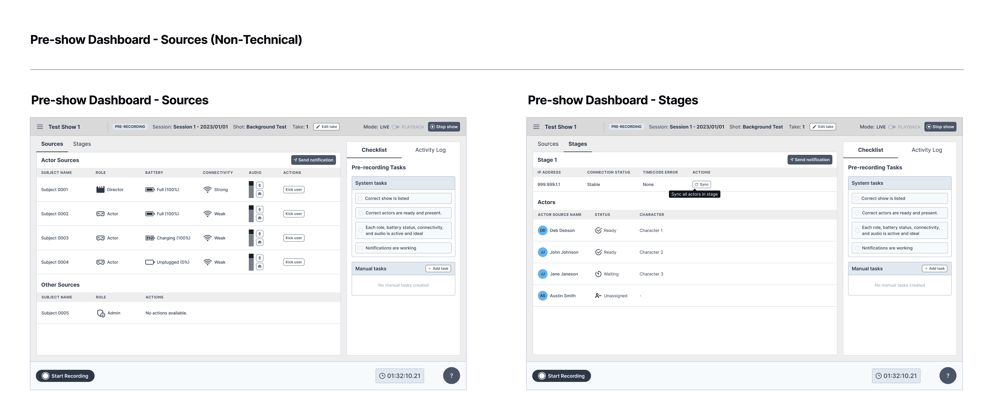
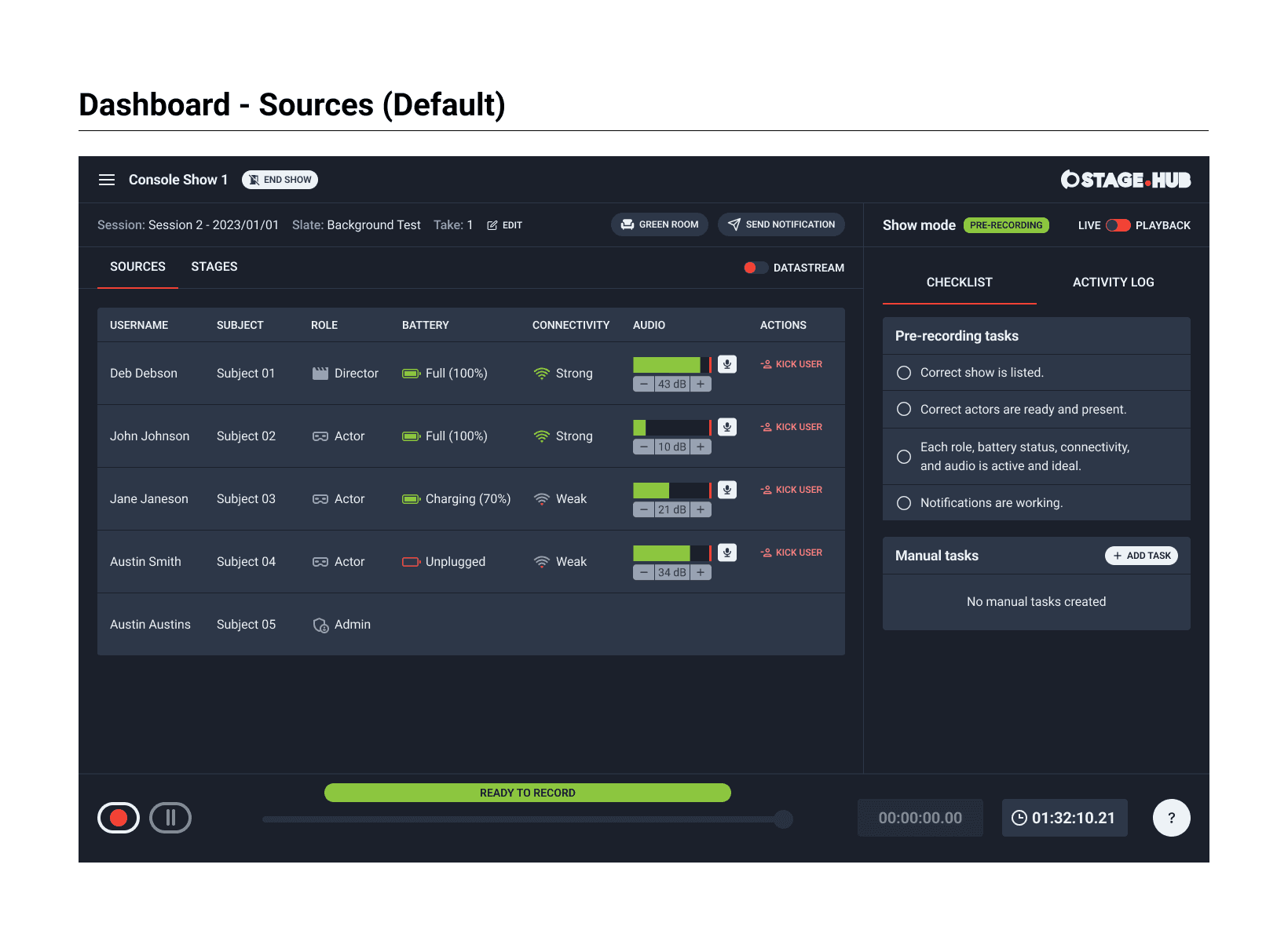
I worked on the non-technical screens for the pre-recording dashboard that was used by admins, members and viewers. The dashboard showed a breakdown of the connected sources from Unreal to the Stage.HUB application. The performance and latency of the virtual stage was communicated to the team. This explained which members were using which characters for the take. Secondary mute and kick actions were included for admins and members. This dashboard had several other features. The plan was to complete all wireframes for the dashboard and then review with the client team.
Checklist
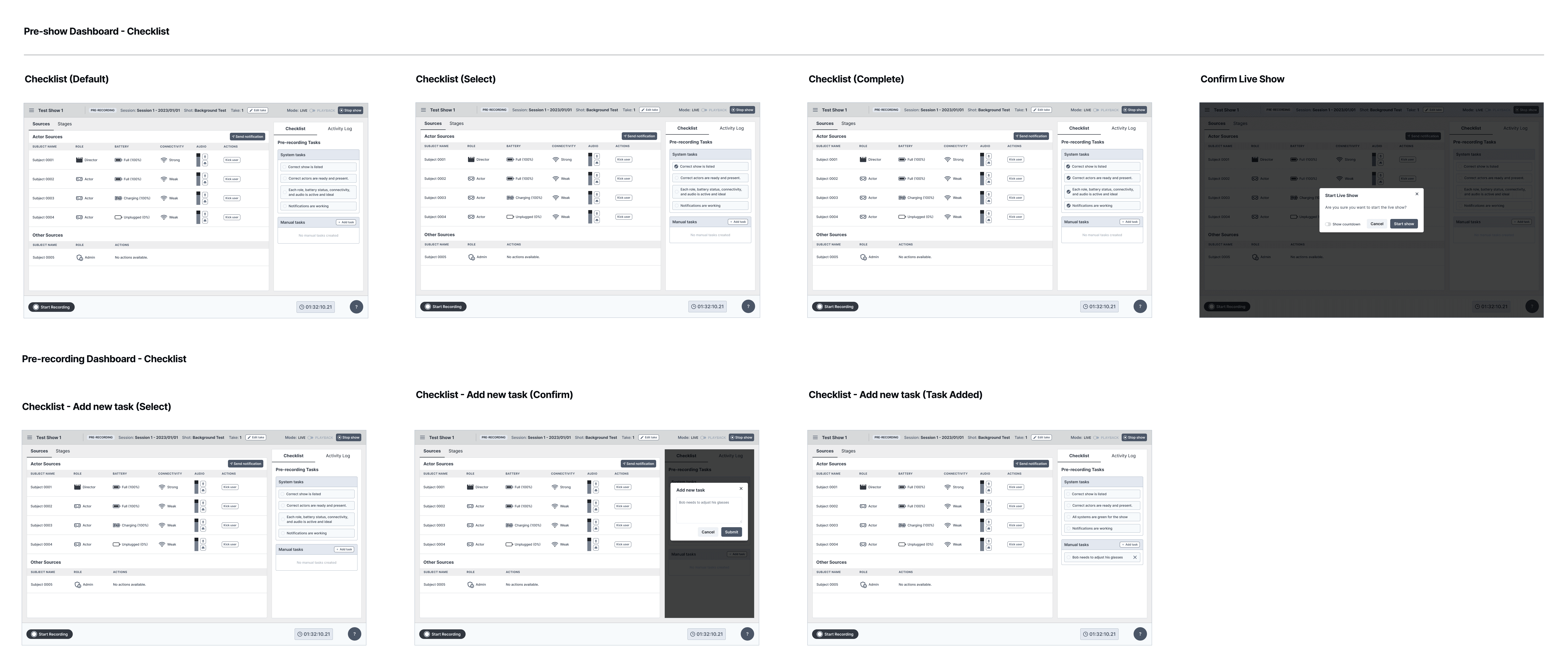
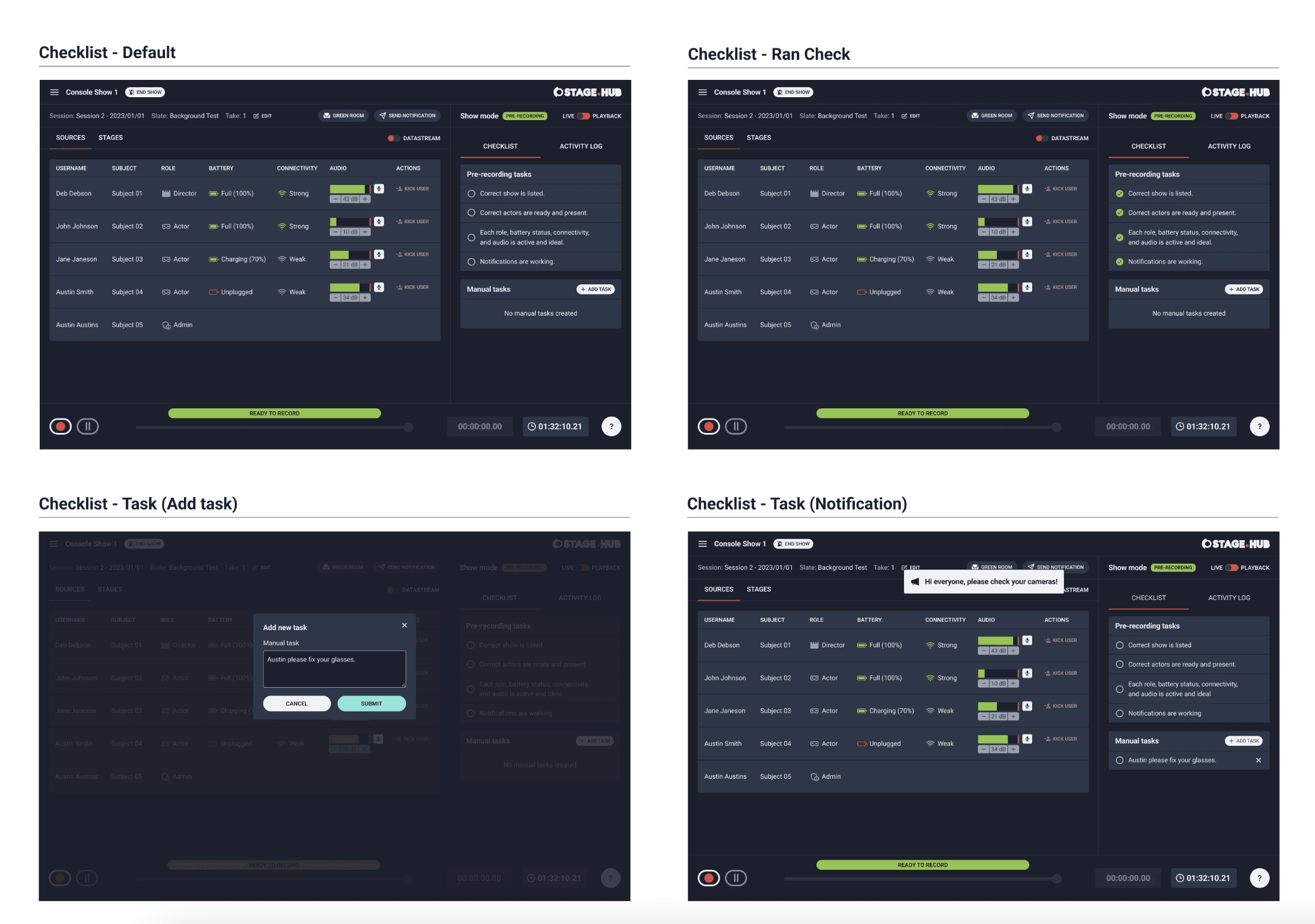
The next step was to refine the checklist. Admins and members could (optionally) use the checklist to conduct pre-recording quality checks. This was commonly done prior to creating takes for their shows. The checklist accommodated default tasks and custom tasks.
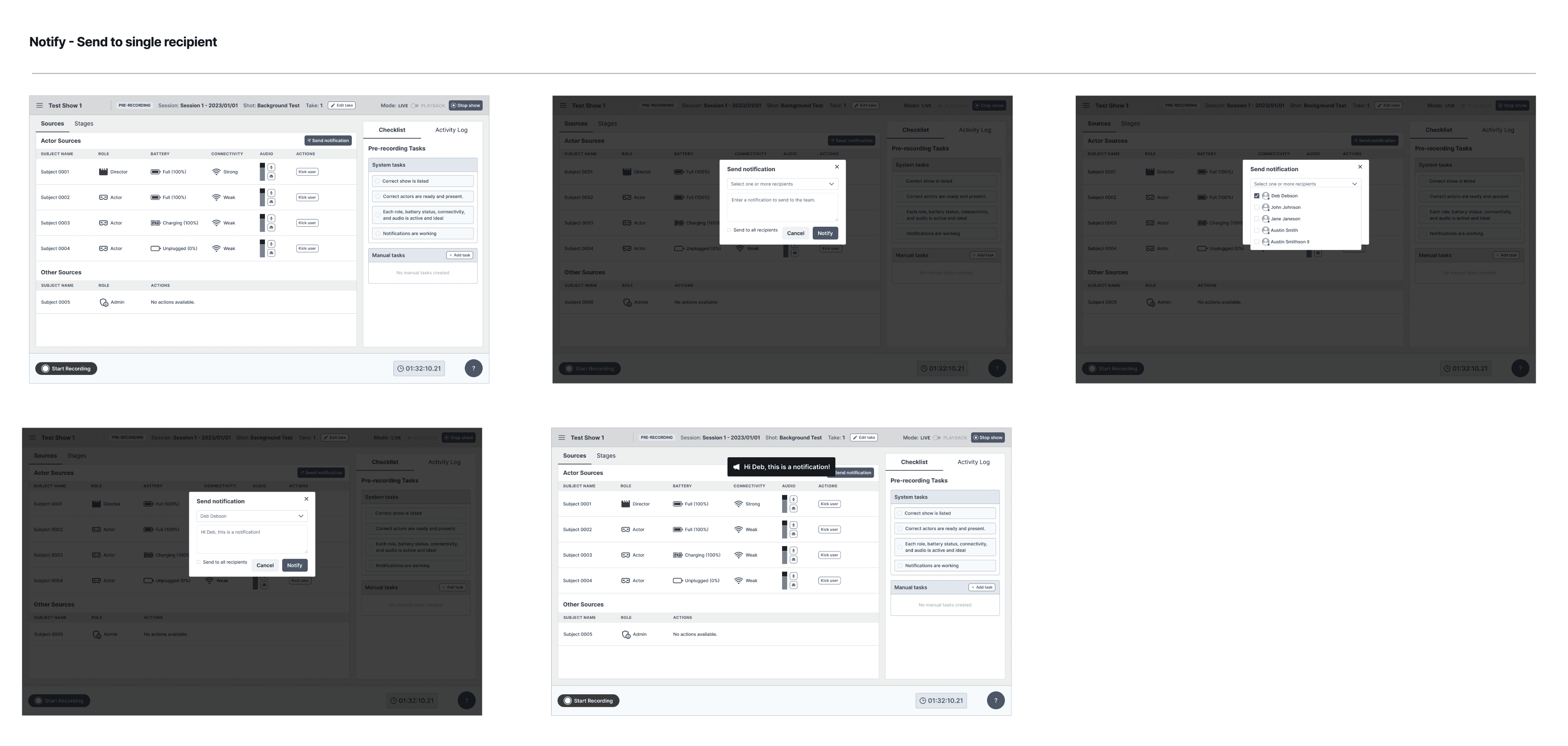
Notifications
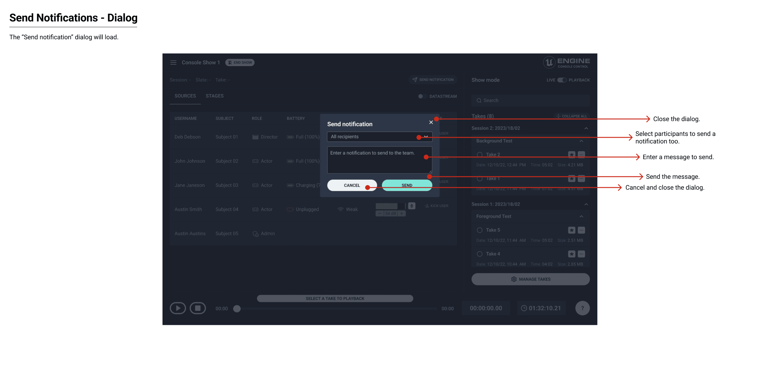
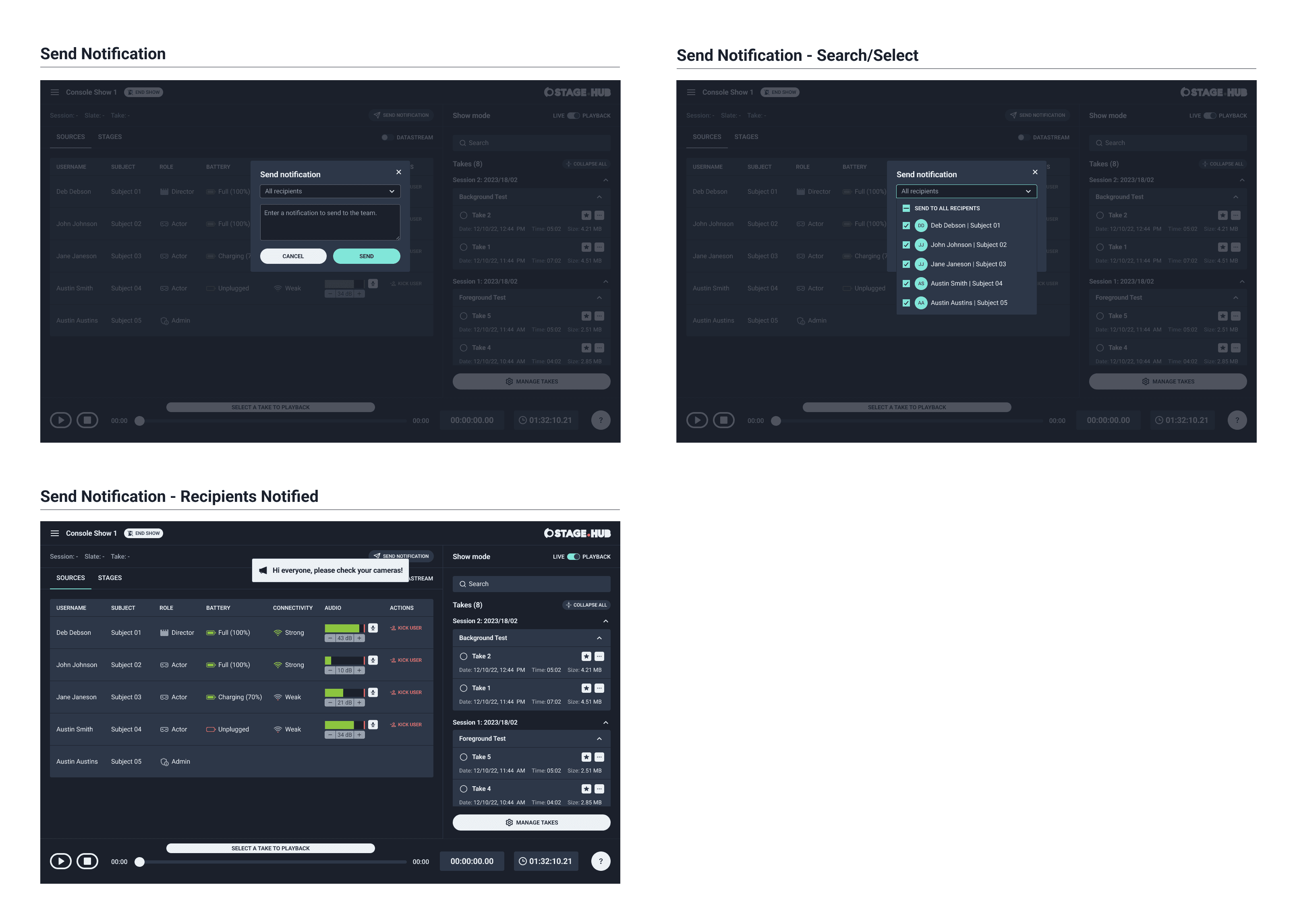
Admins and members needed to send global and individual notifications to other members on their team. This feature included a dropdown to find names quickly, select them and notify them for technical and non-technical reasons. The recipient of the notification would see the notification as a banner message in their dashboard.
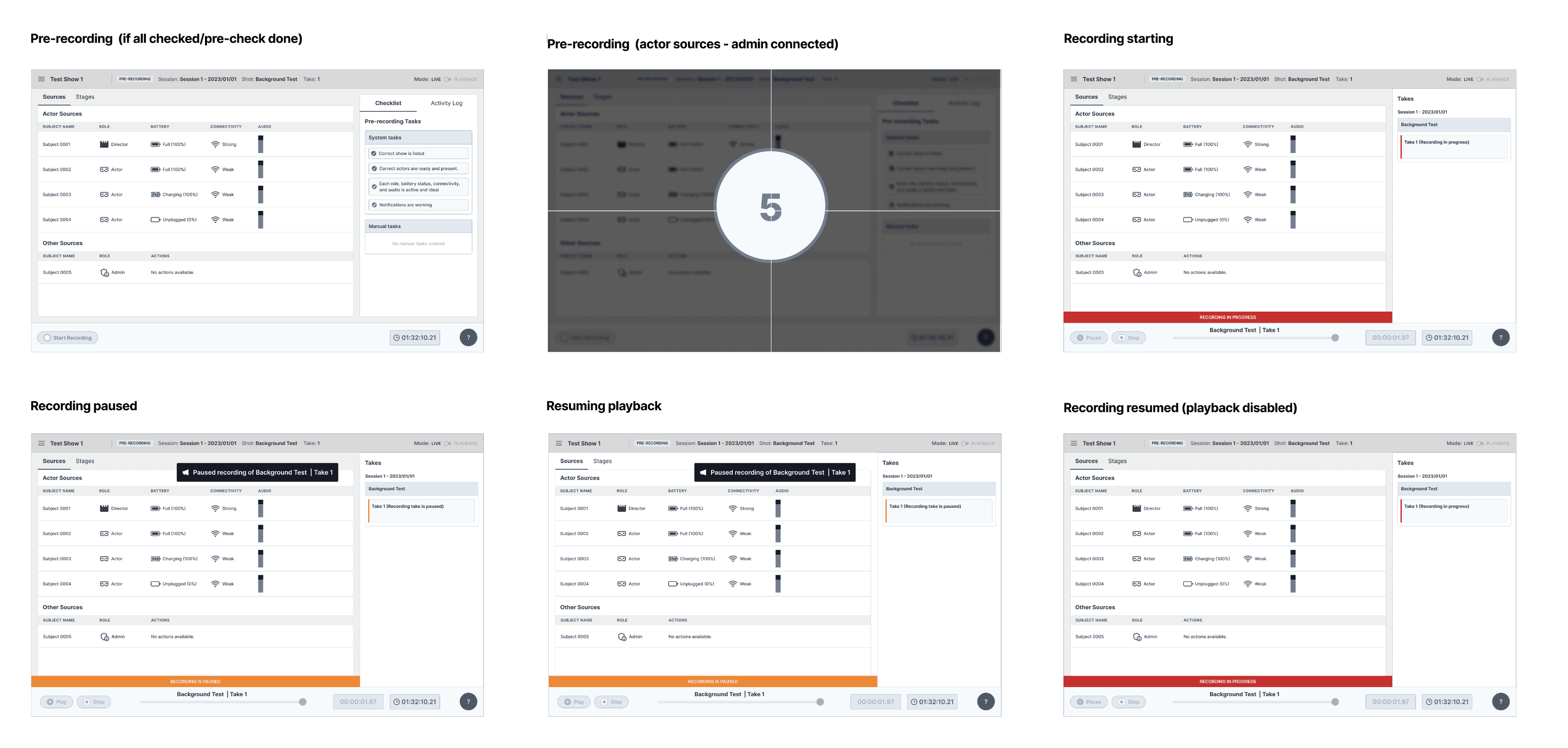
Live-recording DATA
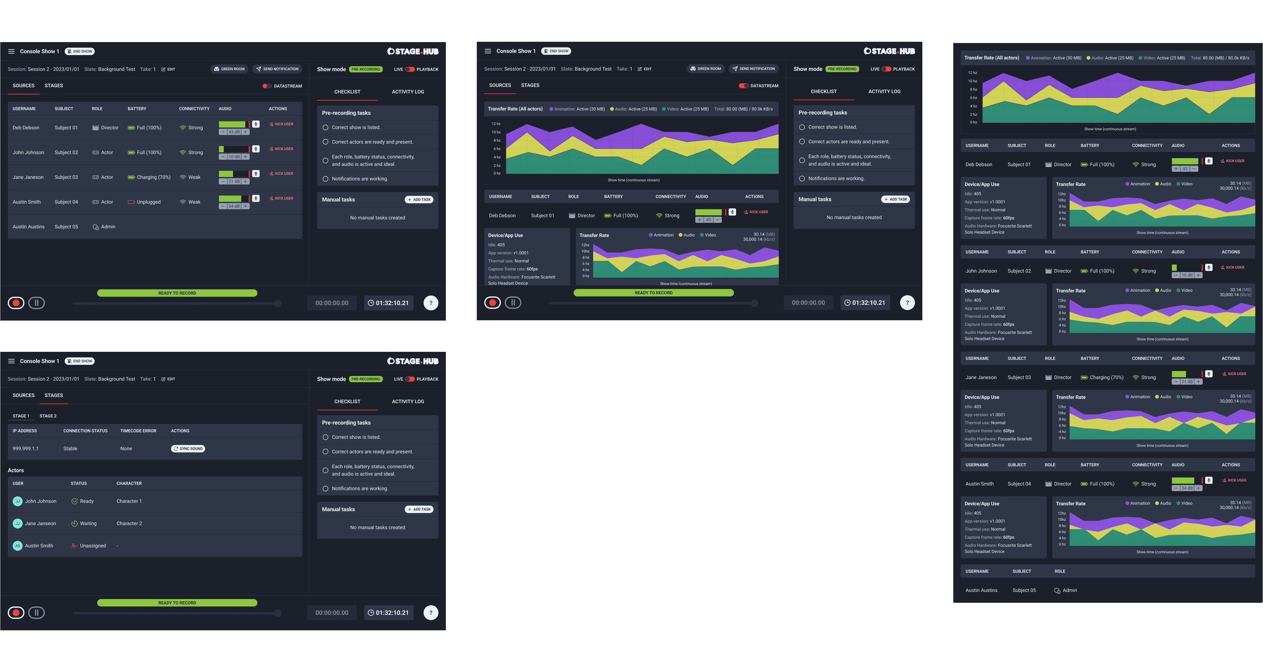
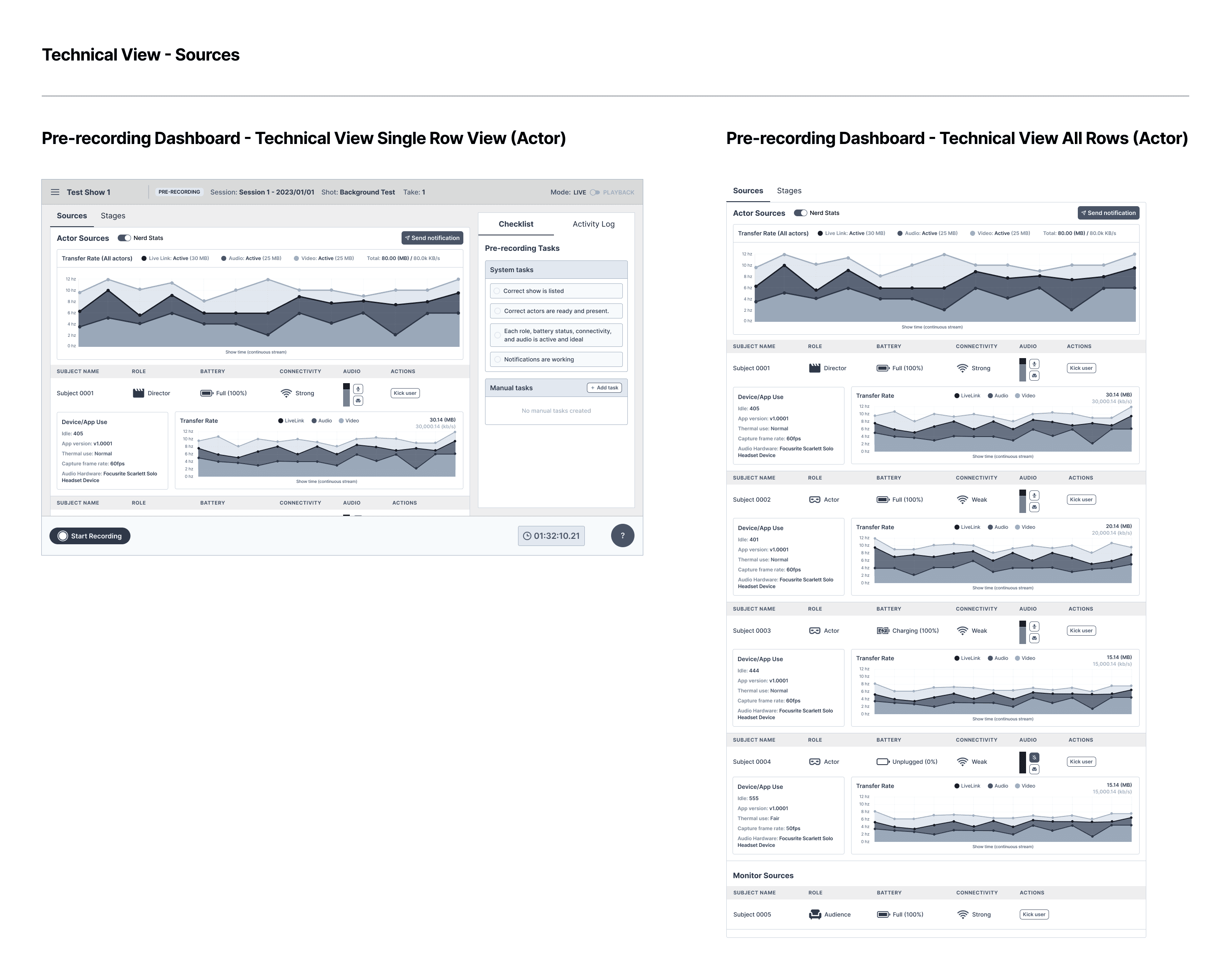
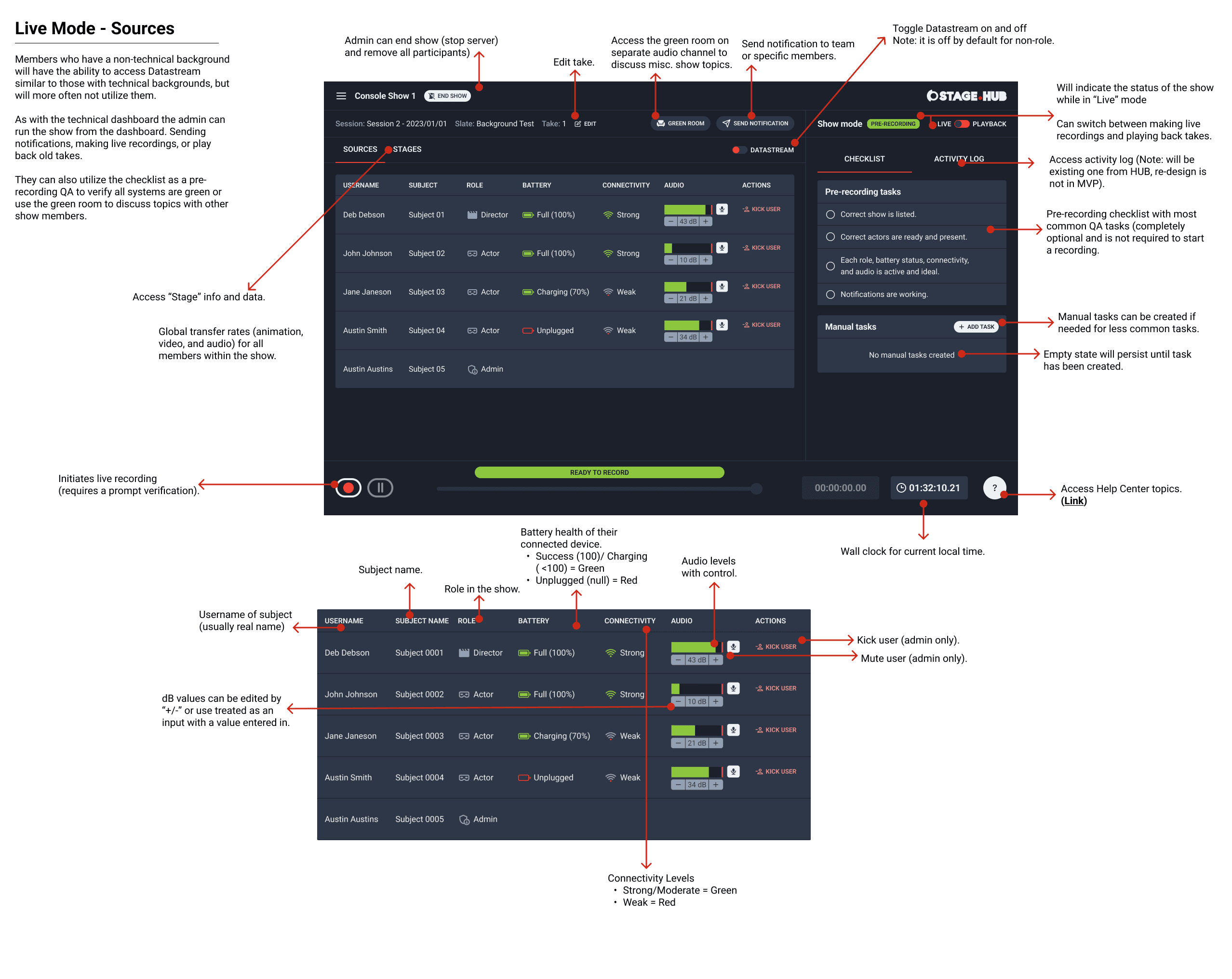
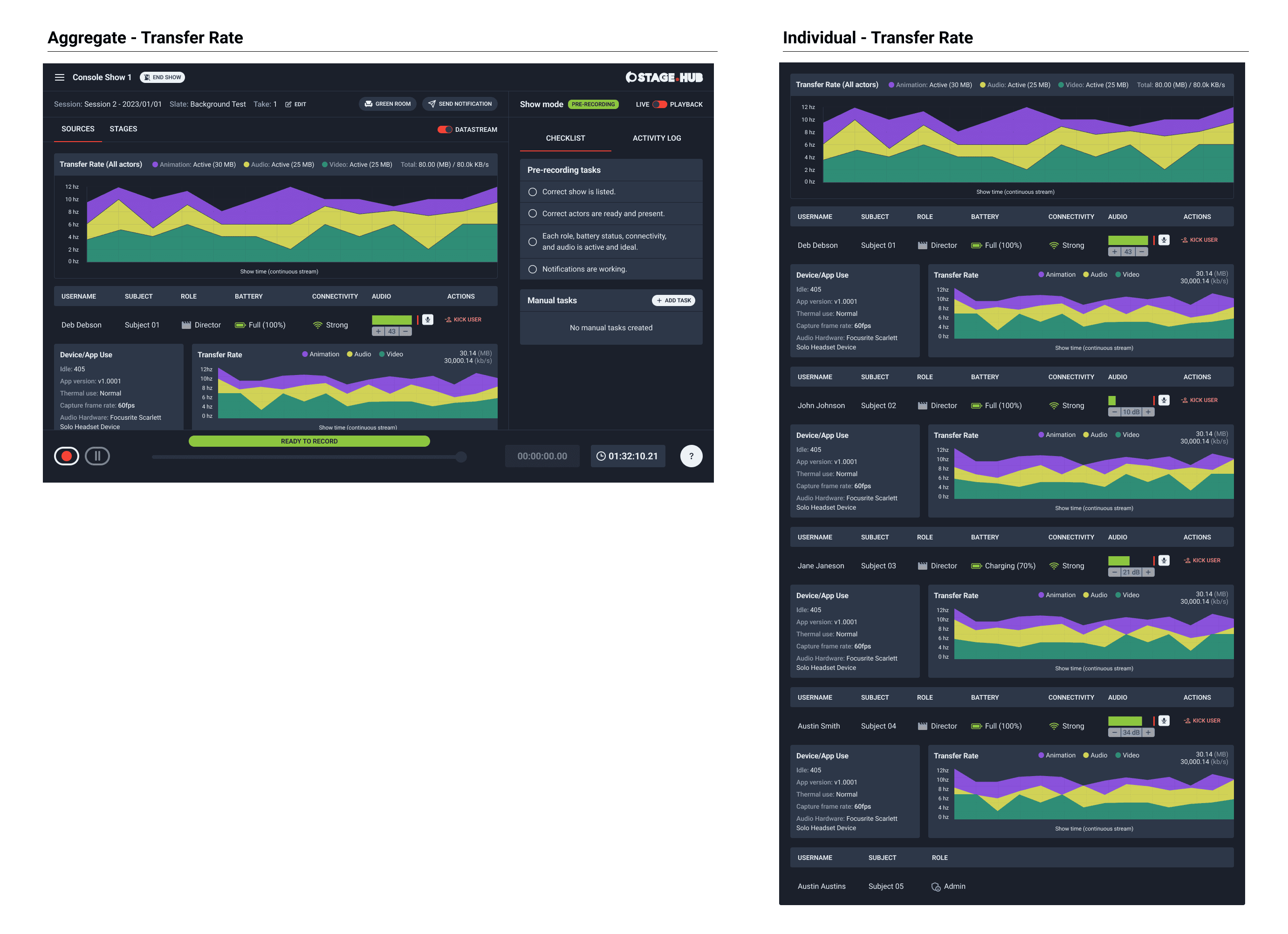
I reviewed wireframes with the client team and the product manager. I received feedback for some adjustments to the transport control on current screens. I completed their requested updates and then finished the technical screens for the live-recording dashboard. I used an area graph which displayed a real time data stream of video, audio and animation data and total file size being stored in S3.
Video data contained live recording data being sent in from Stage.HUB and rendered in Unreal. Audio data were sound effects or voice audio being sent to Unreal. Animation data were effects or assets the animators were applying to the characters, foreground and background.
Additionally, there was also a technical breakdown of the data to understand processing, connectivity, latency, and memory for each connected source (to and from Unreal).
Create, start, pause and stop a RECORDING
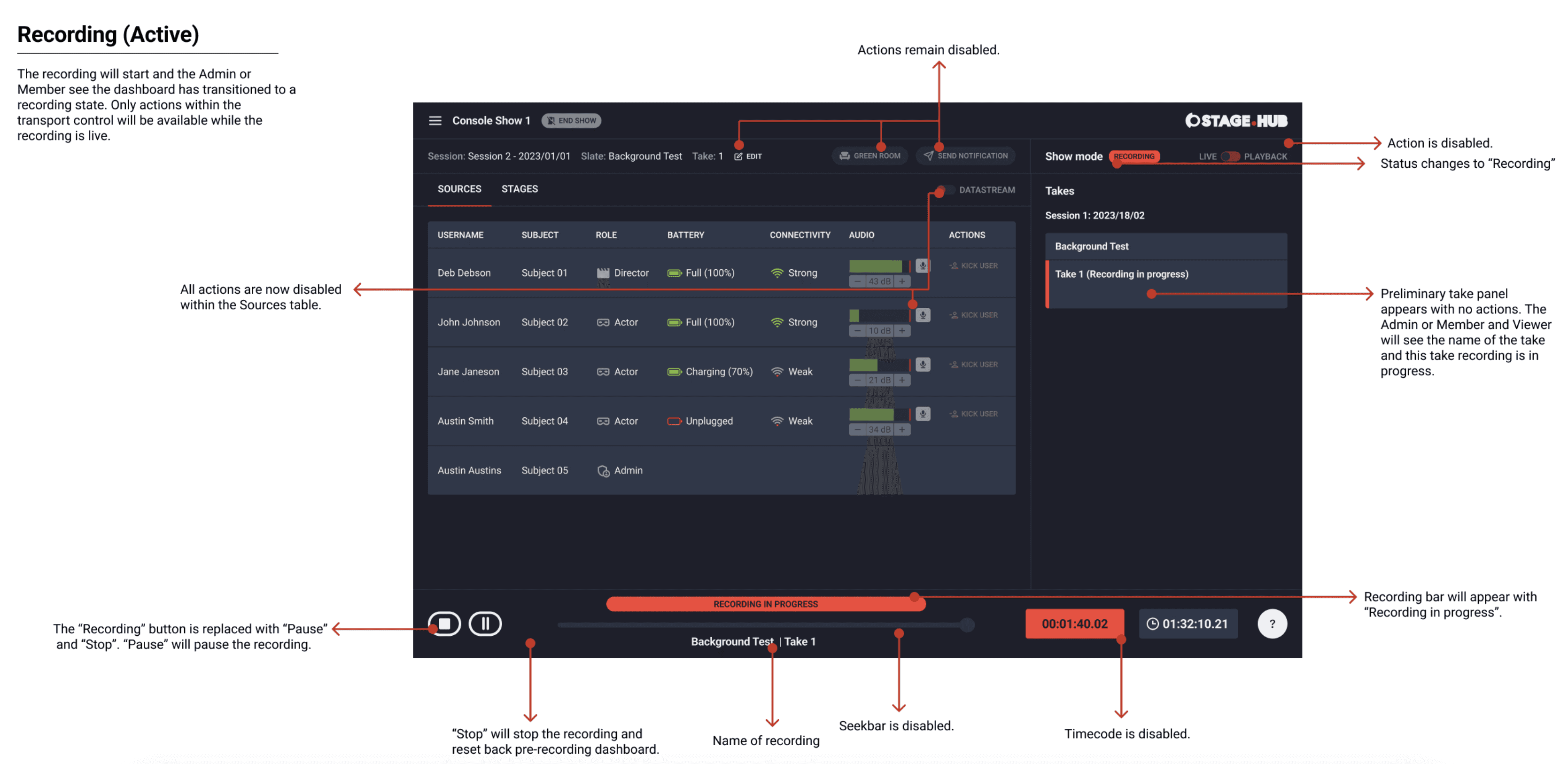
Next, I reviewed wireframes with the client team. The feedback was well received and some adjustments to the data structure was requested. The client wanted to understand how a team would create, start, pause and stop a recording.
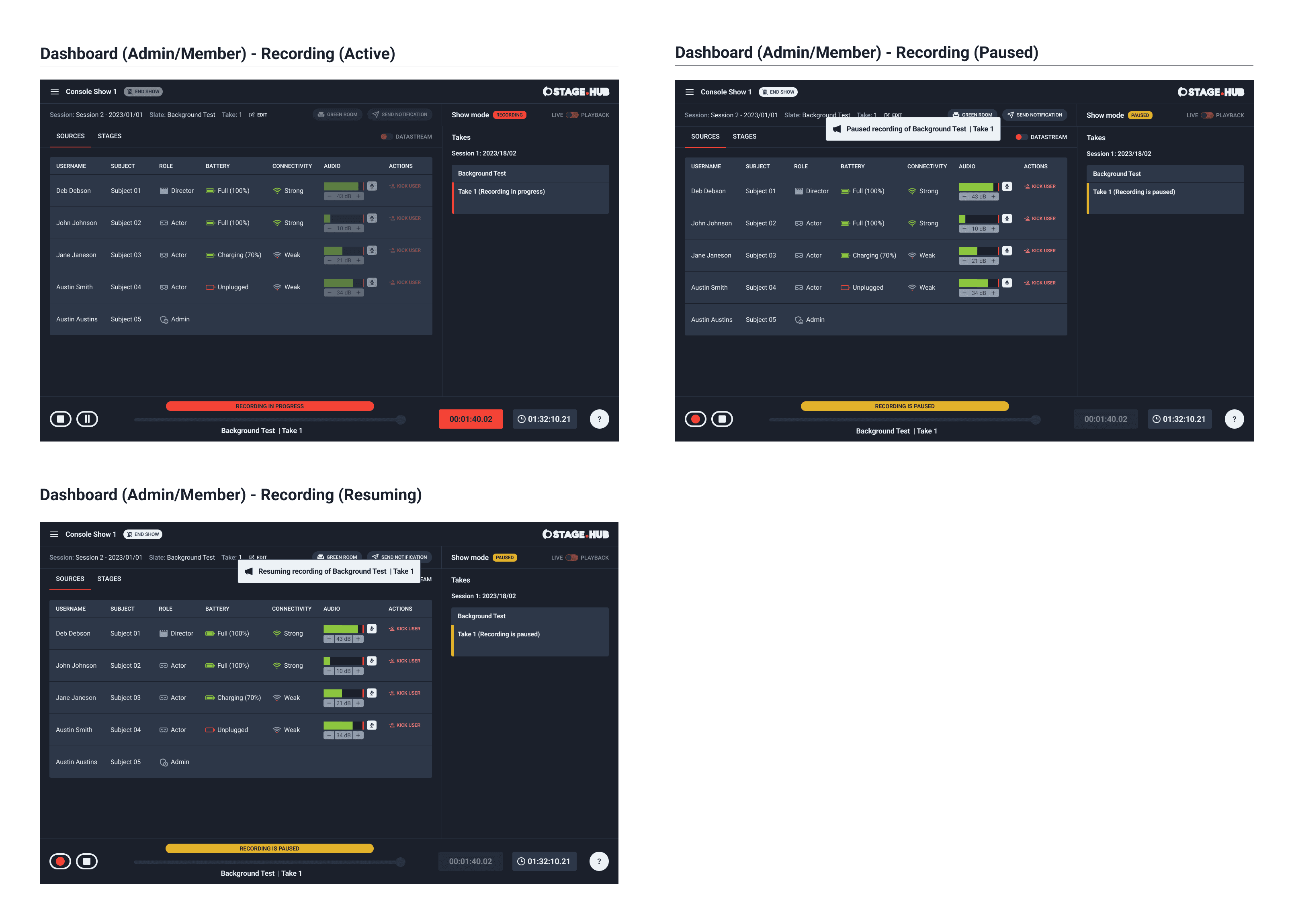
I worked on the wireframes for creating a recording and the different actions for how an admin or member would start, pause, stop the recording and end the show. The different statues and controls were distinctly displayed by the different states in the transport control and in the panel.
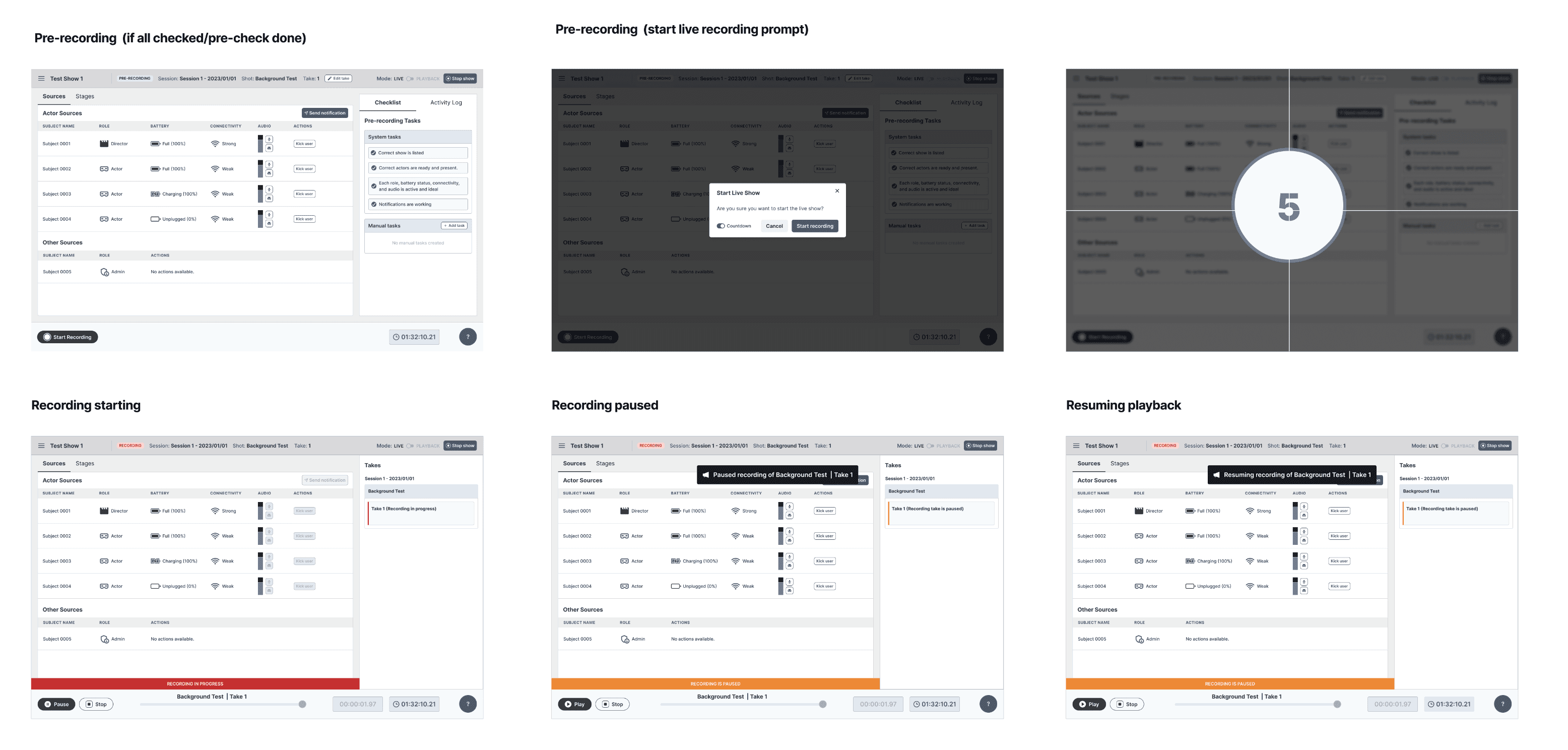
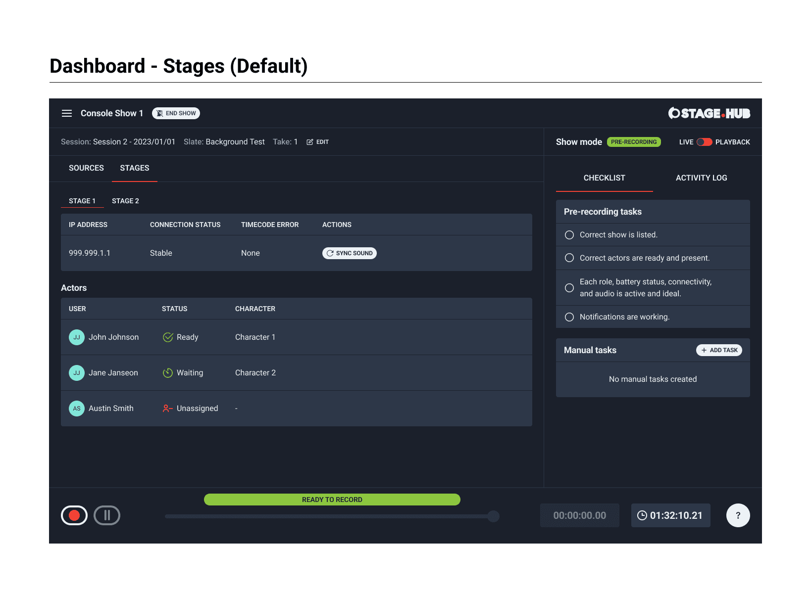
Separate dashboard views
I communicated to the client that an admin or member would see slight variations on their dashboard compared to a viewer. I showed a viewer, admin and member perspectives. There was a clear distinction between which actions were available (based on user role and permissions).
PHASE TWO
SCOPE REVIEW
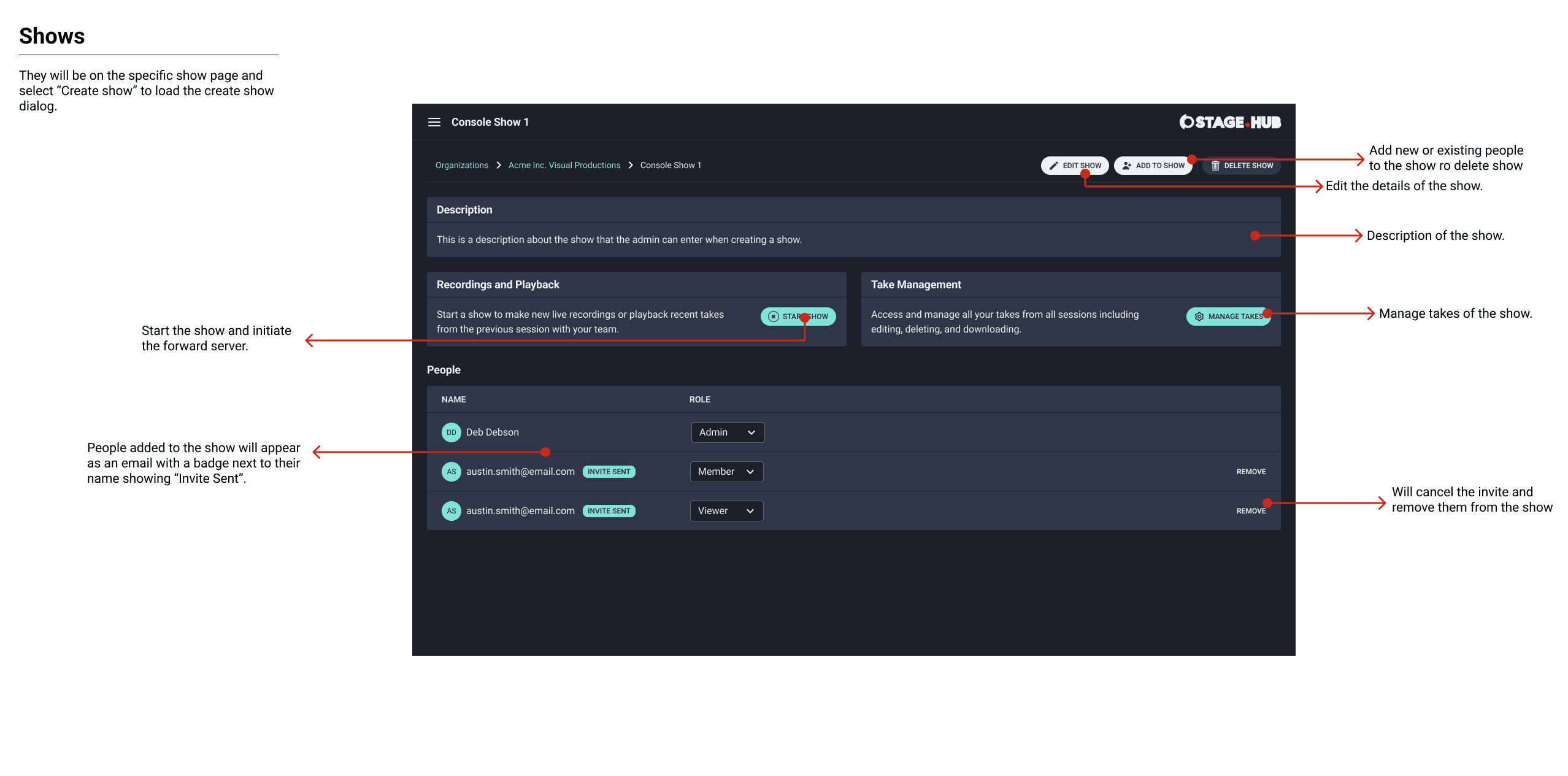
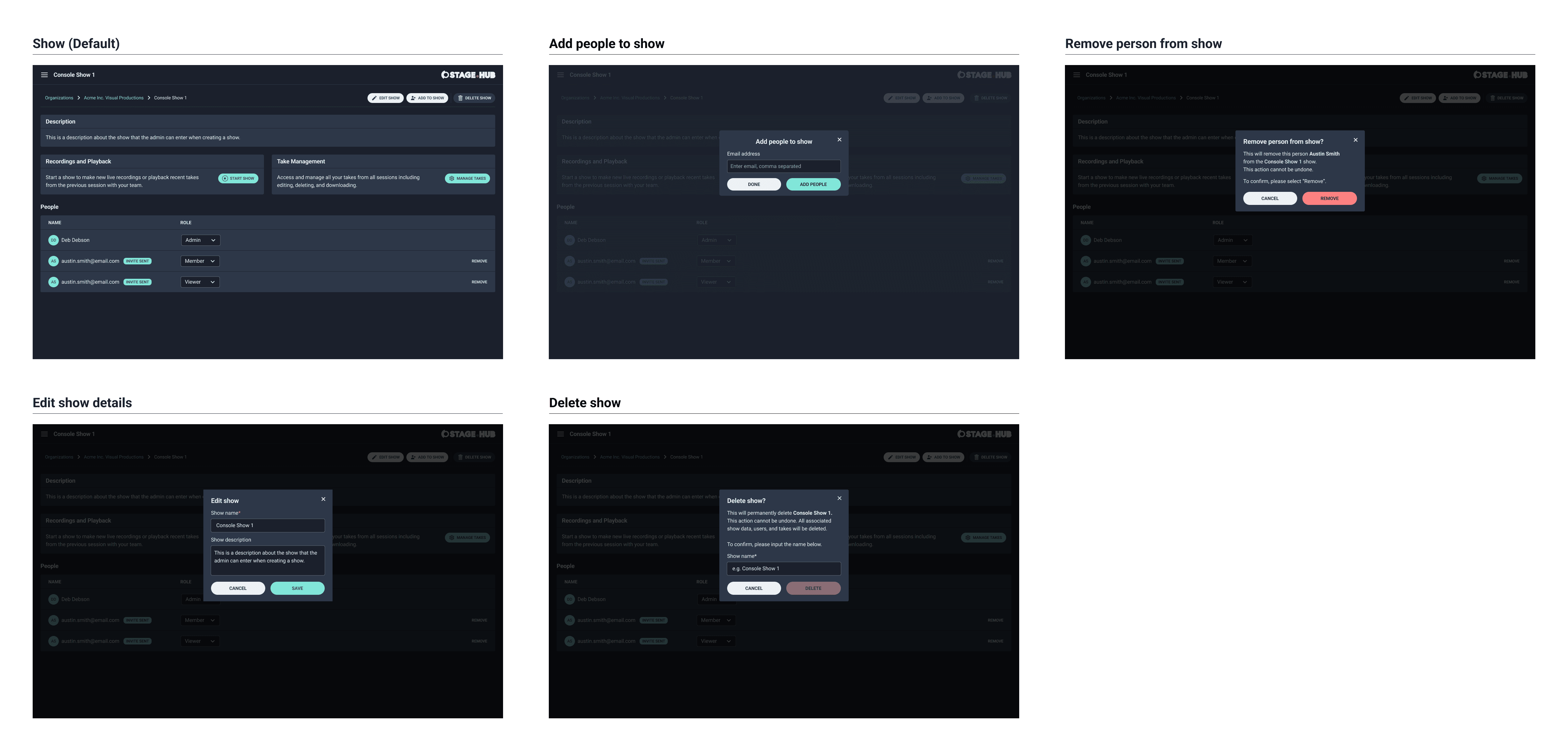
I reviewed the user stories and design topics with the product manager. The plan was to start with show management to understand how a show was created, managed and started by an admin or member. Included in this scope of work was post-recording (dashboard) and show management.
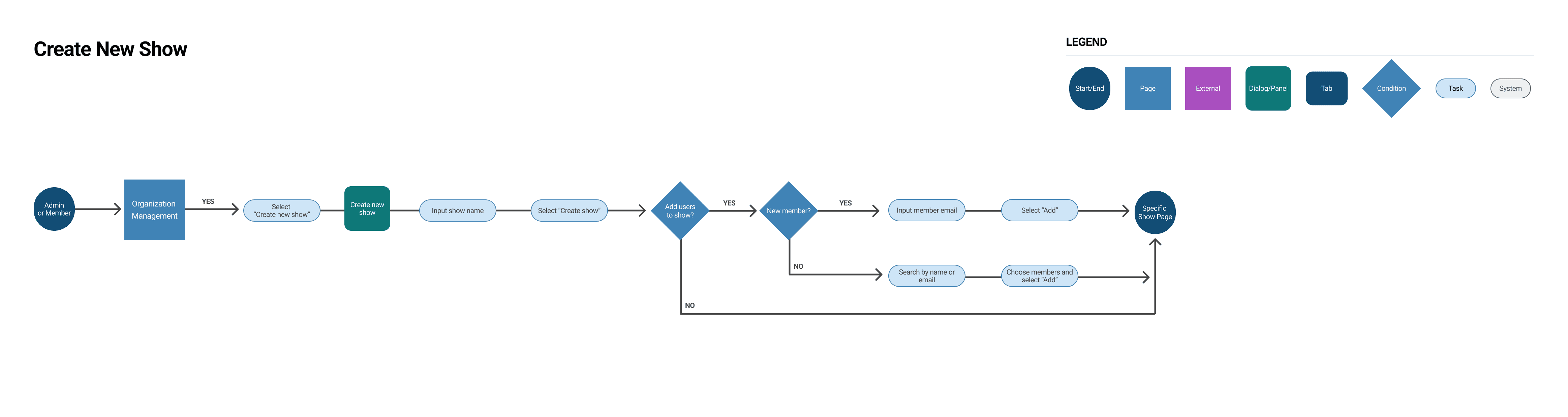
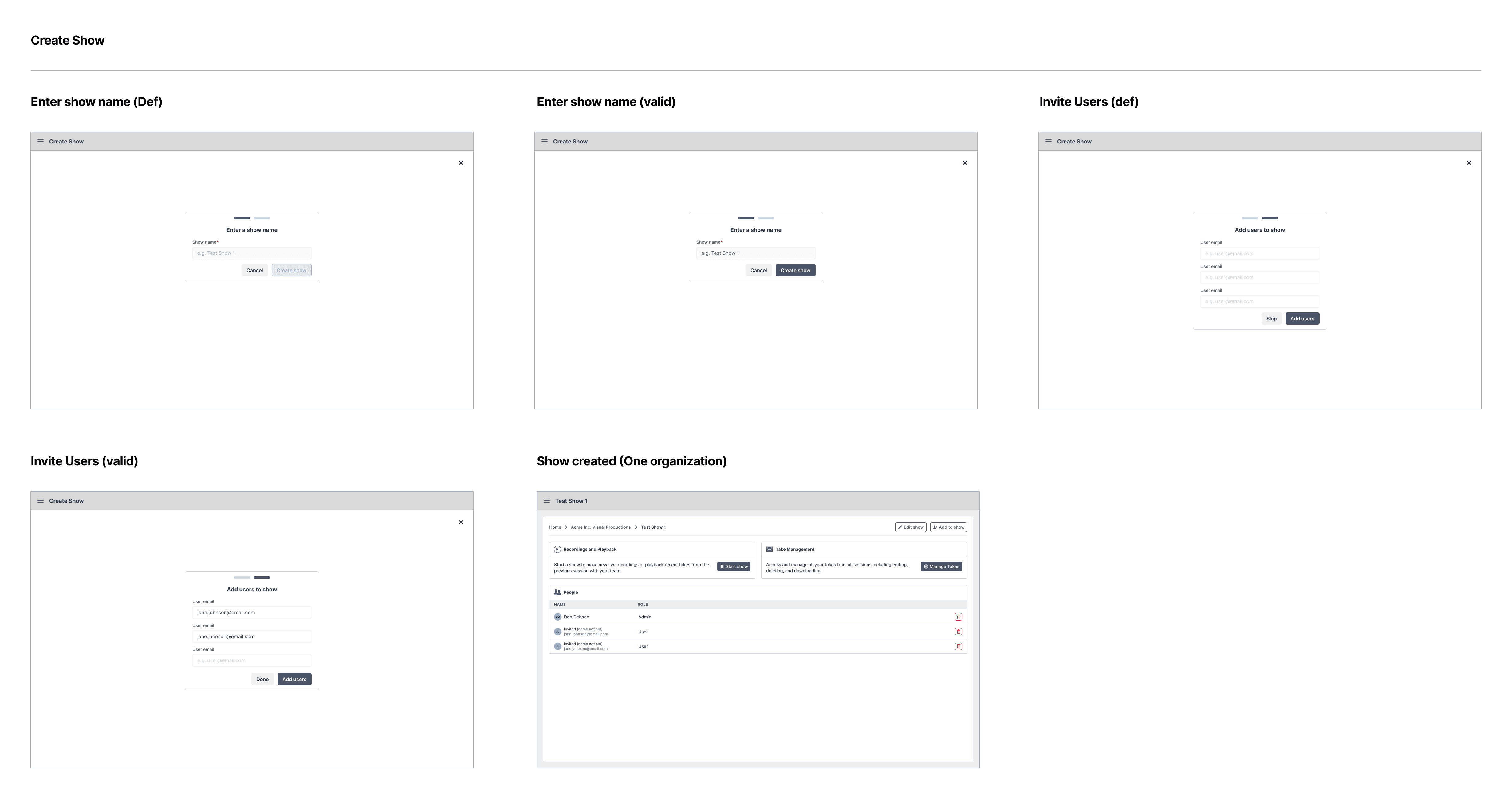
Create new show
This workflow showed how an admin or member could create a show and add their team members to the show. I started with this workflow as it was the first step to initiate team collaboration.
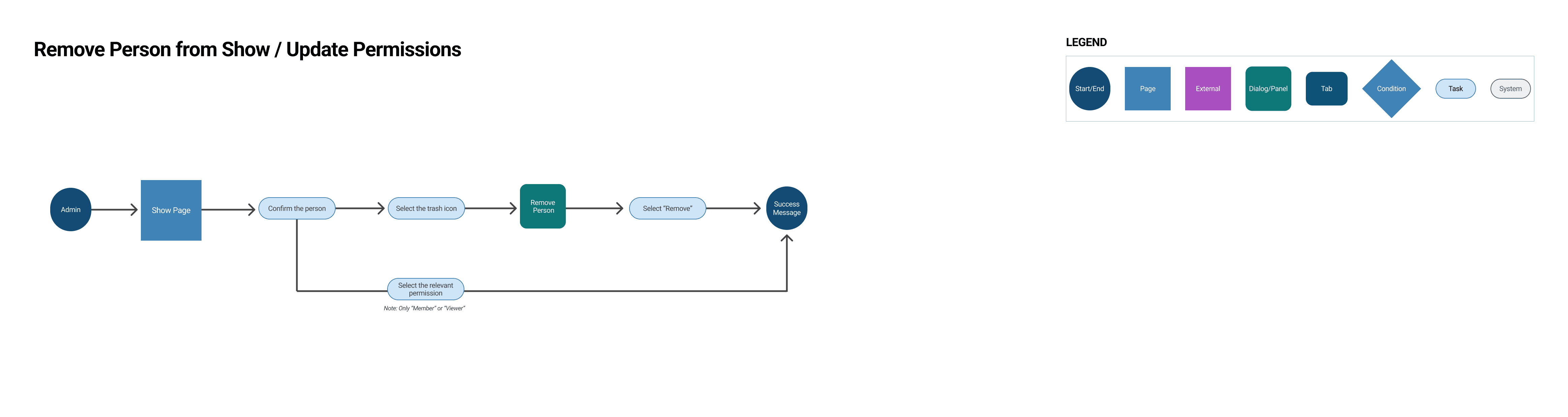
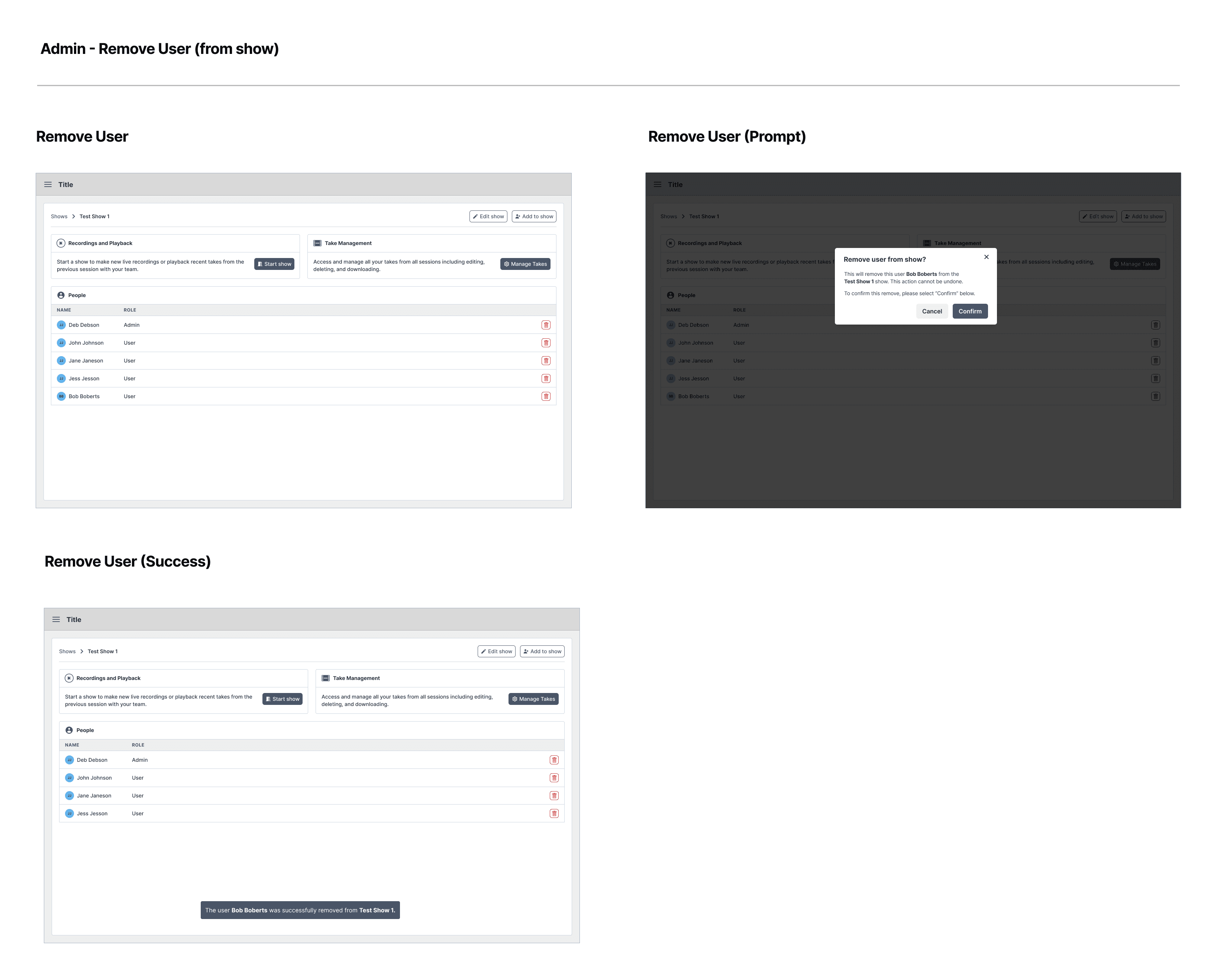
Remove person from show
This workflow showed how an admin or member could remove a person from a show. I created this workflow to show a standard way of managing team members within a show.
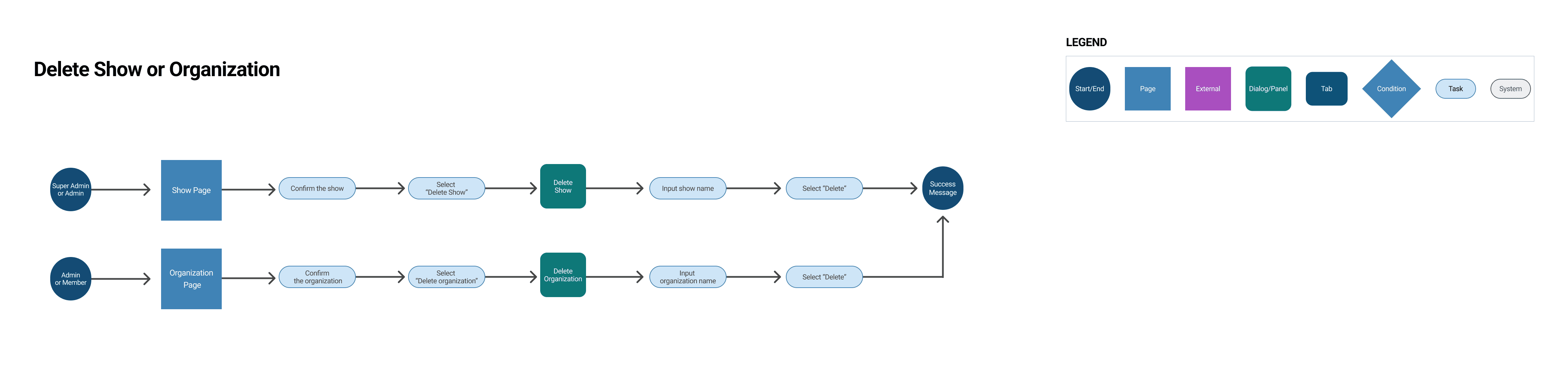
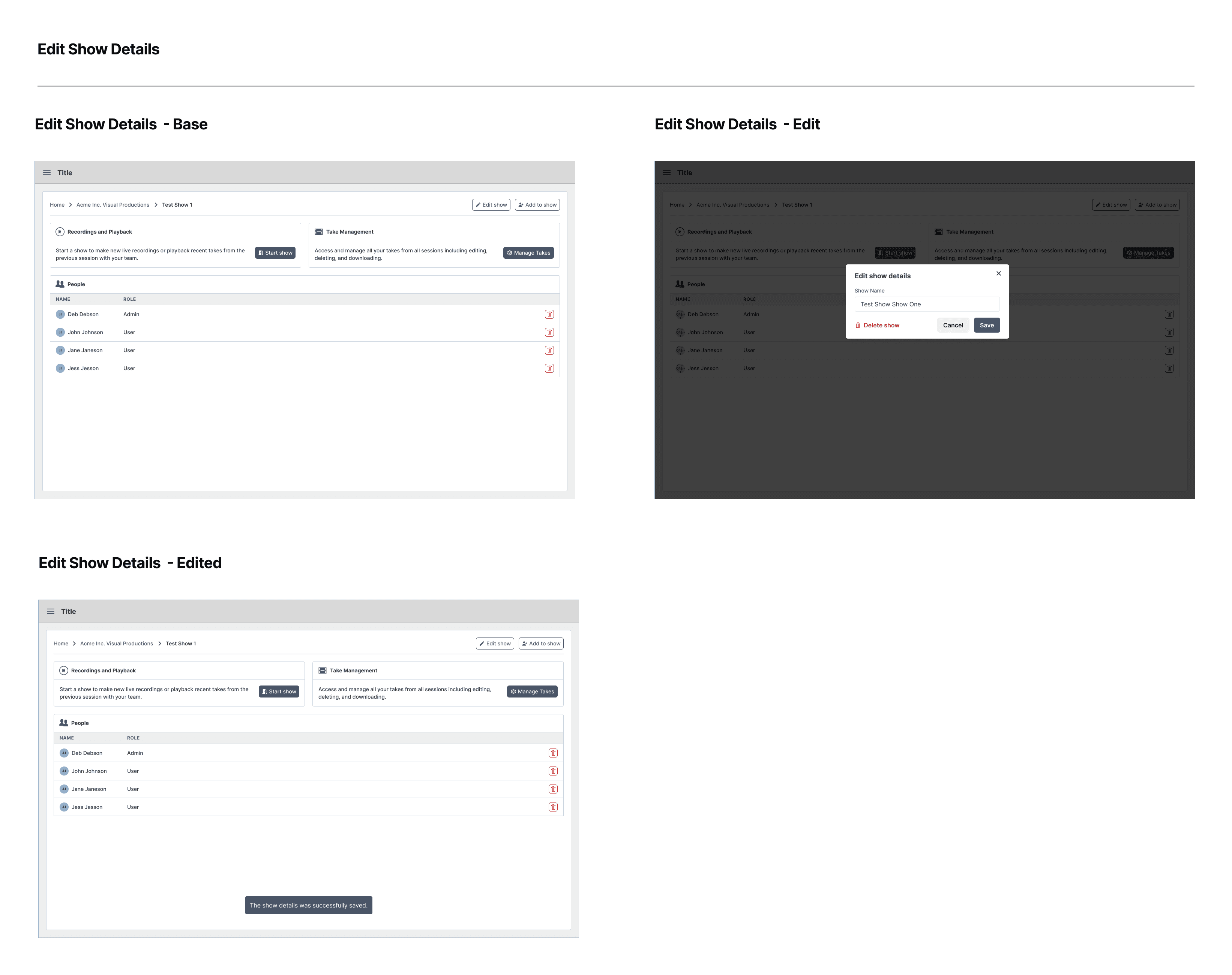
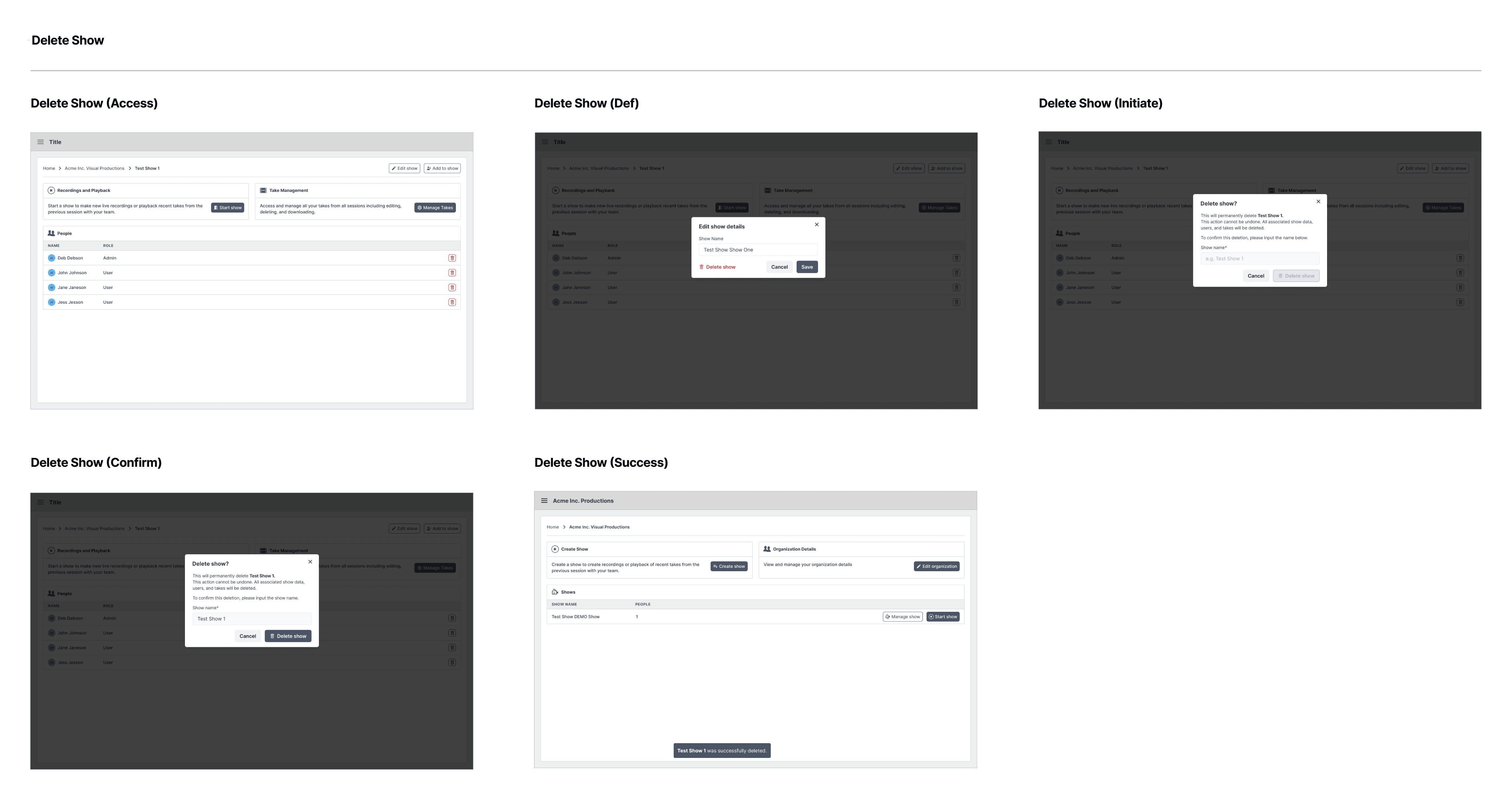
Edit show details or delete show
This workflow showed how an admin or member could edit details or delete a show. I created this workflow last as it was a less common and deprioritized interaction.
Primary wireframes
The client team requested to review all show management screens in a single review to get a complete perspective. I first completed show management for admins and members. These wireframes contained the primary actions to start the show, add members and display the team members of the show. The secondary wireframes showed a view-only perspective which indicated how a viewer could join a show with other team members.

Secondary mockups
The next set of wireframes showed how an admin or member could conduct secondary actions by removing team members, editing show details and deleting a show. As a precaution the admin or member had to enter the show name to confirm the show deletion. The product manager and I set up a client meeting to go over the wireframes. The feedback was positive with some minor adjustments and future notes around governance.
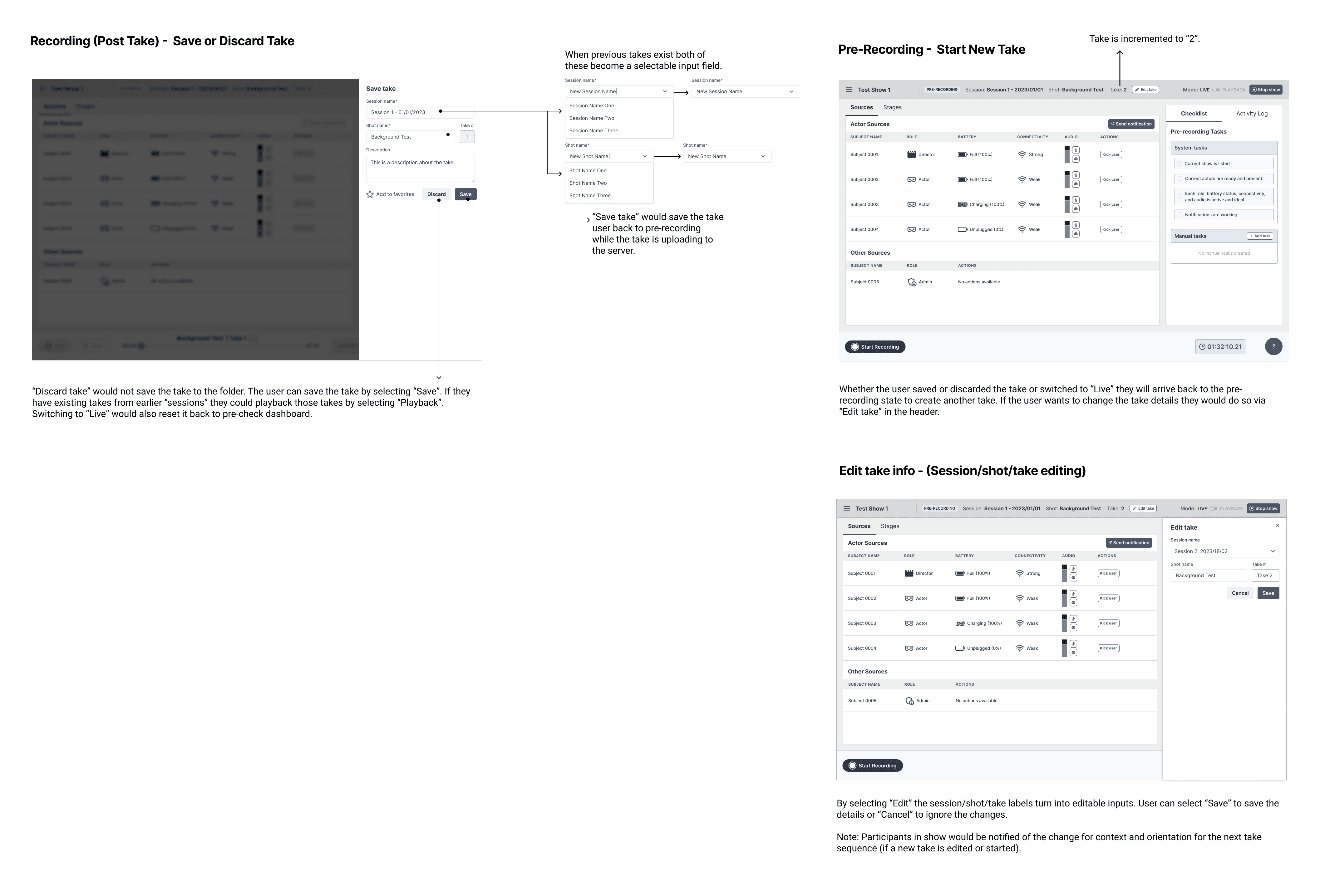
Post recording (creating a take)
Next, I completed the workflow for saving and creating a take once recording concluded. This workflow showed the connection between pre-recording, live-recording and post-recording. This allowed an admin or member to save or discard their take and then reset for the next take sequence
completing wireframes
I worked on completing the wireframes for the post-recording dashboard which illustrated how a take could be saved or discarded. Once the next take sequence was ready, the dashboard would reset to pre-recording for the next take.
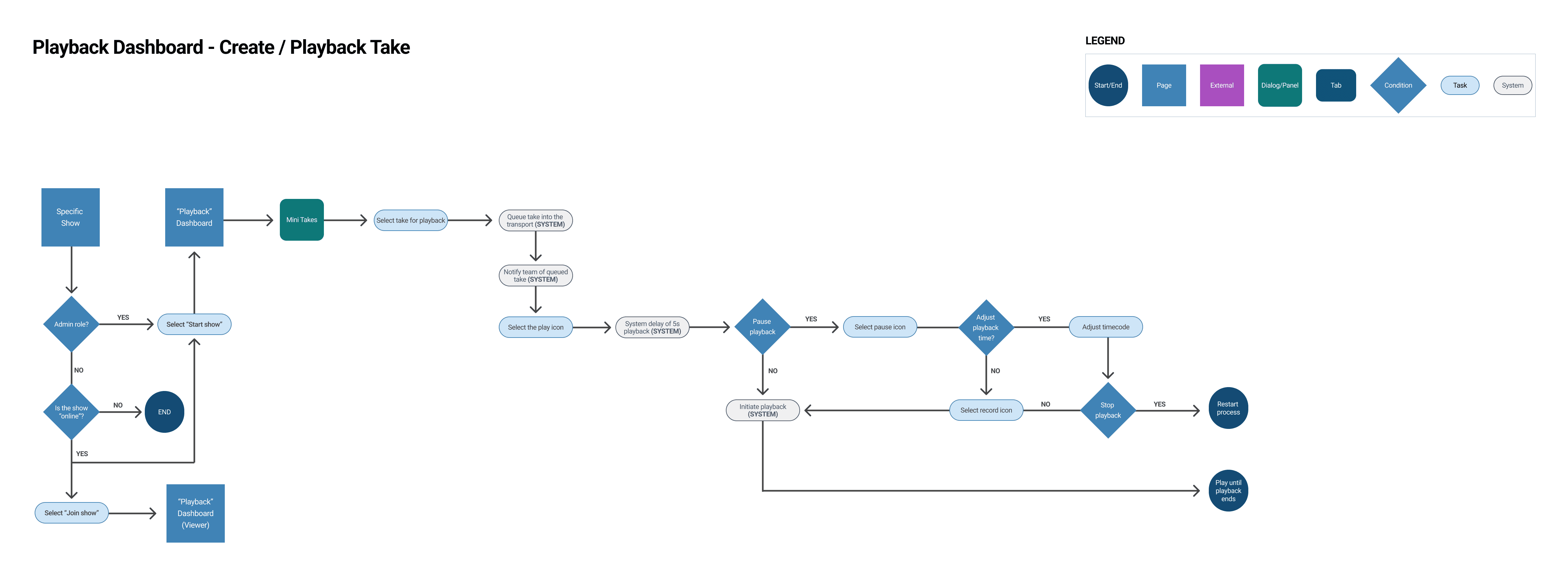
Playback mode
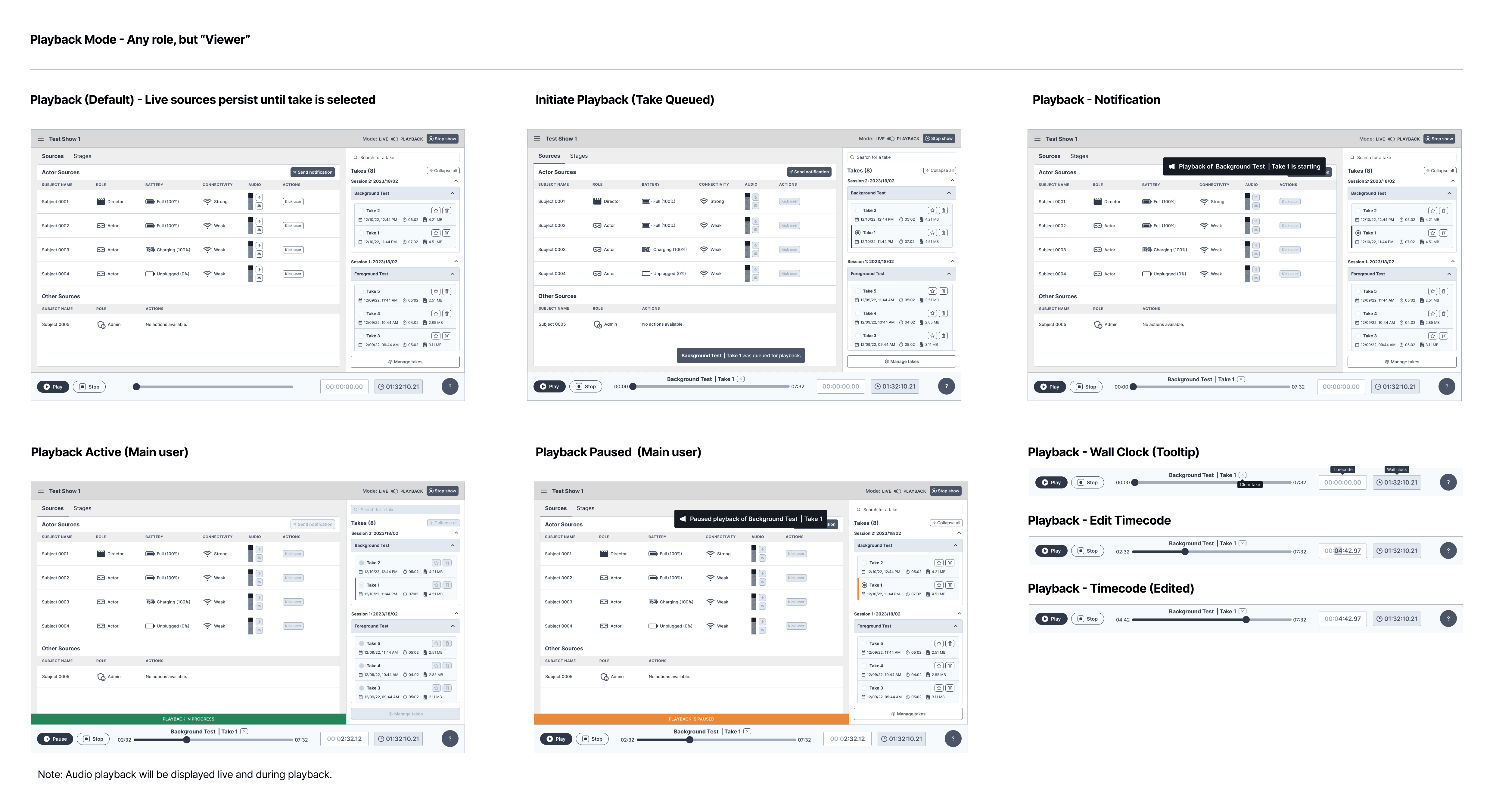
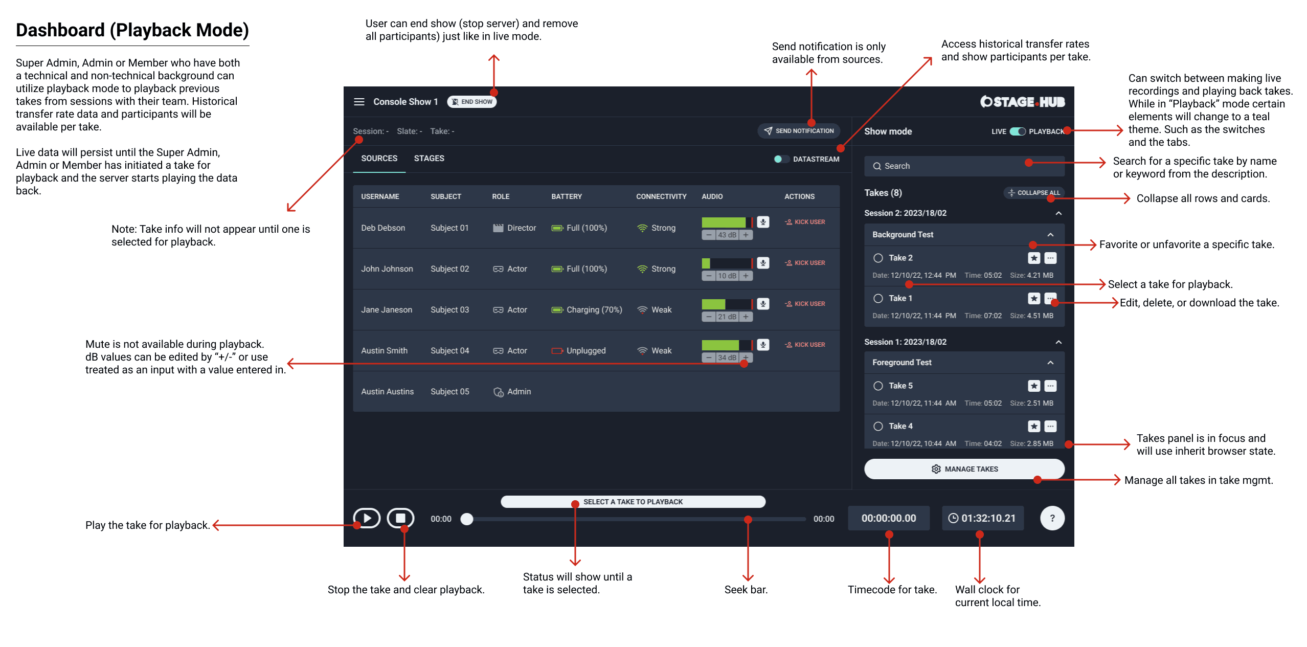
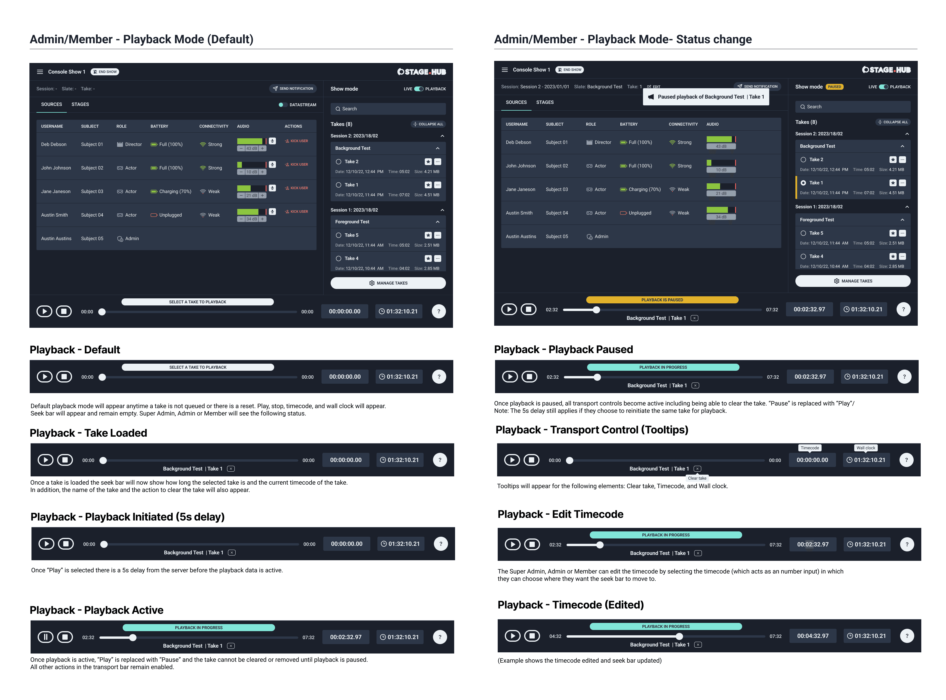
Playback mode allowed an admin or member to playback and review takes with the technical crew and creative team. Often, there were multiple test takes and the team had to narrow down the best take. This resulted in multiple playbacks of takes. To keep the experience consistent I mirrored the live-recording dashboard statuses and information being communicated back to the team.
Viewers would see the notifications being sent by the admin or member and vice-versa. The admin or member could play, pause, stop and manage takes. I reviewed the wireframes with the client and received feedback to iterate on the messaging and the notifications. I added additional tooltips for context and the ability to manually edit the timecode in the transport control.
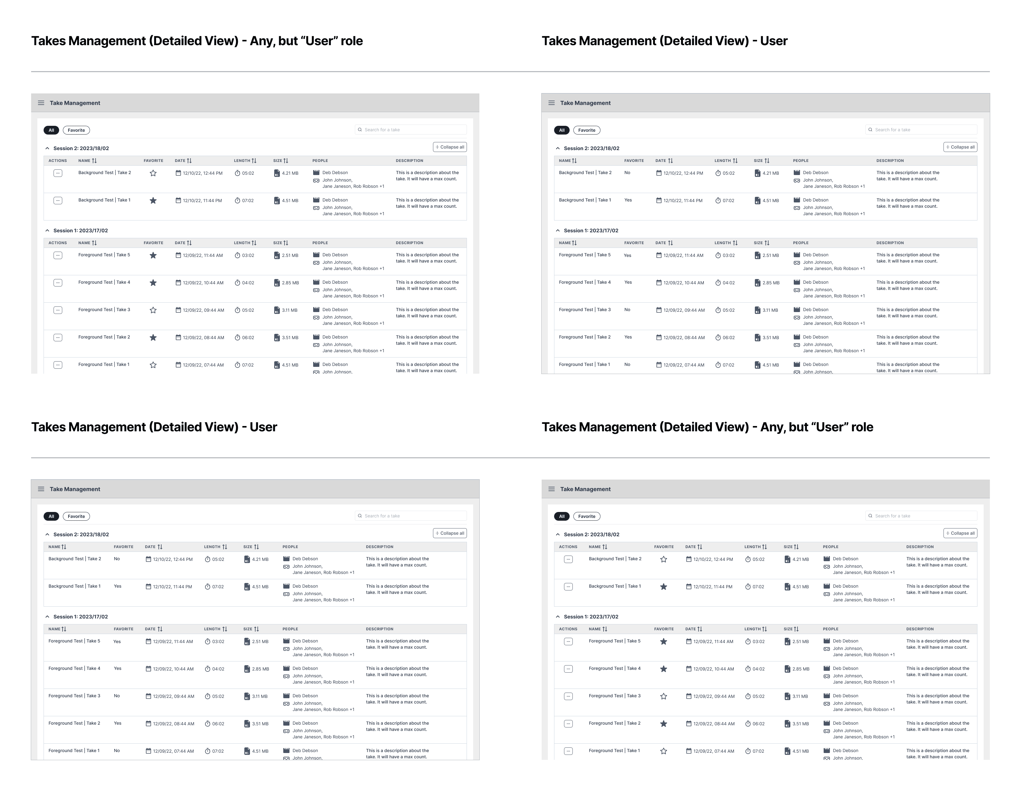
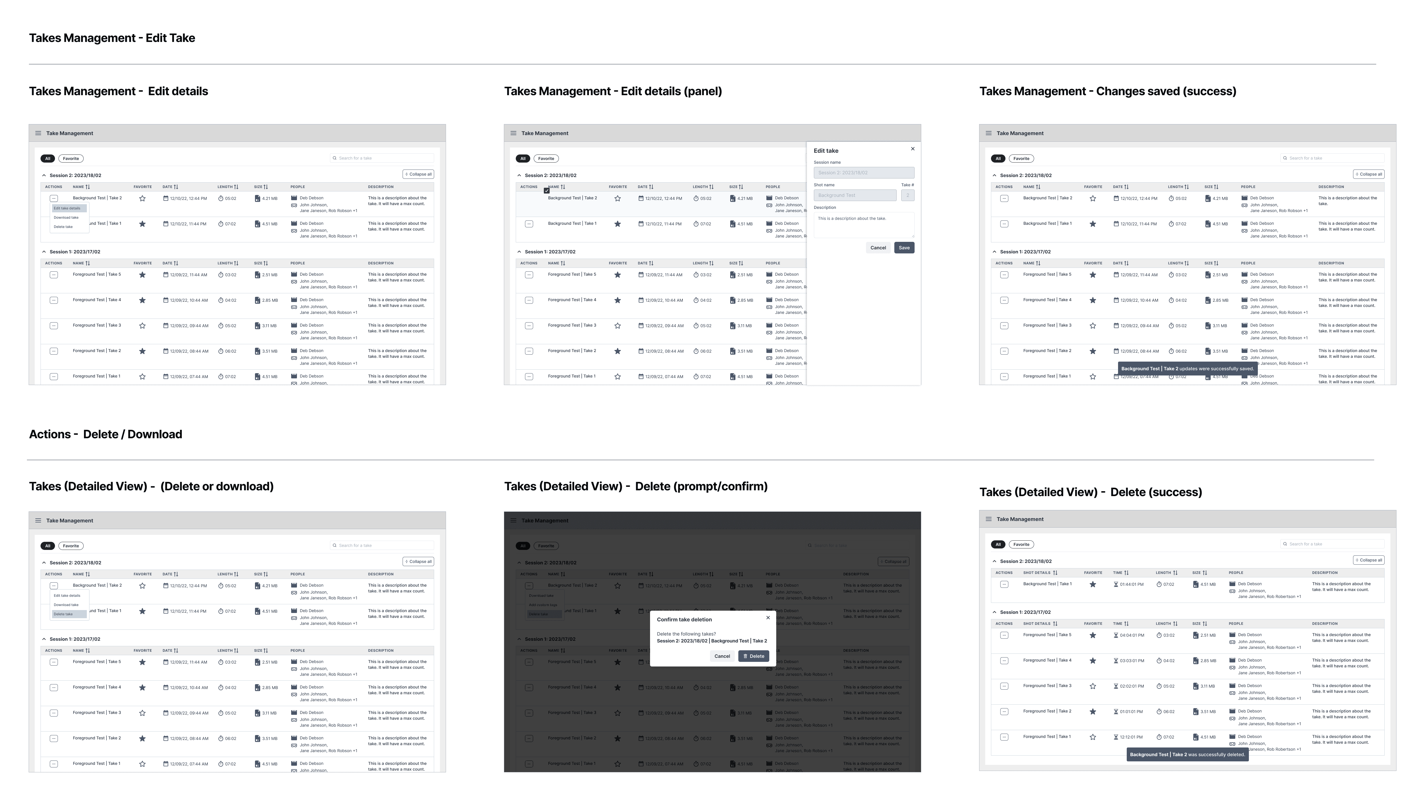
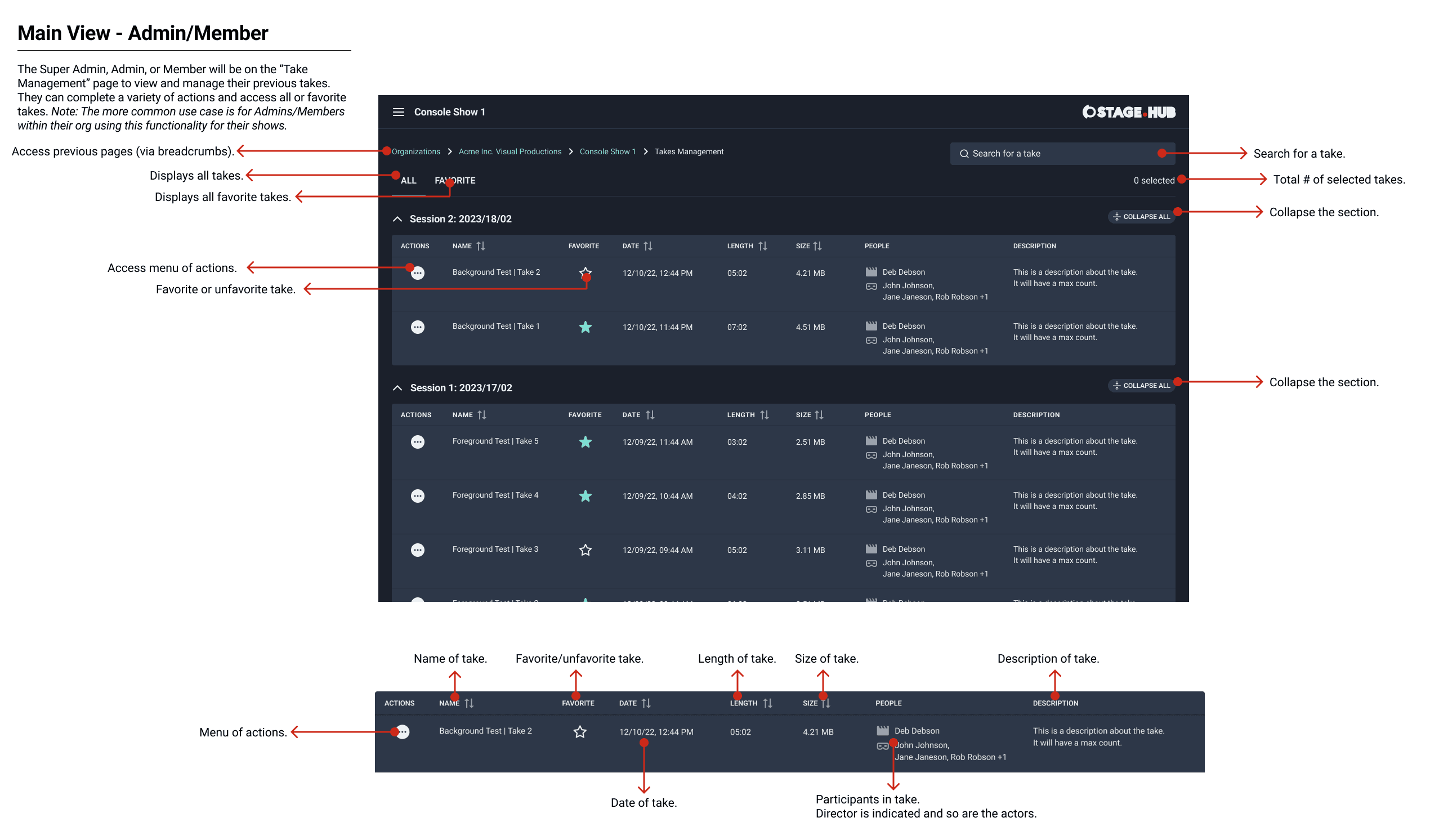
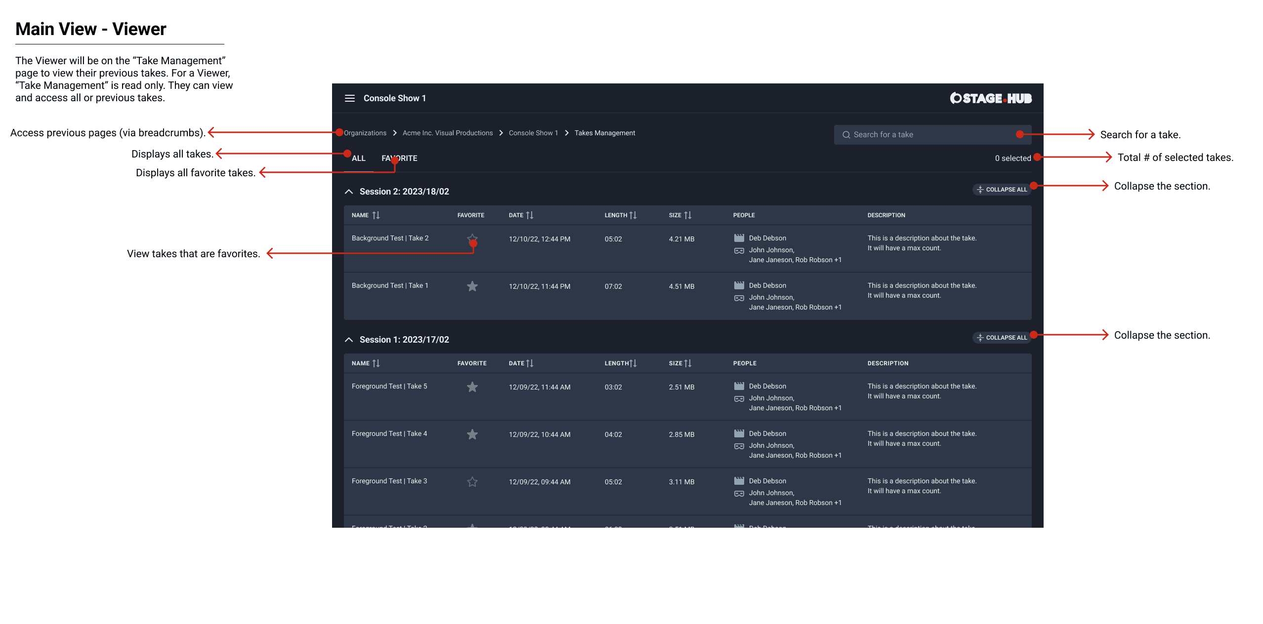
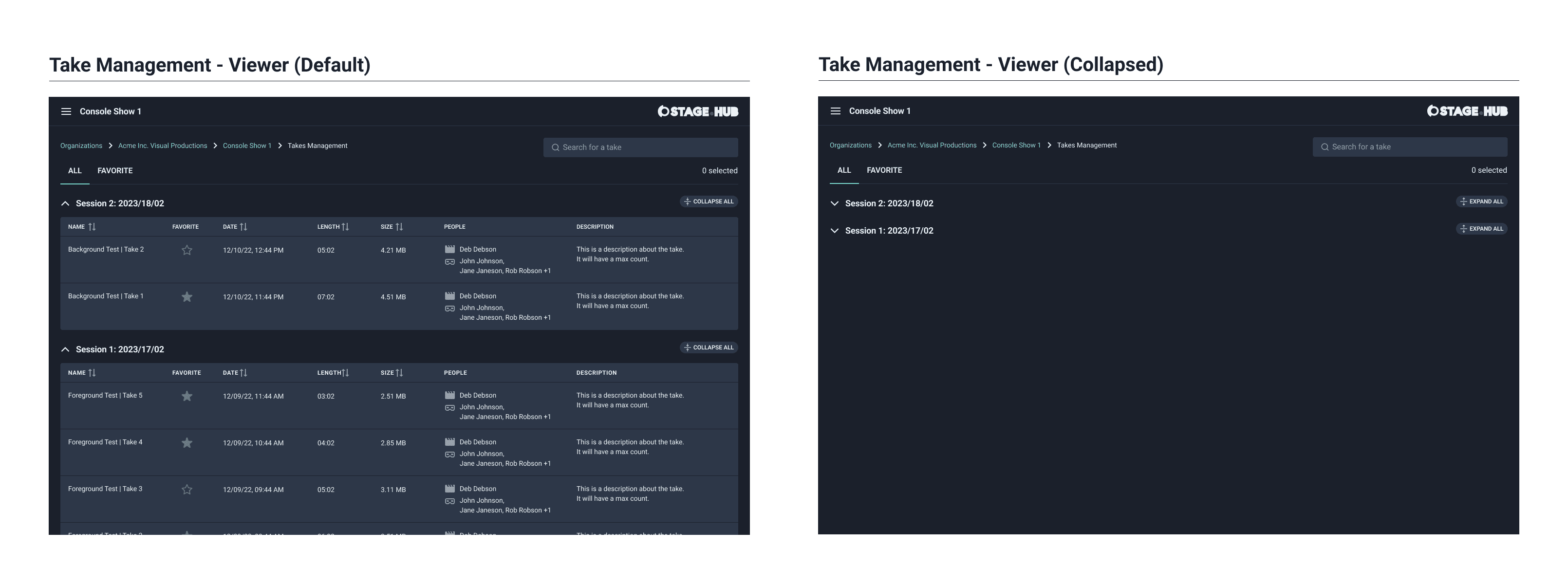
Take management
The workflow for take management was straightforward. Takes could be accessed from the dashboard, shows or from the take management screen. Actions and information were limited on the dashboard and were fully accessible on the main take management screen. I created two user flows that detailed the different paths.
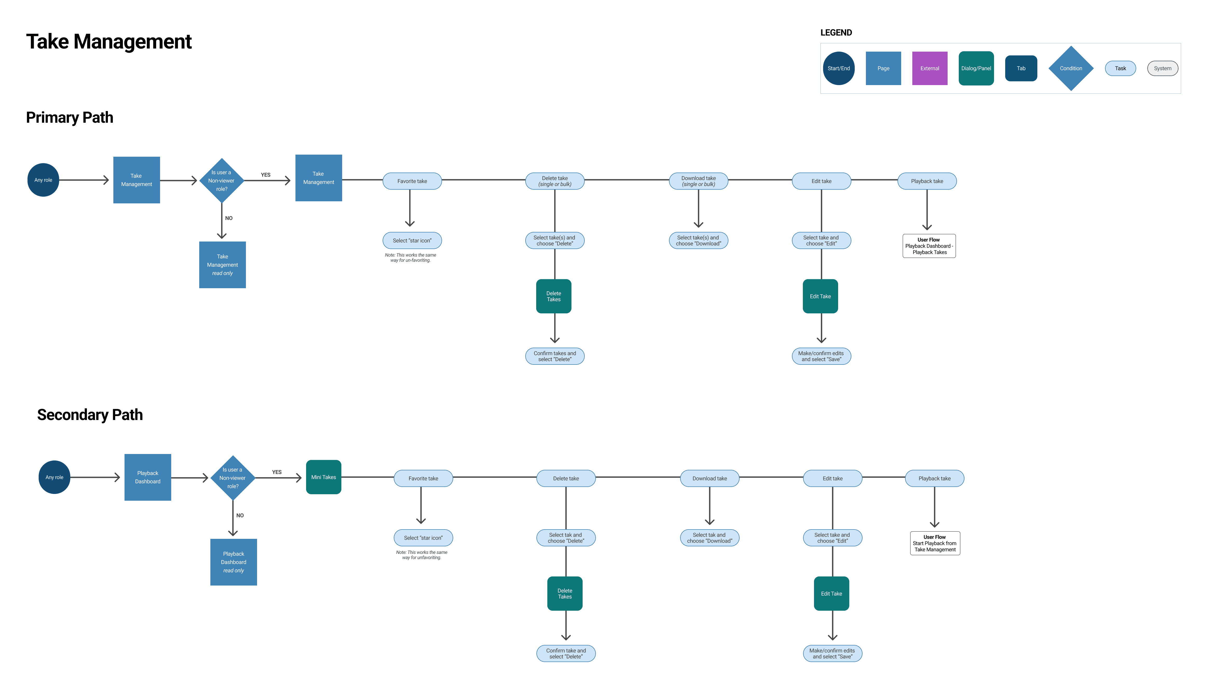
Using a standard format
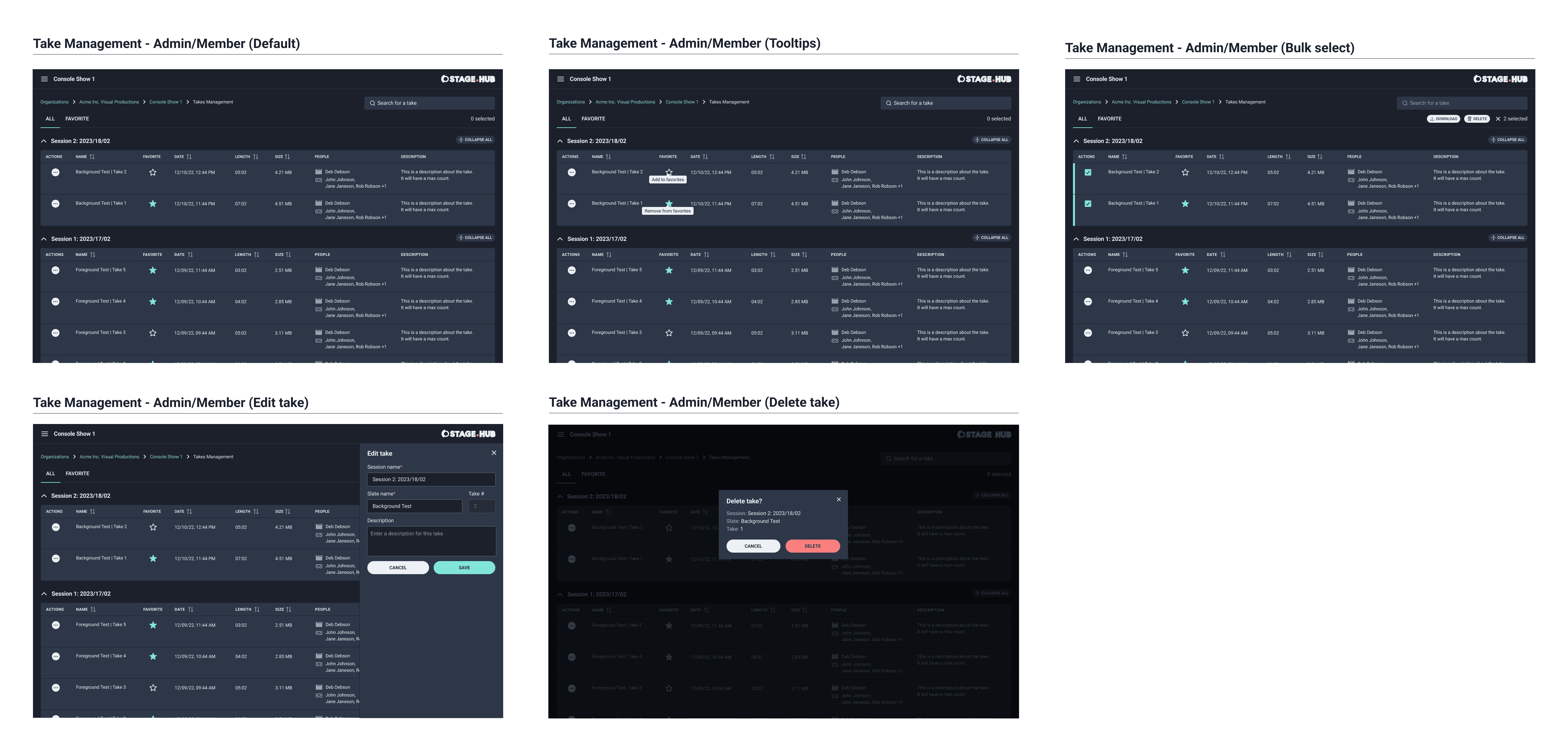
The primary view for take management contained all data for a take that was saved to S3 by the admin or member. They could view all the file information, participants and the description. Also, they could favorite, delete, or edit the details for a take. In my design explorations I started with a card format as the client team did not lean towards the table. However, I explained a table was a better format due to the amount of data and information displayed.
I created wireframes indicating the different tasks that could be completed from this view. I indicated how a take could be marked as a favorite with a single click of the star icon. The menu contained actions to edit, delete and download the take. I reviewed the wireframes with the client team to solicit feedback.
The feedback was positive and there were some edits to make. The client team requested bulk actions to be introduced to bulk download takes for offline refinement or delete test takes that were no longer needed. I notated their feedback and I moved onto account management.
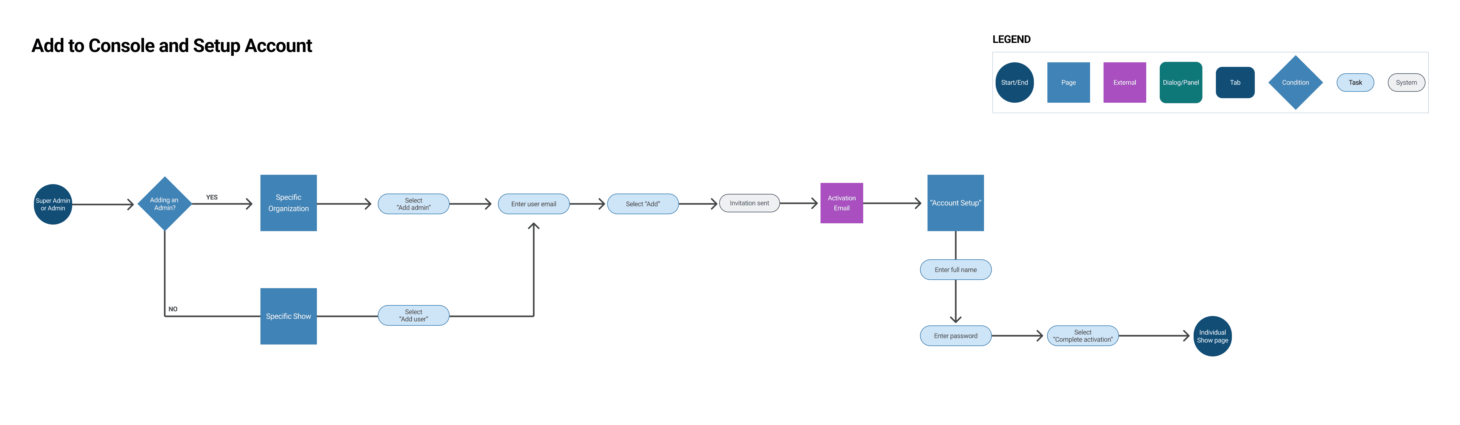
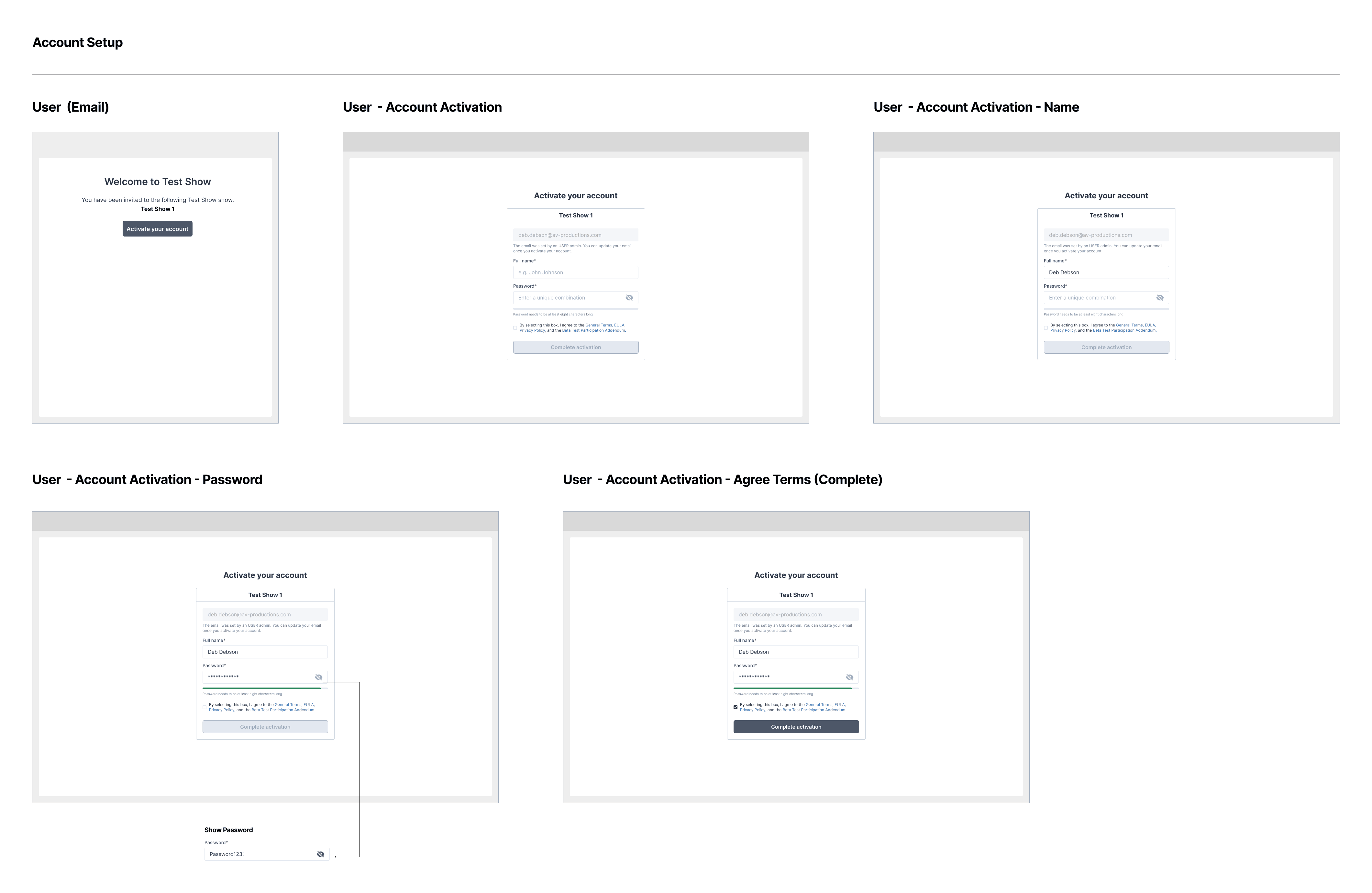
Account setup
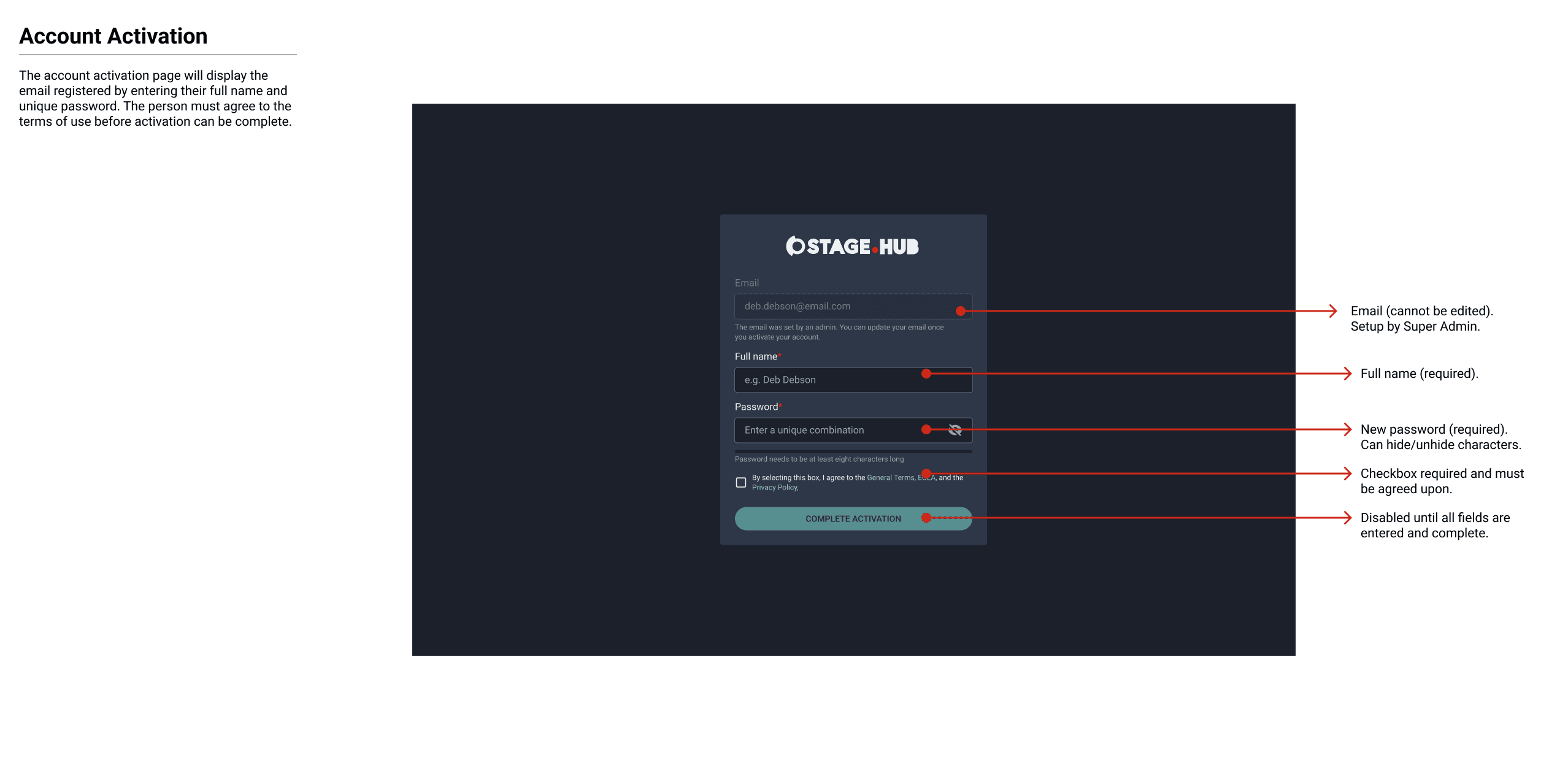
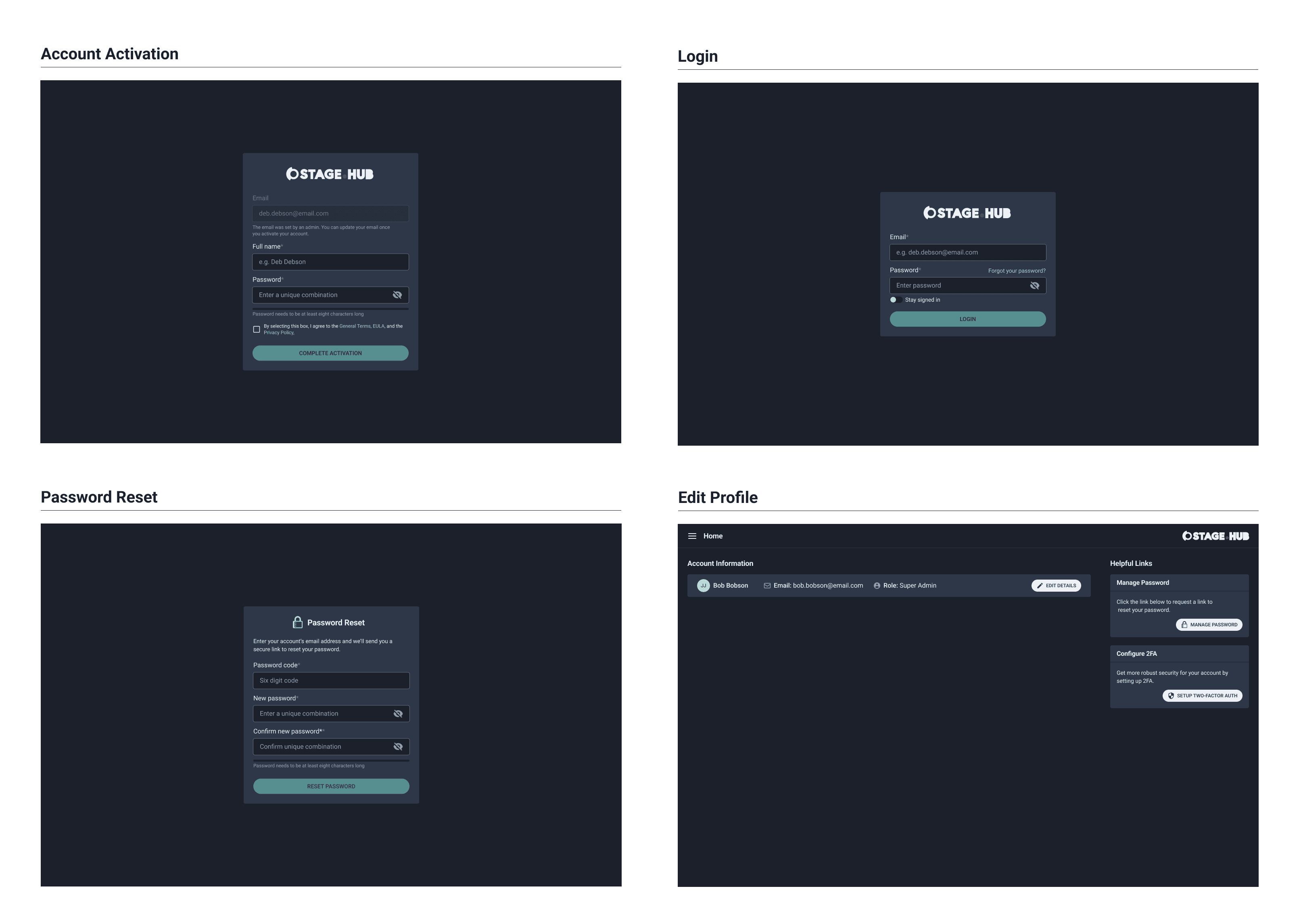
The next workflow I completed was for account setup and activation for super admins, admins, members and viewers. It showed the process for how they would receive their invite and activate their account.
CONSISTENT PROCESS
The wireframes for account setup showed how the super admin, admin, member and viewer would complete their account setup after they received an invitation email. AWS Coginto sent an activation email and the recipient would enter their name and email and then be directed to their organization/show (navigation paths would determine login scenarios in phase three).
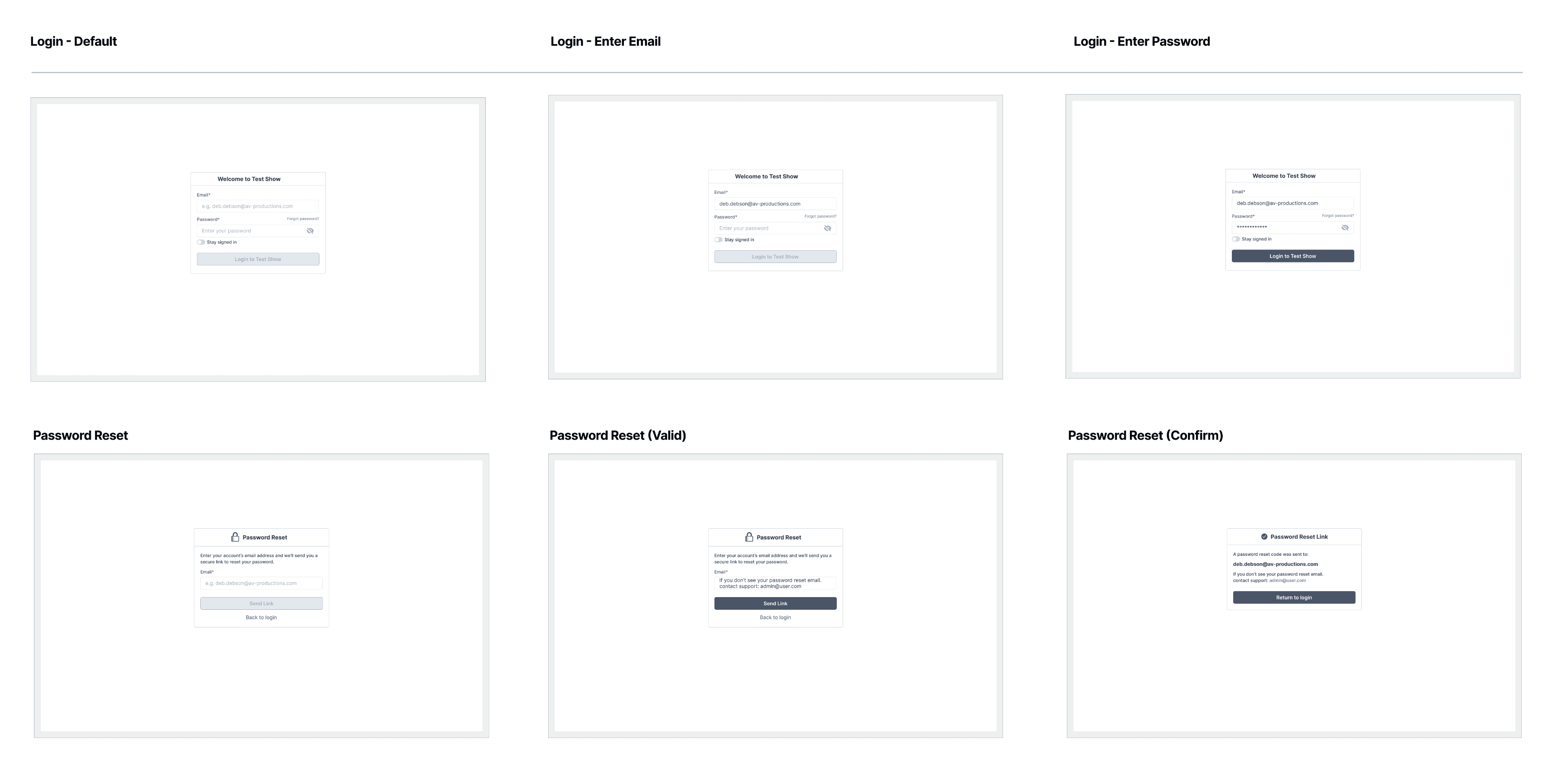
Login and password reset
After account setup I completed the workflow for login and password reset. This workflow showed all the different navigational paths based on user role (wireframes for individual paths were completed in phase three). This path also indicated how to request and update their password.
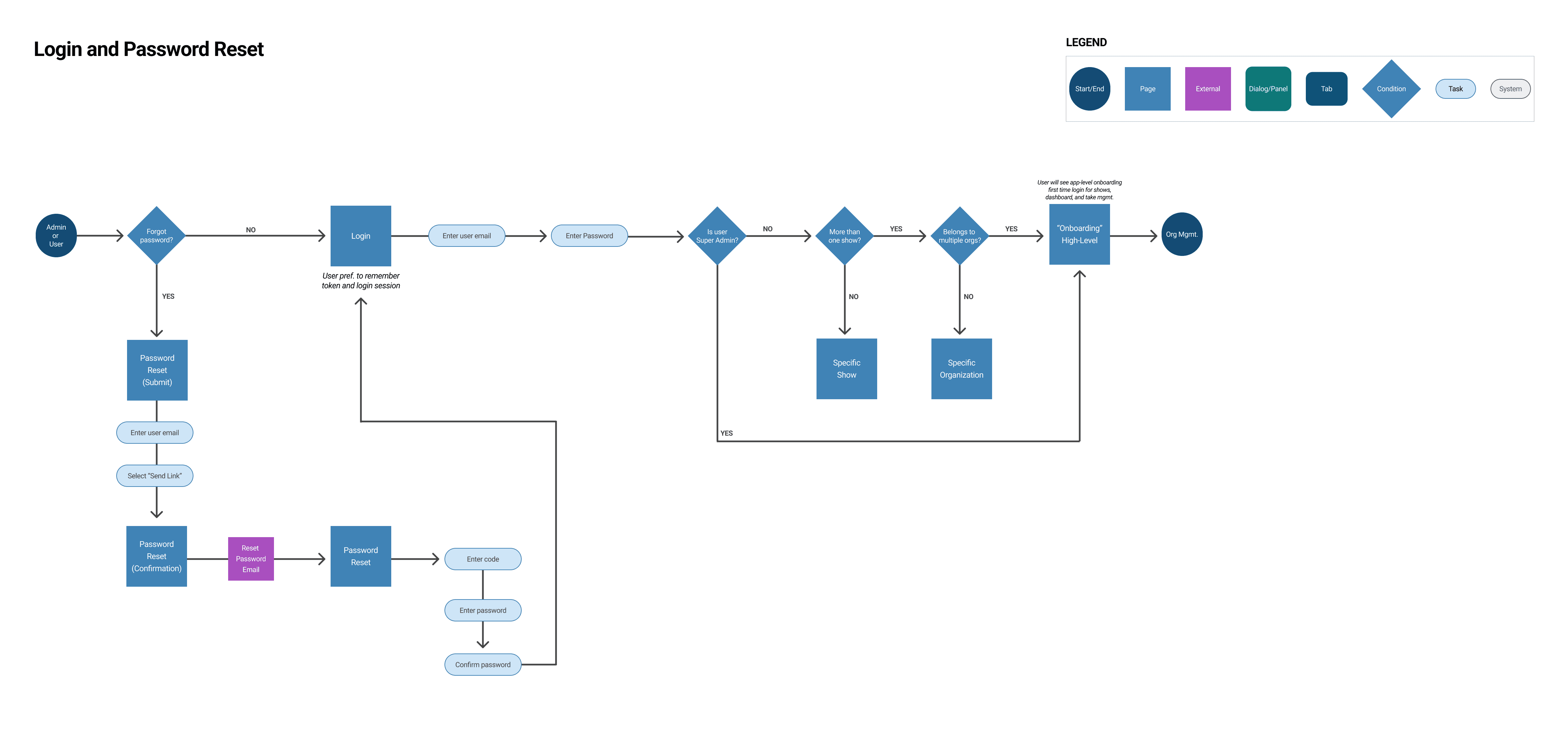
STANDARD MODEL
This topic utilized the AWS Cognito model. Login required a name and password. For password reset there was a reset email with a unique code that was entered to complete the reset. The client team asked engineering if there was a way this could be changed to a secret link. Engineering confirmed the code was a more secure path.
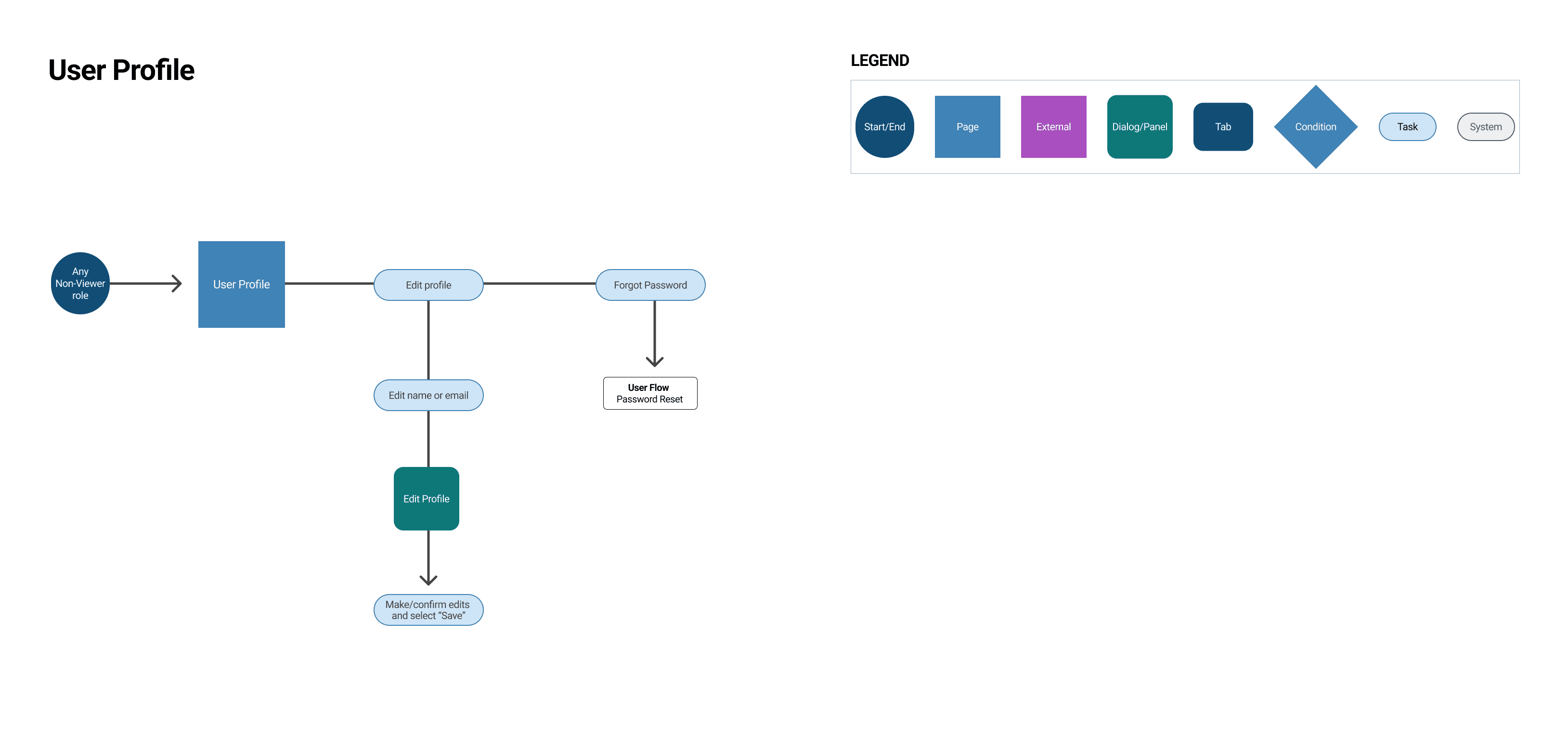
USER profile
The last workflow I completed was for the user profile. The profile was standard and consistent across the system for all user roles. Any admin or member could edit their own profile (name and email).
phase two COMPLETION
I worked on the wireframes for the account profile and cleaned up any remaining account management wireframes. My team and I scheduled a client review to go over the workflows and wireframes. There was no additional feedback to implement. The product manager went over the remaining scope and features with the client team.
PHASE THREE
organizations (super admin)
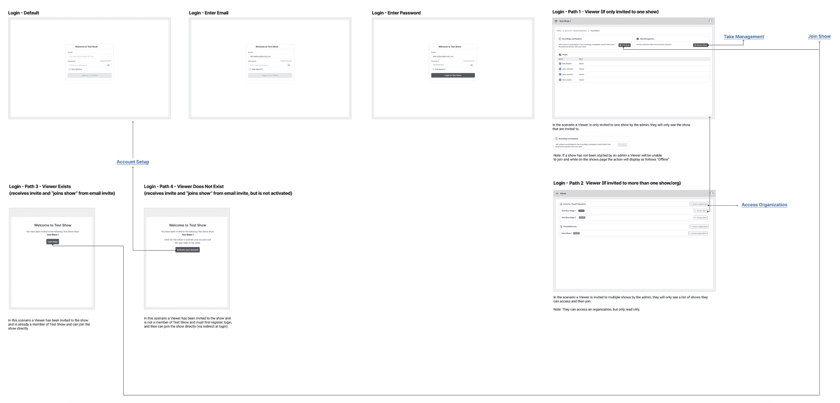
Phase three was the ramp up phase for planning and ideation. The first step was to finish out governance so that the navigation and edge cases could be finalized. After navigation was complete the “Help Center” was the next feature. Early on in the project my team and I had established four primary roles: super admin, admin, member and viewer. These roles required a refinement to the permissioning to establish governance for the application. There was no user flow for this topic. Rather, I proposed some UI flows which would cover the login paths and wireframes for each of the user roles.
super admin - NAVIGATION
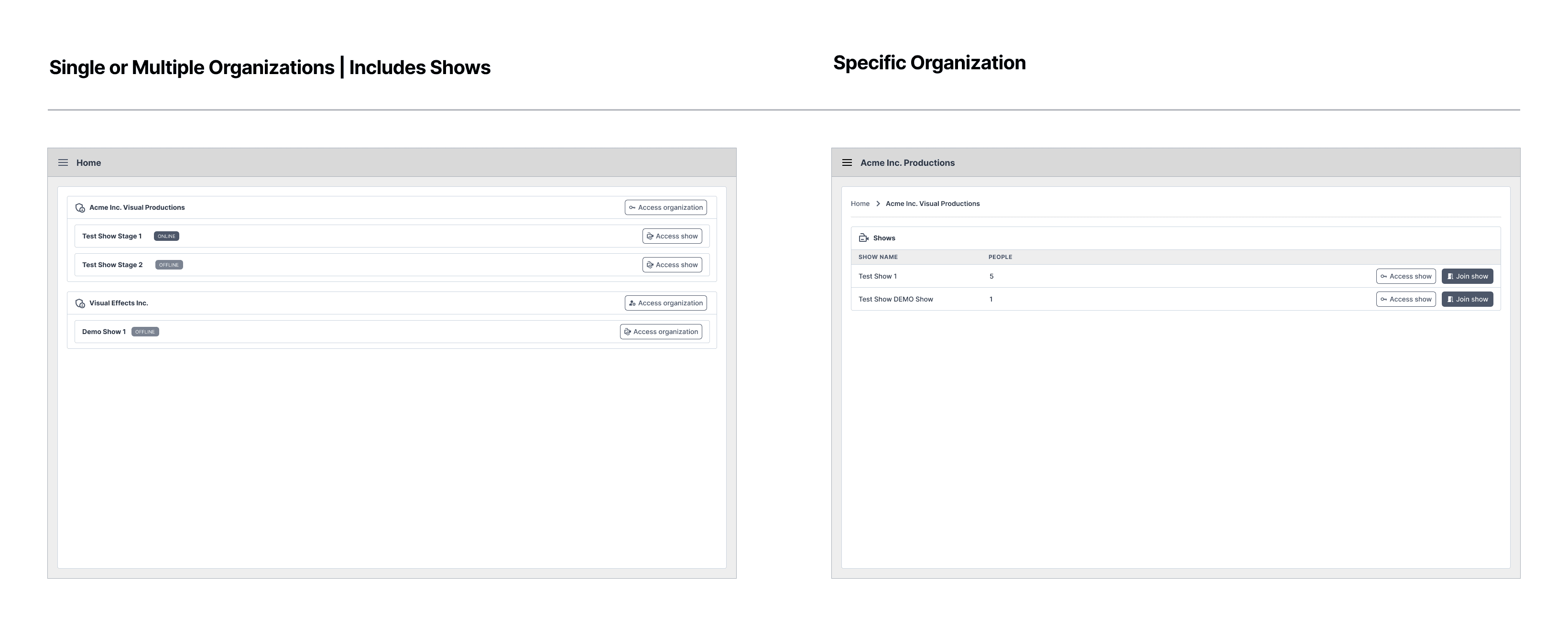
The super admin role focused on managing all organizations. I focused on creating an aggregate view of all organizations. Only executive team members were designated as a super admin. Often, they relied on the admins of an individual organization to manage their own teams and shows.
When a super admin was invited to the application for the first time they were required to create a new organization. The super admin created their organization and then invited admins (and in some cases created the show and invited team members). The secondary path is when the organization was created but no shows existed. The super admin was navigated to their organization page to either manage the organization or add admins. The last path accounted for multiple organizations with multiple shows. In this scenario, the super admin was navigated to the organization list.
organizations (admins)
The admin role focused on managing their individual organization and shows. They were able to perform most system level actions with the exception of creating or deleting an organization. If an admin was only assigned to one organization, they were not able to see other organizations. The admins were usually associate directors, technical directors and senior producers.
organizations (members)
The member role was one level below admins in permission access. Members focused on assisting the admin with managing the show and team members. Members could add or remove other team members from the show, manage and edit show details. This role was mostly associated with the technical crew and in some cases with creative team members that assisted with production or post-production. Note: This UI flow was combined into a single flow for admins and members.
admin/member - NAVIGATION
The navigation for admins and members did not differ much with the exception that admins and members would only see the organizations they belonged to. Admins and members encountered three paths. The first path is when an organization exists, but no shows were created. In this scenario, they were navigated to the organization page to create the show and invite team members. The second path navigated them to the show if a show did exist. The third path navigated them to the organization list (multiple shows and organizations exist).
organizations (viewers)
The viewer role had view-only access. Viewers were participants of the show (usually an actor or audience member). Most actions were restricted and they could only participate in a show if a member or admin was present. They could not access anything outside the show. Viewers were mostly collaborators outside the studio unless that specific studio had an in-house agency.
viewer - NAVIGATION
The navigation for viewers followed a separate path that required additional account activation as they were often third-party. Engineers raised a concern with me that a non-studio email has more potential to become compromised and it required additional process. I agreed and voiced this concern to the product manager. The product manager noted it and stated we could discuss this with the client. Viewers that belonged to a single organization or show were navigated to that show page. If the viewer belonged to multiple organizations with shows then they were navigated to the organization list (view-only) .
Review and final additions
I reviewed the UI flows with the product manager and engineers, and there weren’t any changes needed. After a follow-up discussion with the product manager and the client, I walked the client team through the different navigation UI flows. I recommended simplifying things by omitting the extra registration and activation steps for viewers, which would make navigation more consistent across all roles. I explained my reasoning and suggested they provide emails to the contractors instead. The client team liked the idea and asked for some time to review everything offline.
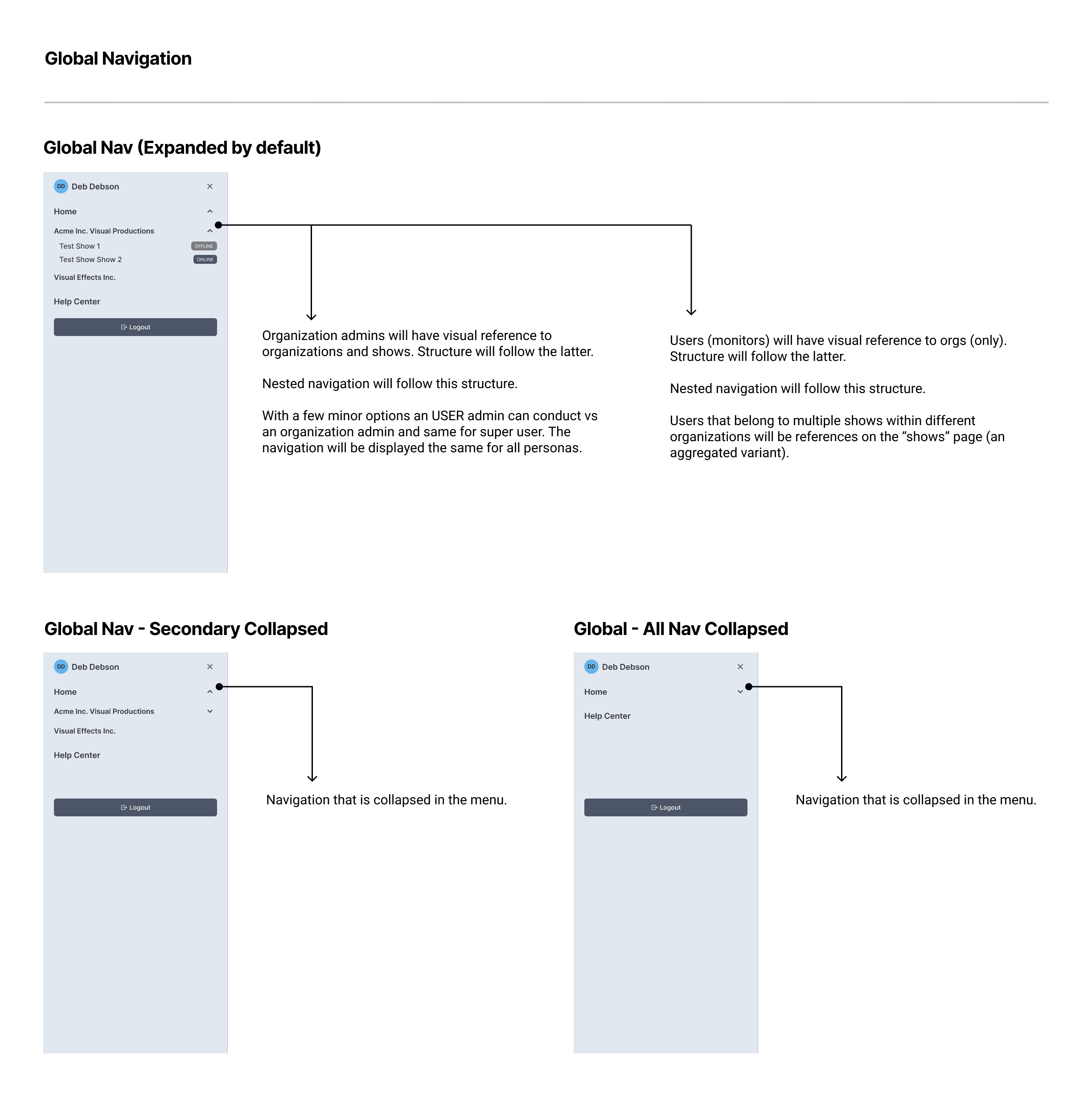
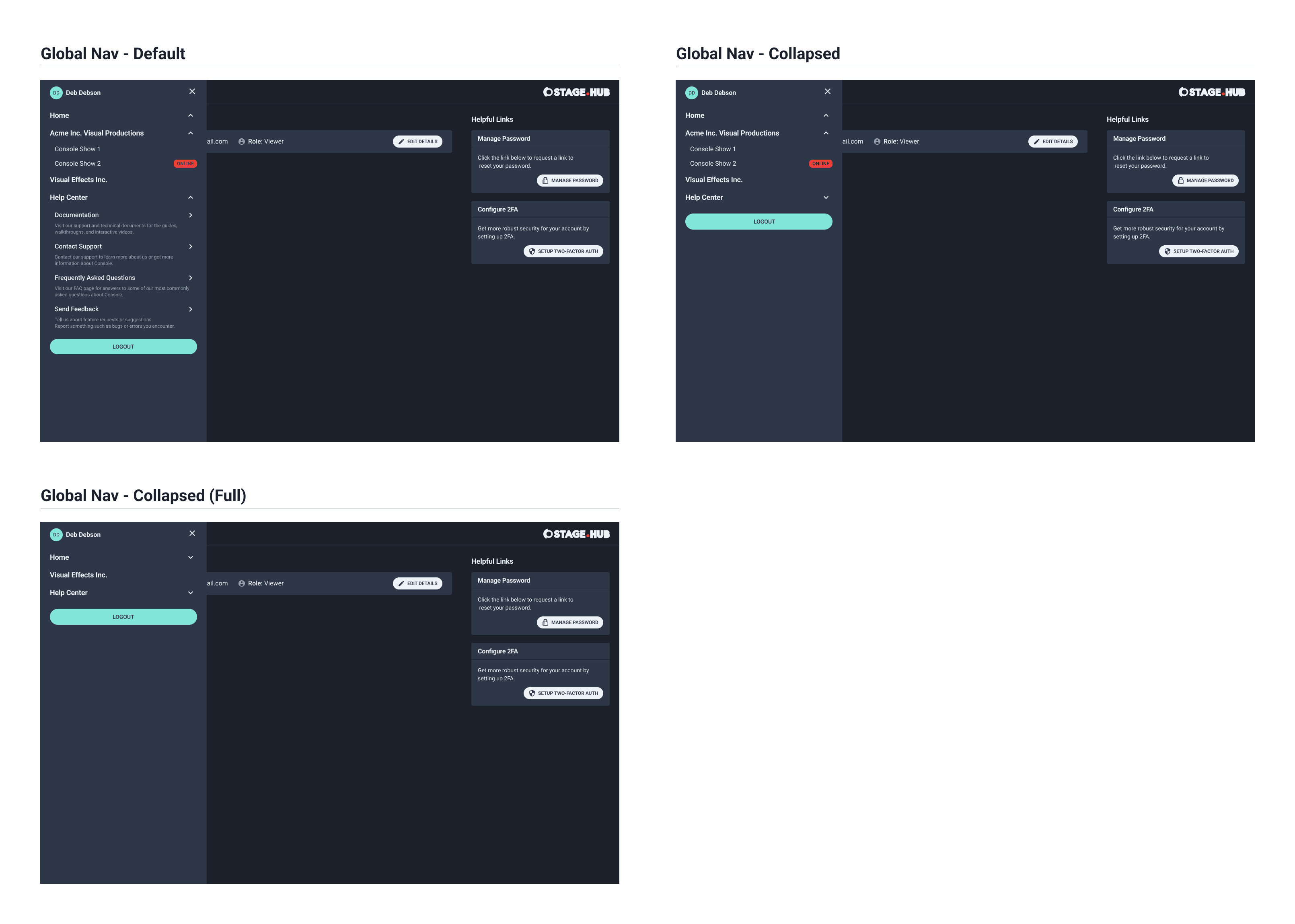
Global navigation
Next, I worked on the global navigation wireframes. I created a standard and scalable navigation that contained links to shows, organizations and the help center. I showed an expanded and collapsed view for the menus nested in the mobile navigation. I shared this last screen with the client team and there was no feedback to implement.
They shared their opinion on the navigation recommendation and agreed with the approach. However, they noted that in a future iteration they’d like to see a self-registration option for contractors. We noted that request and I worked on the last topic for this phase which was the help center.
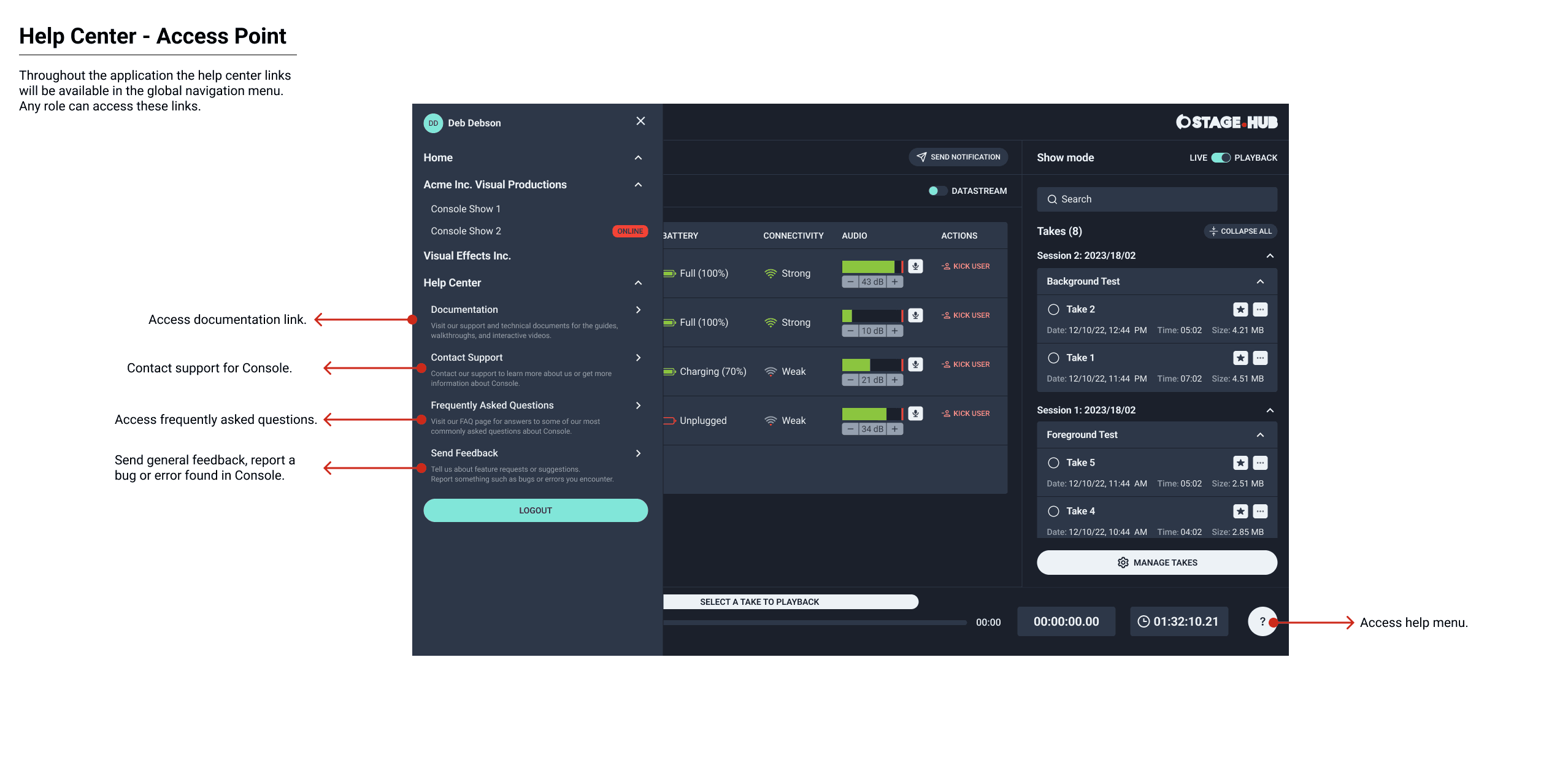
Help Center
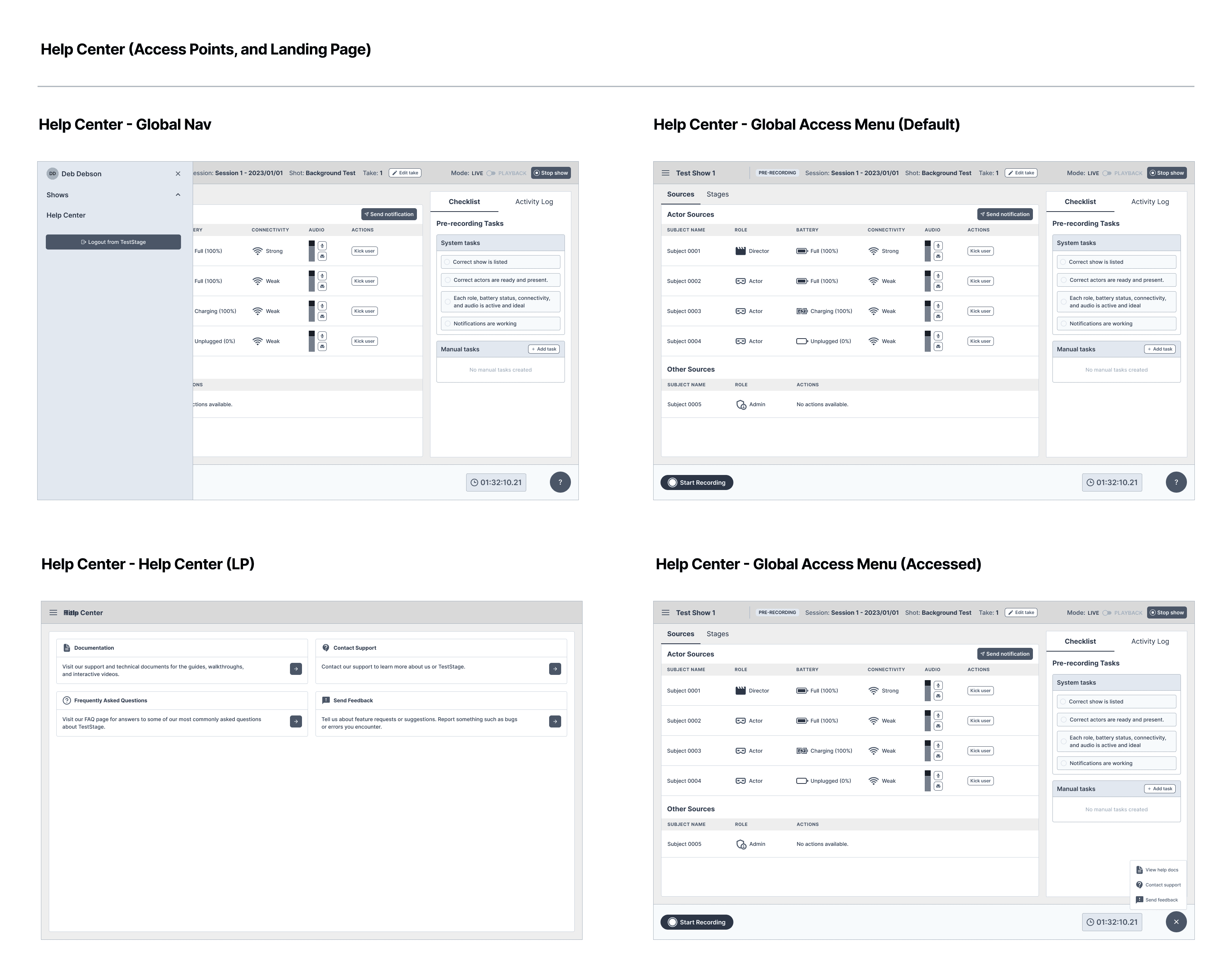
The help center contained basic information as the studio did not yet have an extensive documentation and support process in place. The goal of the first version was to provide an option for users to send feedback, report any bugs, request support and visit any available documentation. I created two access options for the help center.
The first was a floating button that was visible and accessible throughout most of the application. The other access point was inside the global navigation. I added iconography and a simple copy to explain what each link did. The client team did not request a review. I explained I would create a site map to show the current structure of the application.
PLAN
Planning phase
The first task was to define the roles in the system based on the role of the studio team member (permissions would come later). I worked with the product manager and engineers to define the user roles. There were four primary roles: “Super Admin,“ Admin,” “Members” and “Viewers.”
The super admin were a few of the top level senior directors who managed multiple shows. The admins had almost the same authority as the super admin, but were slightly limited; admins were associate directors or technical directors.
The members were primarily the technical crew; the technical crew members had permission to do anything at the show management level. However, nothing at the organizational level. Lastly, viewers were either an audience or actor and were limited to view-only access.
Learning their process
One of my goals (and the client) was to understand their technical setup and learn more about Unreal and the process for creating motion capture animations. I watched their technical and creative crews in real time. I spent a week participating in test shows, script reviews and animation workshops.
This resulted in a holistic view of the studio’s technical and creative team process and setup. I set up a local environment to learn and create some test takes. This helped me understand the type of data and information passed to and from the Unreal Engine.
Key takeaways
I learned how involved the technical and creative process is to create test takes and complete a finished animated show
How each of the key team members perform their role in the technical and creative operations
The type information and data each persona looks for when completing their tasks
More insight from the studio team members on how they would like to benefit from this new application
Scope and planning
Once I completed my local environment setup, I started to answer the clarifying questions that were asked during the workshops with the new insights I learned. User story related questions were answered as the planning and scope began. The product manager and I met to discuss the phases and features. The phases were divided into four succinct phases of work. There would be three phases of discovery and design. The final phase covered the design library, finalized visual mockups, annotations and hand off to engineering.
Phase one
Phase one consisted of the dashboard for both technical and non-technical team members. This included pre-recording and recording (live) for the dashboard. I met with key members of the technical and creative team to finalize the other phases.
Phase two
Phase two included account management, show management, take management, and post-recording (playback) in the application.
Phase three
Phase three would cover governance, navigation, help and support for studio team members, their collaborators and partners.
Phase four
The final phase would consist of any outstanding topics, the finalized annotated visual mockups and handoff to engineering. In addition, any design work that required additional scope.
PHASE ONE
Creating the initial workflow
I created the first workflow for the local-environment setup. This workflow showed the necessary steps a user completed to set up a working instance for Unreal Engine and Stage.HUB in order to login into the application.
Pre-recording
Next, I conducted a meeting with key members of the technical and creative team to confirm the goals for the pre-recording dashboard. The goals included: configure the show, conduct a pre-show checklist (if needed), test the system, run connectivity checks and recording tests. I completed the user flow to outline the steps to achieve these goals.
Live-recording
I met with more members of the technical and creative team to confirm the goals for the live-recording dashboard. The goals included: show all connected crew members, ensure source and stage data is being captured correctly by detecting and fixing errors, pre-check, communicate with team members and record test takes. I created the user flow for the live-recording dashboard. I shared the first three user flows with the client team and there were no updates requested.
Concepts and ideas
The client team requested wireframes for the dashboard. These wireframes illustrated the features for pre-recording and live-recording from a technical and non-technical perspective.
I worked on the non-technical screens for the pre-recording dashboard that was used by admins, members and viewers. The dashboard showed a breakdown of the connected sources from Unreal to the Stage.HUB application. The performance and latency of the virtual stage was communicated to the team. This explained which members were using which characters for the take. Secondary mute and kick actions were included for admins and members. This dashboard had several other features. The plan was to complete all wireframes for the dashboard and then review with the client team.
Checklist
The next step was to refine the checklist. Admins and members could (optionally) use the checklist to conduct pre-recording quality checks. This was commonly done prior to creating takes for their shows. The checklist accommodated default tasks and custom tasks.
Notifications
Admins and members needed to send global and individual notifications to other members on their team. This feature included a dropdown to find names quickly, select them and notify them for technical and non-technical reasons. The recipient of the notification would see the notification as a banner message in their dashboard.
Live-recording DATA
I reviewed wireframes with the client team and the product manager. I received feedback for some adjustments to the transport control on current screens. I completed their requested updates and then finished the technical screens for the live-recording dashboard. I used an area graph which displayed a real time data stream of video, audio and animation data and total file size being stored in S3.
Video data contained live recording data being sent in from Stage.HUB and rendered in Unreal. Audio data were sound effects or voice audio being sent to Unreal. Animation data were effects or assets the animators were applying to the characters, foreground and background.
Additionally, there was also a technical breakdown of the data to understand processing, connectivity, latency, and memory for each connected source (to and from Unreal).
Create, start, pause and stop a RECORDING
Next, I reviewed wireframes with the client team. The feedback was well received and some adjustments to the data structure was requested. The client wanted to understand how a team would create, start, pause and stop a recording.
I worked on the wireframes for creating a recording and the different actions for how an admin or member would start, pause, stop the recording and end the show. The different statues and controls were distinctly displayed by the different states in the transport control and in the panel.
Separate dashboard views
I communicated to the client that an admin or member would see slight variations on their dashboard compared to a viewer. I showed a viewer, admin and member perspectives. There was a clear distinction between which actions were available (based on user role and permissions).
PHASE TWO
SCOPE REVIEW
I reviewed the user stories and design topics with the product manager. The plan was to start with show management to understand how a show was created, managed and started by an admin or member. Included in this scope of work was post-recording (dashboard) and show management.
Create new show
This workflow showed how an admin or member could create a show and add their team members to the show. I started with this workflow as it was the first step to initiate team collaboration.
Remove person from show
This workflow showed how an admin or member could remove a person from a show. I created this workflow to show a standard way of managing team members within a show.
Edit show details or delete show
This workflow showed how an admin or member could edit details or delete a show. I created this workflow last as it was a less common and deprioritized interaction.
Primary wireframes
The client team requested to review all show management screens in a single review to get a complete perspective. I first completed show management for admins and members. These wireframes contained the primary actions to start the show, add members and display the team members of the show. The secondary wireframes showed a view-only perspective which indicated how a viewer could join a show with other team members.
Secondary mockups
The next set of wireframes showed how an admin or member could conduct secondary actions by removing team members, editing show details and deleting a show. As a precaution the admin or member had to enter the show name to confirm the show deletion. The product manager and I set up a client meeting to go over the wireframes. The feedback was positive with some minor adjustments and future notes around governance.
Post recording (creating a take)
Next, I completed the workflow for saving and creating a take once recording concluded. This workflow showed the connection between pre-recording, live-recording and post-recording. This allowed an admin or member to save or discard their take and then reset for the next take sequence
completing wireframes
I worked on completing the wireframes for the post-recording dashboard which illustrated how a take could be saved or discarded. Once the next take sequence was ready, the dashboard would reset to pre-recording for the next take.
Playback mode
Playback mode allowed an admin or member to playback and review takes with the technical crew and creative team. Often, there were multiple test takes and the team had to narrow down the best take. This resulted in multiple playbacks of takes. To keep the experience consistent I mirrored the live-recording dashboard statuses and information being communicated back to the team.
Viewers would see the notifications being sent by the admin or member and vice-versa. The admin or member could play, pause, stop and manage takes. I reviewed the wireframes with the client and received feedback to iterate on the messaging and the notifications. I added additional tooltips for context and the ability to manually edit the timecode in the transport control.
Take management
The workflow for take management was straightforward. Takes could be accessed from the dashboard, shows or from the take management screen. Actions and information were limited on the dashboard and were fully accessible on the main take management screen. I created two user flows that detailed the different paths.
Using a standard format
The primary view for take management contained all data for a take that was saved to S3 by the admin or member. They could view all the file information, participants and the description. Also, they could favorite, delete, or edit the details for a take. In my design explorations I started with a card format as the client team did not lean towards the table. However, I explained a table was a better format due to the amount of data and information displayed.
I created wireframes indicating the different tasks that could be completed from this view. I indicated how a take could be marked as a favorite with a single click of the star icon. The menu contained actions to edit, delete and download the take. I reviewed the wireframes with the client team to solicit feedback.
The feedback was positive and there were some edits to make. The client team requested bulk actions to be introduced to bulk download takes for offline refinement or delete test takes that were no longer needed. I notated their feedback and I moved onto account management.
Account setup
The next workflow I completed was for account setup and activation for super admins, admins, members and viewers. It showed the process for how they would receive their invite and activate their account.
CONSISTENT PROCESS
The wireframes for account setup showed how the super admin, admin, member and viewer would complete their account setup after they received an invitation email. AWS Coginto sent an activation email and the recipient would enter their name and email and then be directed to their organization/show (navigation paths would determine login scenarios in phase three).
Login and password reset
After account setup I completed the workflow for login and password reset. This workflow showed all the different navigational paths based on user role (wireframes for individual paths were completed in phase three). This path also indicated how to request and update their password.
STANDARD MODEL
This topic utilized the AWS Cognito model. Login required a name and password. For password reset there was a reset email with a unique code that was entered to complete the reset. The client team asked engineering if there was a way this could be changed to a secret link. Engineering confirmed the code was a more secure path.
USER profile
The last workflow I completed was for the user profile. The profile was standard and consistent across the system for all user roles. Any admin or member could edit their own profile (name and email).
phase two COMPLETION
I worked on the wireframes for the account profile and cleaned up any remaining account management wireframes. My team and I scheduled a client review to go over the workflows and wireframes. There was no additional feedback to implement. The product manager went over the remaining scope and features with the client team.
PHASE THREE
organizations (super admin)
Phase three was the ramp up phase for planning and ideation. The first step was to finish out governance so that the navigation and edge cases could be finalized. After navigation was complete the “Help Center” was the next feature. Early on in the project my team and I had established four primary roles: super admin, admin, member and viewer. These roles required a refinement to the permissioning to establish governance for the application. There was no user flow for this topic. Rather, I proposed some UI flows which would cover the login paths and wireframes for each of the user roles.
super admin - NAVIGATION
The super admin role focused on managing all organizations. I focused on creating an aggregate view of all organizations. Only executive team members were designated as a super admin. Often, they relied on the admins of an individual organization to manage their own teams and shows.
When a super admin was invited to the application for the first time they were required to create a new organization. The super admin created their organization and then invited admins (and in some cases created the show and invited team members). The secondary path is when the organization was created but no shows existed. The super admin was navigated to their organization page to either manage the organization or add admins. The last path accounted for multiple organizations with multiple shows. In this scenario, the super admin was navigated to the organization list.
organizations (admins)
The admin role focused on managing their individual organization and shows. They were able to perform most system level actions with the exception of creating or deleting an organization. If an admin was only assigned to one organization, they were not able to see other organizations. The admins were usually associate directors, technical directors and senior producers.
organizations (members)
The member role was one level below admins in permission access. Members focused on assisting the admin with managing the show and team members. Members could add or remove other team members from the show, manage and edit show details. This role was mostly associated with the technical crew and in some cases with creative team members that assisted with production or post-production. Note: This UI flow was combined into a single flow for admins and members.
admin/member - NAVIGATION
The navigation for admins and members did not differ much with the exception that admins and members would only see the organizations they belonged to. Admins and members encountered three paths. The first path is when an organization exists, but no shows were created. In this scenario, they were navigated to the organization page to create the show and invite team members. The second path navigated them to the show if a show did exist. The third path navigated them to the organization list (multiple shows and organizations exist).
organizations (viewers)
The viewer role had view-only access. Viewers were participants of the show (usually an actor or audience member). Most actions were restricted and they could only participate in a show if a member or admin was present. They could not access anything outside the show. Viewers were mostly collaborators outside the studio unless that specific studio had an in-house agency.
viewer - NAVIGATION
The navigation for viewers followed a separate path that required additional account activation as they were often third-party. Engineers raised a concern with me that a non-studio email has more potential to become compromised and it required additional process. I agreed and voiced this concern to the product manager. The product manager noted it and stated we could discuss this with the client. Viewers that belonged to a single organization or show were navigated to that show page. If the viewer belonged to multiple organizations with shows then they were navigated to the organization list (view-only) .
Review and final additions
I reviewed the UI flows with the product manager and engineers, and there weren’t any changes needed. After a follow-up discussion with the product manager and the client, I walked the client team through the different navigation UI flows. I recommended simplifying things by omitting the extra registration and activation steps for viewers, which would make navigation more consistent across all roles. I explained my reasoning and suggested they provide emails to the contractors instead. The client team liked the idea and asked for some time to review everything offline.
Global navigation
Next, I worked on the global navigation wireframes. I created a standard and scalable navigation that contained links to shows, organizations and the help center. I showed an expanded and collapsed view for the menus nested in the mobile navigation. I shared this last screen with the client team and there was no feedback to implement.
They shared their opinion on the navigation recommendation and agreed with the approach. However, they noted that in a future iteration they’d like to see a self-registration option for contractors. We noted that request and I worked on the last topic for this phase which was the help center.
Help Center
The help center contained basic information as the studio did not yet have an extensive documentation and support process in place. The goal of the first version was to provide an option for users to send feedback, report any bugs, request support and visit any available documentation. I created two access options for the help center.
The first was a floating button that was visible and accessible throughout most of the application. The other access point was inside the global navigation. I added iconography and a simple copy to explain what each link did. The client team did not request a review. I explained I would create a site map to show the current structure of the application.
DESIGN
Prior to design
Prior to beginning the design phase I took all existing workflows and navigation and created a site map to show the structure and relationship of the application. The sitemap would contain a breakdown of all topics explored from the different phases.
PHASE FOUR
The final phase
Phase four covered high-fidelity mockups, pattern and component library and accessibility testing to persuade the client to a more web accessible and compliant color palette. In addition, a clickthrough prototype for the current experience was created. The design phase was scoped into a single phase to cover all these requests.
Assess current visuals and adjust design scope
The client’s existing color palette was not web accessible nor web-compliant. The first challenge was having the creative team of the studio agree to utilizing an alternative color selection to match ADA and WCAG standards. Their creative director was adamant about using their color palette. I conducted heuristics of their color palettes and provided recommendations based off of my assessments. The heuristics indicated their colors not passing ADA and WCAG standards. My heuristics showed color combinations that did meet those standards.
I recommended a color palette that aligned with ADA and WCAG standards and were web-compliant. I reviewed my heuristic analysis and the new recommended color palette with the client. After extensive discussion they agreed on the new proposed color palette. The application was created in a dark theme to retain application performance, reduce the eye strain and enhance productivity (the client spent a large amount of time between monitors and tablets running multiple shows sometimes in dimly lit environments).
Assess current visuals and
adjust design scope
The client’s existing color palette was not web accessible nor web-compliant. The first challenge was having the creative team of the studio agree to utilizing an alternative color selection to match ADA and WCAG standards. Their creative director was adamant about using their color palette. I conducted heuristics of their color palettes and provided recommendations based off of my assessments. The heuristics indicated their colors not passing ADA and WCAG standards. My heuristics showed color combinations that did meet those standards.
I recommended a color palette that aligned with ADA and WCAG standards and were web-compliant. I reviewed my heuristic analysis and the new recommended color palette with the client. After extensive discussion they agreed on the new proposed color palette. The application was created in a dark theme to retain application performance, reduce the eye strain and enhance productivity (the client spent a large amount of time between monitors and tablets running multiple shows sometimes in dimly lit environments).
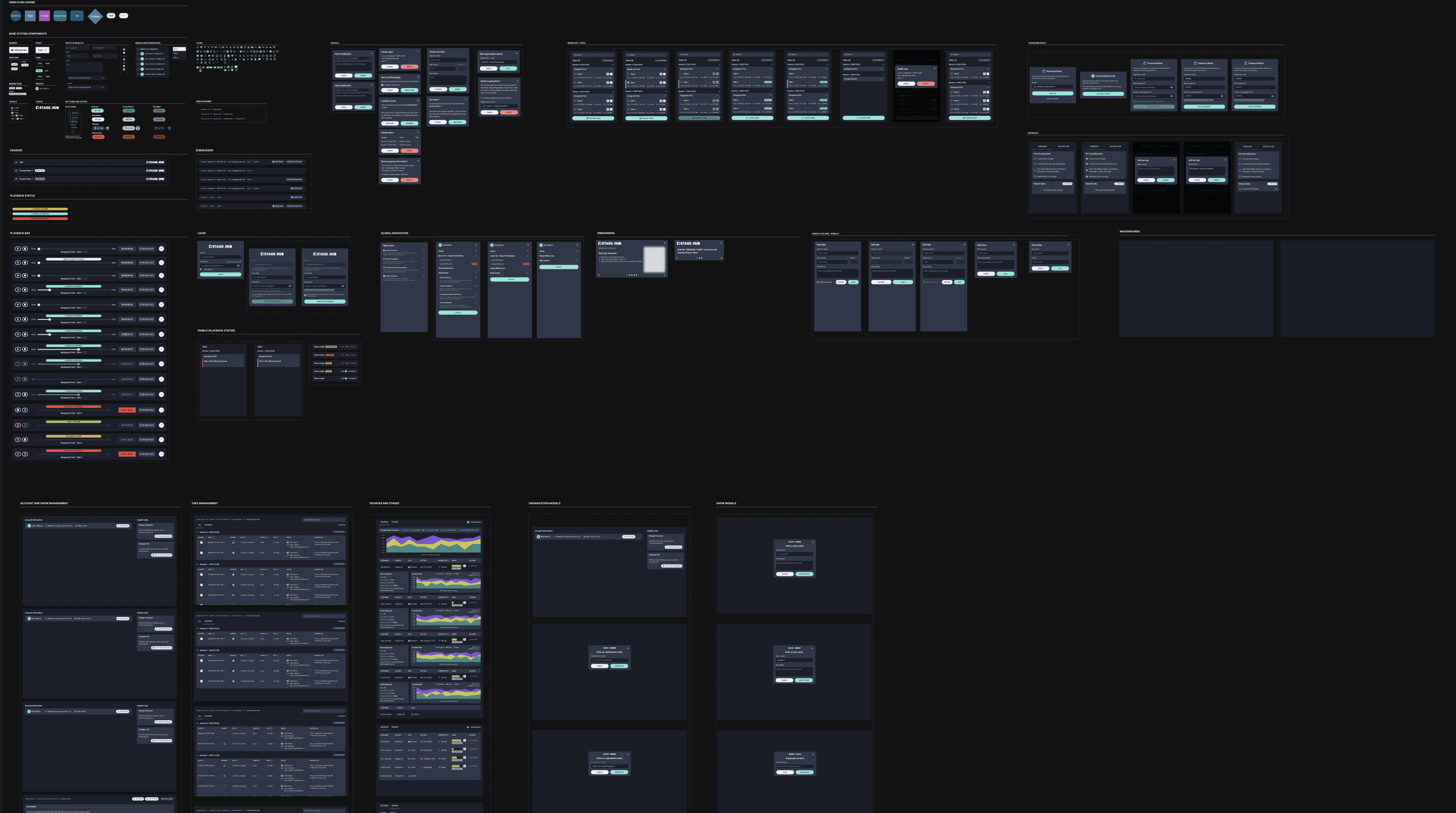
Atoms
There was no existing design library. Originally, there were no plans to create a design library, but instead utilize Chakra or Tailwind. The client did not want to use an off-the-shelf option but wanted a custom solution. This required adjusting the project scope to accommodate the design library. The product manager and I discussed this with the client and they agreed with the new scope adjustment.
I created local styles for fonts and colors (variables were still in BETA for Figma). The pattern library adapted an atomic design approach. I created the base atoms for the components (inputs, labels, icons, buttons and more). The atoms were used to create the molecules.
Molecules
Next, I took the atoms and transformed them into molecules that were created into organisms. The molecules included header, subheaders, modals, panels and more. The molecules were used to create organisms and form the foundation for the application elements and pages.
Organisms
I utilized the molecules and transformed them into organisms which would be created into the final elements and pages. Examples of these organisms included login, navigation, onboarding, advanced panels and more. The organisms were the foundation and structure for the application templates and pages.
Completing the library
Next, I compiled all the organisms and molecules into base templates and pages that were utilized throughout the application. These included account and show management, take management, dashboard (live and playback modes) and more. Once the library was complete I scheduled a meeting with the client’s creative director, myself and the product manager. I went over the different fonts, colors and components. After discussing, the creative director gave their approval and I moved forward with high-fidelity design.
High-fidelity DESIGN
I started to work on the high-fidelity mockups for each of the core design topics. I also annotated the wireframes for development as each topic was completed. First, I worked on and completed the dashboard and its related design topics.
Dashboard (Live)
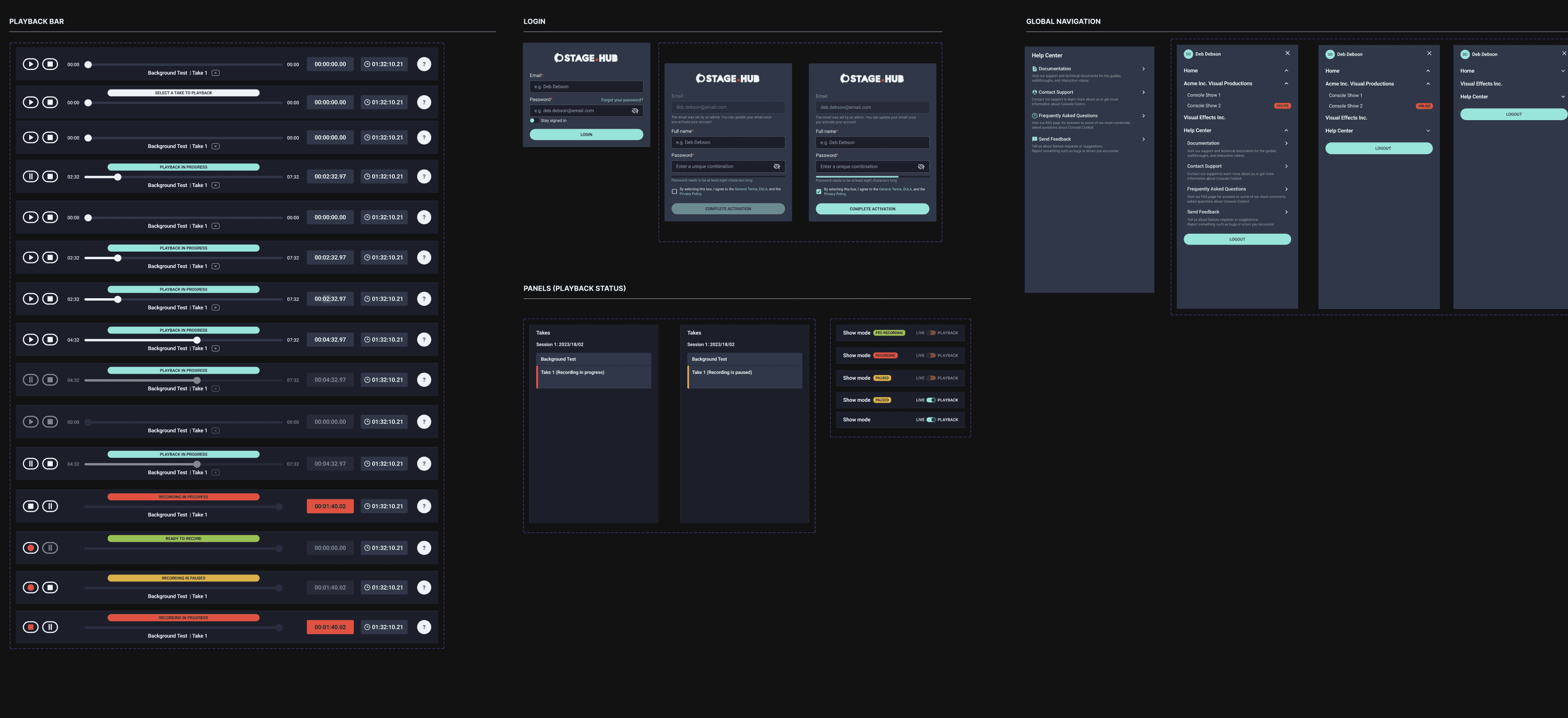
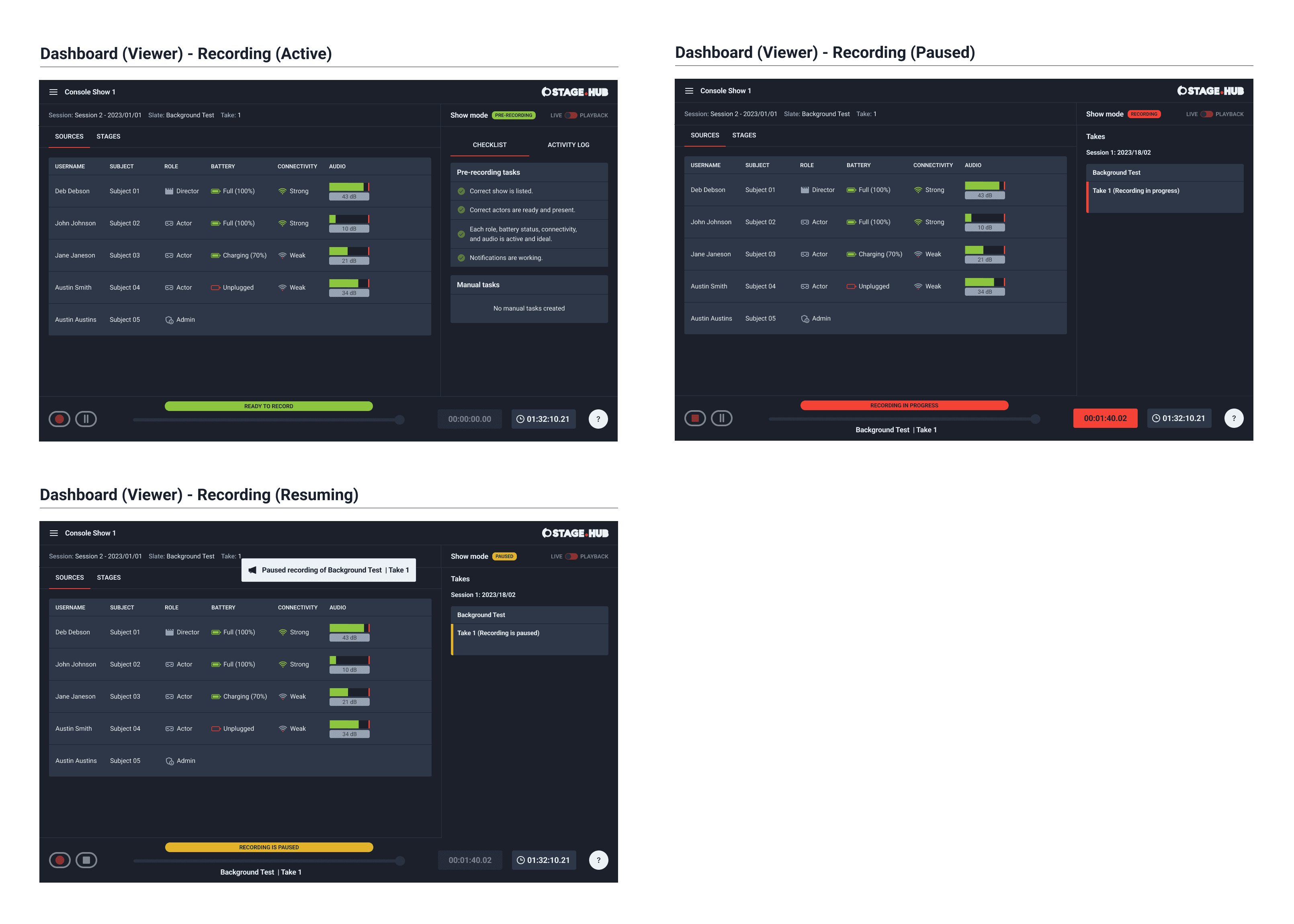
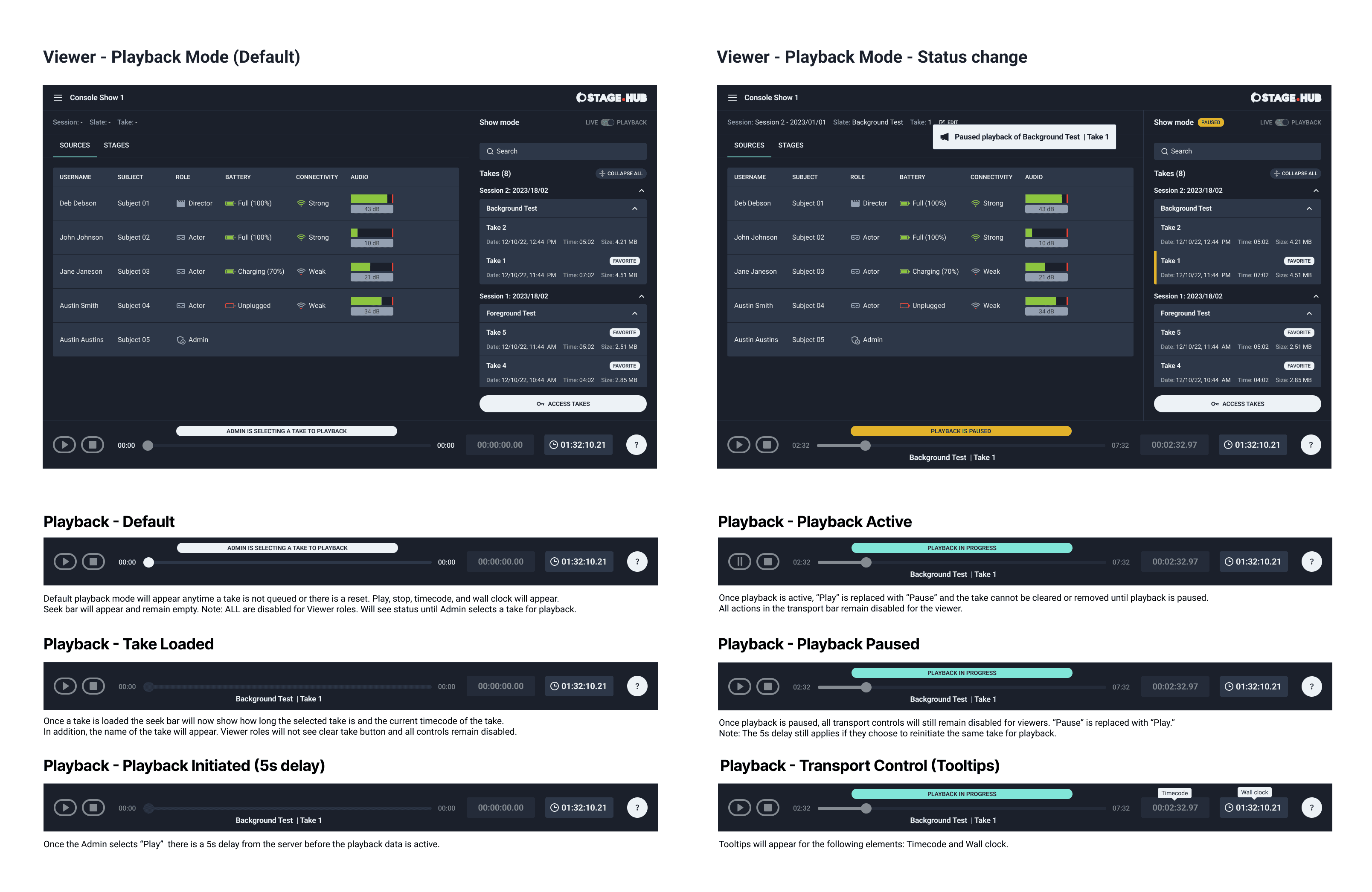
Utilizing “Live” and “Playback” mode was the most important aspect of the dashboard. I created various visual references for when “Live” mode was beginning, paused and stopped. The visual indicators helped the user understand what status the recording was in. I utilized the standard red that is seen in recording for active and stop. I used yellow for when a recording was paused. For (pre-recording) I used a prominent green. “Live” mode was themed with slight hints of red in the UI to show a transition between the dashboard modes.
Dashboard (Playback)
When the UI switched to “Playback” mode it switched to a turquoise color. I used this same color when the take was ready for playback. When the take was queued I used a clear and concise light gray. When a take was paused I used the same yellow from "Live" mode.
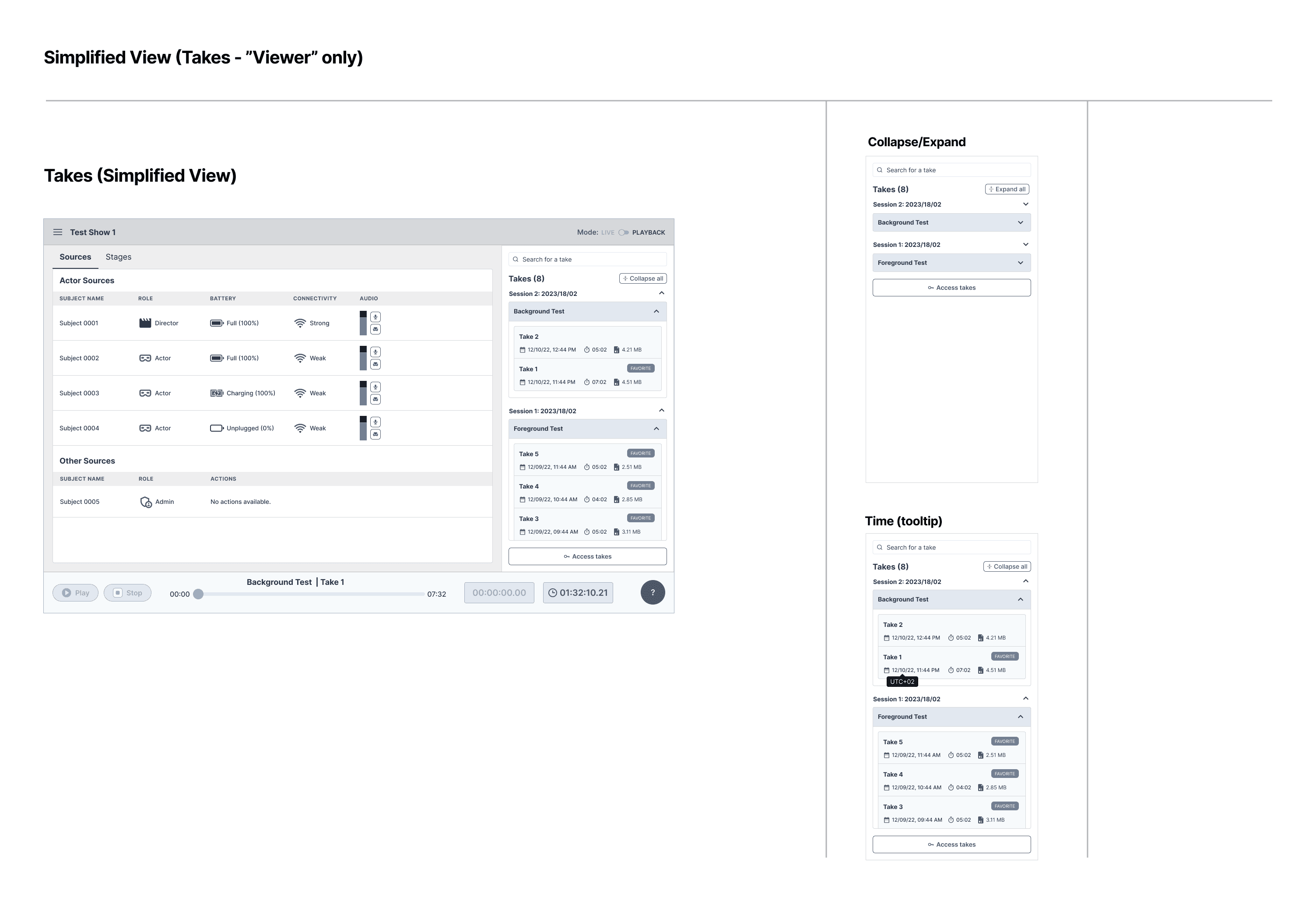
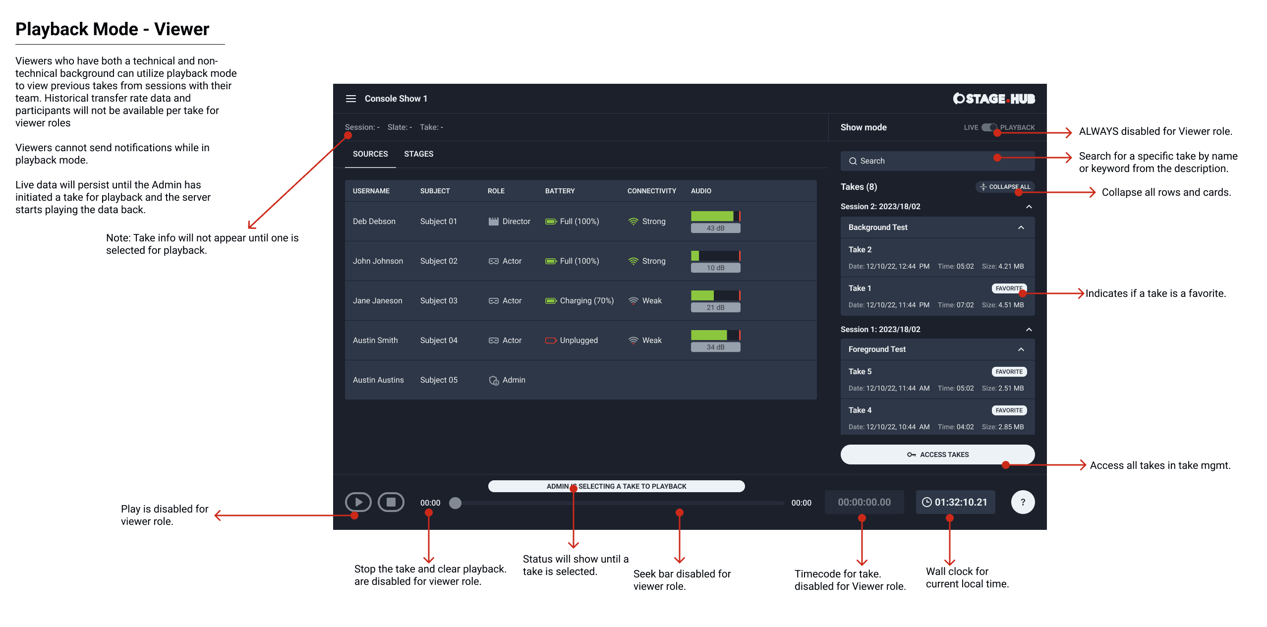
Dashboard (Live and Playback) - VIEWER
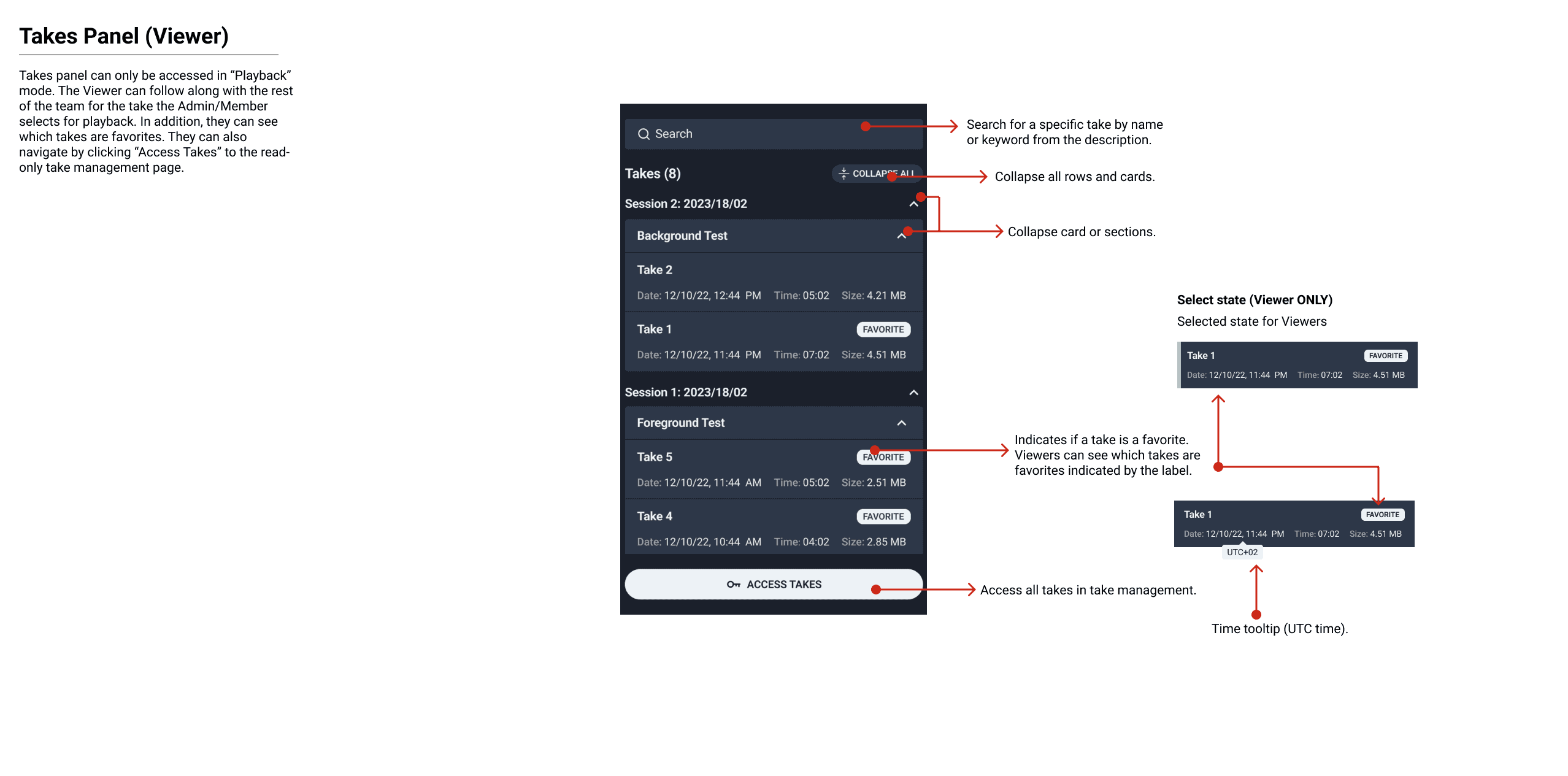
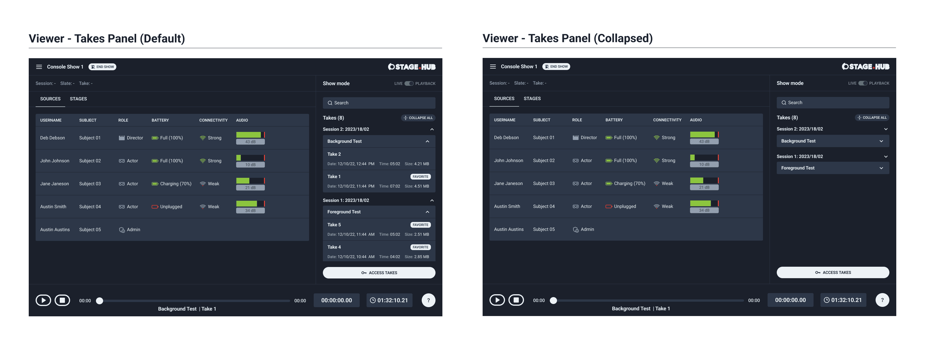
Viewer roles had access to “Live” and “Playback” modes. However, based on the previous established user permissions the viewer role was view-only. I condensed the dashboard to give viewers the information and access they needed to collaborate with their team. I omitted any controls or elements they did not require.
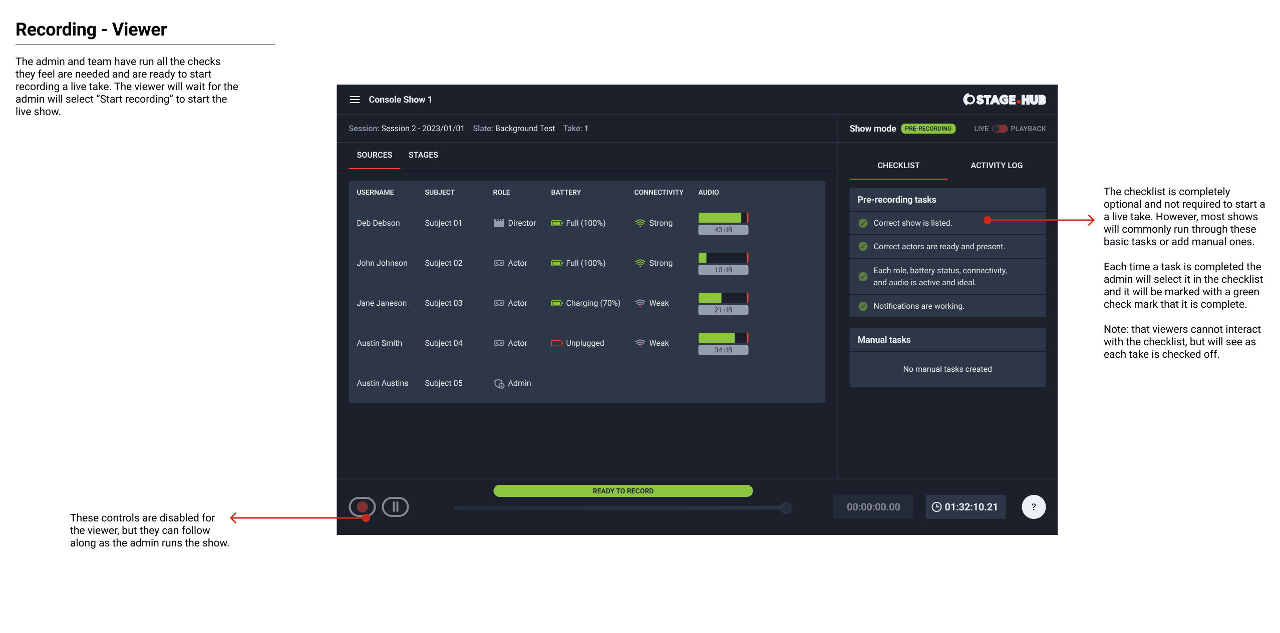
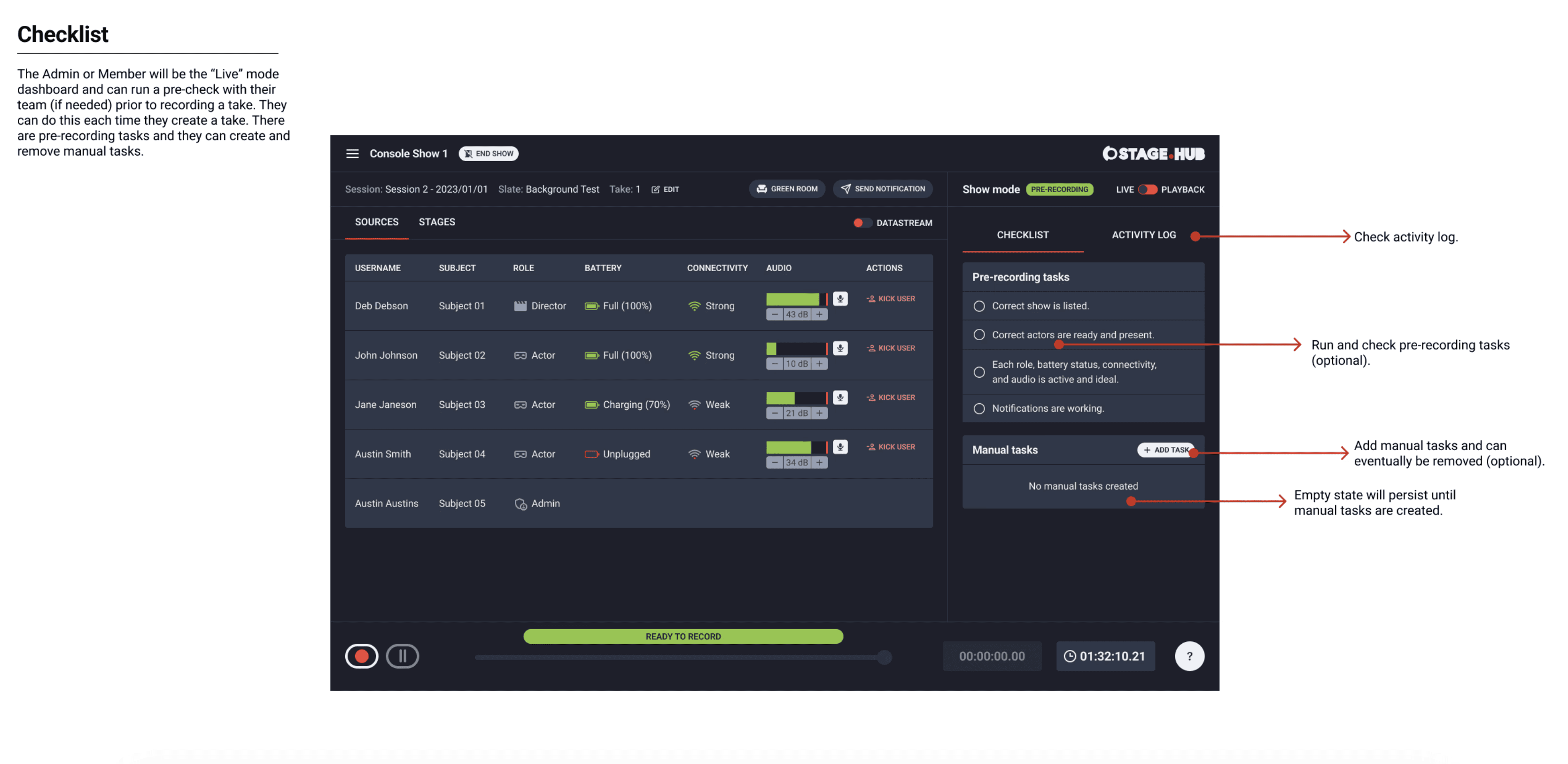
Dashboard (Checklist)
Next, I completed the high-fidelity mockups for the checklist. The checklist was incorporated as a list to quickly mark tasks as complete. The checklist was a panel as this would share the same space for the takes panel when switching between modes.
Dashboard (Notifications)
Next, I completed the high-fidelity mockups for sending notifications. This feature was accessed through a dialog to give a clear way to select the applicable recipients, add them to the notification, enter the message and send the notification. The notification was received as a banner message so the recipients of the show could clearly see the message.


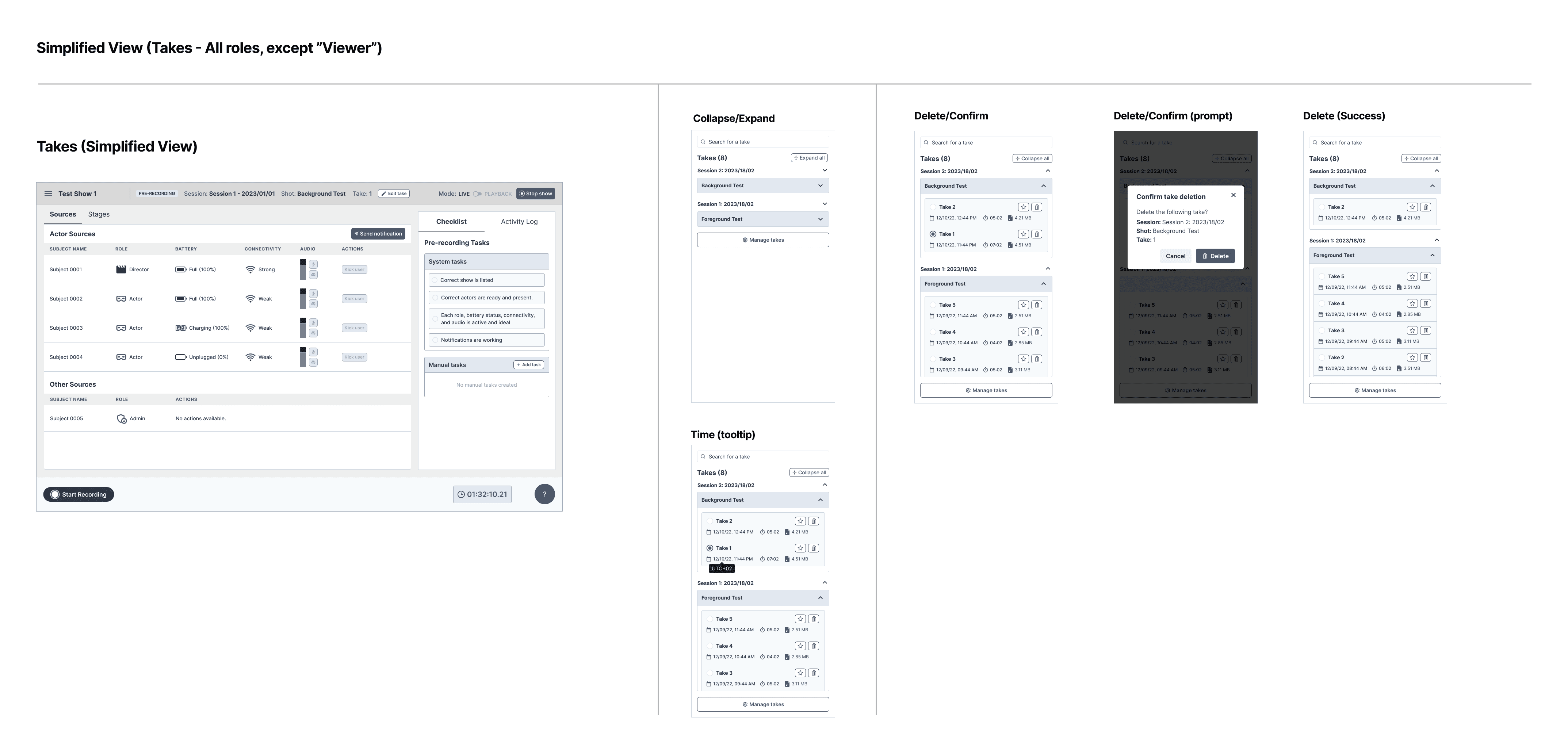
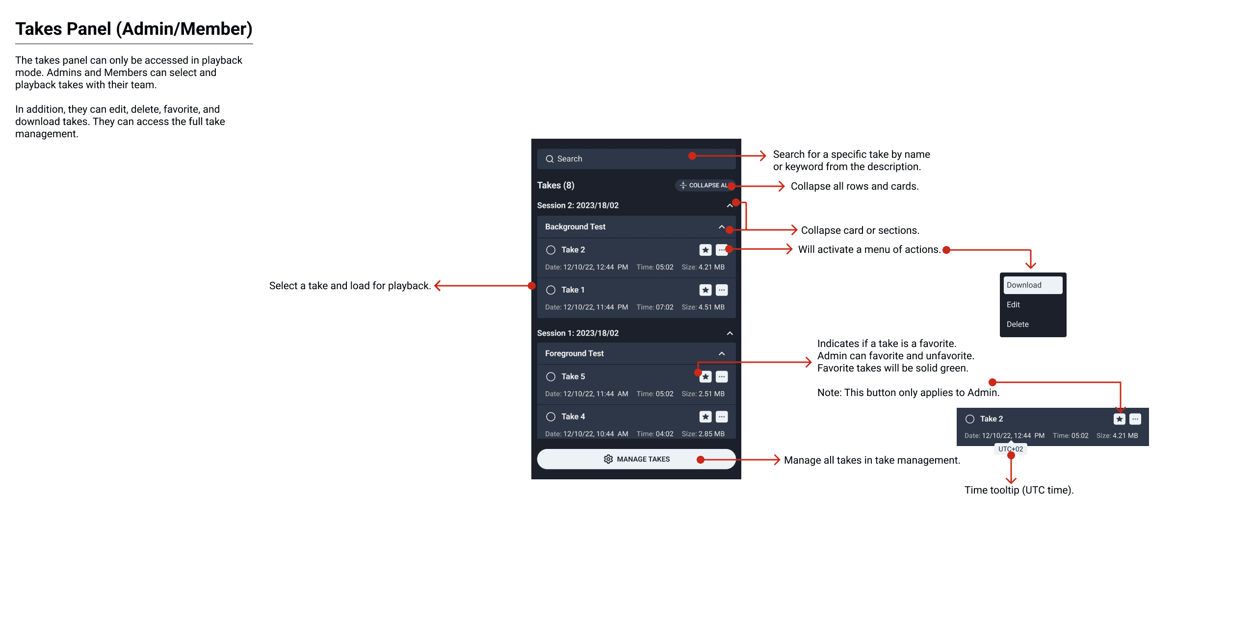
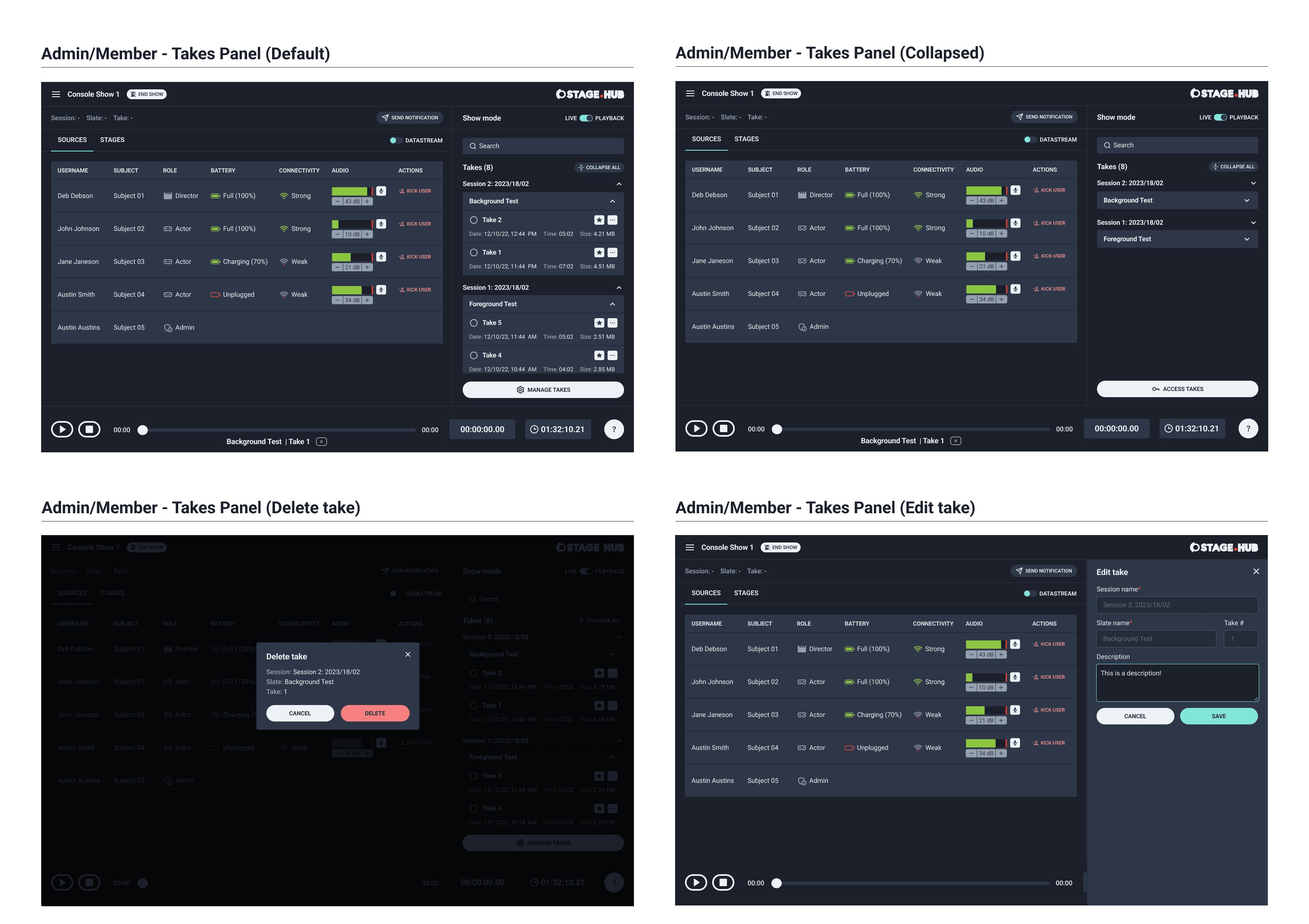
Dashboard (Takes Panel)
After notifications I completed the takes panel. This panel was accessible during recording and playback. While a take was being recorded the status of take was indicated in the transport control and the panel.
The takes panel was aggregated by session. The takes were consolidated into a card format and contained basic information, an action menu and favorite button. The controls and information were kept to secondary colors so as to not distract from the primary sources and stages.
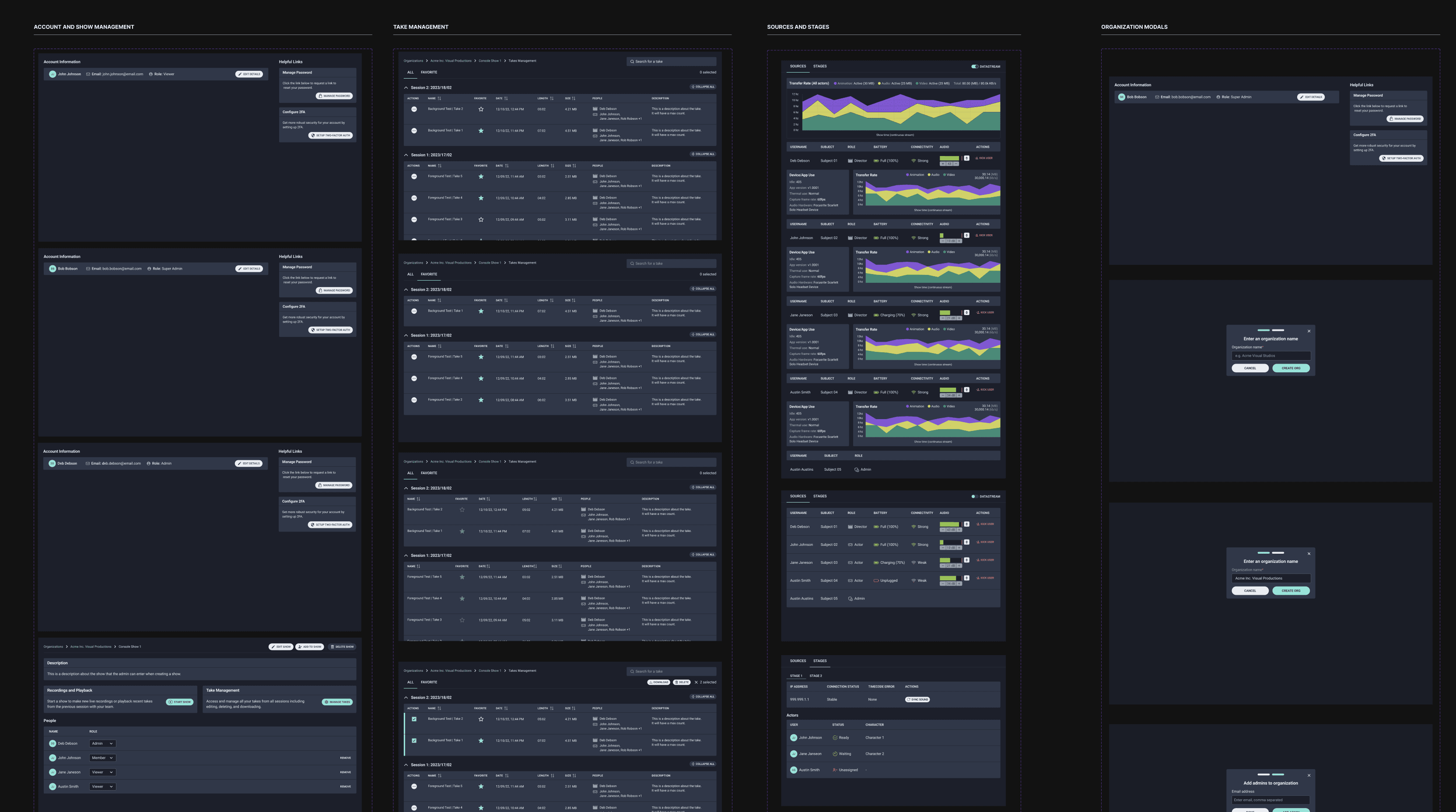
Dashboard (Technical View)
The last portion of this dashboard was the technical view. This feature was called “Datastream” and was accessible to any admin or member. The technical view contained all the data-visualizations which were based off of Charts.JS. I chose an area graph to show a breakdown of transfer rate data in real-time. I recommended using the colors built into Charts.JS to keep these accessible and web compliant.
The primary chart and secondary charts utilized the same colors and broke down the data in different intervals; an aggregate and an individual summary. I connected with the product manager and reviewed the screens. We set up a design review with the client.
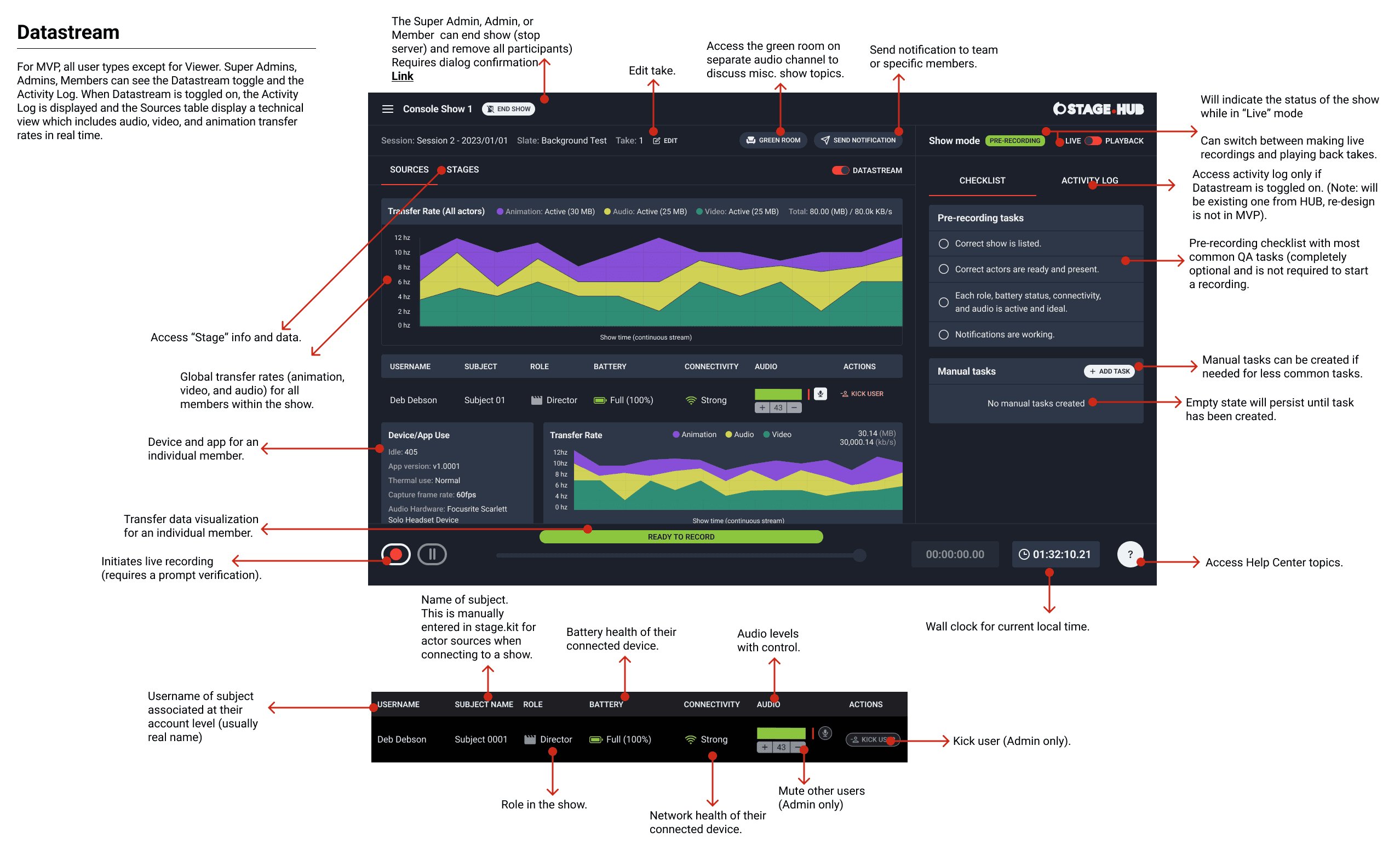

Design Review
I reviewed the mockups with the client team. The feedback was very positive but they requested to see other color variations for the area chart. I created several other mockups to match their request. I was adamant about using the provided colors to keep the data-visualizations web-standard and accessible. The client reviewed the mockups and agreed with my recommendation.
Take Management
The next topic I completed was take management. Managing takes was primarily done from the take management page that contained more information and data about the takes. I used a table format given the amount of data that separated the primary view from the secondary view (favorite takes).
I implemented an action menu with a multiselect pattern (on:focus) to prevent redundant actions and to allow bulk actions. I balanced neutral colors between the controls and information. This view adopted the existing patterns I utilized elsewhere in the application. I created variant screens to cover other edge cases for tooltips and collapsed views. I wrapped up the remaining screens and annotated them for engineering.
Organization Management
This topic utilized a card format since there was limited information that a user required to see (each user role has their respective view) and would access it to manage their team and shows. I cascaded the card format and colors to the individual organization page’s primary controls, secondary controls, information and tertiary actions.
Adding an admin, editing and deleting an organization was done through a dialog to confirm the user wanted to complete these actions. I completed the organization screens and annotated them for development.
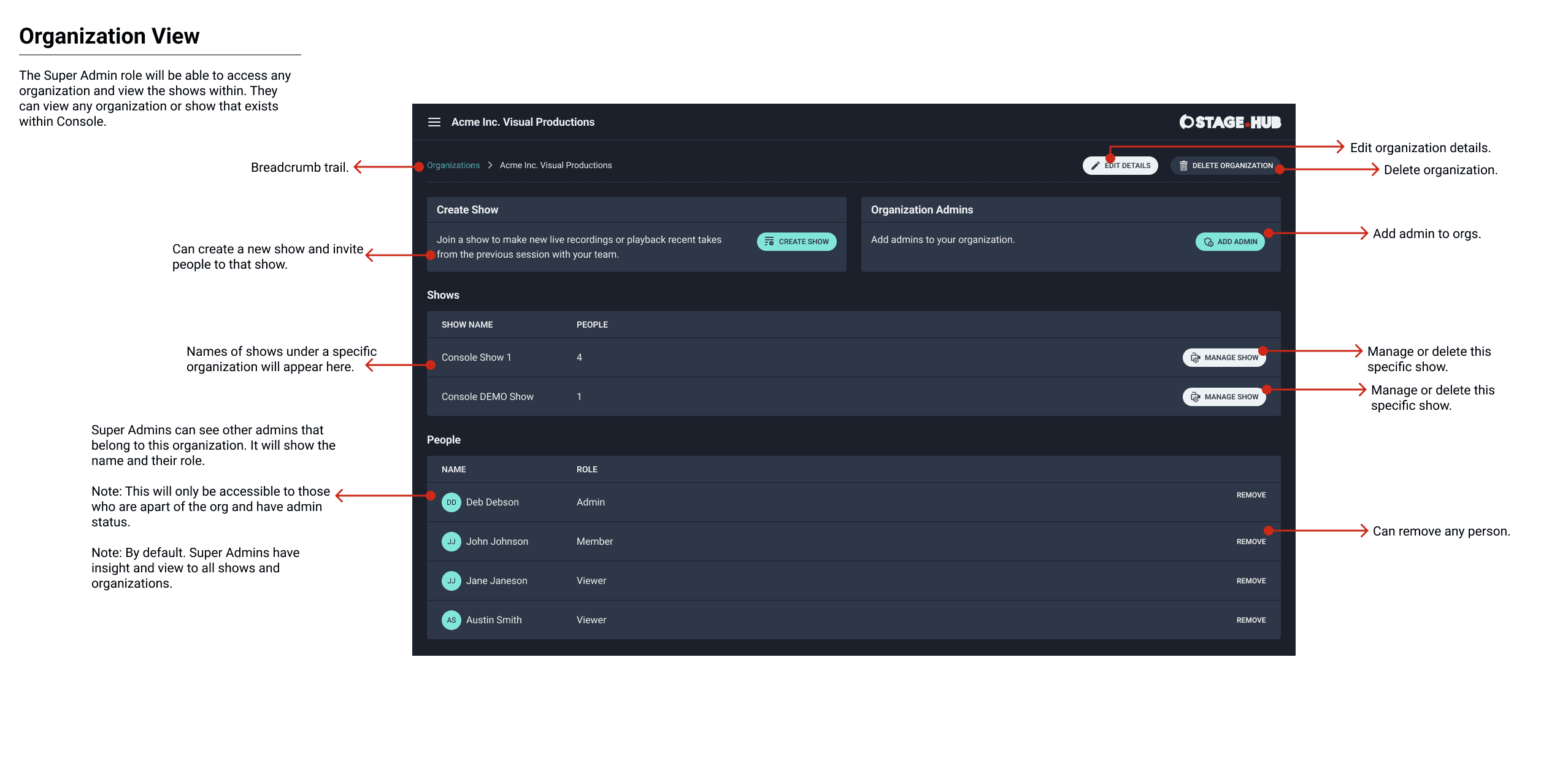
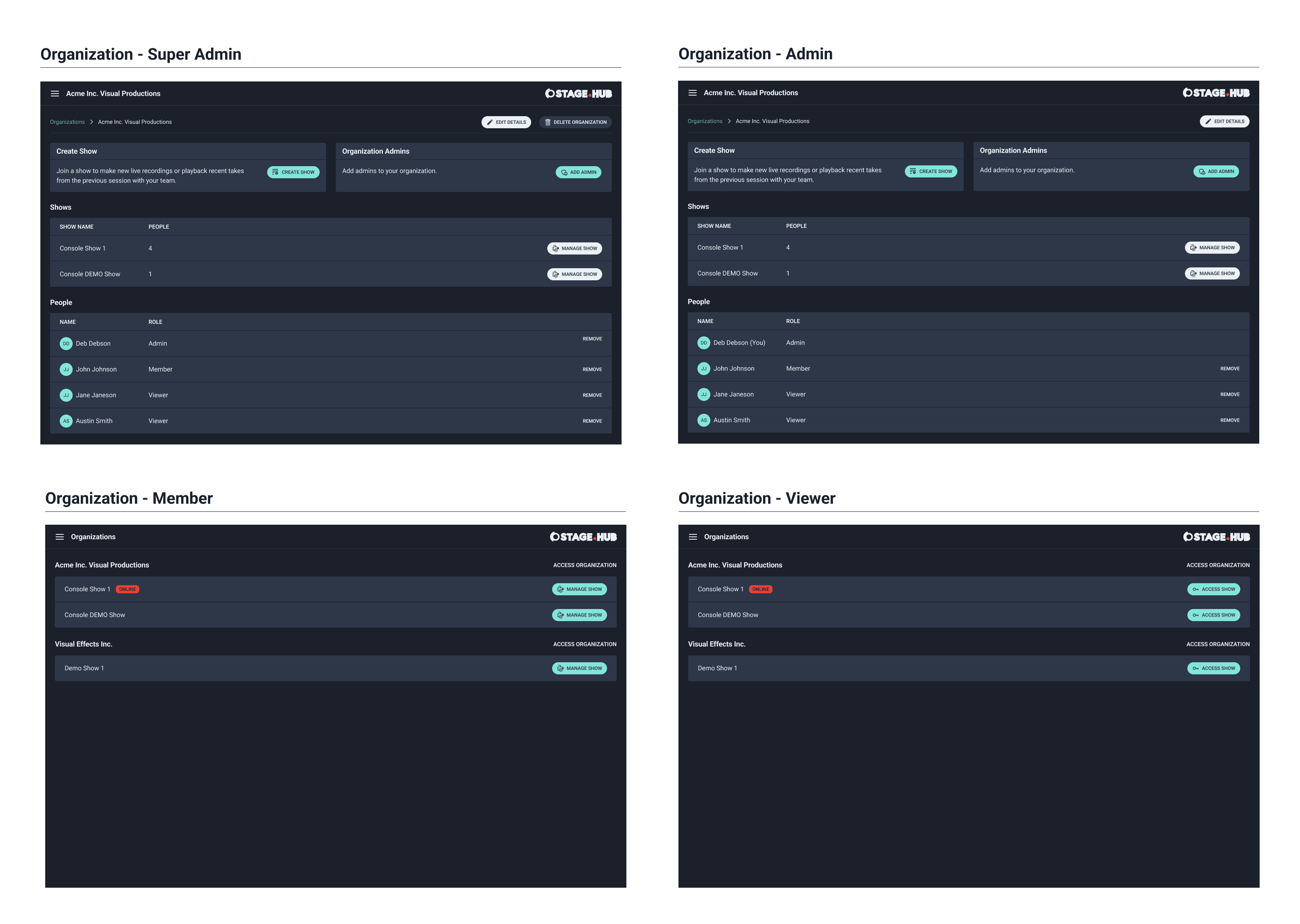
Show Management
I mirrored the visual and interaction patterns from organization management to the show management. This approach retained continuity to the admins and members between organizations and shows. I created a view-only view for viewers and a standard view for super admins, admins and members. I finalized the screens and annotated them for development. I reviewed both sets of mockups with the product manager and engineering.
There were a few clarifying questions from the engineers which I answered. Then, I presented both sets of screens to the client team. There was some minor feedback on differentiating some of the controls from white to gray.
I explained that a user might assume the control is not accessible because it's gray and that white was used for secondary controls throughout the UI. We discussed and they agreed on using white. The client requested us move forward with the remaining topics.
Account Management
For this topic I used a standard structure and pattern found in most account management experiences. An established and recognizable pattern made it easier for users to quickly understand how to access the application and collaborate with their team members. I completed all the high-fidelity mockups first and then annotated them all at once. I did this because engineering was completing the backend service and frontend simultaneously for this topic and this saved time.
Account activation and Login
I used the built-in form provided by AWS Cognito. Some customization was required in the configuration for account activation. I applied the information and controls the user would need to complete their registration. Login was a basic form implementation. I created the main screen and subsequent variants and applied the new styles.
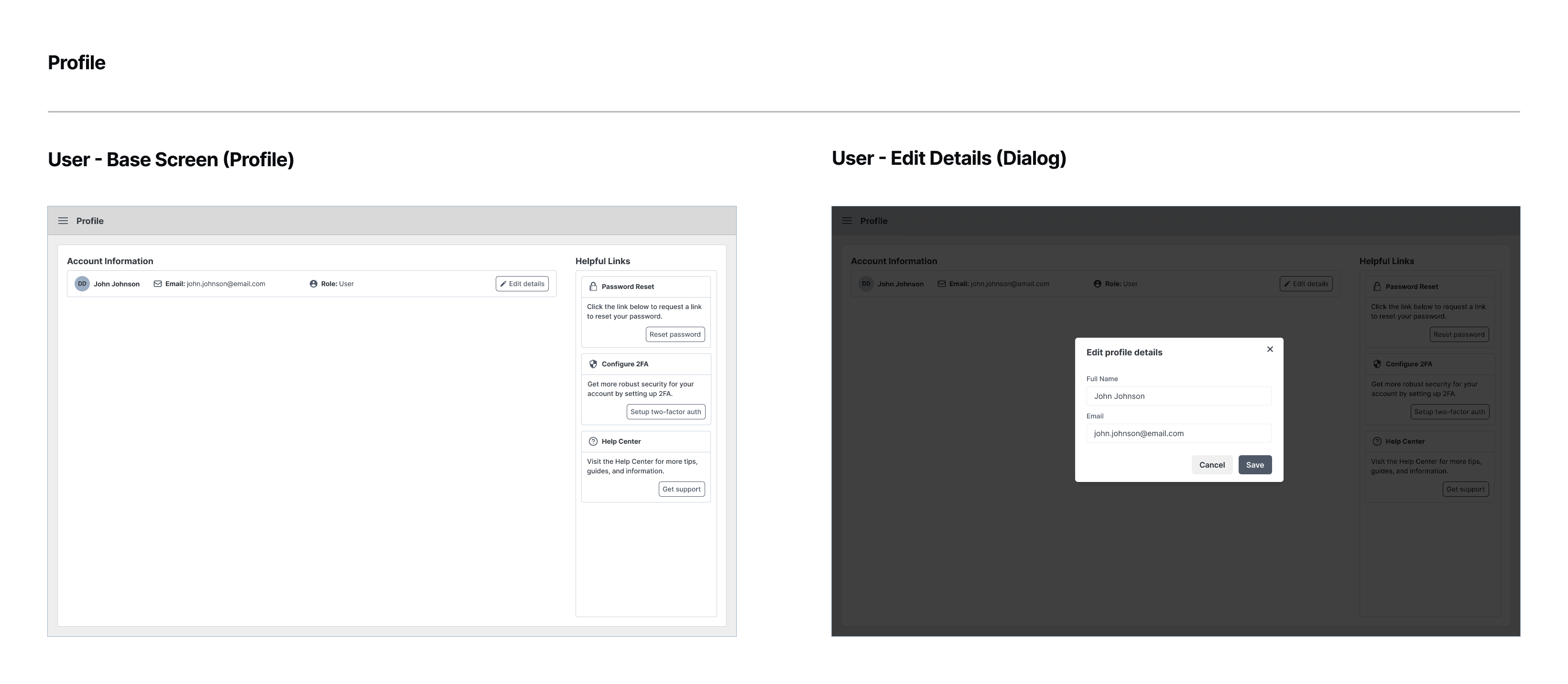
Account profile
This topic used the existing card pattern I applied in the other organization and show management screens. The profile included basic information and help links.
Password reset
I used the built-in form provided by AWS Cognito. I applied the existing account management form styles to match consistency. I added a custom “password strength” indicator to inform the user of how effective their new password was. I cleaned up any remaining screens and annotated them for development.
Client meeting
The project was winding down to the last three topics. I connected with the product manager to get a glance at what scope was remaining and to set up time to review the designs. Additionally, I inquired if the client wanted a prototype of the current experience from account activation to creating a take.
The product manager and I set up a meeting with the client team. The client requested to review all the remaining screens once the last topics were complete. The client agreed that a prototype would be beneficial. The product manager went over the remaining scope and timeline. I informed the client team I would complete the remaining topics and prototype and that we would review it together.
Prototype
The prototype covered login, show creation, accessing the dashboard and creating and saving a take. It showed how other features were accessed within the dashboard. The prototype was a clickthrough prototype, but did use transitions and other advanced properties to give the client an idea for what they could expect in a production environment. I completed the prototype and the next step was to wrap up the remaining design topics.
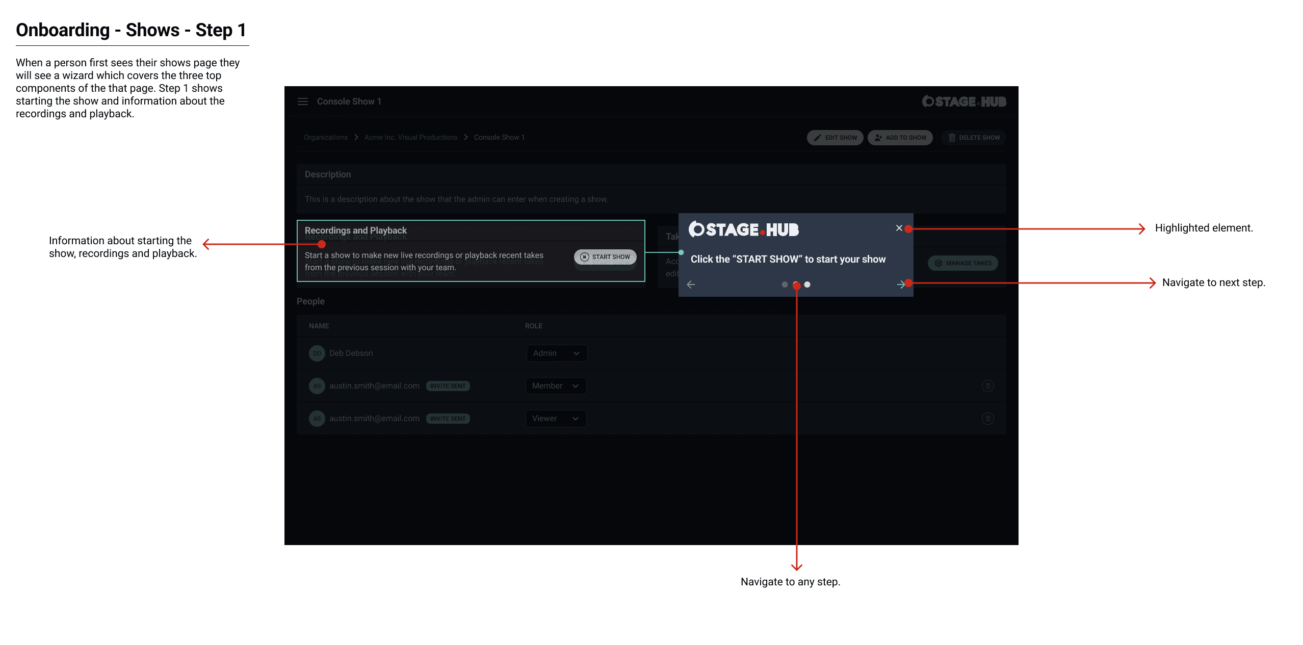
Help Center, Global Navigation and Onboarding
The last three topics for the application were not as large as the other topics. The help center was limited but would be expanded in the future once additional documentation became available. The global navigation was a standard collapsible menu with access to various points in the application. The onboarding experience was an integration with UserGuiding. I recommended this solution to save on time and budget.
Help Center
The help center was accessed throughout the application for help, guidance and feedback. I implemented a standard pattern that was seen in other chat and support assistants. I achieved this by using a prevalent icon that would expand a panel which displayed helpful links.
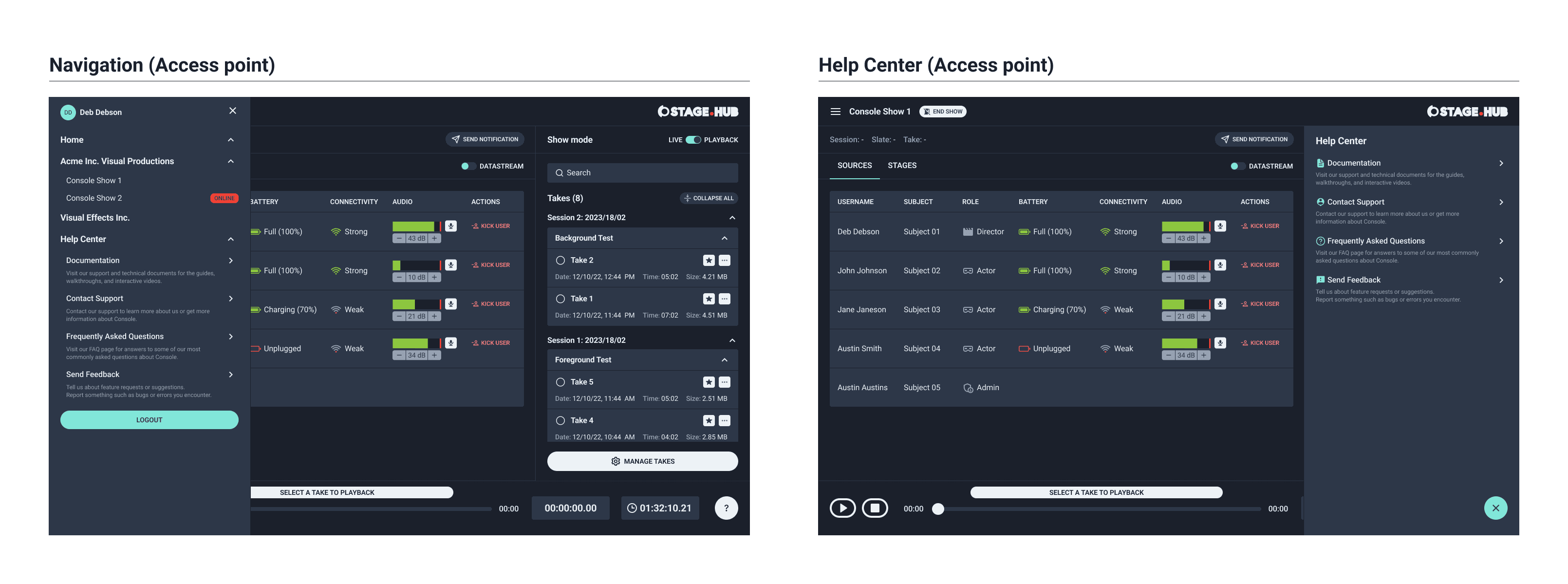
Navigation
I designed the navigation menu as a simple collapsible structure, making it easy for users to access different parts of the application. Using a familiar hamburger menu icon, I aimed for a clear and straightforward layout. Each navigation path was organized with consistent patterns and visuals, ensuring a seamless and intuitive experience for each user.
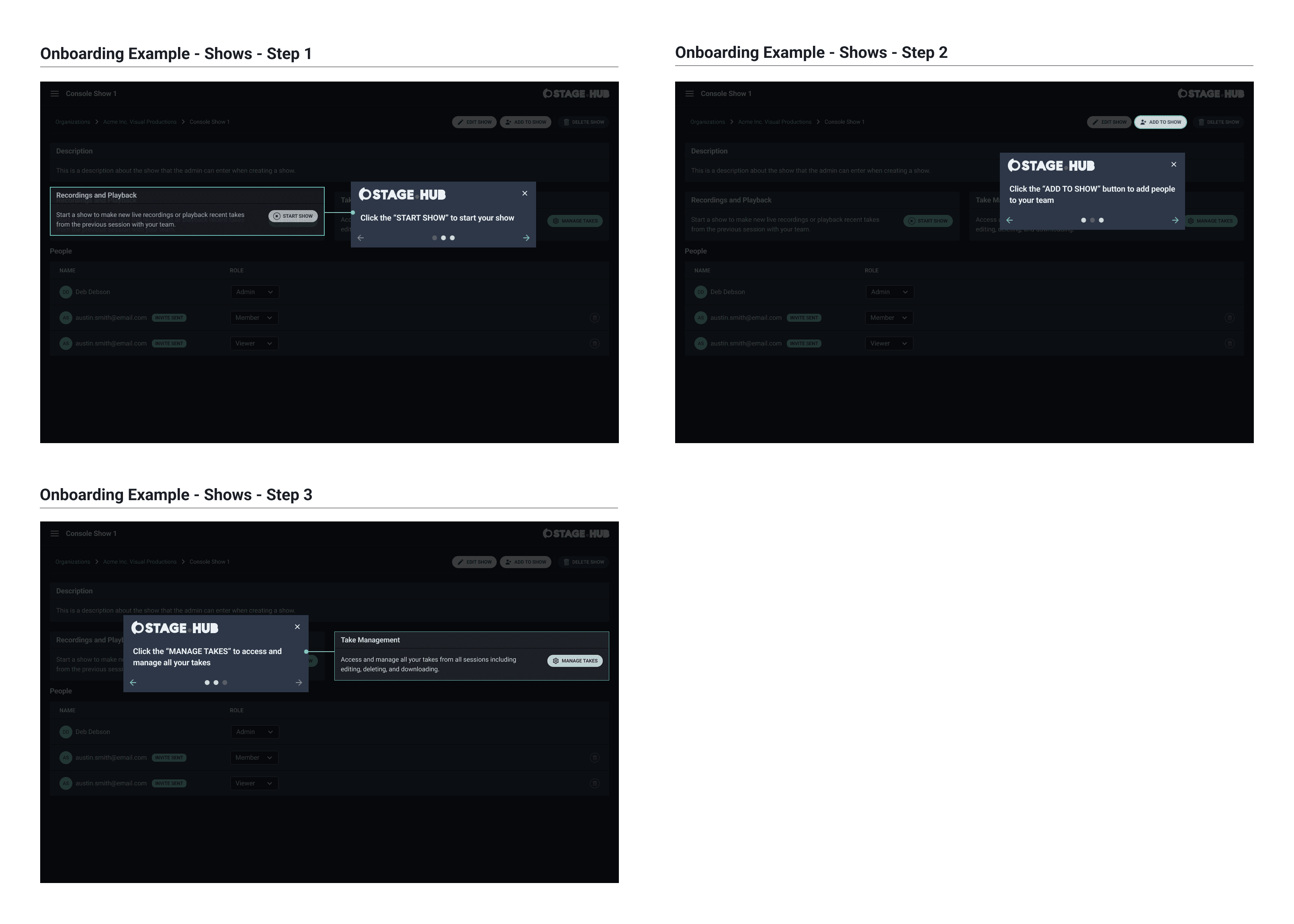
Onboarding
The onboarding experience was the final piece I worked on, using UserGuiding to create a welcoming and informative introduction for new users. I customized the built-in prompts to align with the overall design of the application. After wrapping up this last section, I annotated the remaining screens for development.
DESIGN
Prior to design
Prior to beginning the design phase I took all existing workflows and navigation and created a site map to show the structure and relationship of the application. The sitemap would contain a breakdown of all topics explored from the different phases.
PHASE FOUR
The final phase
Phase four covered high-fidelity mockups, pattern and component library and accessibility testing to persuade the client to a more web accessible and compliant color palette. In addition, a clickthrough prototype for the current experience was created. The design phase was scoped into a single phase to cover all these requests.
Assess current visuals and adjust design scope
The client’s existing color palette was not web accessible nor web-compliant. The first challenge was having the creative team of the studio agree to utilizing an alternative color selection to match ADA and WCAG standards. Their creative director was adamant about using their color palette. I conducted heuristics of their color palettes and provided recommendations based off of my assessments. The heuristics indicated their colors not passing ADA and WCAG standards. My heuristics showed color combinations that did meet those standards.
I recommended a color palette that aligned with ADA and WCAG standards and were web-compliant. I reviewed my heuristic analysis and the new recommended color palette with the client. After extensive discussion they agreed on the new proposed color palette. The application was created in a dark theme to retain application performance, reduce the eye strain and enhance productivity (the client spent a large amount of time between monitors and tablets running multiple shows sometimes in dimly lit environments).
Atoms
There was no existing design library. Originally, there were no plans to create a design library, but instead utilize Chakra or Tailwind. The client did not want to use an off-the-shelf option but wanted a custom solution. This required adjusting the project scope to accommodate the design library. The product manager and I discussed this with the client and they agreed with the new scope adjustment.
I created local styles for fonts and colors (variables were still in BETA for Figma). The pattern library adapted an atomic design approach. I created the base atoms for the components (inputs, labels, icons, buttons and more). The atoms were used to create the molecules.
Molecules
Next, I took the atoms and transformed them into molecules that were created into organisms. The molecules included header, subheaders, modals, panels and more. The molecules were used to create organisms and form the foundation for the application elements and pages.
Organisms
I utilized the molecules and transformed them into organisms which would be created into the final elements and pages. Examples of these organisms included login, navigation, onboarding, advanced panels and more. The organisms were the foundation and structure for the application templates and pages.
Completing the library
Next, I compiled all the organisms and molecules into base templates and pages that were utilized throughout the application. These included account and show management, take management, dashboard (live and playback modes) and more. Once the library was complete I scheduled a meeting with the client’s creative director, myself and the product manager. I went over the different fonts, colors and components. After discussing, the creative director gave their approval and I moved forward with high-fidelity design.
High-fidelity DESIGN
I started to work on the high-fidelity mockups for each of the core design topics. I also annotated the wireframes for development as each topic was completed. First, I worked on and completed the dashboard and its related design topics.
Dashboard (Live)
Utilizing “Live” and “Playback” mode was the most important aspect of the dashboard. I created various visual references for when “Live” mode was beginning, paused and stopped. The visual indicators helped the user understand what status the recording was in. I utilized the standard red that is seen in recording for active and stop. I used yellow for when a recording was paused. For (pre-recording) I used a prominent green. “Live” mode was themed with slight hints of red in the UI to show a transition between the dashboard modes.
Dashboard (Playback)
When the UI switched to “Playback” mode it switched to a turquoise color. I used this same color when the take was ready for playback. When the take was queued I used a clear and concise light gray. When a take was paused I used the same yellow from "Live" mode.
Dashboard (Live and Playback) - VIEWER
Viewer roles had access to “Live” and “Playback” modes. However, based on the previous established user permissions the viewer role was view-only. I condensed the dashboard to give viewers the information and access they needed to collaborate with their team. I omitted any controls or elements they did not require.
Dashboard (Checklist)
Next, I completed the high-fidelity mockups for the checklist. The checklist was incorporated as a list to quickly mark tasks as complete. The checklist was a panel as this would share the same space for the takes panel when switching between modes.
Dashboard (Notifications)
Then I completed the high-fidelity mockups for sending notifications. This feature was accessed through a dialog to give a clear way to select the applicable recipients, add them to the notification, enter the message and send the notification. The notification was received as a banner message so the recipients of the show could clearly see the message.
Dashboard (Takes Panel)
After notifications I completed the takes panel. This panel was accessible during recording and playback. While a take was being recorded the status of take was indicated in the transport control and the panel.
The takes panel was aggregated by session. The takes were consolidated into a card format and contained basic information, an action menu and favorite button. The controls and information were kept to secondary colors so as to not distract from the primary sources and stages.
Dashboard (Technical View)
The last portion of this dashboard was the technical view. This feature was called “Datastream” and was accessible to any admin or member. The technical view contained all the data-visualizations which were based off of Charts.JS. I chose an area graph to show a breakdown of transfer rate data in real-time. I recommended using the colors built into Charts.JS to keep these accessible and web compliant.
The primary chart and secondary charts utilized the same colors and broke down the data in different intervals; an aggregate and an individual summary. I connected with the product manager and reviewed the screens. We set up a design review with the client.
Design Review
I reviewed the mockups with the client team. The feedback was very positive but they requested to see other color variations for the area chart. I created several other mockups to match their request. I was adamant about using the provided colors to keep the data-visualizations web-standard and accessible. The client reviewed the mockups and agreed with my recommendation.
Take Management
The next topic I completed was take management. Managing takes was primarily done from the take management page that contained more information and data about the takes. I used a table format given the amount of data that separated the primary view from the secondary view (favorite takes).
I implemented an action menu with a multiselect pattern (on:focus) to prevent redundant actions and to allow bulk actions. I balanced neutral colors between the controls and information. This view adopted the existing patterns I utilized elsewhere in the application. I created variant screens to cover other edge cases for tooltips and collapsed views. I wrapped up the remaining screens and annotated them for engineering.
Organization Management
This topic utilized a card format since there was limited information that a user required to see (each user role has their respective view) and would access it to manage their team and shows. I cascaded the card format and colors to the individual organization page’s primary controls, secondary controls, information and tertiary actions.
Adding an admin, editing and deleting an organization was done through a dialog to confirm the user wanted to complete these actions. I completed the organization screens and annotated them for development.
Show Management
I mirrored the visual and interaction patterns from organization management to the show management. This approach retained continuity to the admins and members between organizations and shows. I created a view-only view for viewers and a standard view for super admins, admins and members. I finalized the screens and annotated them for development. I reviewed both sets of mockups with the product manager and engineering.
There were a few clarifying questions from the engineers which I answered. Then, I presented both sets of screens to the client team. There was some minor feedback on differentiating some of the controls from white to gray.
I explained that a user might assume the control is not accessible because it's gray and that white was used for secondary controls throughout the UI. We discussed and they agreed on using white. The client requested us move forward with the remaining topics.
Account Management
For this topic I used a standard structure and pattern found in most account management experiences. An established and recognizable pattern made it easier for users to quickly understand how to access the application and collaborate with their team members. I completed all the high-fidelity mockups first and then annotated them all at once. I did this because engineering was completing the backend service and frontend simultaneously for this topic and this saved time.
Account activation and Login
I used the built-in form provided by AWS Cognito. Some customization was required in the configuration for account activation. I applied the information and controls the user would need to complete their registration. Login was a basic form implementation. I created the main screen and subsequent variants and applied the new styles.
Account profile
This topic used the existing card pattern I applied in the other organization and show management screens. The profile included basic information and help links.
Password reset
I used the built-in form provided by AWS Cognito. I applied the existing account management form styles to match consistency. I added a custom “password strength” indicator to inform the user of how effective their new password was. I cleaned up any remaining screens and annotated them for development.
Client meeting
The project was winding down to the last three topics. I connected with the product manager to get a glance at what scope was remaining and to set up time to review the designs. Additionally, I inquired if the client wanted a prototype of the current experience from account activation to creating a take.
The product manager and I set up a meeting with the client team. The client requested to review all the remaining screens once the last topics were complete. The client agreed that a prototype would be beneficial. The product manager went over the remaining scope and timeline. I informed the client team I would complete the remaining topics and prototype and that we would review it together.
Prototype
The prototype covered login, show creation, accessing the dashboard and creating and saving a take. It showed how other features were accessed within the dashboard. The prototype was a clickthrough prototype, but did use transitions and other advanced properties to give the client an idea for what they could expect in a production environment. I completed the prototype and the next step was to wrap up the remaining design topics.
Help Center, Global Navigation and Onboarding
The last three topics for the application were not as large as the other topics. The help center was limited but would be expanded in the future once additional documentation became available. The global navigation was a standard collapsible menu with access to various points in the application. The onboarding experience was an integration with UserGuiding. I recommended this solution to save on time and budget.
Help Center
The help center was accessed throughout the application for help, guidance and feedback. I implemented a standard pattern that was seen in other chat and support assistants. I achieved this by using a prevalent icon that would expand a panel which displayed helpful links.
Navigation
I designed the navigation menu as a simple collapsible structure, making it easy for users to access different parts of the application. Using a familiar hamburger menu icon, I aimed for a clear and straightforward layout. Each navigation path was organized with consistent patterns and visuals, ensuring a seamless and intuitive experience for each user.
Onboarding
The onboarding experience was the last topic to be completed and utilized UserGuiding which provided an intuitive onboarding experience for new users. I styled the built in prompts to match the rest of the application. Once I completed the final topic I annotated the remaining screens for development.
NEXT STEPS
CLIENT REVIEW
The next step was to review with the client and acquire final approval. In addition, make any last adjustments based on feedback and answer any clarifying questions for engineering. There was no feedback or requests to implement. The client was delighted with the final result and were excited for their BETA. Engineering had some clarifying questions which I answered and they moved forward with development.
OUTCOMES
Successful BETA
The client team reported that their BETA was very successful, leading to increased business and new partnerships from utilizing their application. The product was well received, with a key quote from the client team being, "This application saves our partners and us so much time and is very easy to use." This success resulted in additional business for my team.
Successful FIRST BETA
The client team informed us that their first BETA was very successful. It resulted in more testers and partnerships from utilizing their application. In addition, the product was very well received and a key quote from the client team was “This application saves our partners and us so much time and is very easy to use.” This outcome resulted in future business for my team.
Delivered early and in budget
My team and I managed time and requirements very effectively. We delivered the product several weeks ahead of schedule, despite a tight and complex timeline. We stayed within budget, including additional work scoped in after planning. Both the client and our executive leadership team were very pleased with the result.
OUTCOMES
Successful BETA
The client team reported that their BETA was very successful, leading to increased business and new partnerships from utilizing their application. The product was well received, with a key quote from the client team being, "This application saves our partners and us so much time and is very easy to use." This success resulted in additional business for my team.
Delivered early and in budget
My team and I managed time and requirements very effectively. We delivered the product several weeks ahead of schedule, despite a tight and complex timeline. We stayed within budget, including additional work scoped in after planning. Both the client and our executive leadership team were very pleased with the result.
LEARNINGS
Motion-capture process
Understanding the technical process and setup required to accurately capture motion graphics was one of the most complex tasks I’ve ever undertaken. The setup involves multiple facets and numerous individuals performing different tasks that must be synchronized. Learning about their day-to-day process and applying it to create and test my own work was highly rewarding.
Learning Unreal
The project timeline was very constrained given the extensive scope. With the additional scope, there was limited time to learn Unreal Engine, which was crucial for delivering the desired outcome for client and their partners.
To provide the best design that complemented their environment, I needed to learn Unreal Engine as thoroughly as possible. I utilized Udemy and other online resources to gain a comprehensive understanding of Unreal Engine 5. Learning Unreal and the motion-capture process provided me with a holistic view, enabling me to deliver the best possible outcome for the client.