Simplify Express Checkout
Simplify Express Checkout
Meijer, a leading grocery chain based in the United States, asked for a better express Rx checkout to
improve the checkout experience for their customers.
Meijer, a leading grocery chain based in the United States, asked for a better express Rx checkout to improve the checkout experience for their customers.
GOALS
Evaluate and make recommendations for Meijer's iOS mobile app. Plan, design, and validate a new and improved Rx express checkout experience from my findings. Improve the app store's rating through an improved user experience.
CHALLENGES
Incomplete and incorrect user research.
Diplomacy; integrating atop a different team get to help them get
back on track.Small timeframe to examine other design's team research and recommendations and correct any errors found.
Poor existing user experience with large client expectation to increase app store rating.
Improve the complex pharmacy process from both a logistical and technical aspect.
MY ROLE
Build wireframes for various pharmacy features and services.
Conduct remote interviews for different users.
Perform research in relation to current workflow and architecture.
Create reference and action point analysis.
Compile detailed report of findings from research.
Create in-depth heuristic of existing designs, detail issues, and provide recommendations (utilizing Nielsen's 10 Heuristics).
WHAT I DELIVERED
20-page analysis of client’s UX Design (reference & action, workflow and architecture analysis)
5 User interview transcripts
1 Competitive analysis
20 High-fidelity wireframes
3 UI flows (one each use case)
15-page heuristic evaluation utilizing Nielsen's 10 Principles and iOS best practices and guidelines
RESEARCH
on-boarding
This project came as an opportunity to help a client’s internal UX team (a separate offshore TCS team) to improve various features for the Meijer iOS app. The app in the Apple Store had a low score (3.2/5), and the business side wanted to improve that as much as possible. They wanted to improve their stance in the market as more competitors started popping up and moving to robust online solutions. During this meeting we discussed the specific tasks that needed to be accomplished. The client's internal UX team (separate TCS team) had spent a significant amount of time coming up with a redesign but had reached a roadblock and now required TCSI’s assistance.
kickoff meeting
I organized a kick-off meeting with the client's TCS design team, my internal team (myself, the director, senior researcher, and one other designer), and the client account team. The client account team asked my team to assess their current efforts and go from there. The first task was to evaluate their existing concept, identify issues, make recommendations, and create a report from these findings. The second task was to design and test a new and improved pharmacy express checkout experience based on the findings of the report.

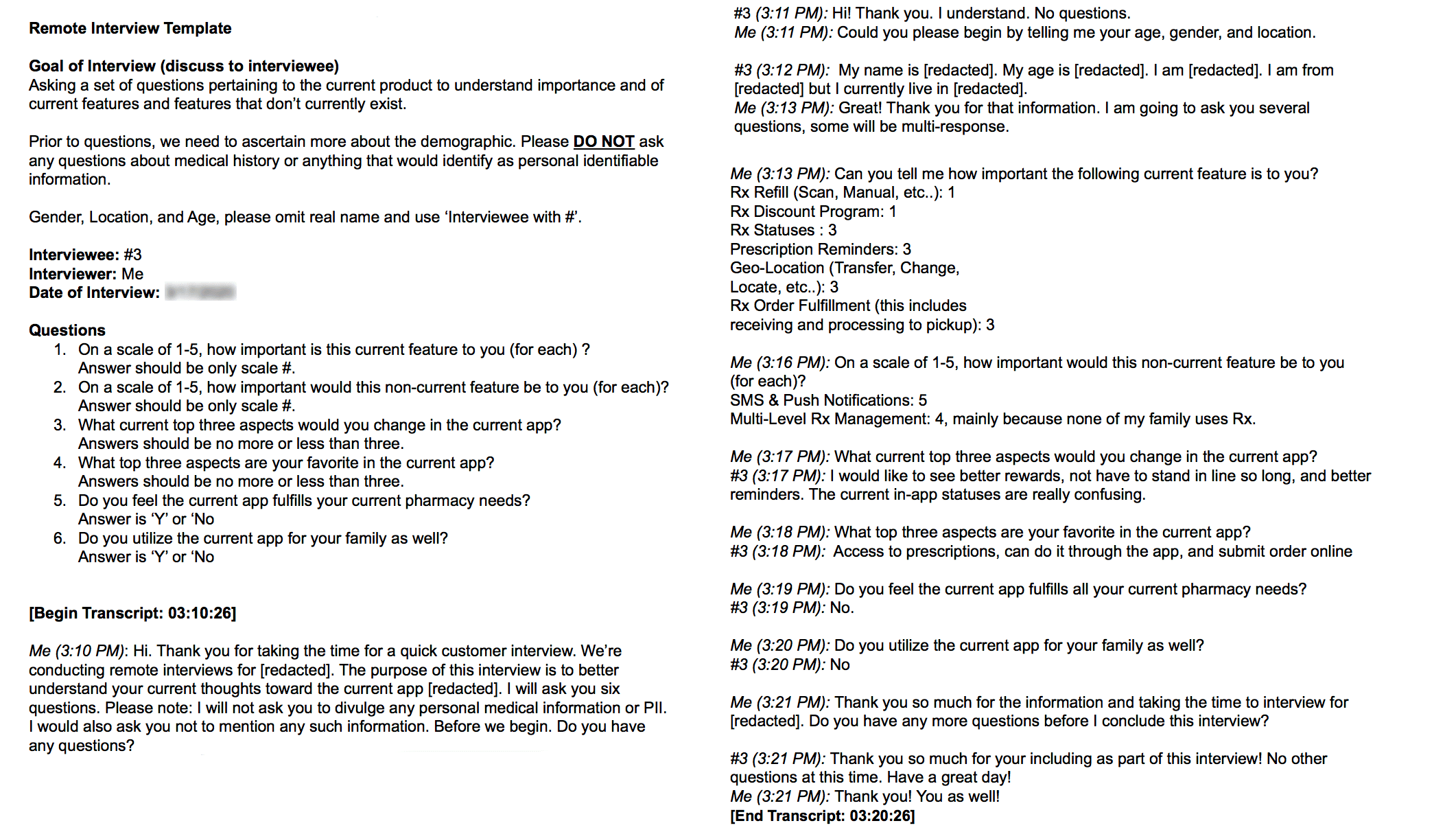
conducting interviews
The only user research the internal TCS team had looked at were the reviews of the app. This information gave insight into some of the existing problems the current app had; however, much of it was vague and didn’t address specific issues. I needed to understand from a user's perspective some of the specific outstanding pain points so that I could get a better benchmark for improvement. Therefore, I conducted user interviews for six customers, as this is what the time and budget would allow.
The researcher provided the participants and composed a set of criteria and questions for these interviews. I planned and facilitated the interview sessions in a remote environment through Skype. Afterward, I built out chat transcripts from the calls and compiled them into a basic text document from which the team and I could later extrapolate key concerns.
key findings
I found that current customers are annoyed with the checkout process.
Customers didn't understand why it took so long to checkout and why there were so many screens. They also thought the existing SMS method was buggy and minimal.
There was no push notification communication method beyond updates, and there was a delay between notification and pickup.
Because of system lag time, customers would often arrive 30 minutes before their prescription was ready, sometimes even earlier.
Lastly, customers wondered why Meijer lacked in-store Wifi, especially in certain rural and urban areas.
the goals
Effectively communicate the right details and information to the customer through SMS and other methods.
Offer counter-solutions to a lack of reception or in-store Wifi.
Improve the app store rating within a set timeframe.
Solve the engineering backend system issues to reduce lag and delay time between pharmacist and customer.

online vs in-store pickup customers
Most customers who use mobile express checkout to pick up their prescriptions differ from traditional demographics. Online customers prefer to have their order shipped or sent to a pickup locker. If they do have to go to the pharmacy, they do not want to wait to have their order filled. In-store pickup customers bypass the online process by either calling in their order over the phone or doing it while they shop. These customers usually don't mind waiting.
The target persona: Linda
Lives in a urban or suburban dwelling.
Age 21-48.
Is very comfortable with technology, especially smartphones.
Does not want to wait; would prefer shipping or locker as opposed to in-store pickup.
Relies on and expects a quick and easy express checkout process, whether through text or notifications.
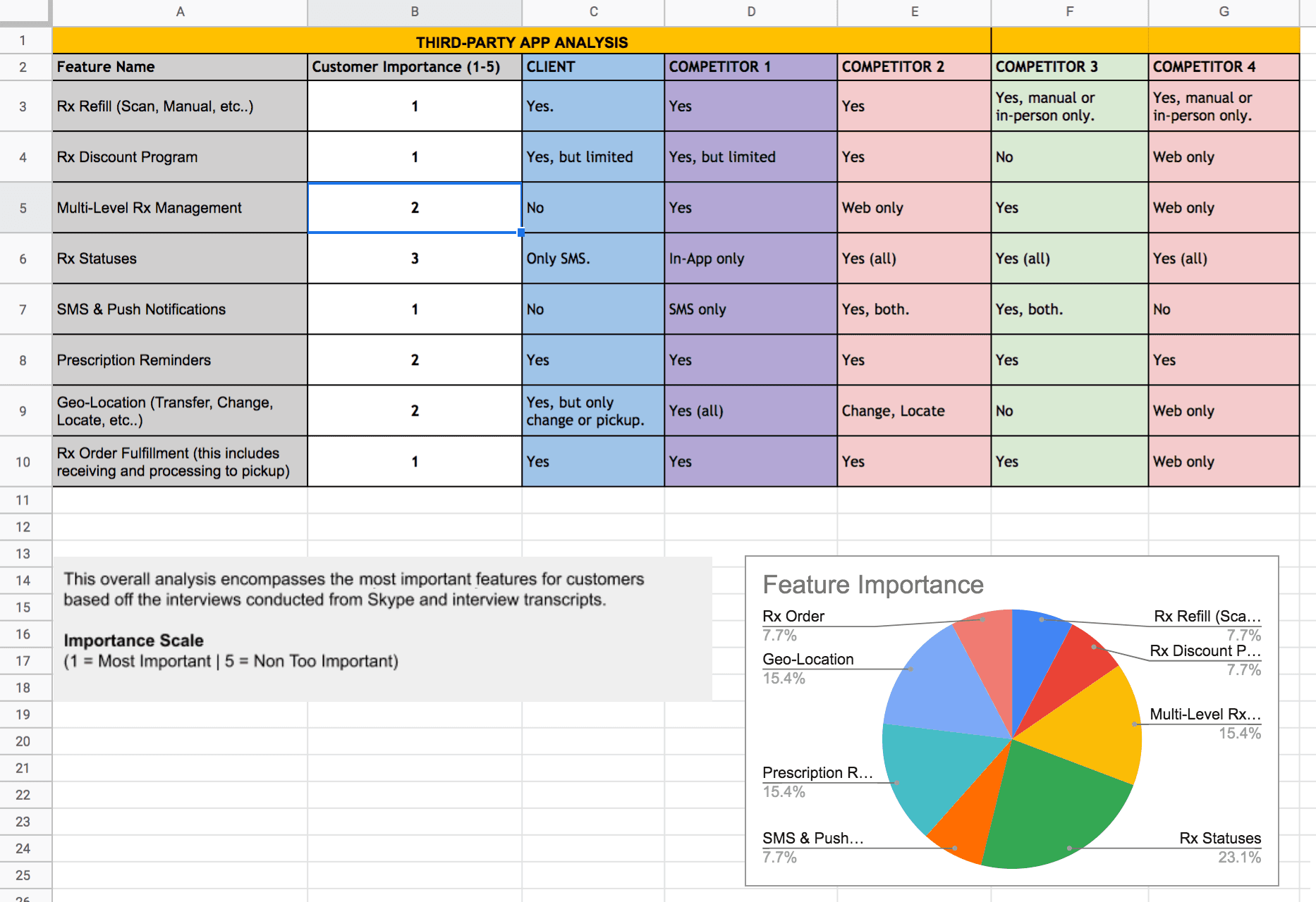
competitive analysis
I began by completing a competitive analysis, which gave me excellent insight into which key features were part of major pharmacy apps other than Meijer's. This allowed me to compare and contrast between Meijer and other major competitors as I was identifying key issues (weaknesses) and recommendations (strengths) to help Meijer improve their position within their current market of the Midwest.
RESEARCH
on-boarding
This project came as an opportunity to help a client’s internal UX team (a separate offshore TCS team) to improve various features for the Meijer iOS app. The app in the Apple Store had a low score (3.2/5), and the business side wanted to improve that as much as possible. They wanted to improve their stance in the market as more competitors started popping up and moving to robust online solutions. During this meeting we discussed the specific tasks that needed to be accomplished. The client's internal UX team (separate TCS team) had spent a significant amount of time coming up with a redesign but had reached a roadblock and now required TCSI’s assistance.
kickoff meeting
I organized a kick-off meeting with the client's TCS design team, my internal team (myself, the director, senior researcher, and one other designer), and the client account team. The client account team asked my team to assess their current efforts and go from there. The first task was to evaluate their existing concept, identify issues, make recommendations, and create a report from these findings. The second task was to design and test a new and improved pharmacy express checkout experience based on the findings of the report.
conducting interviews
The only user research the internal TCS team had looked at were the reviews of the app. This information gave insight into some of the existing problems the current app had; however, much of it was vague and didn’t address specific issues. I needed to understand from a user's perspective some of the specific outstanding pain points so that I could get a better benchmark for improvement. Therefore, I conducted user interviews for six customers, as this is what the time and budget would allow.
The researcher provided the participants and composed a set of criteria and questions for these interviews. I planned and facilitated the interview sessions in a remote environment through Skype. Afterward, I built out chat transcripts from the calls and compiled them into a basic text document from which the team and I could later extrapolate key concerns.
key findings
I found that current customers are annoyed with the checkout process.
Customers didn't understand why it took so long to checkout and why there were so many screens. They also thought the existing SMS method was buggy and minimal.
There was no push notification communication method beyond updates, and there was a delay between notification and pickup.
Because of system lag time, customers would often arrive 30 minutes before their prescription was ready, sometimes even earlier.
Lastly, customers wondered why Meijer lacked in-store Wifi, especially in certain rural and urban areas.
the goals
Effectively communicate the right details and information to the customer through SMS and other methods.
Offer counter-solutions to a lack of reception or in-store Wifi.
Improve the app store rating within a set timeframe.
Solve the engineering backend system issues to reduce lag and delay time between pharmacist and customer.
online vs in-store pickup customers
Most customers who use mobile express checkout to pick up their prescriptions differ from traditional demographics. Online customers prefer to have their order shipped or sent to a pickup locker. If they do have to go to the pharmacy, they do not want to wait to have their order filled. In-store pickup customers bypass the online process by either calling in their order over the phone or doing it while they shop. These customers usually don't mind waiting.
The target persona: Linda
Lives in a urban or suburban dwelling.
Age 21-48.
Is very comfortable with technology, especially smartphones.
Does not want to wait; would prefer shipping or locker as opposed to in-store pickup.
Relies on and expects a quick and easy express checkout process, whether through text or notifications.
competitive analysis
I began by completing a competitive analysis, which gave me excellent insight into which key features were part of major pharmacy apps other than Meijer's. This allowed me to compare and contrast between Meijer and other major competitors as I was identifying key issues (weaknesses) and recommendations (strengths) to help Meijer improve their position within their current market of the Midwest.
PLAN
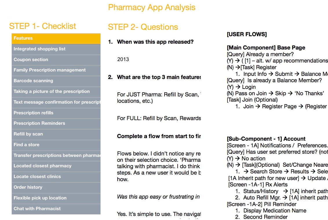
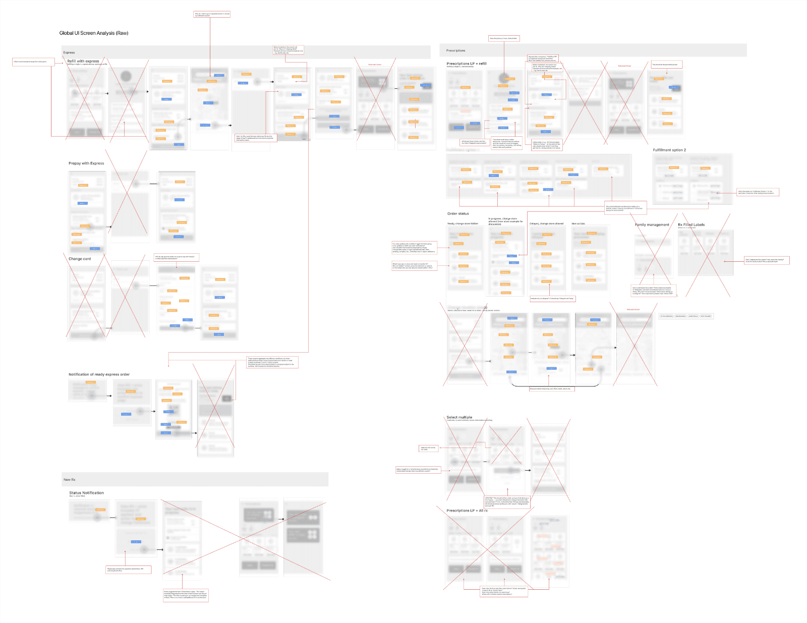
architecture analysis
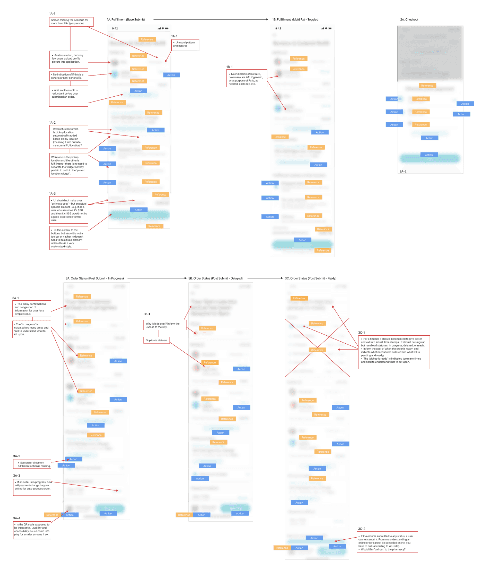
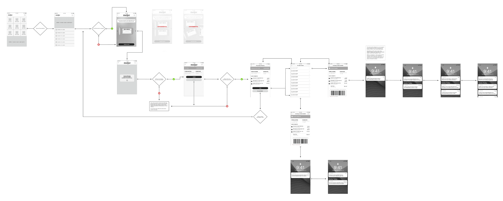
The competitive research had given me a better understanding of the current user experience. Next, to understand what workflow, actions, and references the client’s design team was trying to achieve, I did a raw analysis of the architecture of the existing screens. In the process, I omitted duplicate screens and added relevant red line notes where needed. I then compiled a word doc of the architecture analysis and met with the team to discuss it. The lead and I discussed an approach, deciding I would also do an action, reference, and workflow analysis.
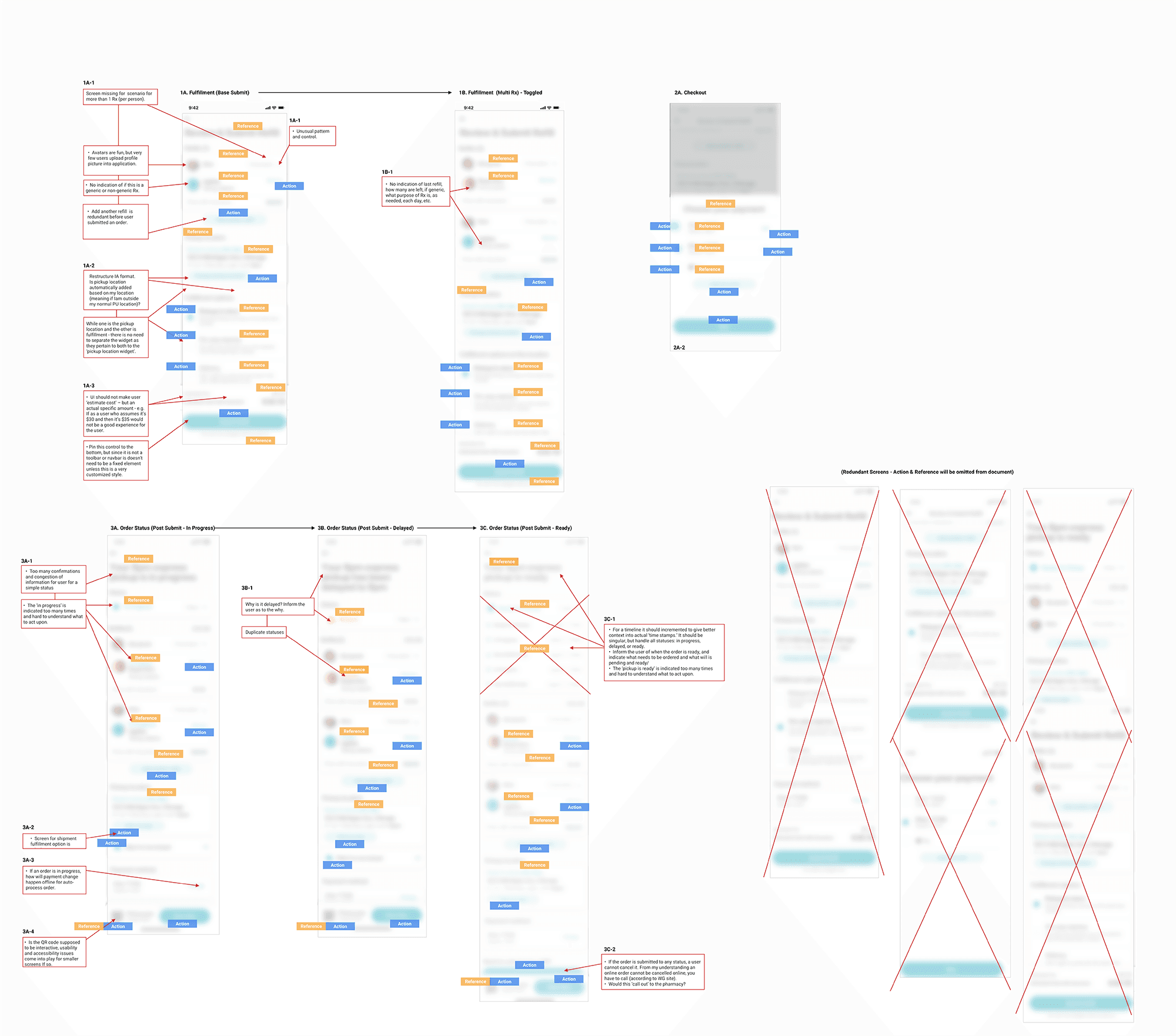
action and reference analysis
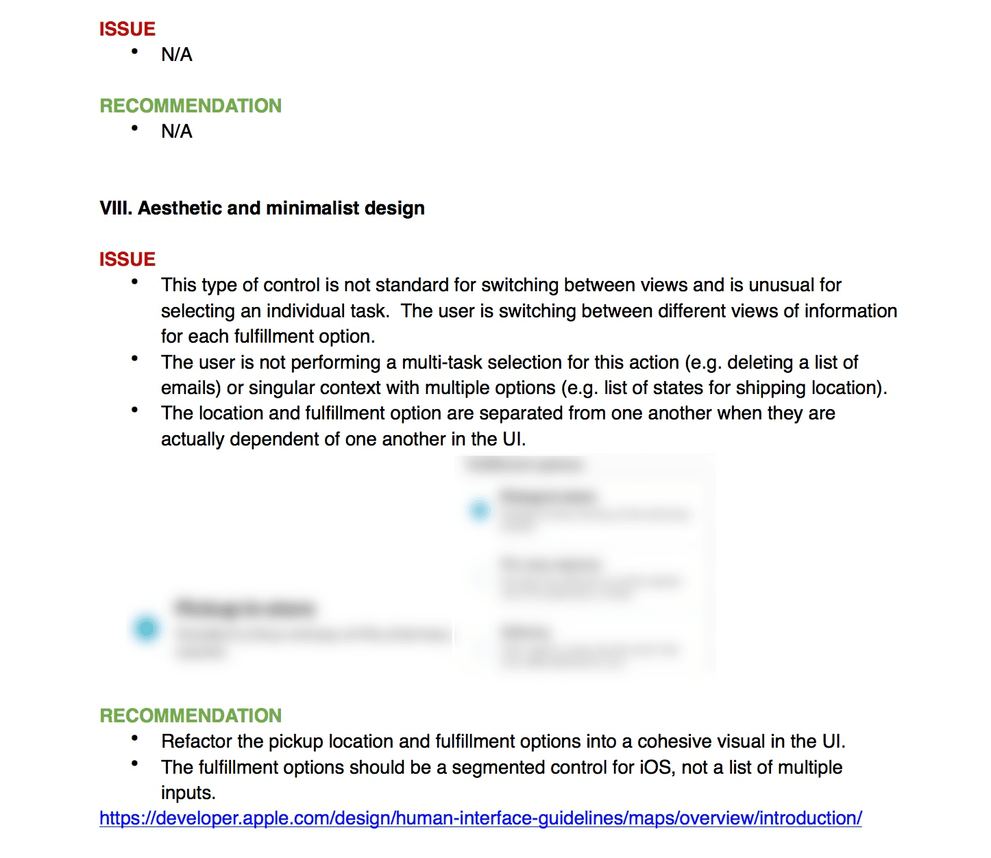
The next step was to get a better understanding of the current information architecture and primary, secondary, and tertiary actions by scrutinizing the existing actions and references on each screen. The analysis would define any inconsistencies in the information, navigation, and content of the provided screens.
action and reference analysis
The next step was to get a better understanding of the current information architecture and primary, secondary, and tertiary actions by scrutinizing the existing actions and references on each screen. The analysis would define any inconsistencies in the information, navigation, and content of the provided screens.
workflow analysis
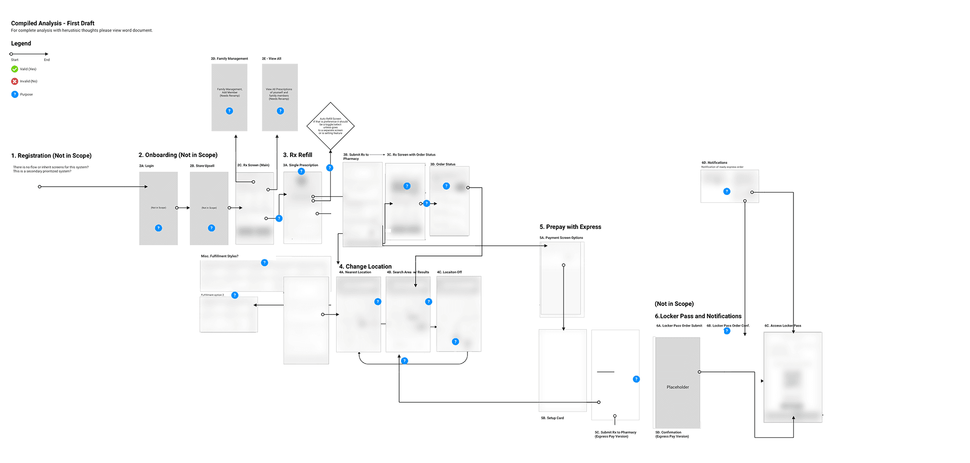
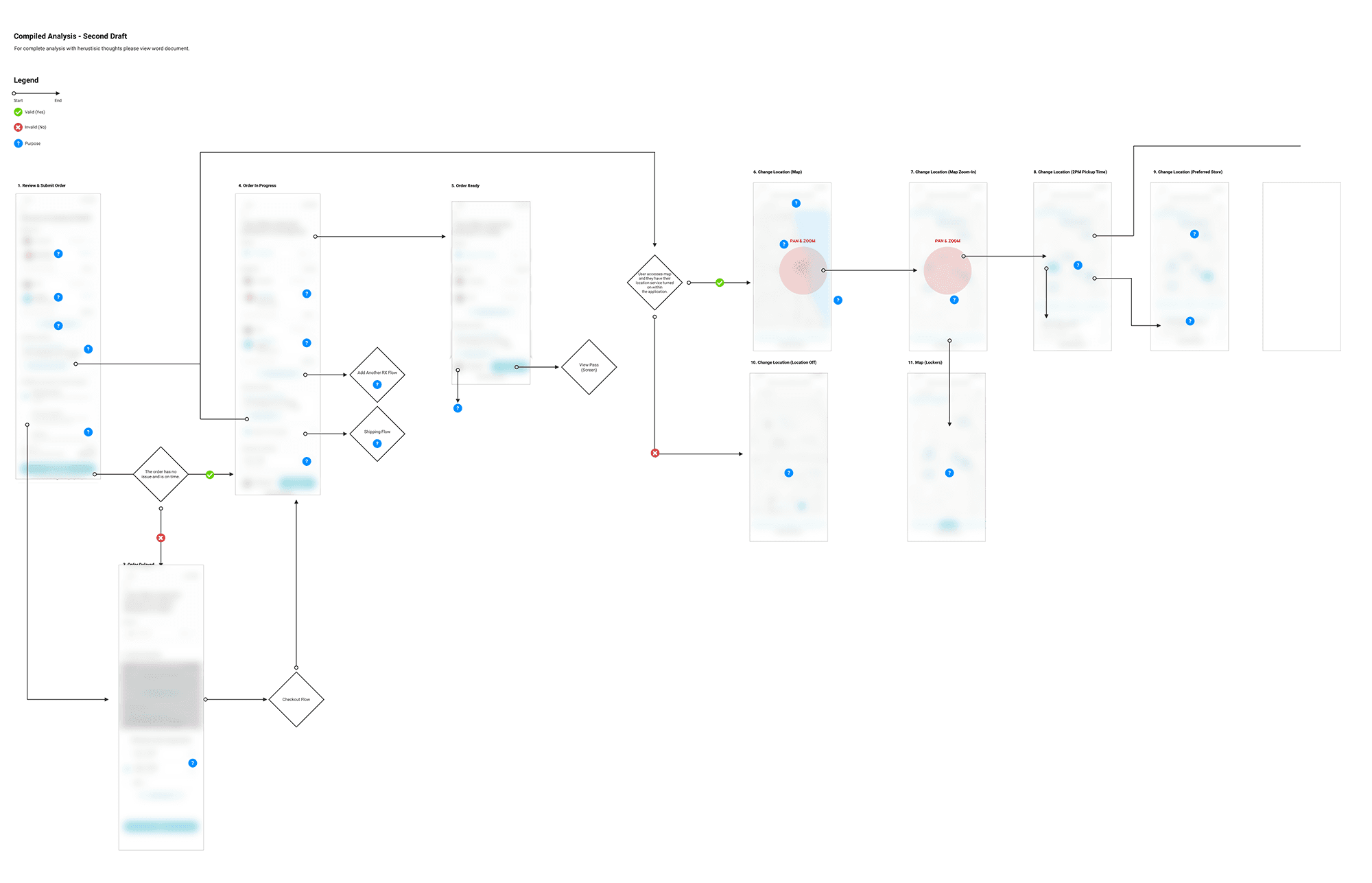
I compiled a workflow analysis that included the omitted actions and references as well as the redundant screens as identified in my architecture analysis. I divided the workflow into three primary tasks for investigation: rx refill, checkout and location services, and prepay with express. In addition, I incorporated out of scope examinations of the few screens that existed for on-boarding and locker pass/notifications into the workflow analysis. After I completed the inquiry, I put the information into the control doc. In the end, the analysis revealed the vast disconnect in workflow.
sharing the first analysis
I shared the first analysis with the team and product owner. I showed them the gaping errors in workflow and architecture, which included the overall inconsistencies I had found in the UI in terms of actions, references, and information, and which are addressed in detail below. The client feedback was positive.
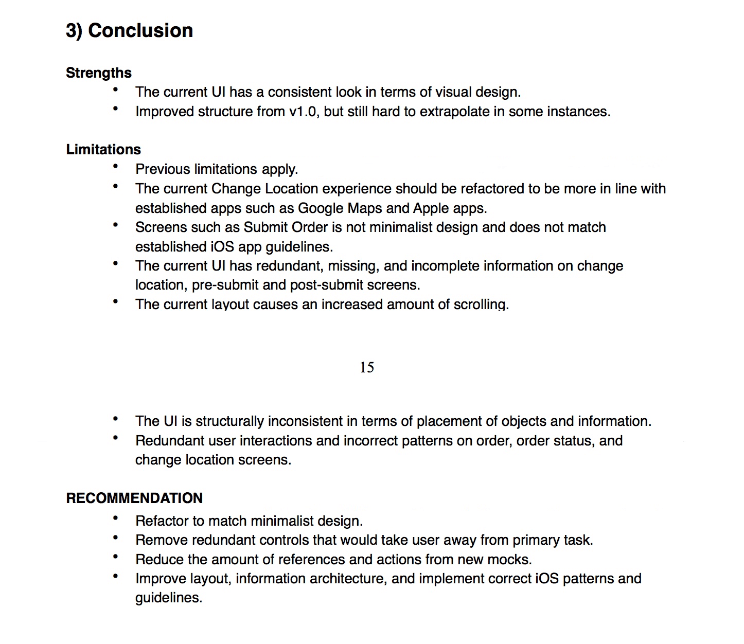
key findings from 1.0
In the existing workflow, the checkout process had far too many steps. It required almost seven steps to complete a simple refill, prepay, and set up a prescription for an auto-refill.
Because there were multiple duplicate screens, the workflow itself was hard to ascertain. There was no direct user flow. A lot of workflow paths overlapped without producing an outcome.
The UI was structurally inconsistent in terms of navigation and placement of objects, information, and content.
I also noted specific architectural limitations and incorrect controls in relation to very specific portions of the UI.
Even though this was for iOS, I could not identify the issues or make recommendations in accordance with those guidelines due to low fidelity and a lack of continuity in the existing wireframes.

present findings
I presented my comprehensive report to my team. It covered the issues and recommendations relevant to workflow, architecture, information, and content for the first set of screens. The team suggested that we put together a presentation to share with the client account team and the client's internal UX team. The feedback we received from them had been mostly positive. We did find out that the offshore design team had been working on a separate set of screens, which was not authorized.
the second analysis
The secondary analysis wasn't as extensive as the first. It incorporated some of the same methods I had used in the previous analysis, including action, reference, and workflow. However, at this stage, since the screens were higher fidelity, I developed a more detailed heuristic utilizing Nielsen’s 10 Principles and iOS guidelines and best practices. The new screens were an improvement to v1.0 screens. The workflow was moved into a centralized fulfillment workflow.
key findings from 2.0
There were improvements primarily to workflow which reduced the extra and redundant screens for checkout.
It didn't fully solve for a simple express checkout experience; rather it assembled together screens from portions of different workflows which, all together, conveyed how a customer would pay and refill.
It neither conveyed a good stream of information to the customer nor solved for the existing SMS or notification issues.
It demonstrated no method for reducing delay between the customer and pharmacy.
completing the report
I shared these findings with the rest of the team, who then asked me to compile a complete report and presentation for the client account and UX team. After finishing my heuristic report, which included the raw analysis I had done, I began to put together a presentation. The recommendations provided examples of how we might solve for the key issues identified in 2.0. The main feedback I received on the report was to put together a presentation summarizing the heuristic evaluation: issues and recommendations. The client was happy with the report, and from here we determined the second phase.
establishing need
The analysis, reports, and research identified the needs of the user relative to achieving the goals the team and I had defined.
An improved express checkout experience based on the report
and findings.Enhanced communication methods through SMS and push notification methods.
Secondary methods in case there is no in-store Wifi or there is an issue with the mobile service.
A robust and smart backend to reduce lag and delay between pharmacy and customer communications.
A streamlining of the current redesign effort by the internal client UX team in order to better equip them for future efforts.
PLAN
architecture analysis
The competitive research had given me a better understanding of the current user experience. Next, to understand what workflow, actions, and references the client’s design team was trying to achieve, I did a raw analysis of the architecture of the existing screens. In the process, I omitted duplicate screens and added relevant red line notes where needed. I then compiled a word doc of the architecture analysis and met with the team to discuss it. The lead and I discussed an approach, deciding I would also do an action, reference, and workflow analysis.
action and reference analysis
The next step was to get a better understanding of the current information architecture and primary, secondary, and tertiary actions by scrutinizing the existing actions and references on each screen. The analysis would define any inconsistencies in the information, navigation, and content of the provided screens.
workflow analysis
I compiled a workflow analysis that included the omitted actions and references as well as the redundant screens as identified in my architecture analysis. I divided the workflow into three primary tasks for investigation: rx refill, checkout and location services, and prepay with express. In addition, I incorporated out of scope examinations of the few screens that existed for on-boarding and locker pass/notifications into the workflow analysis. After I completed the inquiry, I put the information into the control doc. In the end, the analysis revealed the vast disconnect in workflow.
sharing the first analysis
I shared the first analysis with the team and product owner. I showed them the gaping errors in workflow and architecture, which included the overall inconsistencies I had found in the UI in terms of actions, references, and information, and which are addressed in detail below. The client feedback was positive.
key findings from 1.0
In the existing workflow, the checkout process had far too many steps. It required almost seven steps to complete a simple refill, prepay, and set up a prescription for an auto-refill.
Because there were multiple duplicate screens, the workflow itself was hard to ascertain. There was no direct user flow. A lot of workflow paths overlapped without producing an outcome.
The UI was structurally inconsistent in terms of navigation and placement of objects, information, and content.
I also noted specific architectural limitations and incorrect controls in relation to very specific portions of the UI.
Even though this was for iOS, I could not identify the issues or make recommendations in accordance with those guidelines due to low fidelity and a lack of continuity in the existing wireframes.
present findings
I presented my comprehensive report to my team. It covered the issues and recommendations relevant to workflow, architecture, information, and content for the first set of screens. The team suggested that we put together a presentation to share with the client account team and the client's internal UX team. The feedback we received from them had been mostly positive. We did find out that the offshore design team had been working on a separate set of screens, which was not authorized.
the second analysis
The secondary analysis wasn't as extensive as the first. It incorporated some of the same methods I had used in the previous analysis, including action, reference, and workflow. However, at this stage, since the screens were higher fidelity, I developed a more detailed heuristic utilizing Nielsen’s 10 Principles and iOS guidelines and best practices. The new screens were an improvement to v1.0 screens. The workflow was moved into a centralized fulfillment workflow.
key findings from 2.0
There were improvements primarily to workflow which reduced the extra and redundant screens for checkout.
It didn't fully solve for a simple express checkout experience; rather it assembled together screens from portions of different workflows which, all together, conveyed how a customer would pay and refill.
It neither conveyed a good stream of information to the customer nor solved for the existing SMS or notification issues.
It demonstrated no method for reducing delay between the customer and pharmacy.
completing the report
I shared these findings with the rest of the team, who then asked me to compile a complete report and presentation for the client account and UX team. After finishing my heuristic report, which included the raw analysis I had done, I began to put together a presentation. The recommendations provided examples of how we might solve for the key issues identified in 2.0. The main feedback I received on the report was to put together a presentation summarizing the heuristic evaluation: issues and recommendations. The client was happy with the report, and from here we determined the second phase.
establishing need
The analysis, reports, and research identified the needs of the user relative to achieving the goals the team and I had defined.
An improved express checkout experience based on the report
and findings.Enhanced communication methods through SMS and push notification methods.
Secondary methods in case there is no in-store Wifi or there is an issue with the mobile service.
A robust and smart backend to reduce lag and delay between pharmacy and customer communications.
A streamlining of the current redesign effort by the internal client UX team in order to better equip them for future efforts.
DESIGN
phase two
The research I conducted was pivotal in helping validate some of the issues I had found. It also showed that the recommendations and issues I identified in the v1.0 and v2.0 screens did not solve all the key issues diagnosed in the user interviews. As such, phase two for design would encompass the other three modules that had been pinpointed by the user research. These three use cases had not been conceptualized by the client's UX internal team during the new redesign approach.
sms concept
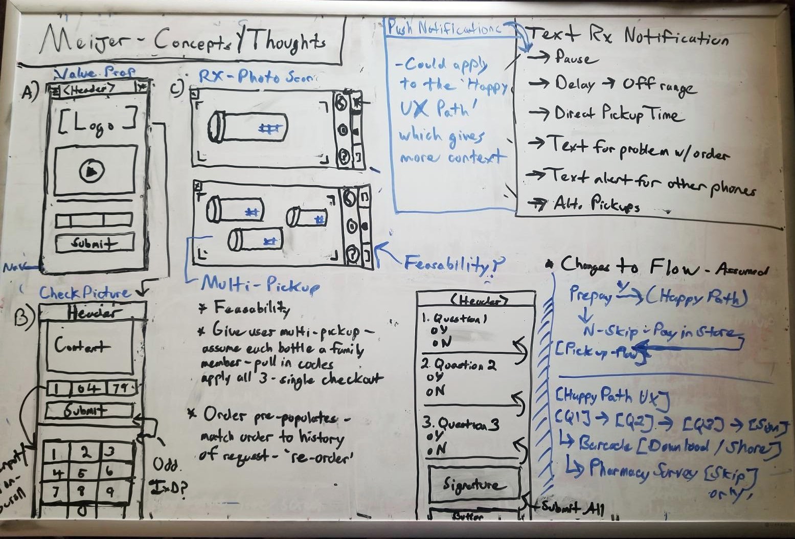
I connected with the lead on the project and did some white boarding of concepts to help visualize some initial ideas. After the second review, my co-designer and I were instructed not to include out of scope modules or payment processes, as those had not been identified as key issues.
We had each come up with different ideas for the express checkout experience once the payment had been setup. The assumption was that "autopay was on." The lead asked us to include a mock ‘Scan Rx’ as part of the full concept showing an end-to-end 'Express Checkout' from refill to pickup.
top three SMS painpoints
Customers didn’t often notice text messages right away.
Customers didn’t like having to text for each order and preferred an in-app setting or additional method to 'Express Checkout'.
Estimated times were sometimes off due to a delay in response at the pharmacy or due to a back up of orders.
Using this information, I worked with the co-designer on refining some of the whiteboard sketches into a more detailed concept. I focused on push notifications and SMS while the other designer was tasked with refining the additional methods and miscellaneous screens.
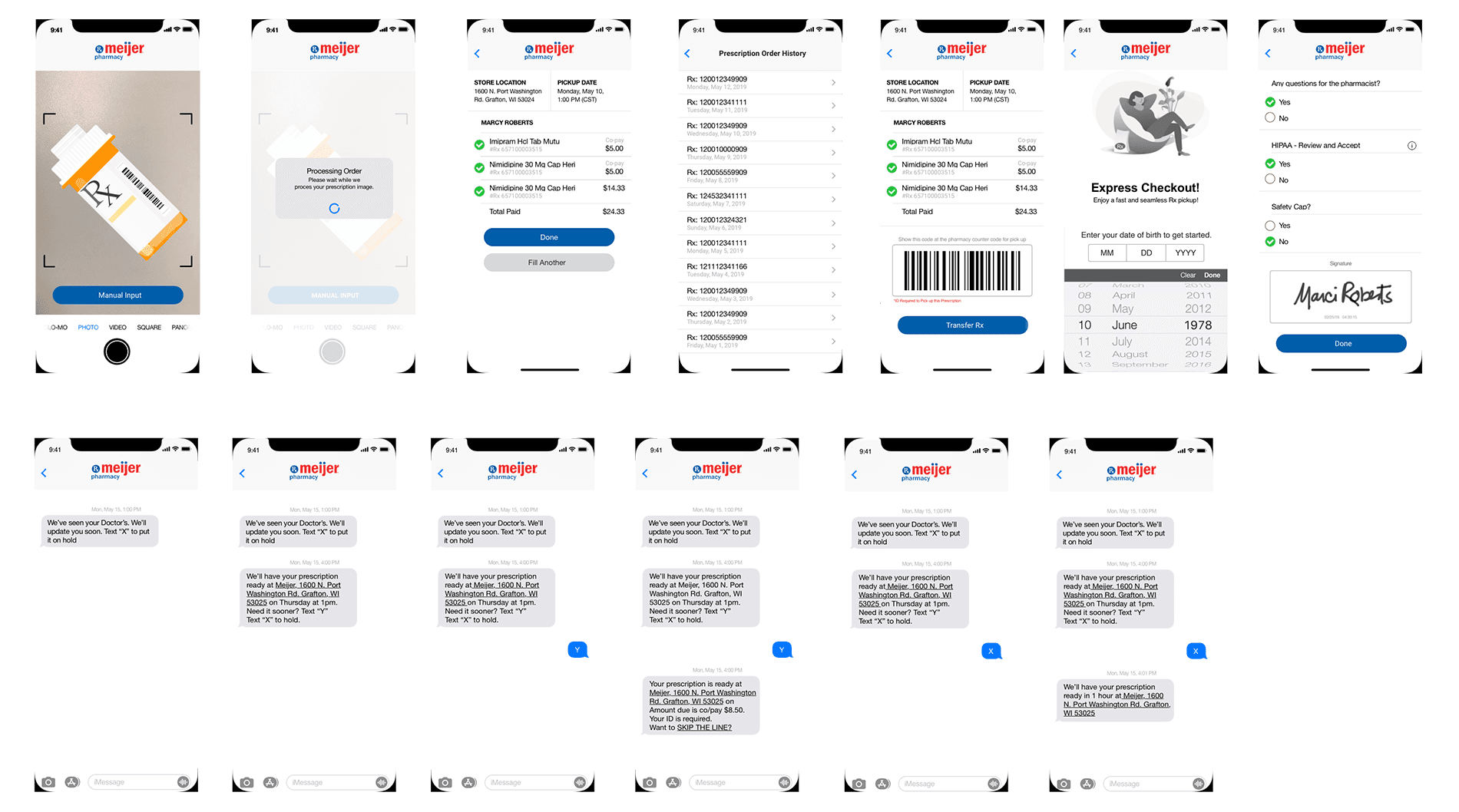
sms/scan rx wireframes
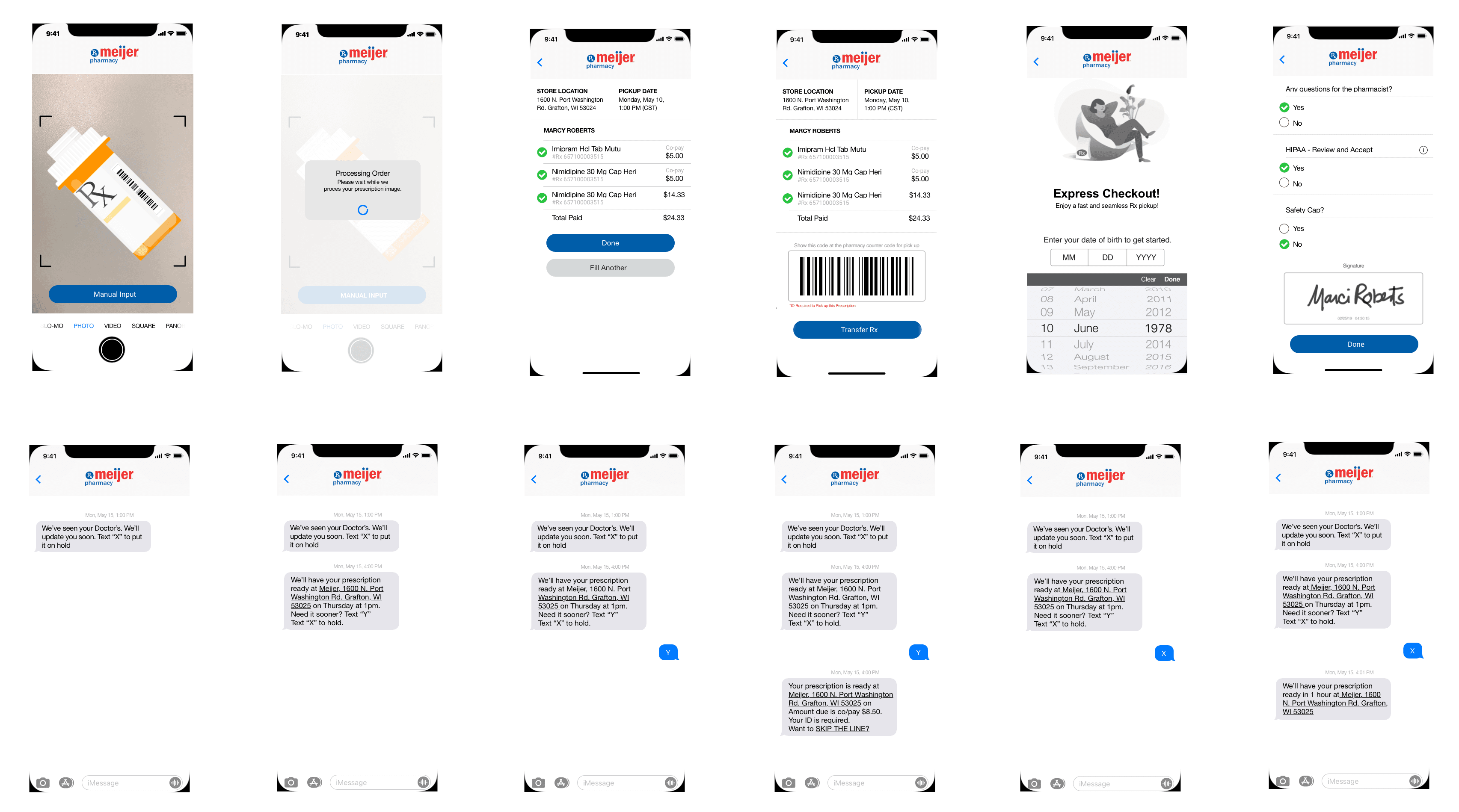
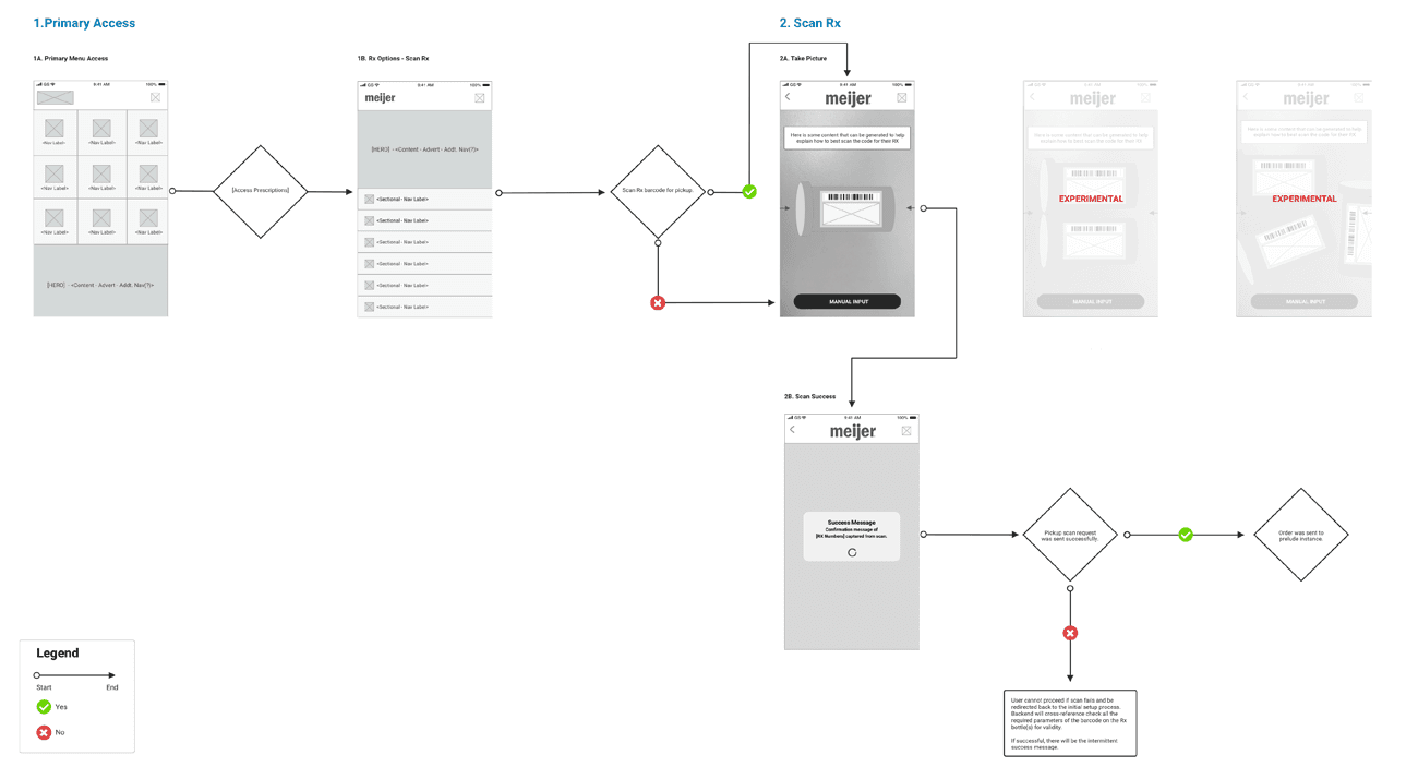
I focused first on creating the ‘Scan Rx’ wires, which I would later add into the prototype so it could go to usability testing. The ‘Scan Rx’ wires were influenced by the inherit architecture of several apps I had analyzed over the course of my competitive analysis. In addition, retrofitting the existing ‘Scan Rx’ method in the current app.
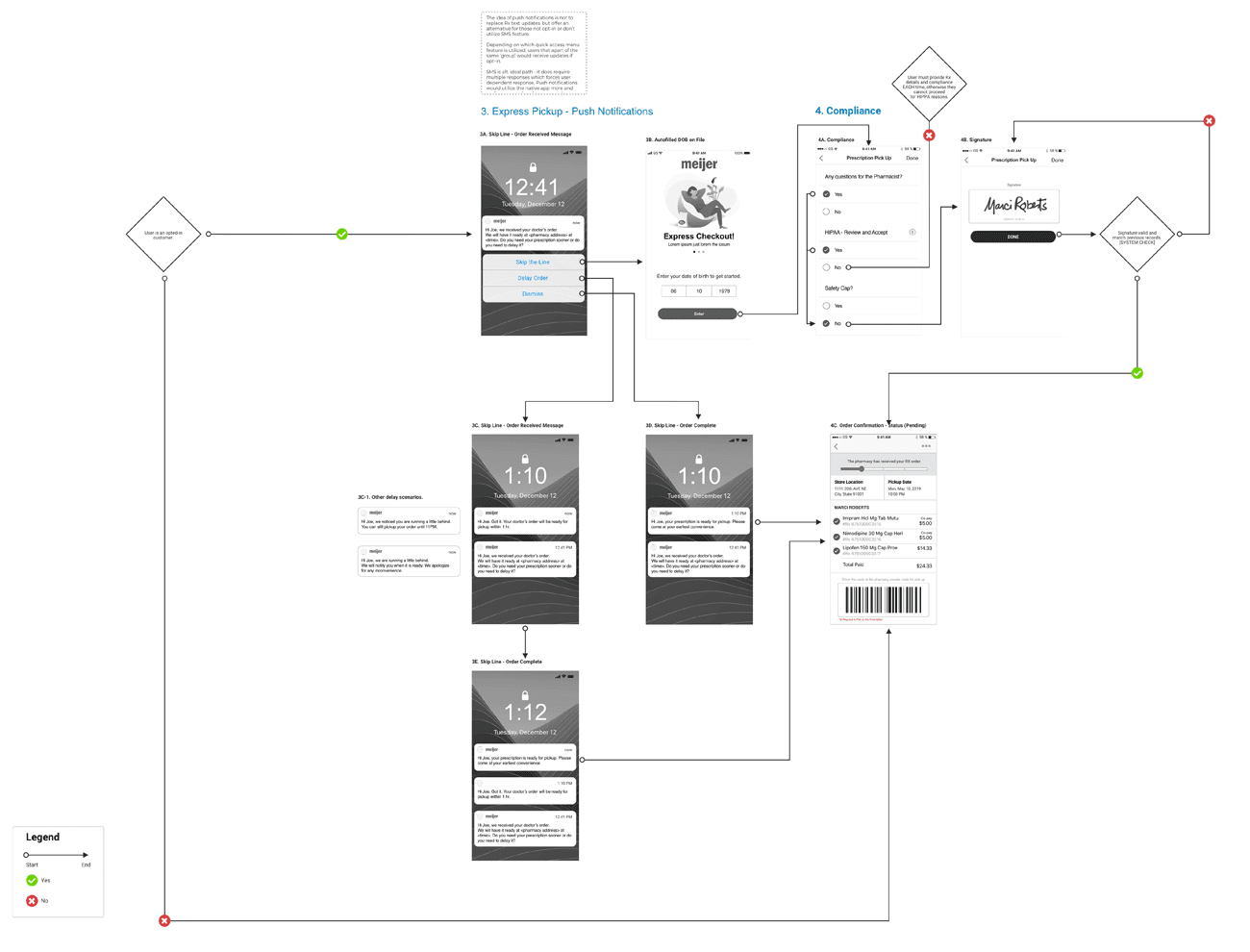
The SMS wireframes would be incorporated into the prototype later. The primary focus was to get the messaging down. The lead brought in a couple copywriters to help with content. I worked on the express checkout experience—in particular, on how a customer would accept, delay, transfer, or reject an Rx. The approach I took utilized a simple Q&A where the user would press "Y/N" depending on the outcome they sought from those four actions. The copywriters helped provide good messaging around the different options.
push notification wireframes
The ‘Push Notification’ wireframes had to match the others closely in terms of information architecture and functionality. SMS was the alternative path, but it required multiple replies, which forced a user-dependent response. Push notifications would utilize the native app to a greater extent and recommend applicable actions on behalf of the user.
There were also technological assumptions I made around broadband ability for SMS. I assumed users did not want to rely on in-app statuses and that the likelihood they would check would be low. Even with some of the constraints around SMS/Push Notifications, I still thought these options would be the most beneficial choice.
Other design team members assumed that push notifications would become too bloated or ‘tech heavy’ and might make the user feel encumbered. This assumption would be invalidated later through testing.
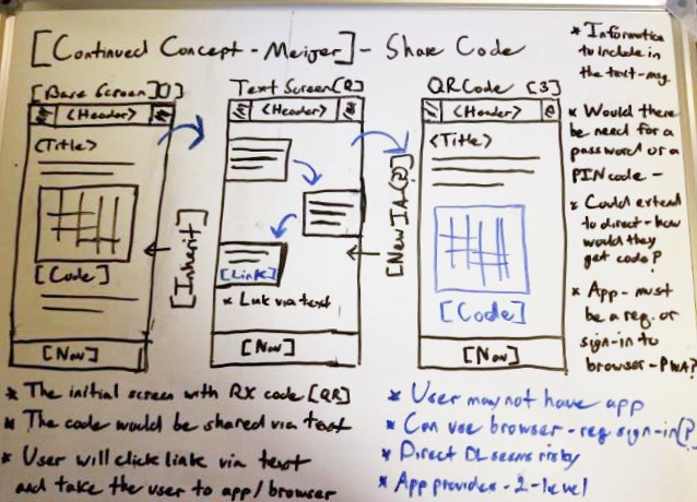
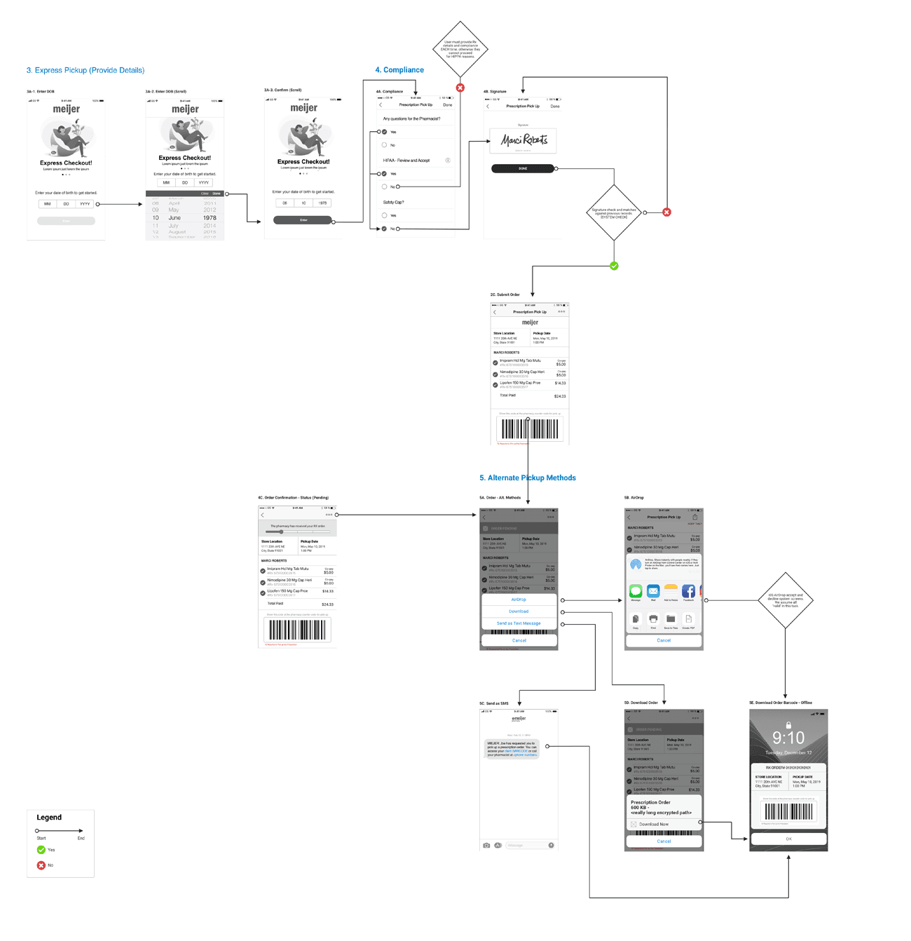
additional pickup methods wireframes
Once the wires were complete for push notifications, my co-designer worked on completing another set of wires for ‘Additional Pickup Methods.’ These were fairly straightforward and were created for users who were not opted in or who did not wish to opt in.
I communicated the requirements I was provided by the lead to my co-designer. The wires would showcase: AirDrop, download, and an SMS notification to pharmacy that would send a barcode (in-app) to the user, who could then go to the store and scan for their pickup.
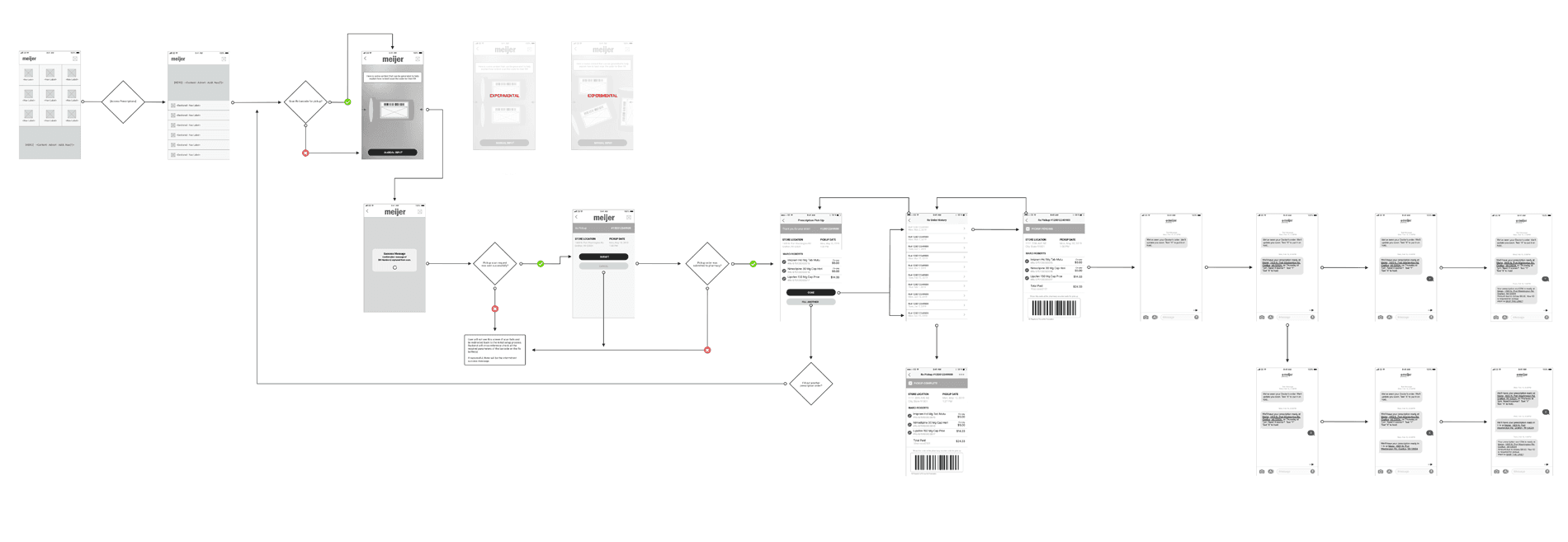
prototype and testing
I shared the screens with my team and the client team. They were approved for testing. The first design phase would test these three features (‘Scan Rx,’ push notifications, and SMS). Feedback and approved recommendations from the usability test would be implemented later and then moved to development after completion of phase two.
My co-designer and I made a simple click-through prototype in InVision for the senior researcher to employ for the usability test. With input from the team and I, the senior researcher determined with whom he would test and what the testing plan would be. I sat in on the test, which was conducted for the first five participants who had opted in from the original surveys.
top takeaways
Four users liked the options offered for express pickup, one did not. Users did not like having to fill out Compliance. They didn't understand the screen until it was explained to them.
All users liked the ‘Scan Rx’ and had no issues with scanning. Five users liked the SMS and push-notification screens.
They liked not having to click through several screens to complete their order. The messaging was clear and understood by them. Four of five users wanted to see more of a full SMS conversation exchange as opposed to just the happy path.
While users did like the additional methods, they found them unnecessary as they would just pay cash or use their debit card since they would have to go to the counter anyway.
Users also stated that if they were provided a barcode, they would access it in-app, not through a secondary delivery method. Pharmacists shared similar thoughts.
DESIGN
phase two
The research I conducted was pivotal in helping validate some of the issues I had found. It also showed that the recommendations and issues I identified in the v1.0 and v2.0 screens did not solve all the key issues diagnosed in the user interviews. As such, phase two for design would encompass the other three modules that had been pinpointed by the user research. These three use cases had not been conceptualized by the client's UX internal team during the new redesign approach.
sms concept
I connected with the lead on the project and did some white boarding of concepts to help visualize some initial ideas. After the second review, my co-designer and I were instructed not to include out of scope modules or payment processes, as those had not been identified as key issues.
We had each come up with different ideas for the express checkout experience once the payment had been setup. The assumption was that "autopay was on." The lead asked us to include a mock ‘Scan Rx’ as part of the full concept showing an end-to-end 'Express Checkout' from refill to pickup.
top three SMS painpoints
Customers didn’t often notice text messages right away.
Customers didn’t like having to text for each order and preferred an in-app setting or additional method to 'Express Checkout'.
Estimated times were sometimes off due to a delay in response at the pharmacy or due to a back up of orders.
Using this information, I worked with the co-designer on refining some of the whiteboard sketches into a more detailed concept. I focused on push notifications and SMS while the other designer was tasked with refining the additional methods and miscellaneous screens.
sms/scan rx wireframes
I focused first on creating the ‘Scan Rx’ wires, which I would later add into the prototype so it could go to usability testing. The ‘Scan Rx’ wires were influenced by the inherit architecture of several apps I had analyzed over the course of my competitive analysis. In addition, retrofitting the existing ‘Scan Rx’ method in the current app.
The SMS wireframes would be incorporated into the prototype later. The primary focus was to get the messaging down. The lead brought in a couple copywriters to help with content. I worked on the express checkout experience—in particular, on how a customer would accept, delay, transfer, or reject an Rx. The approach I took utilized a simple Q&A where the user would press "Y/N" depending on the outcome they sought from those four actions. The copywriters helped provide good messaging around the different options.
push notification wireframes
The ‘Push Notification’ wireframes had to match the others closely in terms of information architecture and functionality. SMS was the alternative path, but it required multiple replies, which forced a user-dependent response. Push notifications would utilize the native app to a greater extent and recommend applicable actions on behalf of the user.
There were also technological assumptions I made around broadband ability for SMS. I assumed users did not want to rely on in-app statuses and that the likelihood they would check would be low. Even with some of the constraints around SMS/Push Notifications, I still thought these options would be the most beneficial choice.
Other design team members assumed that push notifications would become too bloated or ‘tech heavy’ and might make the user feel encumbered. This assumption would be invalidated later through testing.
additional pickup methods wireframes
Once the wires were complete for push notifications, my co-designer worked on completing another set of wires for ‘Additional Pickup Methods.’ These were fairly straightforward and were created for users who were not opted in or who did not wish to opt in.
I communicated the requirements I was provided by the lead to my co-designer. The wires would showcase: AirDrop, download, and an SMS notification to pharmacy that would send a barcode (in-app) to the user, who could then go to the store and scan for their pickup.
prototype and testing
I shared the screens with my team and the client team. They were approved for testing. The first design phase would test these three features (‘Scan Rx,’ push notifications, and SMS). Feedback and approved recommendations from the usability test would be implemented later and then moved to development after completion of phase two.
My co-designer and I made a simple click-through prototype in InVision for the senior researcher to employ for the usability test. With input from the team and I, the senior researcher determined with whom he would test and what the testing plan would be. I sat in on the test, which was conducted for the first five participants who had opted in from the original surveys.
top takeaways
Four users liked the options offered for express pickup, one did not. Users did not like having to fill out Compliance. They didn't understand the screen until it was explained to them.
All users liked the ‘Scan Rx’ and had no issues with scanning. Five users liked the SMS and push-notification screens.
They liked not having to click through several screens to complete their order. The messaging was clear and understood by them. Four of five users wanted to see more of a full SMS conversation exchange as opposed to just the happy path.
While users did like the additional methods, they found them unnecessary as they would just pay cash or use their debit card since they would have to go to the counter anyway.
Users also stated that if they were provided a barcode, they would access it in-app, not through a secondary delivery method. Pharmacists shared similar thoughts.
NEXT STEPS
implementation
Next steps included implementing the previous updates from the first phase of testing. I took the screens I had updated and combined them with my co-designer's screens to test them as interactive prototypes. I did not sit in on these testing sessions, however, the senior researcher did communicate the results to myself and to the team.
The results were very positive. The researcher and client team had tested with over a dozen users in multiple locations. The new experience was described as “easy, convenient, user friendly, and simple.” While customers enjoyed this new revamped concept, there were some who would have liked to see a detailed locker option or dedicated window. Most users were split positively between the SMS and the new push notification option. The testing indicated no need for design updates.
The final design assets were approved by Meijer, at which point all design assets were sent to them. Their internal marketing design team would complete the visual design and their engineering team would take care of the implementation phases in-house.
NEXT STEPS
implementation
Next steps included implementing the previous updates from the first phase of testing. I took the screens I had updated and combined them with my co-designer's screens to test them as interactive prototypes. I did not sit in on these testing sessions, however, the senior researcher did communicate the results to myself and to the team.
The results were very positive. The researcher and client team had tested with over a dozen users in multiple locations. The new experience was described as “easy, convenient, user friendly, and simple.” While customers enjoyed this new revamped concept, there were some who would have liked to see a detailed locker option or dedicated window. Most users were split positively between the SMS and the new push notification option. The testing indicated no need for design updates.
The final design assets were approved by Meijer, at which point all design assets were sent to them. Their internal marketing design team would complete the visual design and their engineering team would take care of the implementation phases in-house.
OUTCOMES
reduced delays
The team and I later learned we decreased delays at express checkout by 60%. This was due to an effective communication method used by online customers. More than 2/3 of mobile customers reported a positive checkout experience to the pharmacists through in-store surveys.
reduced delays
The team and I later learned we decreased delays at express checkout by 60%. This was due to an effective communication method used by online customers. More than 2/3 of mobile customers reported a positive checkout experience to the pharmacists through in-store surveys.
Increased app rating
The team and I grew the app store rating to a 4/5. It was much lower before, with around a 2.8 rating. This news greatly pleased the client; it was done in such a small timeframe. This was in addition to the positive outcomes from testing.
OUTCOMES
reduced delays
The team and I later learned we decreased delays at express checkout by 60%. This was due to an effective communication method used by online customers. More than 2/3 of mobile customers reported a positive checkout experience to the pharmacists through in-store surveys.
Increased app rating
The team and I grew the app store rating to a 4/5. It was much lower before, with around a 2.8 rating. This news greatly pleased the client; it was done in such a small timeframe. This was in addition to the positive outcomes from testing.
LEARNINGS
USING OTHER METHODS
I was surprised that many customers did not want to use alternative pickups even though they enjoyed them. Most users just wanted to do a simple SMS or push notification for their pickup since no locker or a dedicated window exists.
pharmacy process
It was incredible to learn how complex the pharmacy process is. The logistics and technical backend ensuring a seamless pickup process are very in-depth. Pharmacists handle hundreds of different prescriptions with multiple customers each day.
COMMUNICATING TO PHARMACY
It was interesting to find out from the final test how many customers differed in their inclination toward either push notifications or SMS. It would have been interesting to do an even deeper dive into the information in the messages if time and budget had been allowed.