Improve Customer Satisfaction
Improve Customer Satisfaction
Sask Power is the principle public electric utility based in Saskatchewan.
They required an improved customer and meter reading experience.


GOALS
Assess and improve the current online meter reading experience to help customers receive fewer incorrect bills. Help reduce the dependency of CSRs so that CSRs can focus on higher priority tasks and reduce call center costs. Concept and incorporate offline methods of reach to better inform and incentivize customers to submit meter readings and resolve disputes.
CHALLENGES
Limited and incomplete research.
Technological constraints (mainly telecom and bandwidth capabilities).
Outdated methods for submitting meter readings.
Customer trust in new meter reading submission methods.
Design offline methods to compliment online methods.
Reduce cost, billing disputes, and improve CSR productivity.
MY ROLE
As lead UX designer for this project, I oversaw two junior designers and work in conjunction with another hybrid designer.
Create project plan and client presentations.
Perform research in relation to current workflow, architecture, and offline delivery methods.
Build multiple customer journeys to establish and fully understand process.
Analyze and create user flows for existing workflow and options.
Establish new use cases and scenarios for new proposed concept.
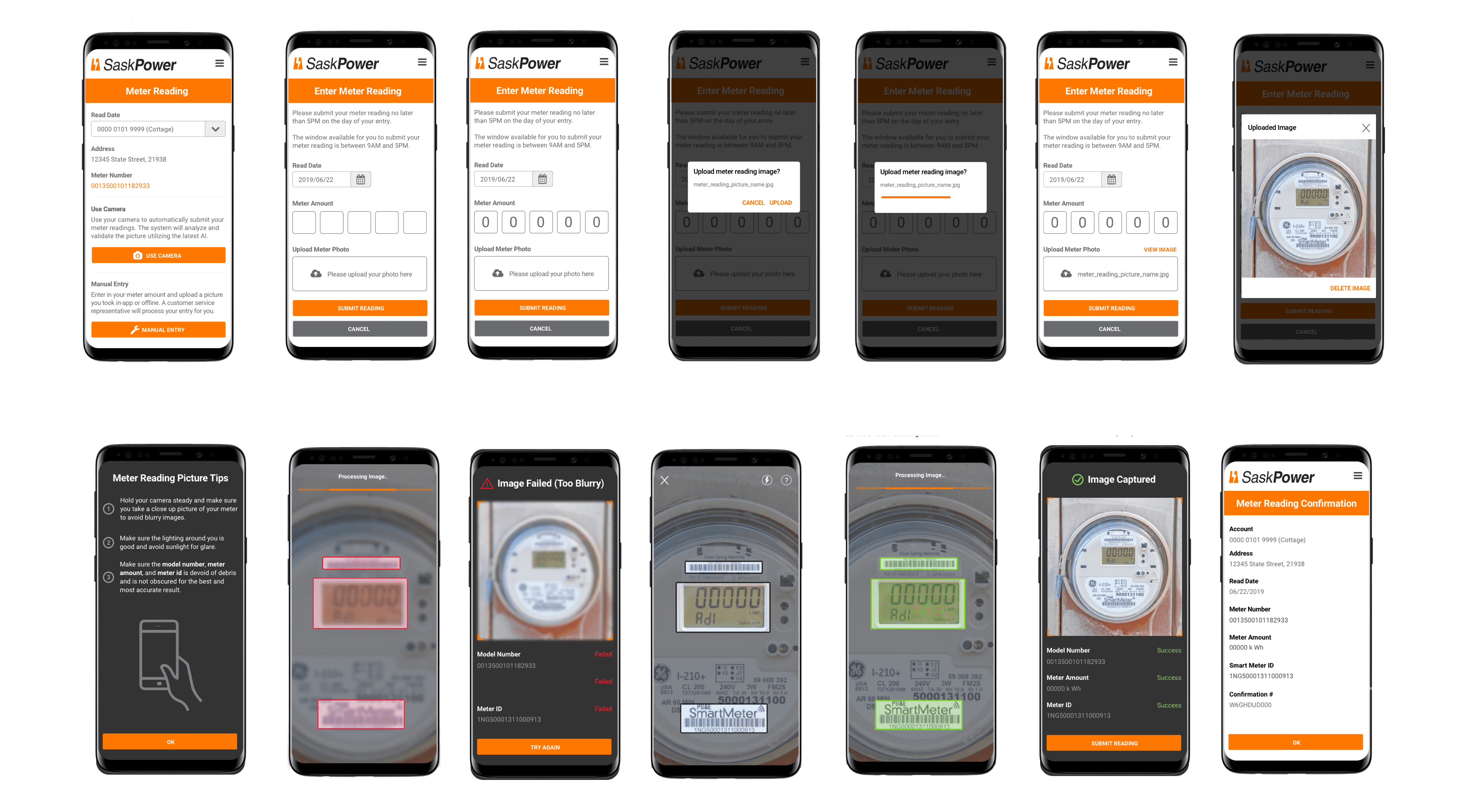
Build wireframes and prototype for automated and manual meter reading submission.
WHAT I DELIVERED
20 Wireframes
1 UI flow
1 Project plan
4 User journeys
6 Non-visual user flows
1 Research Documentation
1 Prototype
RESEARCH
REACHING OUT
First, I needed a project plan for delegating tasks and breaking out the research and design effort. Before I could begin design, I had to get a better understanding of the full requirements. The program lead, who was also the lead researcher, asked me to define the requirements and invited me to ask questions where needed in order to identify key issues.
He would act as a conduit between the customer and my team. I would manage the two junior designers on the project, and the hybrid designer would report some of their findings to me as well, which I would then communicate to the project lead. This plan kept communication consistent by preventing overlapping exchanges.
examine existing research
The team and I came together to review the user research that had been compiled over the two-week period. This research, which was conducted by the senior researcher, included an Omnibus survey, interviews, and field studies. It revealed dozens of user goals, stories, and issues.
My team and I extrapolated that customers who submitted their own meter readings often relied on a CSR to resolve issues stemming from either incorrect entry; sometimes they forgot to submit the reading entirely.
Some customers either didn't trust an automated process, faced various technological constraints, or were simply unaware how to submit a meter reading.
Other customers were okay with the automated verification of submission, but not with the CSR process itself.
Some customers felt they were not sufficiently incentivized to perform this task and were impatient with how long it took to submit meter readings under the existing process.
Most of these customers were centralized in urban and suburban areas.
CSRs spent nearly 50% of their time dealing with disputes and meter readings instead of on high-priority tasks.


more context
This was quite a bit of information to interpret and none of it directly told us what the main disconnect was. The team and I needed more clarity into the current meter reading process to understand the specific obstacles customers faced so that I could identify key issues and propose a plan to solve for them.
key issues
High dependency on CSRs to resolve incorrect entries and late or missing submissions.
Too much time and cost spent on CSRs focusing on low-priority tasks instead of focusing on high-priority tasks.
Far too many incorrect meter readings, which resulted in a high number of billing disputes.
Customers didn't trust an automated process. Customers who wanted to submit readings were unaware how to submit them online.
Customers who wanted to submit readings were unaware how to submit them online.
No research into technology such as telecom and bandwidth usage.
Lack of effective customer incentives.
Lack of offline methods of reach to introduce and opt in customers to online portal.
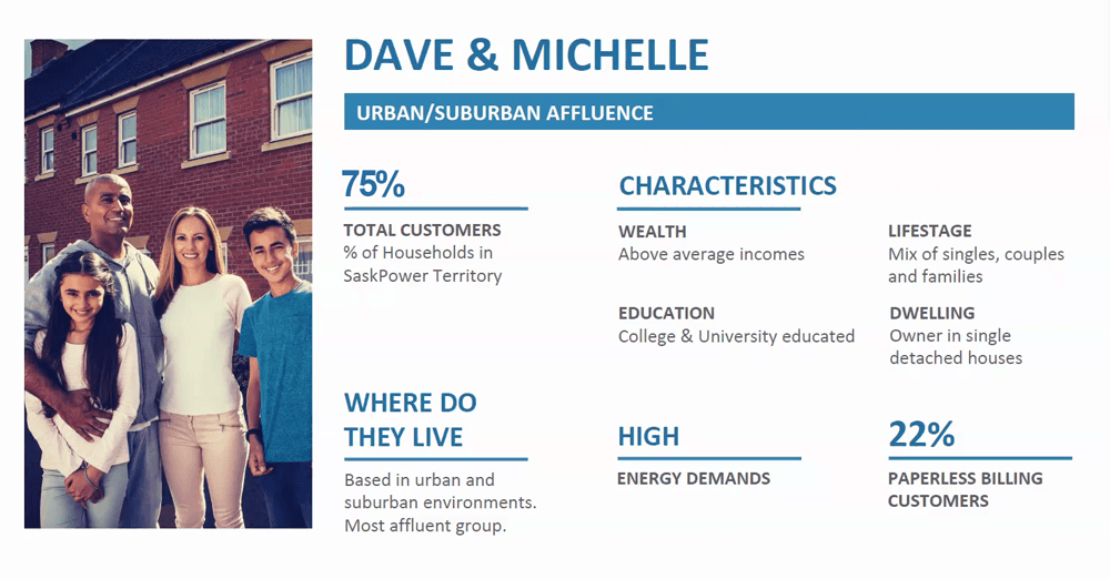
the target persona: urban/suburban
I communicated our findings to the senior researcher. The researcher and I decided to focus on the largest target audience, which was in the suburban and urban areas. These were the majority of Sask Power customers, who usually ranged from young couples to middle-aged adults with families. A low percentage of these customers utilized the paperless option for bills, so most were easier to reach through offline methods.
Still, the large majority of them used online methods for checking outages, meter readings, and more. This was also the most heavily populated area with smartphone coverage. Customers were good with technology and used it often. The next step was to create a project plan and meet with my team.
project plan and requirements
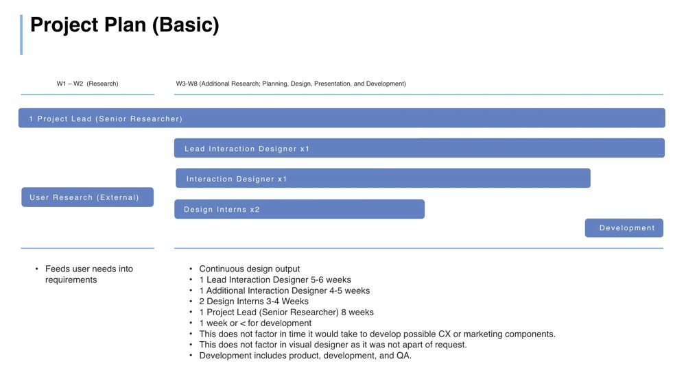
The overall scope of the project would require the entire team: myself, the hybrid designer, two junior designers, the senior researcher (project lead), and engineering.
Eight weeks would be required for the senior researcher.
Six weeks for a lead interaction designer.
Seven weeks for a secondary designer.
Four weeks for two junior designers.
One week for development.
The team would perform additional research where needed.

technology constraints
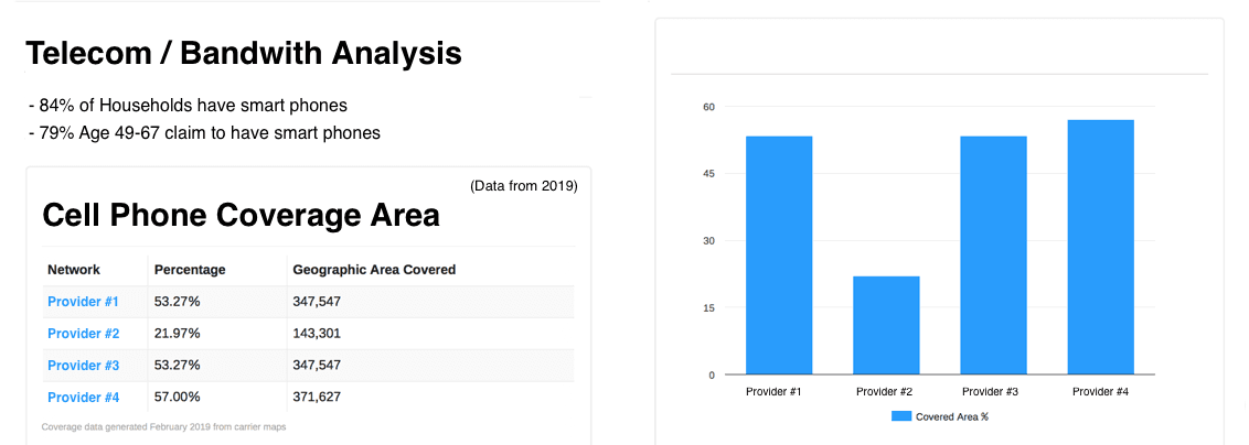
I instructed the junior designers to research the region's telecom usage and bandwidth limitations and to present their findings at the team's next meeting. From the research the senior researcher compiled, we saw customers had indicated as one of their main pain points the fact that they often faced delays and timeouts when submitting meter readings. My assumption was that customers grew too impatient to submit readings because of the extended length of time it took for the system to process the meter reading, presumably due to low reception.
telecom & bandwidth research
The junior designers compiled some very interesting results. In particular, they found that over 84% of households had smartphones and the coverage to use them. Nonetheless, a majority of customers who submitted meter readings were still receiving incorrect bills. These findings invalidated my assumption about the relationship between bandwidth and billing issues. While the two junior designers had been doing this research, the other hybrid designer and myself had been reviewing the current client experience.

existing workflows
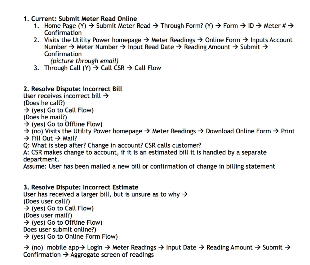
I focused on reviewing the existing meter reading options while the other designer reviewed the billing and dispute processes. I built out basic low-fidelity user flows in a word document for each of the workflows I reviewed; it contained online and offline methods. The current user experience entailed a simple form with an input field; it could be completed online, through mail, and by phone. The app was de-prioritized as no one utilized it. I hypothesized that the majority of billing disputes resulted from an ineffective method for submitting and processing meter readings.
what I discovered
Meter reading pictures were handled through email and were often too blurry to read or forgotten about altogether.
There was no central record for readings. Once a user submitted their reading online, they received a confirmation screen and nothing else (no email, text, etc.).
There was very little marketing collateral used to inform customers about meter readings and other online features.
The current phone method connected the customer to the CSR, which did nothing to reduce dependency or cost.
Marketing collateral could of help informed customers of such features as meter readings.

RESEARCH
REACHING OUT
First, I needed a project plan for delegating tasks and breaking out the research and design effort. Before I could begin design, I had to get a better understanding of the full requirements. The program lead, who was also the lead researcher, asked me to define the requirements and invited me to ask questions where needed in order to identify key issues.
He would act as a conduit between the customer and my team. I would manage the two junior designers on the project, and the hybrid designer would report some of their findings to me as well, which I would then communicate to the project lead. This plan kept communication consistent by preventing overlapping exchanges.
examine existing research
The team and I came together to review the user research that had been compiled over the two-week period. This research, which was conducted by the senior researcher, included an Omnibus survey, interviews, and field studies. It revealed dozens of user goals, stories, and issues.
My team and I extrapolated that customers who submitted their own meter readings often relied on a CSR to resolve issues stemming from either incorrect entry; sometimes they forgot to submit the reading entirely.
Some customers either didn't trust an automated process, faced various technological constraints, or were simply unaware how to submit a meter reading.
Other customers were okay with the automated verification of submission, but not with the CSR process itself.
Some customers felt they were not sufficiently incentivized to perform this task and were impatient with how long it took to submit meter readings under the existing process.
Most of these customers were centralized in urban and suburban areas.
CSRs spent nearly 50% of their time dealing with disputes and meter readings instead of on high-priority tasks.


more context
This was quite a bit of information to interpret and none of it directly told us what the main disconnect was. The team and I needed more clarity into the current meter reading process to understand the specific obstacles customers faced so that I could identify key issues and propose a plan to solve for them.
key issues
High dependency on CSRs to resolve incorrect entries and late or missing submissions.
Too much time and cost spent on CSRs focusing on low-priority tasks instead of focusing on high-priority tasks.
Far too many incorrect meter readings, which resulted in a high number of billing disputes.
Customers didn't trust an automated process. Customers who wanted to submit readings were unaware how to submit them online.
Customers who wanted to submit readings were unaware how to submit them online.
No research into technology such as telecom and bandwidth usage.
Lack of effective customer incentives.
Lack of offline methods of reach to introduce and opt in customers to online portal.
the target persona: urban/suburban
I communicated our findings to the senior researcher. The researcher and I decided to focus on the largest target audience, which was in the suburban and urban areas. These were the majority of Sask Power customers, who usually ranged from young couples to middle-aged adults with families. A low percentage of these customers utilized the paperless option for bills, so most were easier to reach through offline methods.
Still, the large majority of them used online methods for checking outages, meter readings, and more. This was also the most heavily populated area with smartphone coverage. Customers were good with technology and used it often. The next step was to create a project plan and meet with my team.

project plan and requirements
The overall scope of the project would require the entire team: myself, the hybrid designer, two junior designers, the senior researcher (project lead), and engineering.
Eight weeks would be required for the senior researcher.
Six weeks for a lead interaction designer.
Seven weeks for a secondary designer.
Four weeks for two junior designers.
One week for development.
The team would perform additional research where needed.

technology constraints
I instructed the junior designers to research the region's telecom usage and bandwidth limitations and to present their findings at the team's next meeting. From the research the senior researcher compiled, we saw customers had indicated as one of their main pain points the fact that they often faced delays and timeouts when submitting meter readings. My assumption was that customers grew too impatient to submit readings because of the extended length of time it took for the system to process the meter reading, presumably due to low reception.
telecom & bandwidth research
The junior designers compiled some very interesting results. In particular, they found that over 84% of households had smartphones and the coverage to use them. Nonetheless, a majority of customers who submitted meter readings were still receiving incorrect bills. These findings invalidated my assumption about the relationship between bandwidth and billing issues. While the two junior designers had been doing this research, the other hybrid designer and myself had been reviewing the current client experience.

existing workflows
I focused on reviewing the existing meter reading options while the other designer reviewed the billing and dispute processes. I built out basic low-fidelity user flows in a word document for each of the workflows I reviewed; it contained online and offline methods. The current user experience entailed a simple form with an input field; it could be completed online, through mail, and by phone. The app was de-prioritized as no one utilized it. I hypothesized that the majority of billing disputes resulted from an ineffective method for submitting and processing meter readings.
what I discovered
Meter reading pictures were handled through email and were often too blurry to read or forgotten about altogether.
There was no central record for readings. Once a user submitted their reading online, they received a confirmation screen and nothing else (no email, text, etc.).
There was very little marketing collateral used to inform customers about meter readings and other online features.
The current phone method connected the customer to the CSR, which did nothing to reduce dependency or cost.
Marketing collateral could of help informed customers of such features as meter readings.

PLAN
telling the journey: online customers
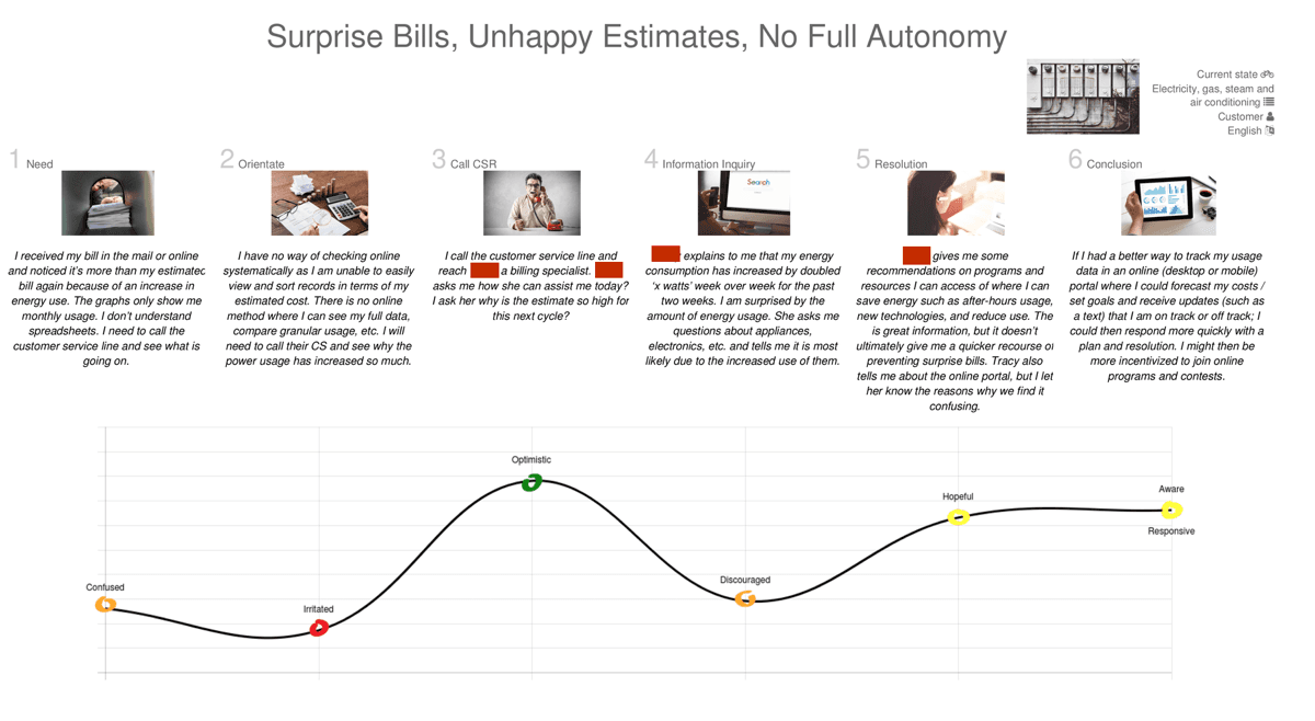
To better understand the current end-to-end user experience, I created a virtual journey through the information and user stories we had gathered so far. This journey depicted the story of a customer who submits a meter reading and then receives and disputes an incorrect bill, and the long process they must go through to resolve it.
current meter reading journey: Summary
Because no online record exists to verify meter readings and pictures, customers must check to see if they have a record of their meter reading submission in their email (unless another method was used). The main reason customers call in about their dispute is because of an incorrect or missing picture. Additional time and costs are required to resolve this issue through the CSR. When customers call in over the phone it puts more strain on CSRs who are then unable to handle higher-priority tasks.
envisioning the ideal journey
It was surprising how often an online customer who submitted a meter reading received an incorrect bill due to an incorrect entry or picture. As the team and I had previously learned, the ineffective process for submitting a meter reading was the most common reason for customers to seek the help of a CSR to figure out the cause of their problem and provide a solution. There were no fail-safes in place in the current experience to prevent these kinds of errors.
I went back to the team to share this customer journey and brainstorm next steps. The journey identified three primary use cases for online customers: These use cases would be built into three ideal-future-state journeys. These ideal journeys were specifically tied to the existing customer journey and would solve for some of the issues previously identified.
Customer who trusts the automated process.
Customers who were unaware of such features or didn't understand how to use them.
Customers who did submit meter readings online but ran into errors/billing disputes and contacted CSR to resolve them.
Three Use Cases
Customer who trusts the automated process, but still prefers an agent to process readings.
Customer who prefers the manual input over an automated process and trusts the agent to process.
Customer who would prefer an automated method of submitting a meter reading over a manual process; prefers an agent to verify but not process the reading.
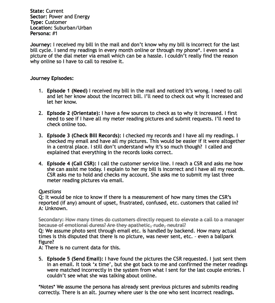

future meter reading journey: Agent
The customer is incentivized to opt in for mobile meter readings. The customer joins and, with the help of an optional tutorial explaining how to perform the reading, utilizes the automated process. They are notified of their submission and will receive a confirmation when an agent has processed it. They can view a record in the online portal.
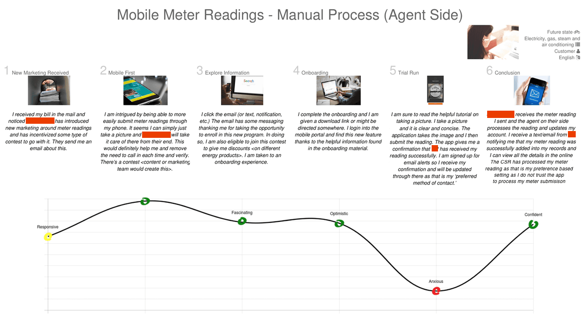

future meter reading journey: Manual upload
The customer is incentivized to opt in for mobile meter readings. The customer joins and, with the help of an optional tutorial explaining how to perform the reading, takes a picture (not through the app) and submits it manually through the portal (rather than through email), including the amount. The customer is later notified of their submission and can view a record in the online portal.
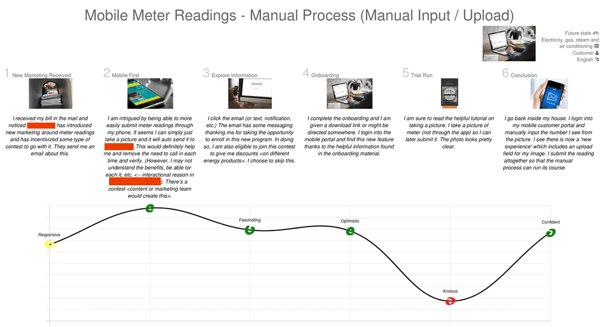

future meter reading journey: Automated
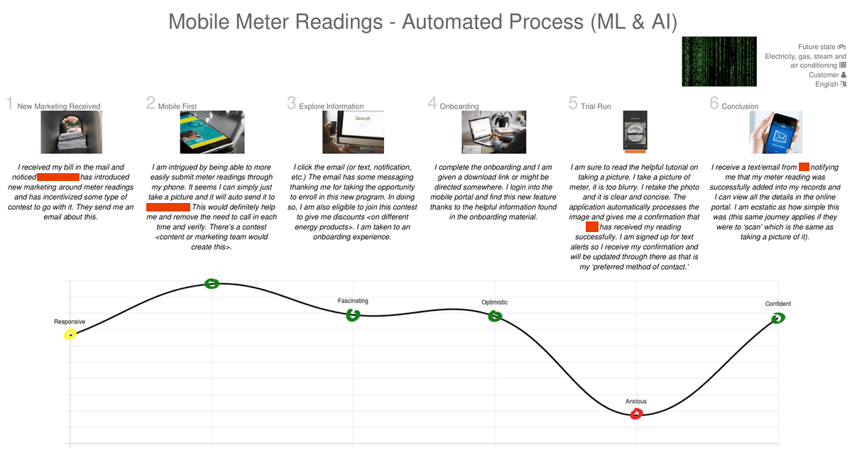
The customer is incentivized to opt in for mobile meter readings. The customer joins and, with the help of an optional tutorial explaining how to perform the reading, submits a blurry picture. The automated process includes a fail-safe and resolution for the users who submit an unrecognizable picture. The customer resubmits the picture. AI auto-processes the image and submits it. The customer is notified of their submission and can view a record in the online portal.

PLAN
telling the journey: online customers
To better understand the current end-to-end user experience, I created a virtual journey through the information and user stories we had gathered so far. This journey depicted the story of a customer who submits a meter reading and then receives and disputes an incorrect bill, and the long process they must go through to resolve it.
current meter reading journey: Summary
Because no online record exists to verify meter readings and pictures, customers must check to see if they have a record of their meter reading submission in their email (unless another method was used). The main reason customers call in about their dispute is because of an incorrect or missing picture. Additional time and costs are required to resolve this issue through the CSR. When customers call in over the phone it puts more strain on CSRs who are then unable to handle higher-priority tasks.

envisioning the ideal journey
It was surprising how often an online customer who submitted a meter reading received an incorrect bill due to an incorrect entry or picture. As the team and I had previously learned, the ineffective process for submitting a meter reading was the most common reason for customers to seek the help of a CSR to figure out the cause of their problem and provide a solution. There were no fail-safes in place in the current experience to prevent these kinds of errors.
I went back to the team to share this customer journey and brainstorm next steps. The journey identified three primary use cases for online customers: These use cases would be built into three ideal-future-state journeys. These ideal journeys were specifically tied to the existing customer journey and would solve for some of the issues previously identified.
Customer who trusts the automated process.
Customers who were unaware of such features or didn't understand how to use them.
Customers who did submit meter readings online but ran into errors/billing disputes and contacted CSR to resolve them.
Three Use Cases
Customer who trusts the automated process, but still prefers an agent to process readings.
Customer who prefers the manual input over an automated process and trusts the agent to process.
Customer who would prefer an automated method of submitting a meter reading over a manual process; prefers an agent to verify but not process the reading.

future meter reading journey: Agent
The customer is incentivized to opt in for mobile meter readings. The customer joins and, with the help of an optional tutorial explaining how to perform the reading, utilizes the automated process. They are notified of their submission and will receive a confirmation when an agent has processed it. They can view a record in the online portal.

future meter reading journey: Manual upload
The customer is incentivized to opt in for mobile meter readings. The customer joins and, with the help of an optional tutorial explaining how to perform the reading, takes a picture (not through the app) and submits it manually through the portal (rather than through email), including the amount. The customer is later notified of their submission and can view a record in the online portal.

future meter reading journey: Automated
The customer is incentivized to opt in for mobile meter readings. The customer joins and, with the help of an optional tutorial explaining how to perform the reading, submits a blurry picture. The automated process includes a fail-safe and resolution for the users who submit an unrecognizable picture. The customer resubmits the picture. AI auto-processes the image and submits it. The customer is notified of their submission and can view a record in the online portal.

DESIGN
sync with senior researcher
I shared the journeys with the senior researcher. He agreed that this helped to identify some of the key issues in relation to billing, awareness, and recommending an improved meter reading experience, but noted that it did not solve for the offline component and did not necessarily reduce call center costs or strains on the CSR. He was also curious about the specific offline methods or incentives the team and I were going to create. I communicated this feedback to my team and instructed the other designers to start brainstorming offline methods. I began the design phase for the meter reading experience.
first design steps
The first step was to reimagine the current meter reading submission feature. This would be a basic concept meant mainly to showcase the automated solution, and it would include the current input form. The client had a mobile app, but less than 3% of their customer base utilized it due to a poor experience and lack of interest.
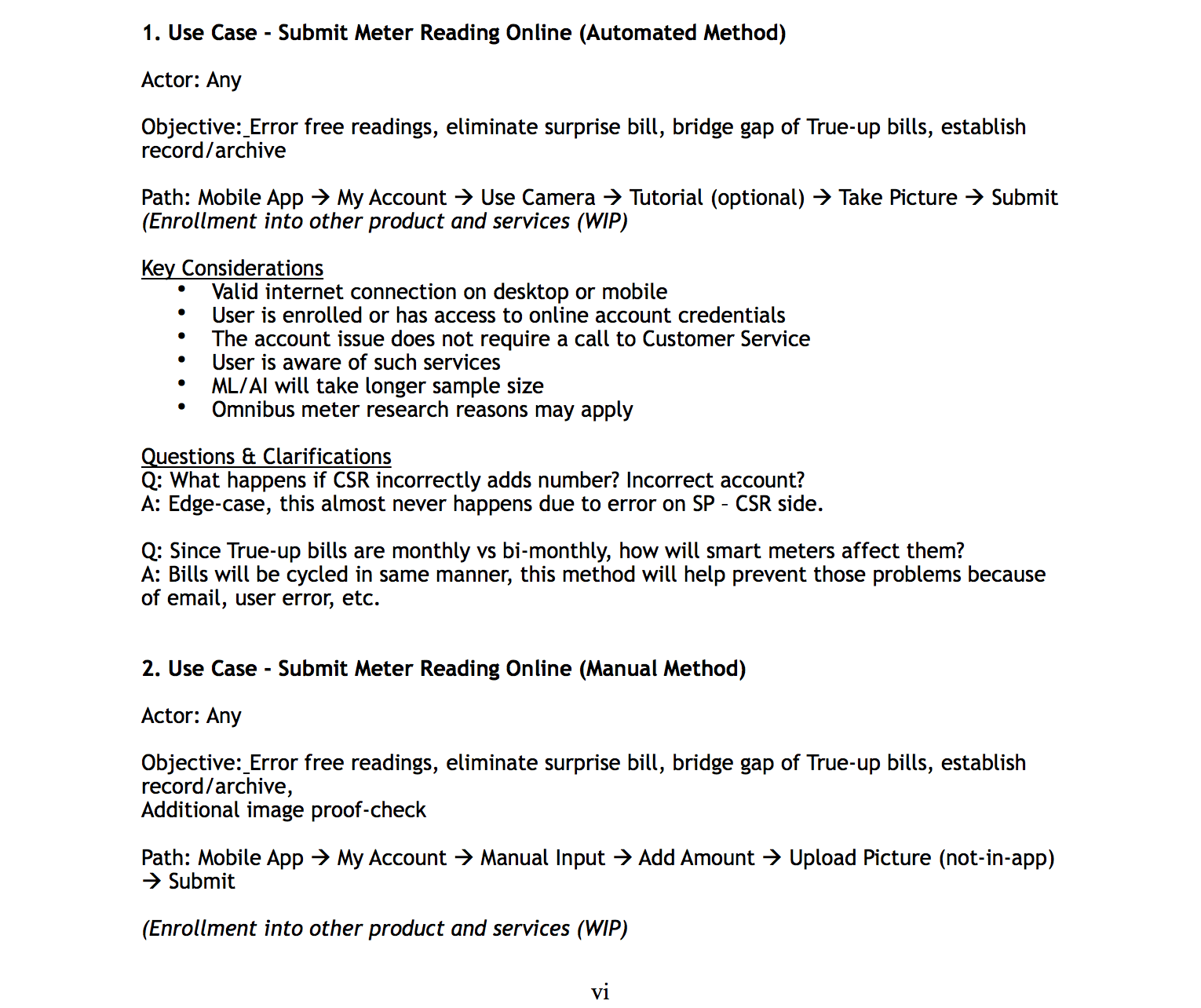
I recommended that this new experience be adapted to the mobile site, as most customers used mobile web according to Google Analytics’ data. I took the use cases from the journey and added them into the control doc while building out the ideal workflow. Each case had key considerations, additional questions, and clarifications where necessary.

the Goals
Reduce call center costs as well as strain and dependency on CSRs so they can focus on high-priority tasks.
Incentivize both Sask Power customers and their employees through offline methods.
Produce ways for offline customers to opt in and self-service their own online utility services.
Assess and improve the meter reading process through manual and automated means so customers receive fewer billing disputes due to incorrect or missing pictures and wrong entries.
As a team, design and propose offline methods in addition to the revamped experience for submitting mobile meter readings.
defining need
Future-state customer journeys that combine offline and online components into a cohesive journey.
An improved online mobile manual and automated process for meter readings that includes fail-safes.
Offline methods such as SMS, IVR, Booths, Live agents, QR codes on bills.
IVR/SMS concept to allow self-service for customers who don’t utilize the online portal.
Contests or prizes to encourage customers to opt in to the automated process.


low-fidelity wireframes
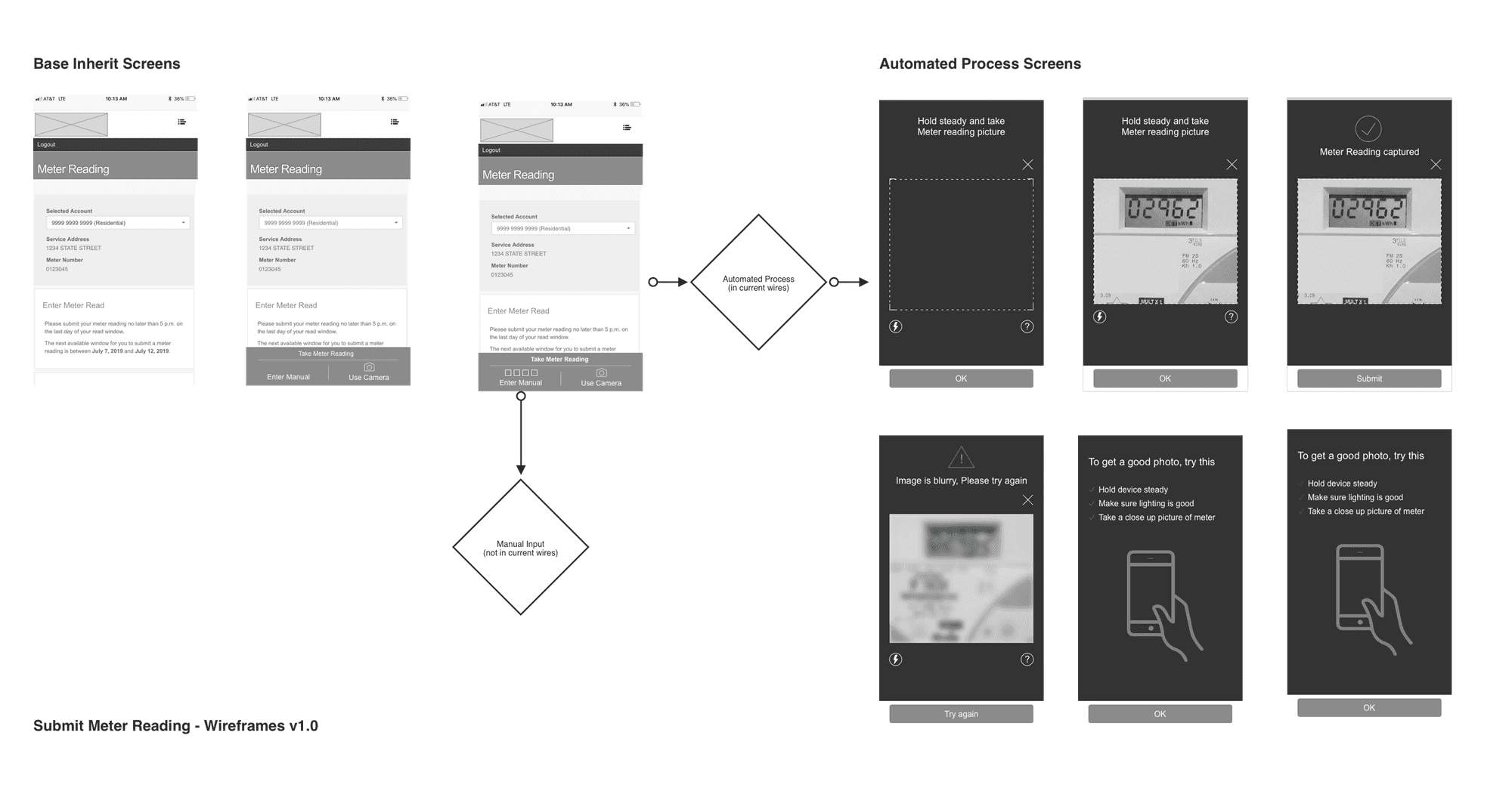
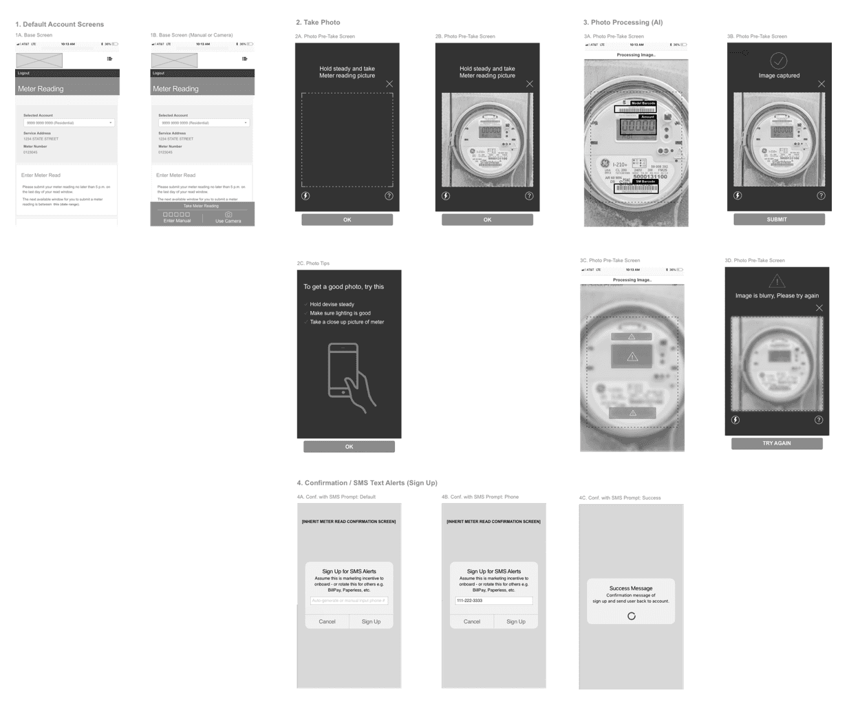
Once I finished compiling information into the control doc, I built out a low-fidelity wireframe. I presented the initial idea to the other UX designer on the project and then met with the project lead. I recommended there be more recognizable AI/ML interactions as well an expanded manual upload to cover the need for fail-safes (in cases of incorrect picture or entry, or lack of confirmation).

offline methods
After sharing the wireframes with my team, I explained my thoughts on expanding the initial concept to the client team and project lead. They agreed with my approach but were curious about how I would handle the mobile side. The team and I were still facing another big design task with respect to how to specifically incentivize or inform customers about the online submission system. The designers presented some ideas they had previous explored. I collaborated with them on expanding those ideas.
Giving guidance
I split up the team efforts in order to conduct research into potential offline methods and how they might plug into the meter reading experience to help reduce CSR time and cost. There would be a focus on three primary methods: IVR, SMS, and secondary considerations for agents, surveys, QR codes, and booths. I split up the efforts between the three designers working under me, with the other designer developing an SMS concept, one junior designer focused on the IVR concept, and the other junior designer exploring secondary methods.
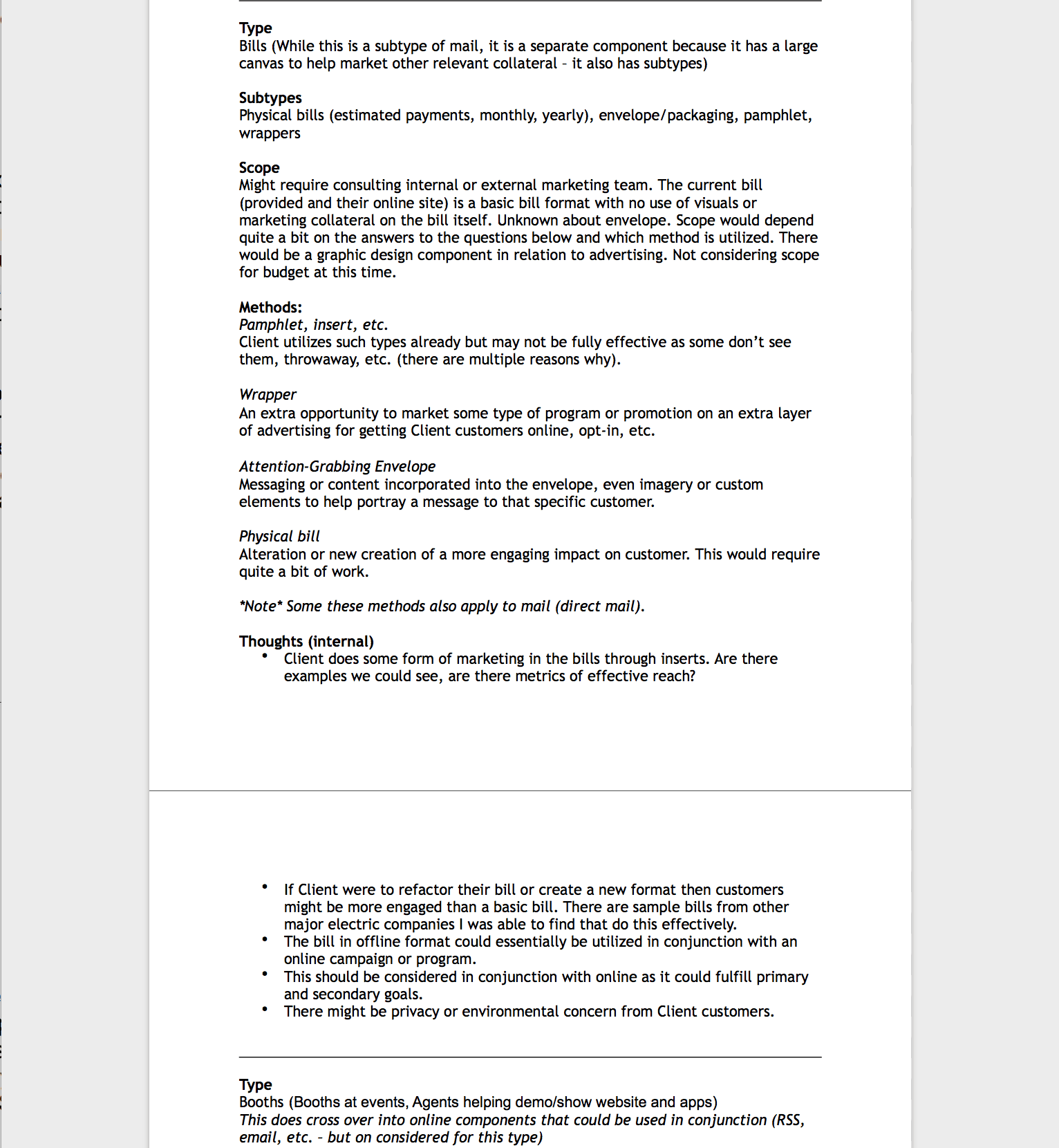

SMS CONCEPT
The other designer came up with an SMS concept to utilize sending meter readings and reporting power outages. Text messaging would open up the scope of consumer interaction. It would require less bandwidth than voice calls & email. (Better reliability in poor coverage areas). Lastly, it allows for more efficient interactions on behalf of the customer and CSR.
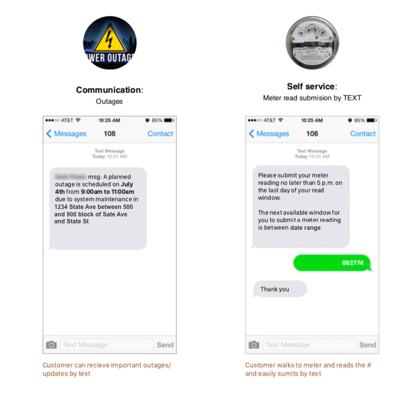

IVR concept
The junior designer who I tasked with developing an IVR concept came up with a new method that the client was not currently utilizing. The concept was simple and could be automated over the phone. Customers would submit their entry automatically and it would reflect in their online record.
There would be no processing required. This method could also be used for promotional purposes. The expectation was that it would reduce call center costs, save customers time, and prioritize CSR calls based on the caller’s priority in queue.
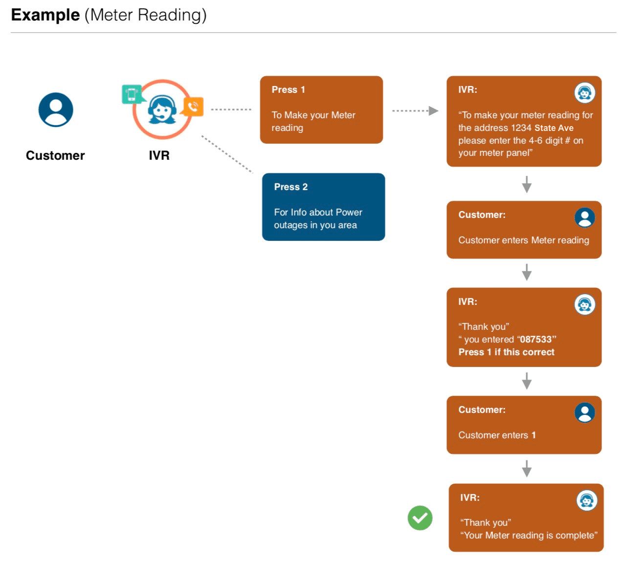

Live Agent, Surveys & QR Code
The other junior designer proposed some secondary methods to incentivize and opt in the customer. The first idea was a QR code that would direct customers to a landing page to sign-up. The second idea was to have live agents with a demo and follow-up survey so that we could get a better gauge on customer feedback. The designer also researched CSR incentives and found out that gift cards and other employee perks were already being implemented.

future meter reading journey: fliers & contest
I, along with one of my junior designers, built out three additional customer journeys to visualize what a potential user’s experience might look like if they were to utilize one of these methods. All three journeys incorporated either the manual, automated, or combined process. These new journeys also introduced specific incentives and additional secondary methods.
The customer is incentivized to opt in for mobile meter readings.The customer takes their own picture (not through app) and submits it manually through the portal (rather than by email) including the meter reading amount. The customer is later notified of their submission and can view a record in the online portal.
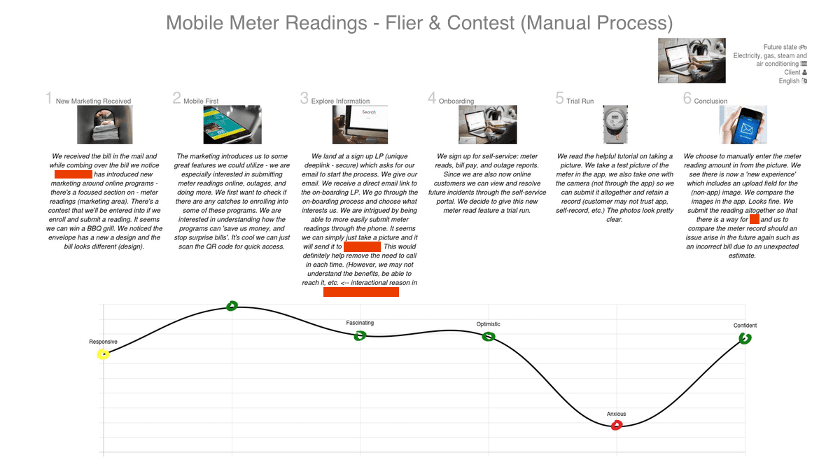

Future meter reading journey: agent & sms
The customer is incentivized to opt in for mobile meter readings. The customer joins and finds an optional tutorial explaining how to perform the reading. The customer takes their own picture (not through app) and submits it manually through the portal (rather than by email) including the meter reading amount. The customer is later notified of their submission and can view a record in the online portal.


future meter reading journey: ivr
The customer is incentivized to opt in for mobile meter readings. The customer joins and finds an optional tutorial explaining how to perform the reading. The customer takes their own picture (not through app) and submits it manually through the portal (rather than by email) including the meter reading amount. The customer is later notified of their submission and can view a record in the online portal.
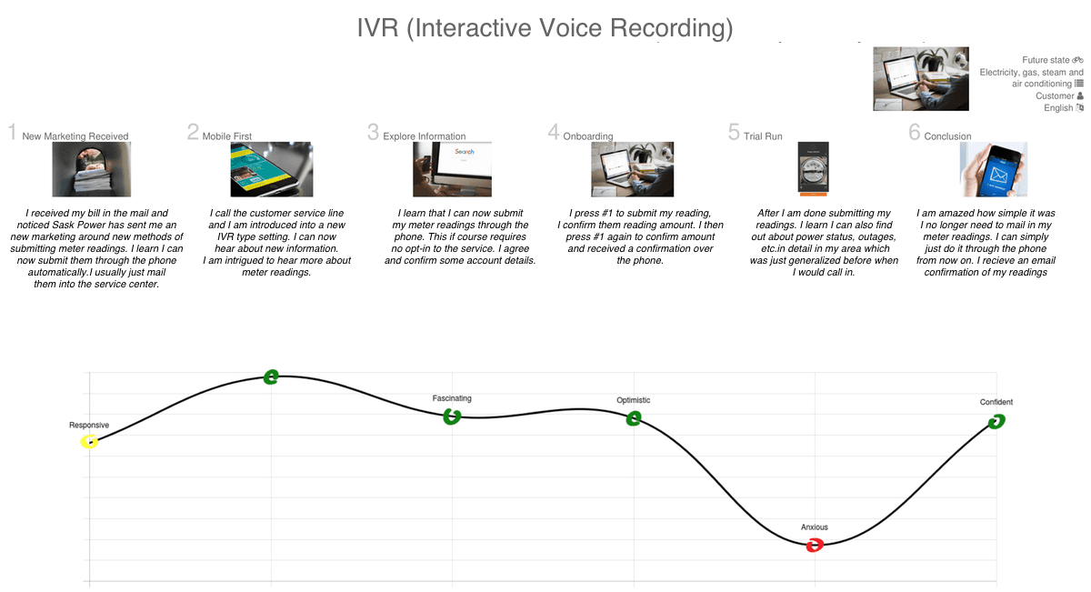

intent of the new customer journeys
The new proposed customer journeys helped establish how incentives could be introduced to the customer, as well as how offline customers could be opted in from an offline collateral to the online portal. It introduced offline methods outside the current experience such as IVR, SMS, QR code, and live agents. Additional ways to reduce call center costs and strains on CSRs included methods such as text and IVR. The new customer journeys combined the offline and online components into a single cohesive experience.
updated concept - automated
After the completion of the journeys, I began to update the current concept. I focused on their primary device, which was the mobile browser that more than 85% of users utilized. The updated automated concept was better designed to take advantage of modern libraries such as Google AI and TensorFlow.
The more advanced functionality, including camera access and push notifications, would be handled through W3C and GetUserMedia. I verified the feasibility of this approach with the engineers. The automated process would quickly recognize an error prone picture and give the user the ability to correct it. By providing these fail-safes, confirmations, and an intuitive way of preventing erroneous actions by the user, this process would help reduce strain and costs on call centers.

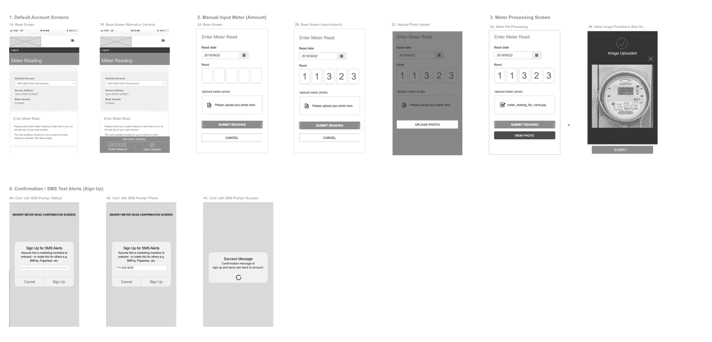
updated concept - manual process
The manual process was fully adopted into the next concept, which went beyond the standard input field. As a fail-safe, users would now be able to see an input and upload field and to view the photo after they upload it. This concept corresponded to the customer journeys where a human element was still required to process the readings.

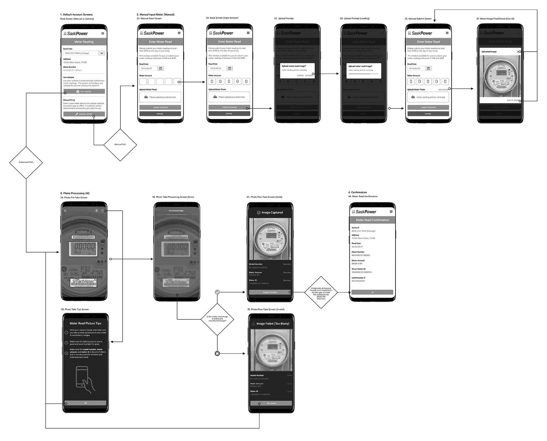
updated wires - UI flow
I assembled the updated wires into a UI flow to better visualize a full end-to-end flow for the automated and manual paths. I shared the updated concept with the rest of the team and noted their feedback. It included a suggestion to update the screen aesthetic into more of a material design and to omit the SMS prompt screens, which they thought seemed overbearing. My focus moving forward was on adopting an Android architecture, since we expected this app (like the previous one) to later be adapted to Android.
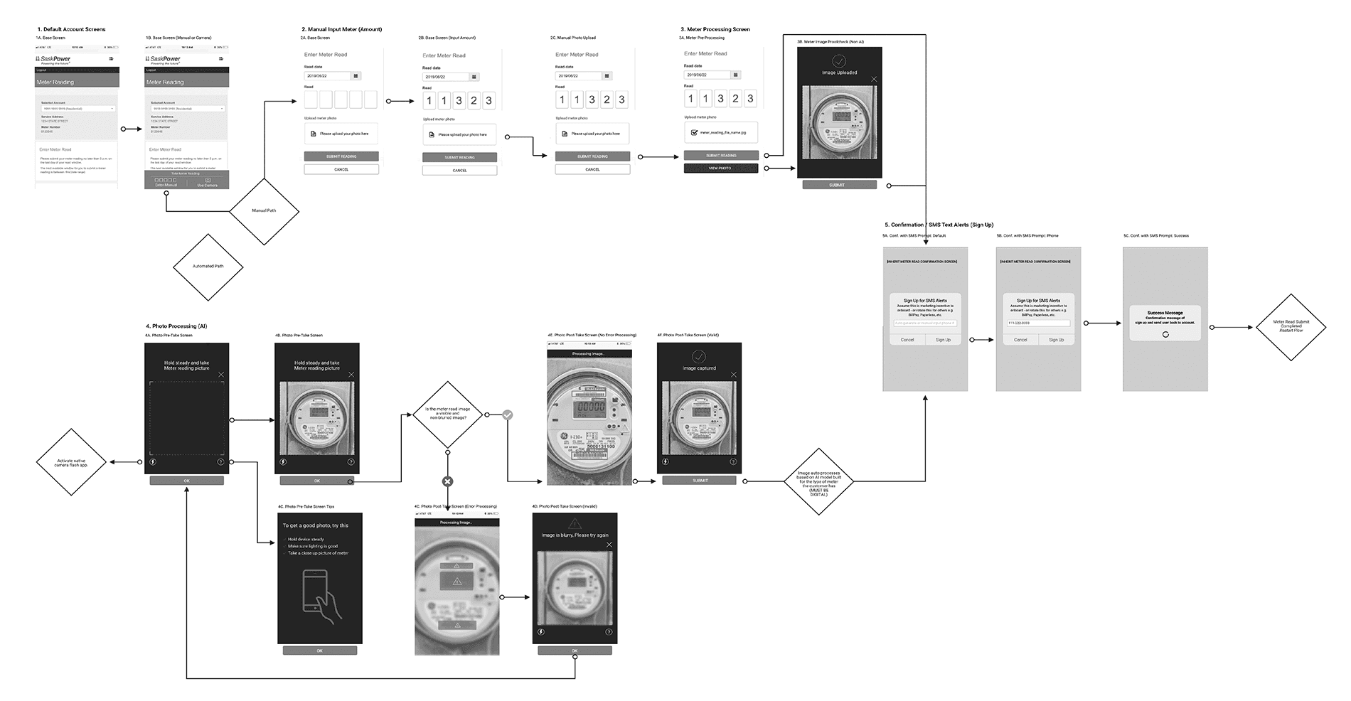

final wireframes
The updated concept included all the account, manual submit, and automated submit screens. I omitted the SMS opt-in screens based on the feedback from my team. Instead, SMS would become a future preference setting or be bundled with additional online utility services.
The final wires also introduced additional screens: upload, enhanced processing, and other recovery screens the user could take action upon depending on their needs. These screens went through one final review. No new feedback was introduced. The final step was adding a visual skin to the wires.

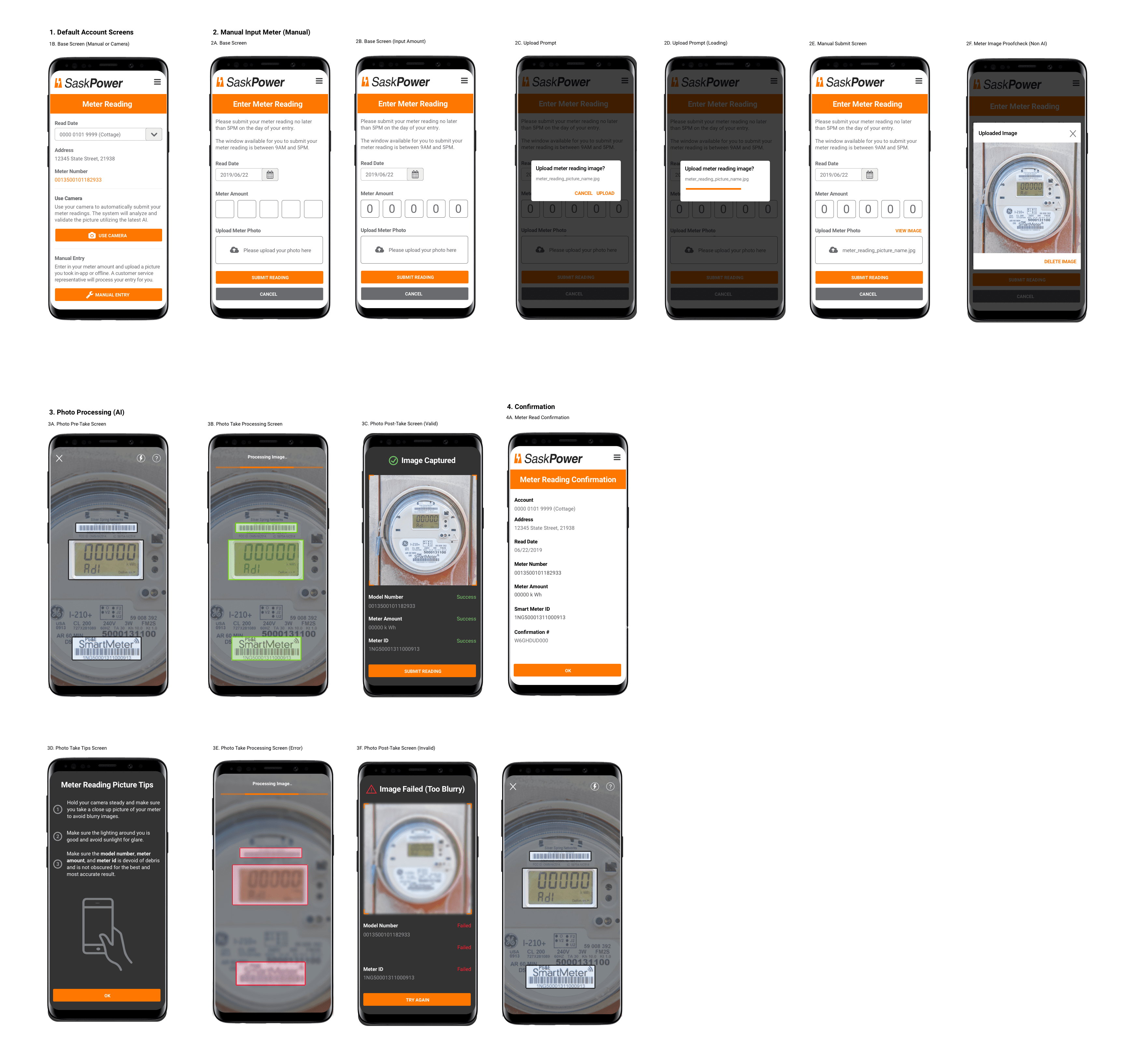
visual treatment
All that remained to be done were the visual treatment and prototype. I utilized the client's branding and, as my team had recommended, I updated the screens to be more inline with material design aesthetic. Finally, I created a prototype for the client presentation.

DESIGN
sync with senior researcher
I shared the journeys with the senior researcher. He agreed that this helped to identify some of the key issues in relation to billing, awareness, and recommending an improved meter reading experience, but noted that it did not solve for the offline component and did not necessarily reduce call center costs or strains on the CSR. He was also curious about the specific offline methods or incentives the team and I were going to create. I communicated this feedback to my team and instructed the other designers to start brainstorming offline methods. I began the design phase for the meter reading experience.
first design steps
The first step was to reimagine the current meter reading submission feature. This would be a basic concept meant mainly to showcase the automated solution, and it would include the current input form. The client had a mobile app, but less than 3% of their customer base utilized it due to a poor experience and lack of interest.
I recommended that this new experience be adapted to the mobile site, as most customers used mobile web according to Google Analytics’ data. I took the use cases from the journey and added them into the control doc while building out the ideal workflow. Each case had key considerations, additional questions, and clarifications where necessary.

the Goals
Reduce call center costs as well as strain and dependency on CSRs so they can focus on high-priority tasks.
Incentivize both Sask Power customers and their employees through offline methods.
Produce ways for offline customers to opt in and self-service their own online utility services.
Assess and improve the meter reading process through manual and automated means so customers receive fewer billing disputes due to incorrect or missing pictures and wrong entries.
As a team, design and propose offline methods in addition to the revamped experience for submitting mobile meter readings.
defining need
Future-state customer journeys that combine offline and online components into a cohesive journey.
An improved online mobile manual and automated process for meter readings that includes fail-safes.
Offline methods such as SMS, IVR, Booths, Live agents, QR codes on bills.
IVR/SMS concept to allow self-service for customers who don’t utilize the online portal.
Contests or prizes to encourage customers to opt in to the automated process.

low-fidelity wireframes
Once I finished compiling information into the control doc, I built out a low-fidelity wireframe. I presented the initial idea to the other UX designer on the project and then met with the project lead. I recommended there be more recognizable AI/ML interactions as well an expanded manual upload to cover the need for fail-safes (in cases of incorrect picture or entry, or lack of confirmation).

offline methods
After sharing the wireframes with my team, I explained my thoughts on expanding the initial concept to the client team and project lead. They agreed with my approach but were curious about how I would handle the mobile side. The team and I were still facing another big design task with respect to how to specifically incentivize or inform customers about the online submission system. The designers presented some ideas they had previous explored. I collaborated with them on expanding those ideas.
Giving guidance
I split up the team efforts in order to conduct research into potential offline methods and how they might plug into the meter reading experience to help reduce CSR time and cost. There would be a focus on three primary methods: IVR, SMS, and secondary considerations for agents, surveys, QR codes, and booths. I split up the efforts between the three designers working under me, with the other designer developing an SMS concept, one junior designer focused on the IVR concept, and the other junior designer exploring secondary methods.

SMS CONCEPT
The other designer came up with an SMS concept to utilize sending meter readings and reporting power outages. Text messaging would open up the scope of consumer interaction. It would require less bandwidth than voice calls & email. (Better reliability in poor coverage areas). Lastly, it allows for more efficient interactions on behalf of the customer and CSR.

IVR concept
The junior designer who I tasked with developing an IVR concept came up with a new method that the client was not currently utilizing. The concept was simple and could be automated over the phone. Customers would submit their entry automatically and it would reflect in their online record.
There would be no processing required. This method could also be used for promotional purposes. The expectation was that it would reduce call center costs, save customers time, and prioritize CSR calls based on the caller’s priority in queue.

Live Agent, Surveys & QR Code
The other junior designer proposed some secondary methods to incentivize and opt in the customer. The first idea was a QR code that would direct customers to a landing page to sign-up. The second idea was to have live agents with a demo and follow-up survey so that we could get a better gauge on customer feedback. The designer also researched CSR incentives and found out that gift cards and other employee perks were already being implemented.

future meter reading journey: fliers & contest
I, along with one of my junior designers, built out three additional customer journeys to visualize what a potential user’s experience might look like if they were to utilize one of these methods. All three journeys incorporated either the manual, automated, or combined process. These new journeys also introduced specific incentives and additional secondary methods.
The customer is incentivized to opt in for mobile meter readings.The customer takes their own picture (not through app) and submits it manually through the portal (rather than by email) including the meter reading amount. The customer is later notified of their submission and can view a record in the online portal.

Future meter reading journey: agent & sms
The customer is incentivized to opt in for mobile meter readings. The customer joins and finds an optional tutorial explaining how to perform the reading. The customer takes their own picture (not through app) and submits it manually through the portal (rather than by email) including the meter reading amount. The customer is later notified of their submission and can view a record in the online portal.

future meter reading journey: ivr
The customer is incentivized to opt in for mobile meter readings. The customer joins and finds an optional tutorial explaining how to perform the reading. The customer takes their own picture (not through app) and submits it manually through the portal (rather than by email) including the meter reading amount. The customer is later notified of their submission and can view a record in the online portal.

intent of the new customer journeys
The new proposed customer journeys helped establish how incentives could be introduced to the customer, as well as how offline customers could be opted in from an offline collateral to the online portal. It introduced offline methods outside the current experience such as IVR, SMS, QR code, and live agents. Additional ways to reduce call center costs and strains on CSRs included methods such as text and IVR. The new customer journeys combined the offline and online components into a single cohesive experience.
updated concept - automated
After the completion of the journeys, I began to update the current concept. I focused on their primary device, which was the mobile browser that more than 85% of users utilized. The updated automated concept was better designed to take advantage of modern libraries such as Google AI and TensorFlow.
The more advanced functionality, including camera access and push notifications, would be handled through W3C and GetUserMedia. I verified the feasibility of this approach with the engineers. The automated process would quickly recognize an error prone picture and give the user the ability to correct it. By providing these fail-safes, confirmations, and an intuitive way of preventing erroneous actions by the user, this process would help reduce strain and costs on call centers.

updated concept - manual process
The manual process was fully adopted into the next concept, which went beyond the standard input field. As a fail-safe, users would now be able to see an input and upload field and to view the photo after they upload it. This concept corresponded to the customer journeys where a human element was still required to process the readings.

updated wires - UI flow
I assembled the updated wires into a UI flow to better visualize a full end-to-end flow for the automated and manual paths. I shared the updated concept with the rest of the team and noted their feedback. It included a suggestion to update the screen aesthetic into more of a material design and to omit the SMS prompt screens, which they thought seemed overbearing. My focus moving forward was on adopting an Android architecture, since we expected this app (like the previous one) to later be adapted to Android.

final wireframes
The updated concept included all the account, manual submit, and automated submit screens. I omitted the SMS opt-in screens based on the feedback from my team. Instead, SMS would become a future preference setting or be bundled with additional online utility services.
The final wires also introduced additional screens: upload, enhanced processing, and other recovery screens the user could take action upon depending on their needs. These screens went through one final review. No new feedback was introduced. The final step was adding a visual skin to the wires.

visual treatment
All that remained to be done were the visual treatment and prototype. I utilized the client's branding and, as my team had recommended, I updated the screens to be more inline with material design aesthetic. Finally, I created a prototype for the client presentation.

NEXT STEPS
final presentation
After finishing the prototype, I shared my final presentation for the client proposal with the project lead and account team. With their approval, I presented the solution to the client. The client came back with positive notes and feedback.
In summary, they were delighted at the initiative and detailed concept but not interested in investing in new marketing initiatives at this time. They would consider the QR code, fliers, and contests. They were, however, open to bringing specialized consultants onboard to help them expand the IVR method and SMS experience my team had come up with.
The final prototype was sent off to development. I worked with the project lead and engineering team until the final sprint to make sure all design specifications were met.
NEXT STEPS
final presentation
After finishing the prototype, I shared my final presentation for the client proposal with the project lead and account team. With their approval, I presented the solution to the client. The client came back with positive notes and feedback.
In summary, they were delighted at the initiative and detailed concept but not interested in investing in new marketing initiatives at this time. They would consider the QR code, fliers, and contests. They were, however, open to bringing specialized consultants onboard to help them expand the IVR method and SMS experience my team had come up with.
The final prototype was sent off to development. I worked with the project lead and engineering team until the final sprint to make sure all design specifications were met.
OUTCOMES
product adoption
The team and I later learned that more than 85% of the offline customers utilized the offline methods to learn about the benefits of the online portal (from submitting meter readings to managing their account, outages, and more) had signed up and moved to utilize the features of the online experience.
reduced disputes & increased productivity
Overall, customer billing disputes were reduced by 50%, and CSR productivity on higher priority tasks such as outages was increased by 75%. These metrics were communicated to us by the client account team.
OUTCOMES
product adoption
The team and I later learned that more than 85% of the offline customers utilized the offline methods to learn about the benefits of the online portal (from submitting meter readings to managing their account, outages, and more) had signed up and moved to utilize the features of the online experience.
reduced disputes & increased productivity
Overall, customer billing disputes were reduced by 50%, and CSR productivity on higher priority tasks such as outages was increased by 75%. These metrics were communicated to us by the client account team.
LEARNINGS
meter reading process
It was interesting to learn and understand how often the agent conducted meter readings—sometimes only one or two times a year. The self-service was confusing because it required users to fill out a basic form and email their pictures separately. Thus, it was easy to understand why some bills resulted in disputes.
device usage
The population of SK does not text much. This appears to be cultural: they are not glued to phones as much as in the US. Some areas of the territory prefer traditional (offline) methods of information outreach. That said, 90% of the users utilized the mobile web and still would choose it over a native app.
dependency on CSRs
It was interesting to see how many dependencies on CSRs there were. There was an abundance of customers who still performed actions offline and didn't utilize the online capabilities at all. This had resulted in high call center costs and ate up most of the time of the CSRs, who could have been dealing with higher priority tasks.