Medications and Clinical
Walgreens's pharmacy team members require detailed patient information and dispensing history to deliver effective care and ensure accurate medication dispensing.
GOALS
Design a way in which pharmacists and technicians can provide efficient patient care without the need for third-party UIs and secondary procedures, in addition, to detailed information about a patient's dispense and clinical history. Also, provide real-time statuses of a patient's medications to ensure multiple dispenses are completed on time and keep all processes to a single system.
CHALLENGES
Re-workshopping all existing business and functional requirements as previous were too incoherent and missing in a short timeframe.
Mentoring a junior designer on design direction and training them on the design system and process while I wore multiple hats.
Integrating dispense details and information from a third-party UI (very little) and did not have billing details, no historical audit information.
Implementing existing refill functionality - required extensive input from pharmacy team members on guidance for a usable UI (for single and multi-dispenses).
Giving team members the ability to view multiple medications and not overbear them with too little or too much information at the time of patient care.
MY ROLE
Participate in product and business team workshops to gather and define requirements.
Build a storyboard and medium wireframes to illustrate patient medications and fill history
Analyze and create a user flow for this pharmacy process.
Create annotated wireframes and tab order diagrams for the engineering and elaboration process (for final implementation).
Design pixel-perfect high-fidelity wireframes for prototype and usability testing purposes.
WHAT I DELIVERED
2 User flows
40 Medium-fidelity wireframes
1 Storyboard
40 High-fidelity wireframes
36 Annotated wireframes
4 Tab order diagrams
RESEARCH
REVIEWING REQUIREMENTS
The existing product document had vague requirements and conflicting business rules from the previous workshops for this next topic. The current product document was not going to be able to be utilized. I had to work with was currently in place, but I required multi-day core team meetings. The scope of work would need an additional junior designer. The designer worked directly under me to assist with production-oriented tasks and trained them on the design system.
SETTING EXPECTATIONS
The first task was setting expectations with the junior designer. Next, I tasked the junior designer to take notes during the core team meetings. Next, I scheduled the first series of meetings which would focus on the "Medication History" feature and the various sub-views prescription history, product history, and self-reported medications.
The first week of meetings (three per week) consolidated the existing information and applied it to the new product requirements document. I asked the SME what the "Medication History" goal was, and the current pain points were over its predecessor. The junior designer took notes as the team, and I completed the first meetings.


GOAL
To allow a team member to view all history and currently in-progress prescriptions associated with the patient. See past and present prescription and product-level details. View and edit the self-reported medications for the patient.
TOP THREE PAIN POINTS
As a pharmacist or technician, certain elements are not present in the internal system, and it requires accessing a third-party UI which reduces patient efficiency care.
As a pharmacist, I cannot close or determine if a prescription is closed, which often results in it becoming therapeutically inactive, which impacts the patient care (usually non-viable).
As a pharmacist, I cannot compare multiple dispense or prescriptions, often has to manually search, and largely depends on whether the Rx number is valid.
DEFINED THE FUNCTIONAL REQUIREMENTS
I met with the junior designer and looked through the additional notes they had compiled, and I wanted to make sure the information was accounted for. The next step was meeting with the core team to define the functional requirements.
For example, prescription history had the most needs, product history had only two, and self-reported medications would be read-only. Then, I met with the Product Manager and SME to look at the proposed requirements. I explained that we needed to have all requirements defined for this topic before moving into planning or design phases. The team agreed with this approach.
NEXT SET OF FEATURES
The following features were "Fill History" and "Clinical History." I instructed the junior designer to continue to take notes as I talked with the core team about requirements. This feature required two separate discussions to define the criteria.


GOAL
To allow a team member to view all details related to a prescription. This feature set includes billing details, audit details, and all clinical interactions (separate feature) per dispense. Team members would require up to 24 months of history. As well, allowing a detailed documentation process for all historic clinical interactions at the medication and dispensing level for a pharmacist. These enhanced abilities would assist with clinical decisions and fulfillment processing for a patient's care and medications.
TOP THREE PAIN POINTS
As a pharmacist, when comparing dispense details I have to switch between multiple numbers and views.
As a pharmacist or technician, all dispense information is not readily available - no indication of billing details, no historical audit information (requires separate UI).
As a pharmacist, I must access a folder system to answer a patient's question about anything clinical related to their medication.
FINALIZING EVERYTHING
The team and I finalized the last set of functional requirements. First, the Product Manager and SME would ensure all business rules were correctly associated with the corresponding application requirements. Next, I tasked the junior designer with adding all relevant notes to the Confluence page. The next step was to begin defining the workflow for the new experience.
RESEARCH
REVIEWING REQUIREMENTS
The existing product document had vague requirements and conflicting business rules from the previous workshops for this next topic. The current product document was not going to be able to be utilized. I had to work with was currently in place, but I required multi-day core team meetings. The scope of work would need an additional junior designer. The designer worked directly under me to assist with production-oriented tasks and trained them on the design system.
SETTING EXPECTATIONS
The first task was setting expectations with the junior designer. Next, I tasked the junior designer to take notes during the core team meetings. Next, I scheduled the first series of meetings which would focus on the "Medication History" feature and the various sub-views prescription history, product history, and self-reported medications.
The first week of meetings (three per week) consolidated the existing information and applied it to the new product requirements document. I asked the SME what the "Medication History" goal was, and the current pain points were over its predecessor. The junior designer took notes as the team, and I completed the first meetings.


GOAL
To allow a team member to view all history and currently in-progress prescriptions associated with the patient. See past and present prescription and product-level details. View and edit the self-reported medications for the patient.
TOP THREE PAIN POINTS
As a pharmacist or technician, certain elements are not present in the internal system, and it requires accessing a third-party UI which reduces patient efficiency care.
As a pharmacist, I cannot close or determine if a prescription is closed, which often results in it becoming therapeutically inactive, which impacts the patient care (usually non-viable).
As a pharmacist, I cannot compare multiple dispense or prescriptions, often has to manually search, and largely depends on whether the Rx number is valid.
DEFINED THE FUNCTIONAL REQUIREMENTS
I met with the junior designer and looked through the additional notes they had compiled, and I wanted to make sure the information was accounted for. The next step was meeting with the core team to define the functional requirements.
For example, prescription history had the most needs, product history had only two, and self-reported medications would be read-only. Then, I met with the Product Manager and SME to look at the proposed requirements. I explained that we needed to have all requirements defined for this topic before moving into planning or design phases. The team agreed with this approach.
NEXT SET OF FEATURES
The following features were "Fill History" and "Clinical History." I instructed the junior designer to continue to take notes as I talked with the core team about requirements. This feature required two separate discussions to define the criteria.


GOAL
To allow a team member to view all details related to a prescription. This feature set includes billing details, audit details, and all clinical interactions (separate feature) per dispense. Team members would require up to 24 months of history. As well, allowing a detailed documentation process for all historic clinical interactions at the medication and dispensing level for a pharmacist. These enhanced abilities would assist with clinical decisions and fulfillment processing for a patient's care and medications.
TOP THREE PAIN POINTS
As a pharmacist, when comparing dispense details I have to switch between multiple numbers and views.
As a pharmacist or technician, all dispense information is not readily available - no indication of billing details, no historical audit information (requires separate UI).
As a pharmacist, I must access a folder system to answer a patient's question about anything clinical related to their medication.
FINALIZING EVERYTHING
The team and I finalized the last set of functional requirements. First, the Product Manager and SME would ensure all business rules were correctly associated with the corresponding application requirements. Next, I tasked the junior designer with adding all relevant notes to the Confluence page. The next step was to begin defining the workflow for the new experience.
PLAN
WORKFLOW
The Product Manager created use cases with the information from the workshops. Once the use cases were made, I started to put together a complete user flow. This user flow overwrote the outdated existing process flow. I shared the user flow with the core team and got approval to move to the concept phase. I met with the junior designer and laid out the design plan. I explained how we would tackle each feature and set expectations with them.
MEDICATION HISTORY
This workflow indicated the process for accessing a patient’s medication history, product history, and self-reported medications. In addition, accessing the various facets: fill history, clinical history, Rx profile, close Rx, and refill Rx.


REFILL RX, CLOSE RX
This workflow indicated the process for closing a prescription should it no longer be needed or required. In addition, how a team member could refill an eligible prescription or take the necessary steps to remove ineligible drugs, add an eligible prescription, and complete the refill process.


CONCEPT PHASE - MEDICATION HISTORY
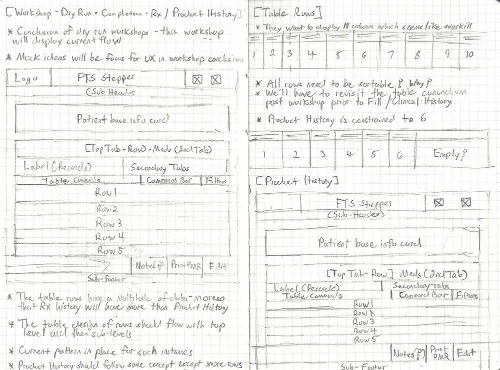
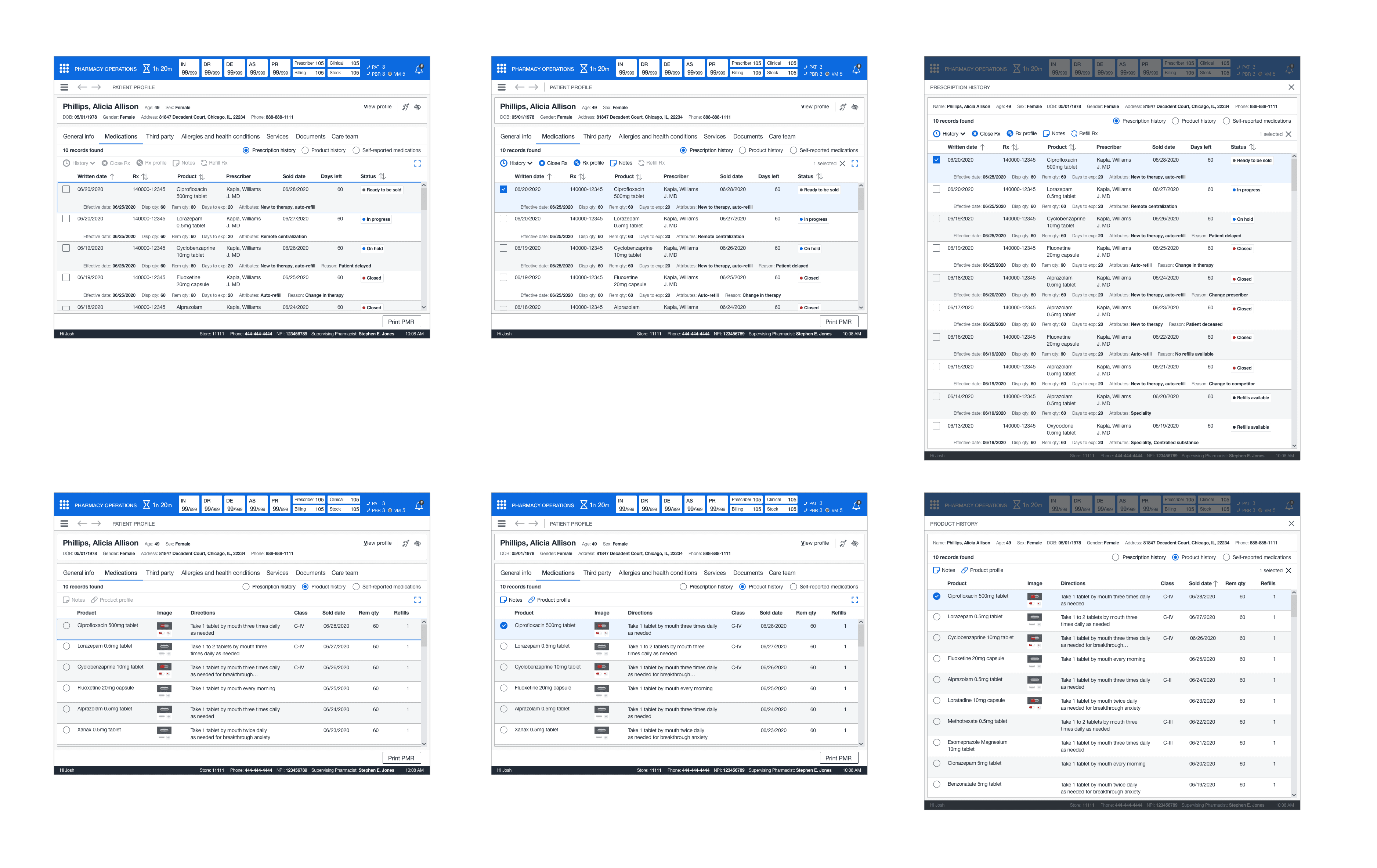
I first started with the medication history. The focus was to design the base structure for this feature and then expand into the individual views within the medication history view. I first started with the primary idea of prescription history and then moved into product history, with self-reported medications being the least utilized view.
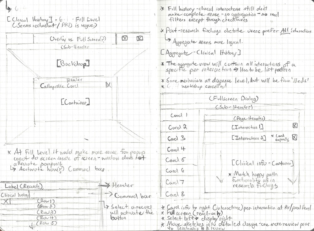
As I moved through this process, I added notes on the sketches to help capture feedback and notate specific interactions and entry points of the user experience (fill history and clinical history). Once the drawings were complete, I set up the next series of meetings to meet with the core team and finish out the other features. Finally, I instructed the junior designer to take the sketches and import them into Figma to start on medium-fidelity wireframes.


PLAN
WORKFLOW
The Product Manager created use cases with the information from the workshops. Once the use cases were made, I started to put together a complete user flow. This user flow overwrote the outdated existing process flow. I shared the user flow with the core team and got approval to move to the concept phase. I met with the junior designer and laid out the design plan. I explained how we would tackle each feature and set expectations with them.
MEDICATION HISTORY
This workflow indicated the process for accessing a patient’s medication history, product history, and self-reported medications. In addition, accessing the various facets: fill history, clinical history, Rx profile, close Rx, and refill Rx.

REFILL RX, CLOSE RX
This workflow indicated the process for closing a prescription should it no longer be needed or required. In addition, how a team member could refill an eligible prescription or take the necessary steps to remove ineligible drugs, add an eligible prescription, and complete the refill process.

CONCEPT PHASE - MEDICATION HISTORY
I first started with the medication history. The focus was to design the base structure for this feature and then expand into the individual views within the medication history view. I first started with the primary idea of prescription history and then moved into product history, with self-reported medications being the least utilized view.
As I moved through this process, I added notes on the sketches to help capture feedback and notate specific interactions and entry points of the user experience (fill history and clinical history). Once the drawings were complete, I set up the next series of meetings to meet with the core team and finish out the other features. Finally, I instructed the junior designer to take the sketches and import them into Figma to start on medium-fidelity wireframes.


DESIGN
DRUG HISTORY RECORD
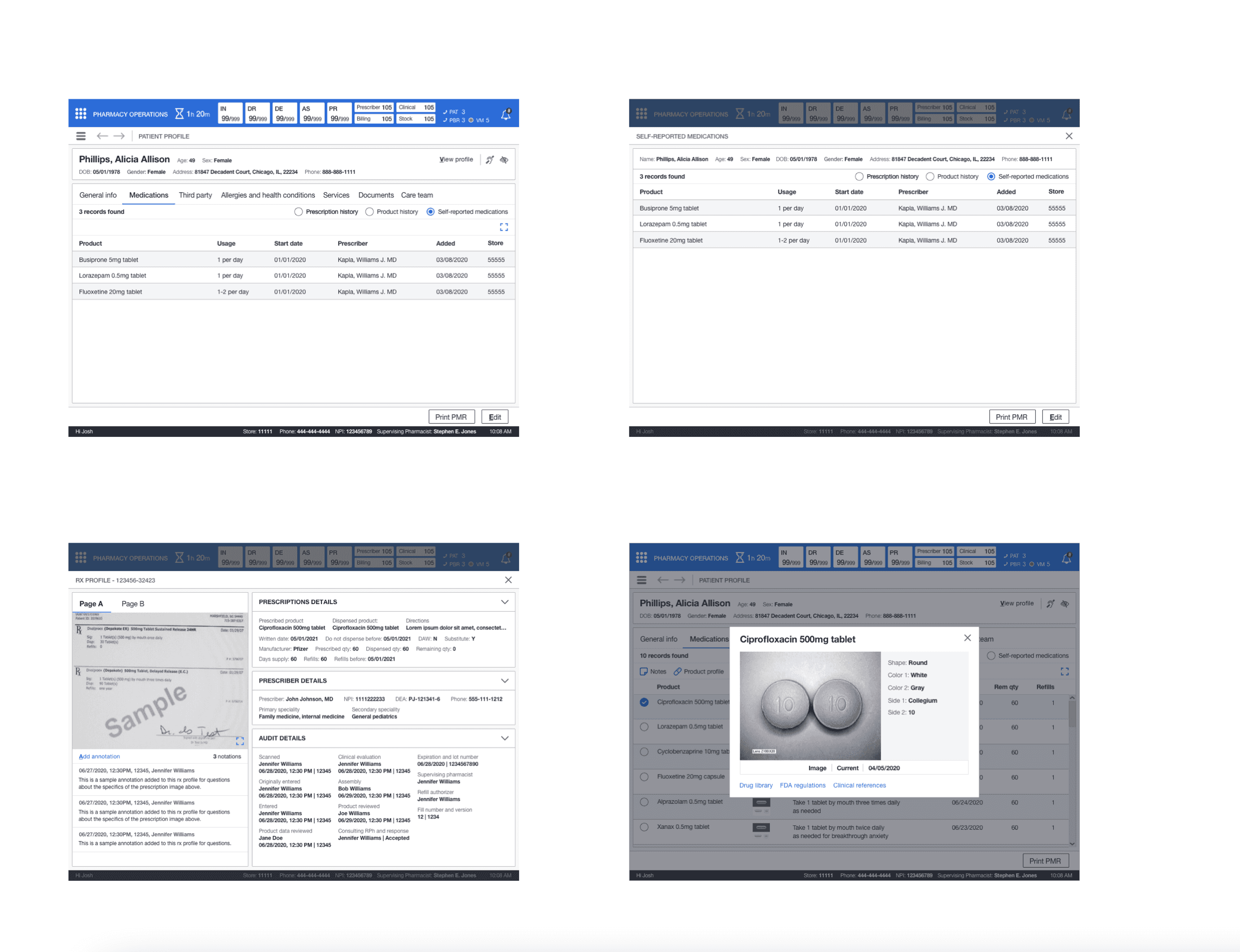
The medical history record encompassed three different perspectives: one favored scheme of rotating among these views. This would get rid of the need to use third-party interfaces since all prescribed medication attributes would be readily available. I also developed a full-screen layout to tackle the issue of "restricted record visibility" in the previous system.
This display offered the functionality to collate several prescriptions without necessitating a manual lookup. The drug table featured a conventional table layout with a command bar to carry out the necessary user operations. I commenced working on the sequential screens. Subsequently, I entrusted further tidying up tasks to the assistant designer, and focused on sketching out the fill history wireframes. Lastly, I turned my attention towards the more urgent matter of clinical history.


FILL HISTORY
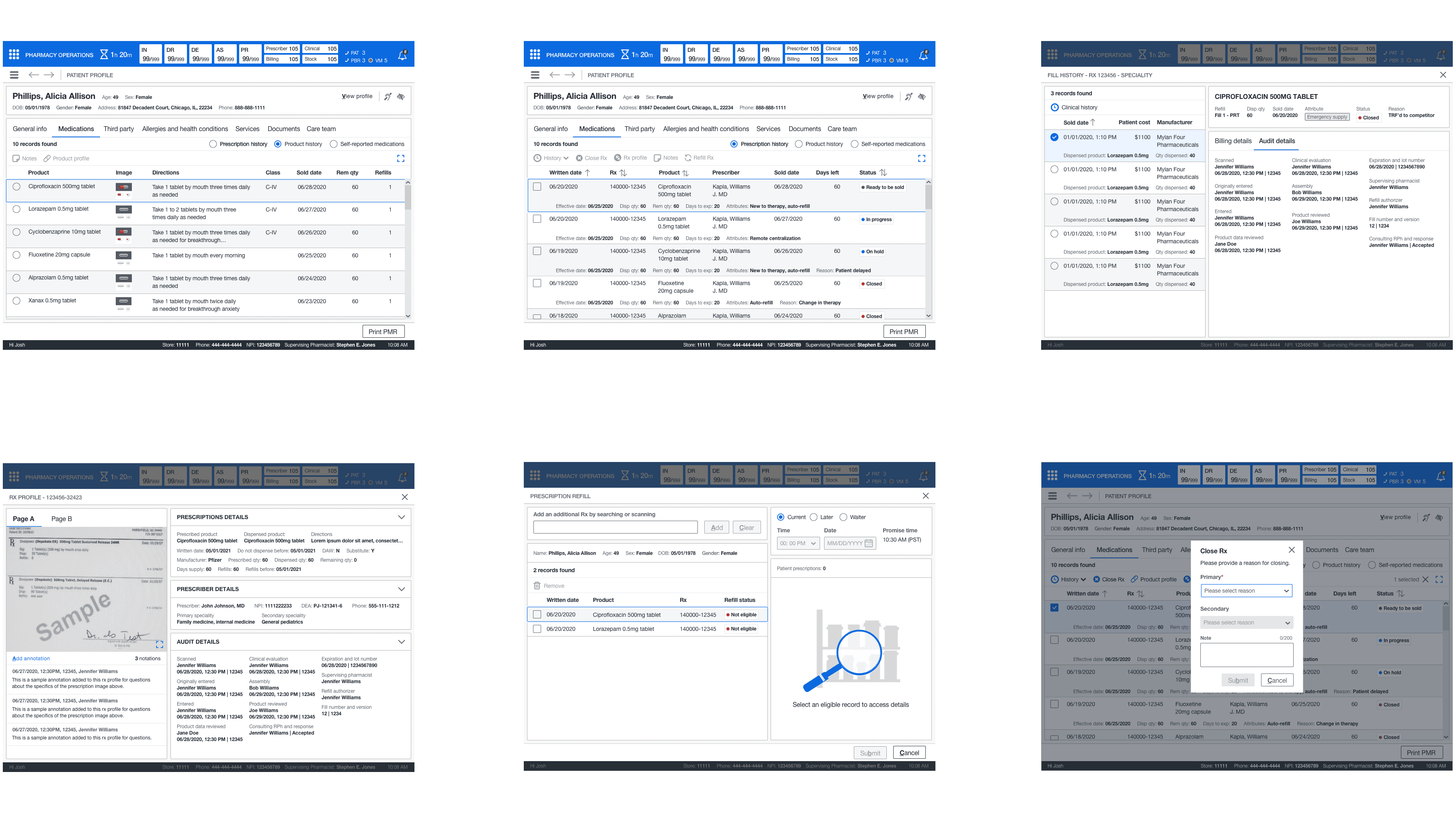
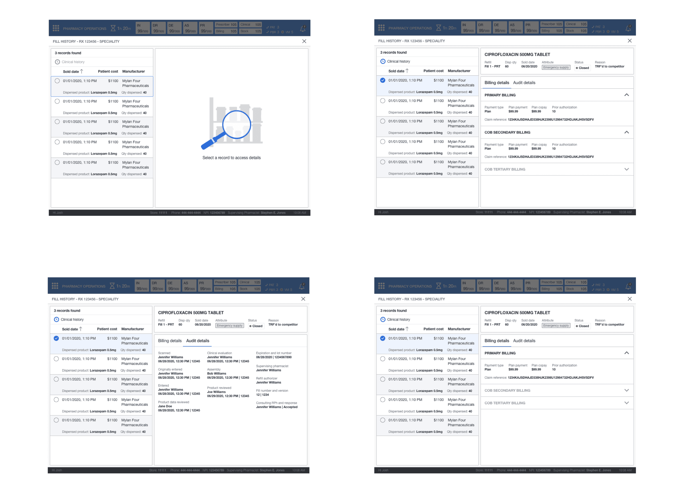
The junior designer needed some guidance on implementing a pattern from the sketches. This pattern would help display the information required but keep records in a simplified format. I recommended following a 60/40 grid design with a selection on the left and a display on the right. I lead the information structure and layout for the fill history screen (billing, audit details, and the drug card).
I tasked the junior designer with implementing the components from our library for the interactions. This new design would give all team members the billing and audit details and the historical dispense information over time for patient medication. On the integration side, it eliminated the draconian folder system. The junior designer continued cleaning up and adding the screens to the storyboard where I had left placeholders while I worked on clinical history.

CLINICAL HISTORY
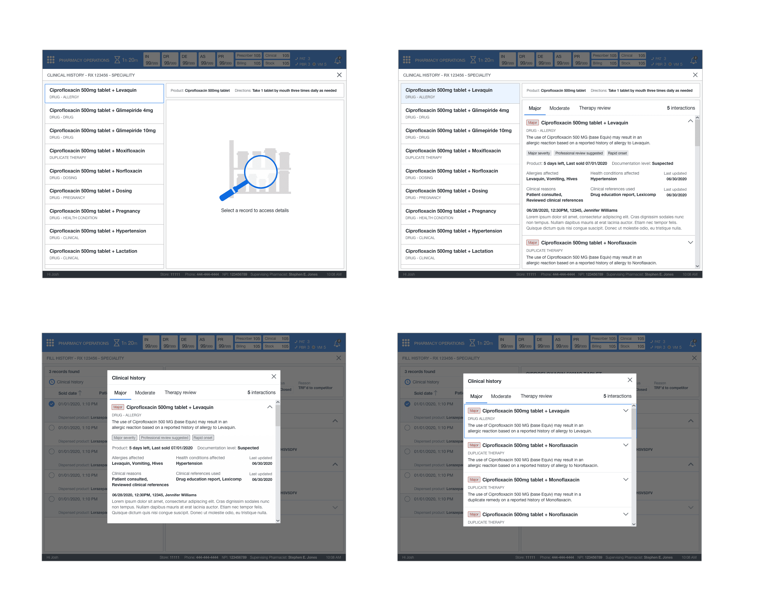
This feature followed the same layout that was utilized for dispensing history. The key difference was I used cards instead as there was no tabular data. I had to design the information layout and structure for the expanded view. There was a global view that contained all clinical history for medication and its dispenses and clinical history at the individual dispense level. This gave the pharmacist the ability to understand why these different clinical interactions became added to the medication or dispense.

CLOSE RX
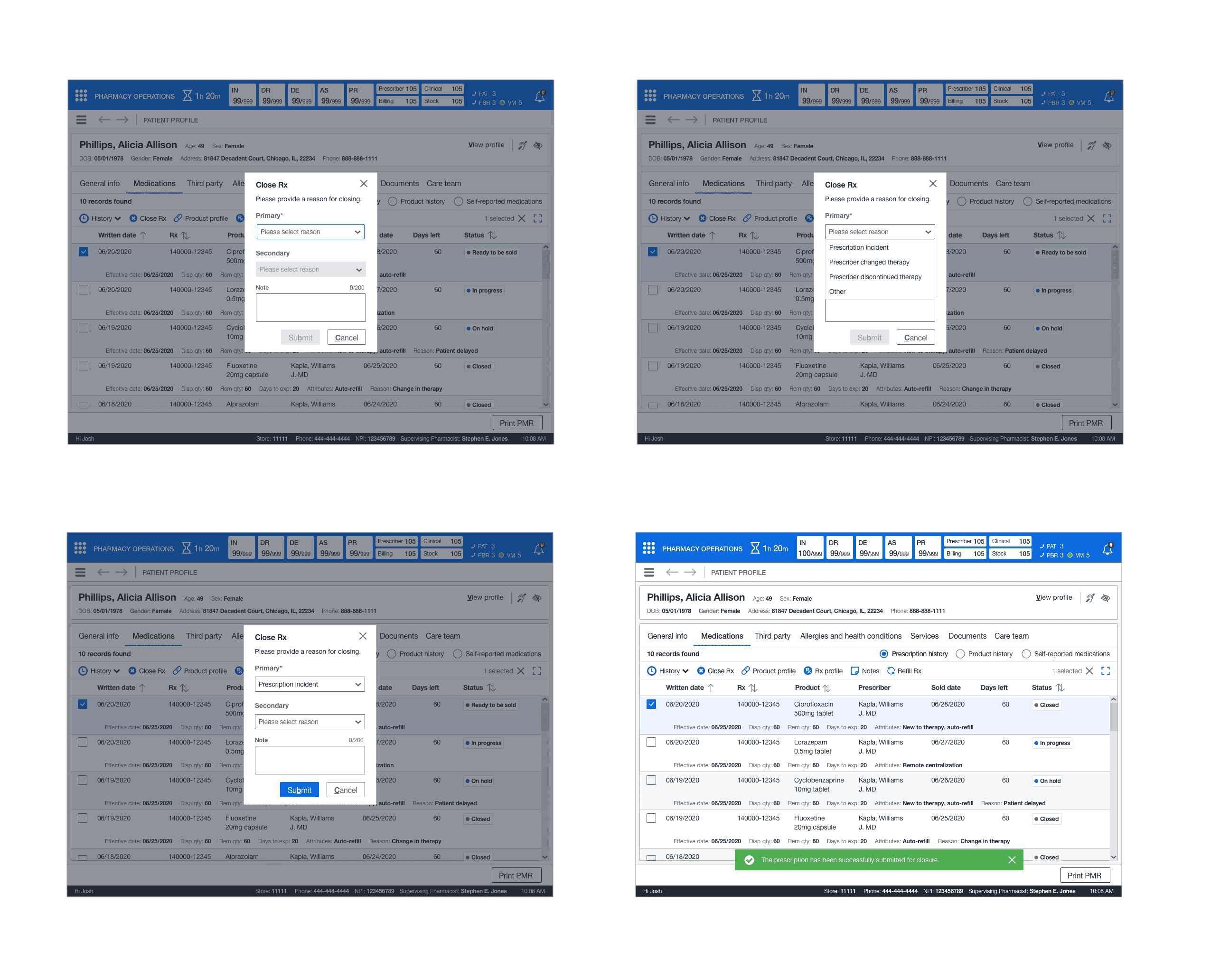
This feature applied the standard pattern of a dialog. The pharmacist or technician can close out the prescription from the dropdown and submit it for closure.

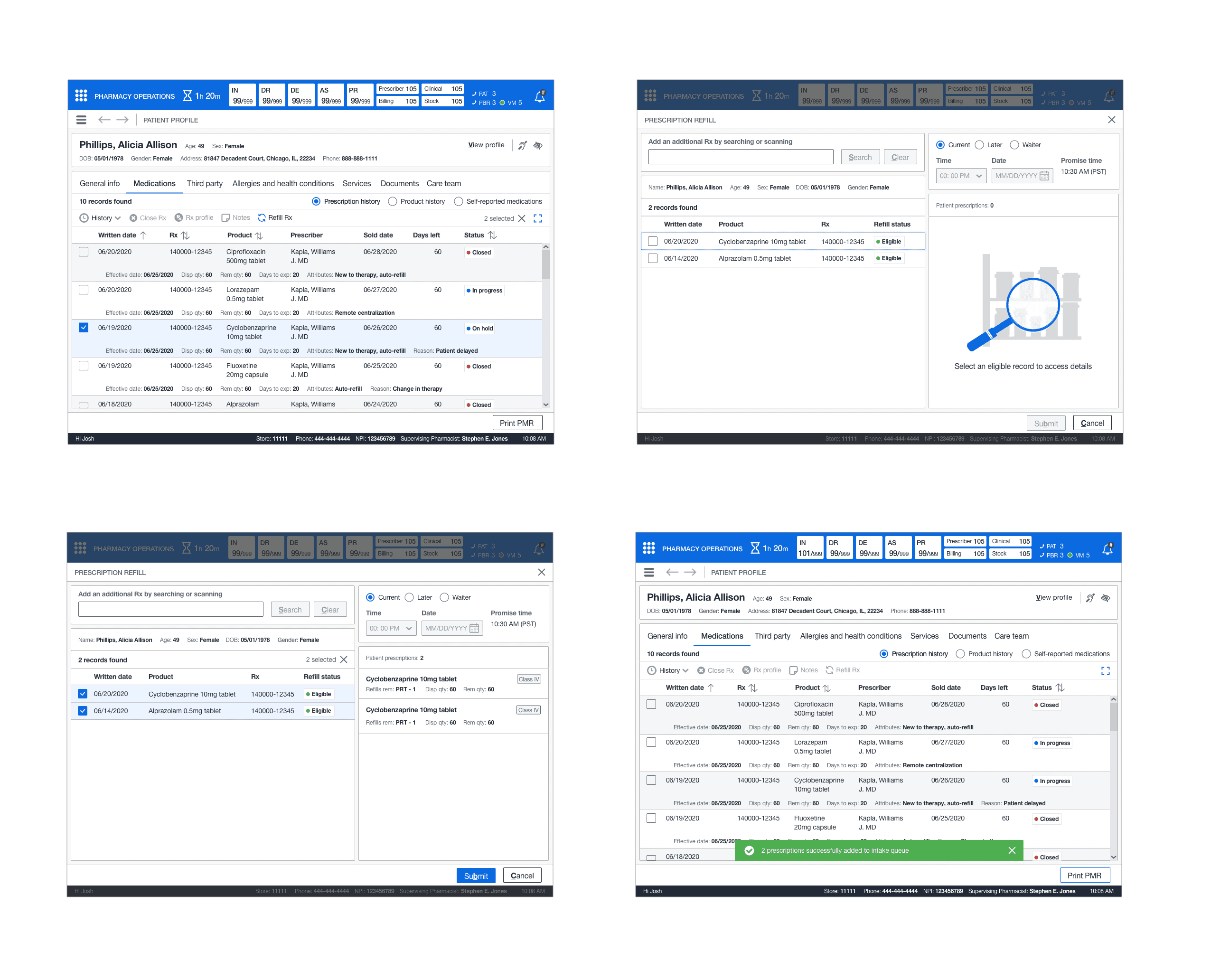
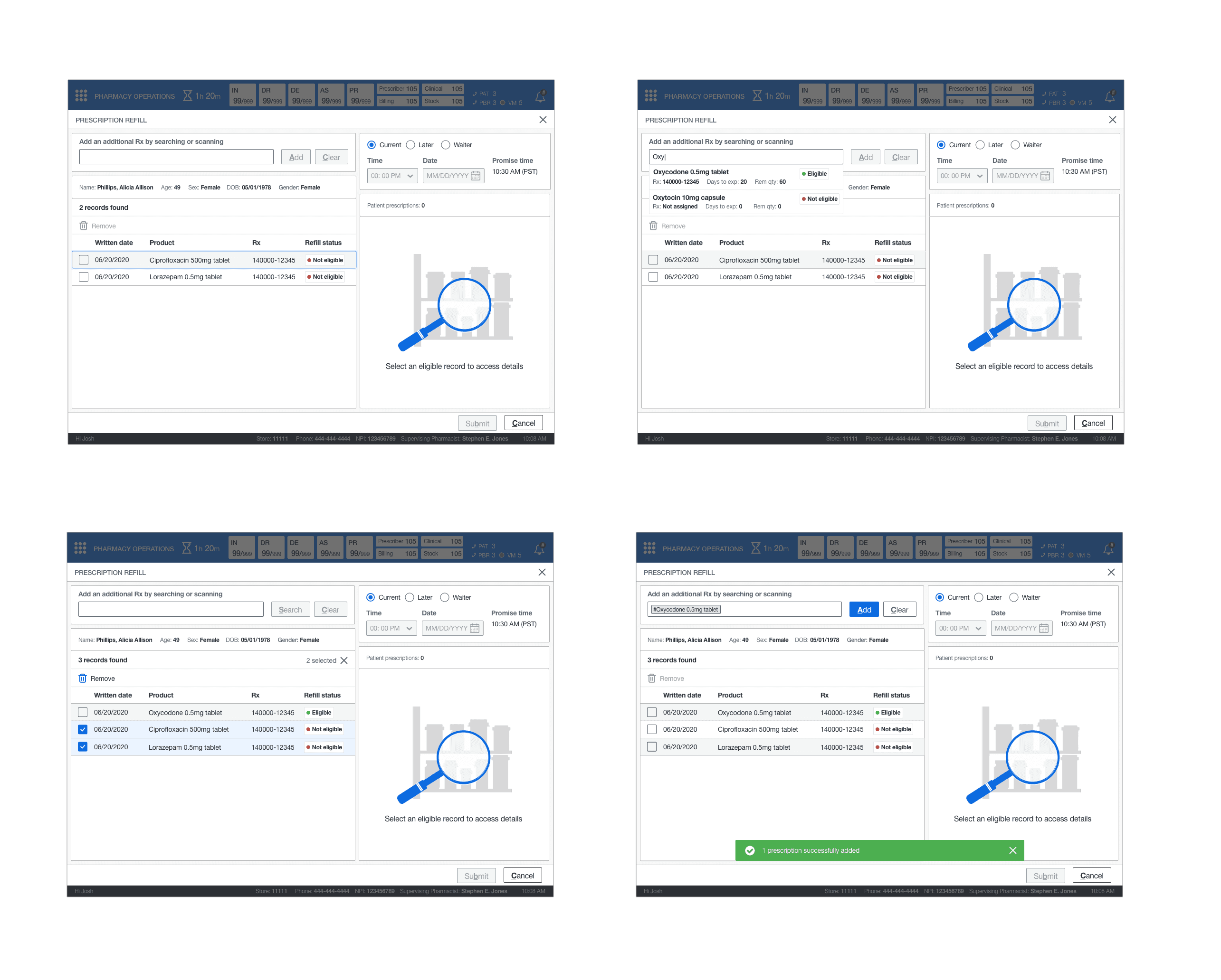
REFILL RX
This feature involved two standard use cases—the ability to refill an eligible medication by utilizing a 60/40 grid split that followed the other models. Interact on the left and display on the right. In addition, introduced search functionality should the pharmacist or technician remove ineligible prescriptions and add new ones for the patient's refill.



STORYBOARD
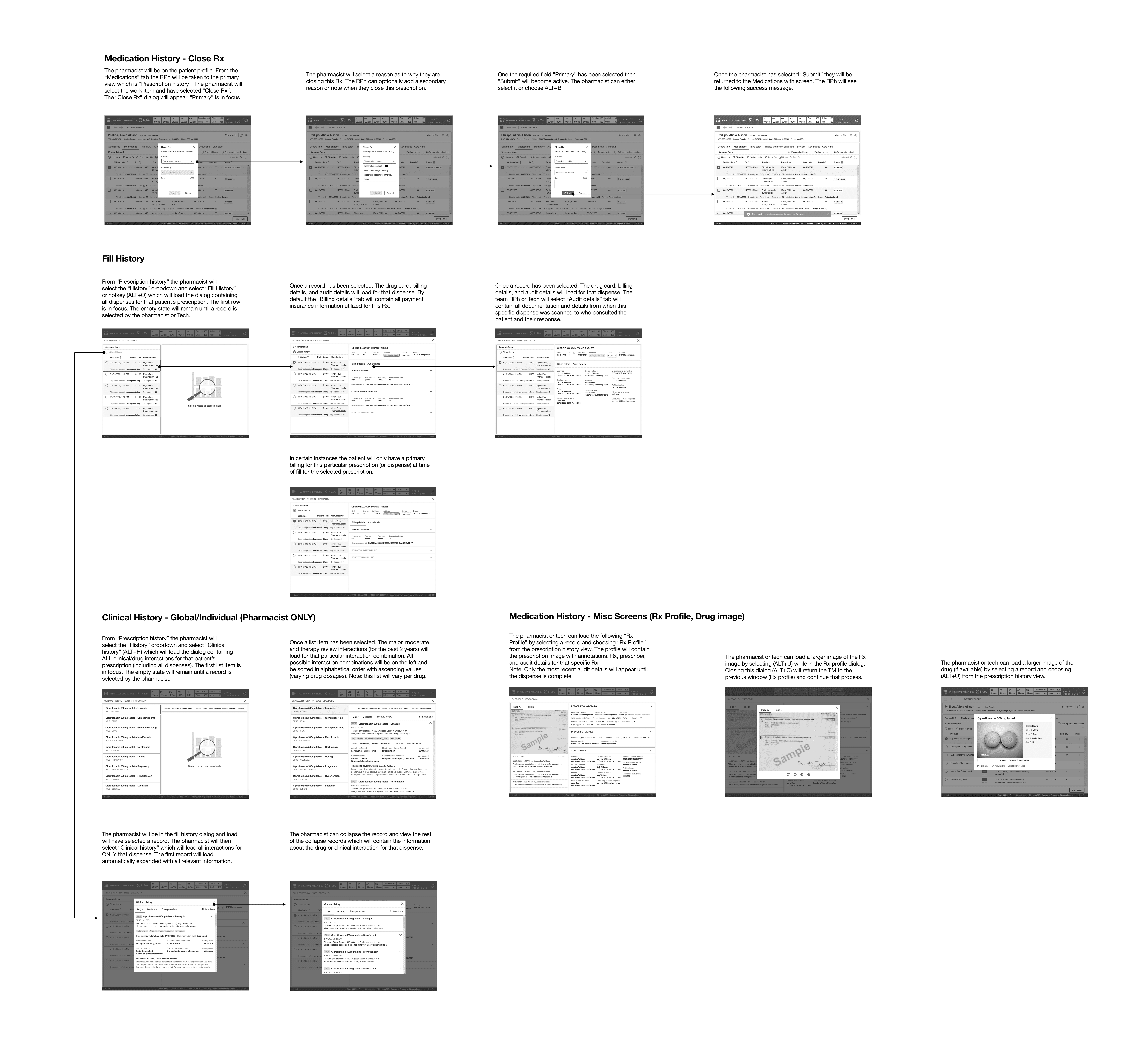
Next, I constructed the wireframes into a storyboard that showed the patient medications', Close Rx, and Refill Rx experiences.
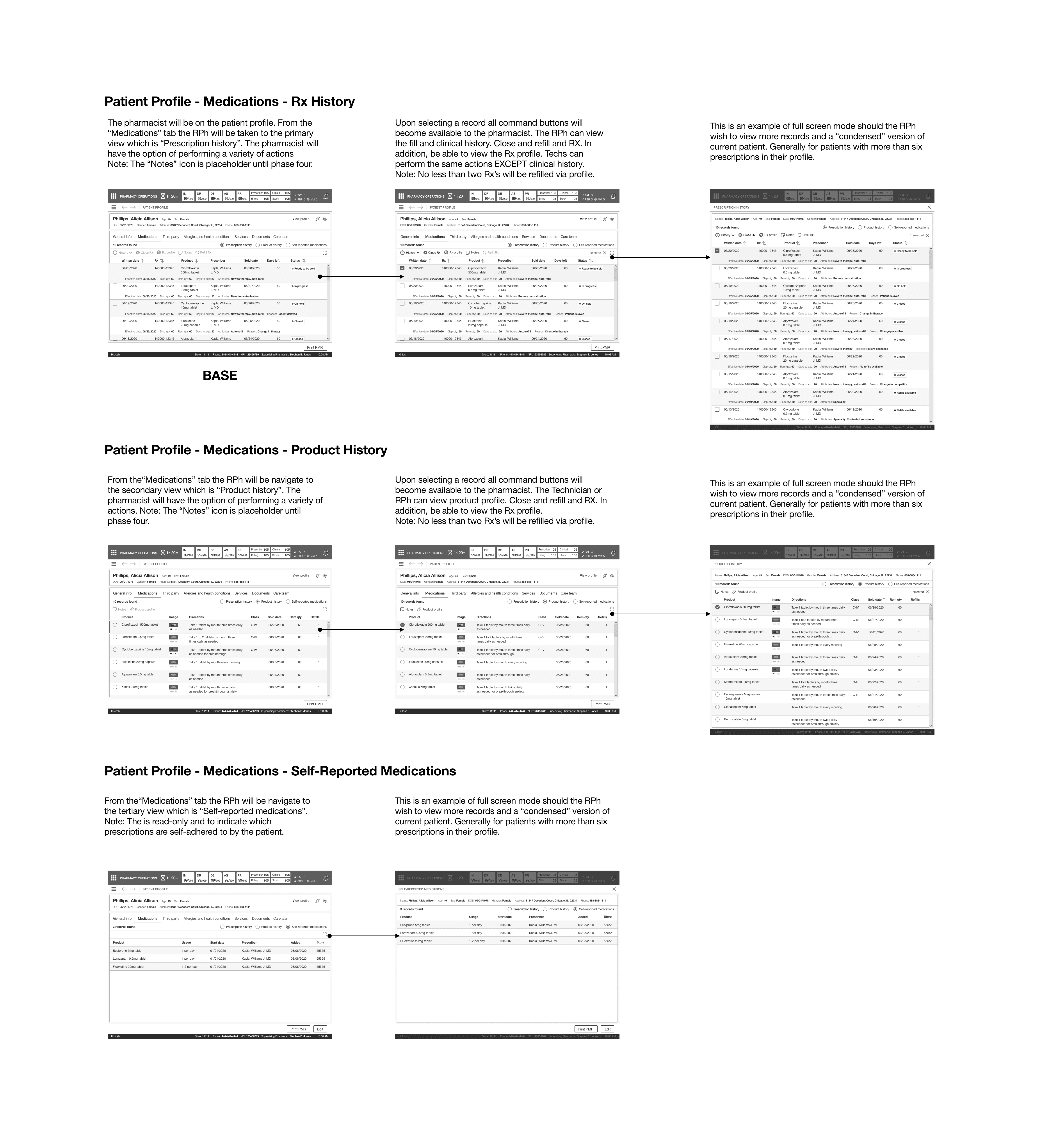
MEDICATION HISTORY
This path indicated how a pharmacist or technician could access the patient's medication history to perform various actions such as refilling, closing, and accessing individual facets of patients' medication history. In addition, access the product history and if a patient had any self-reported medications.

MEDICATIONS - FILL HISTORY
This path indicated how a pharmacist or technician could access the patient's fill history from patient medication history and see the patient's previous dispenses, billing information, and clinical history (per dispense - RPh only).
MEDICATIONS - CLINICAL HISTORY
This path indicated how a pharmacist could access the patient's clinical history from patient medication history and see the patient's previous clinical interactions for all dispenses related to a specific medication OR access it at the dispense level.
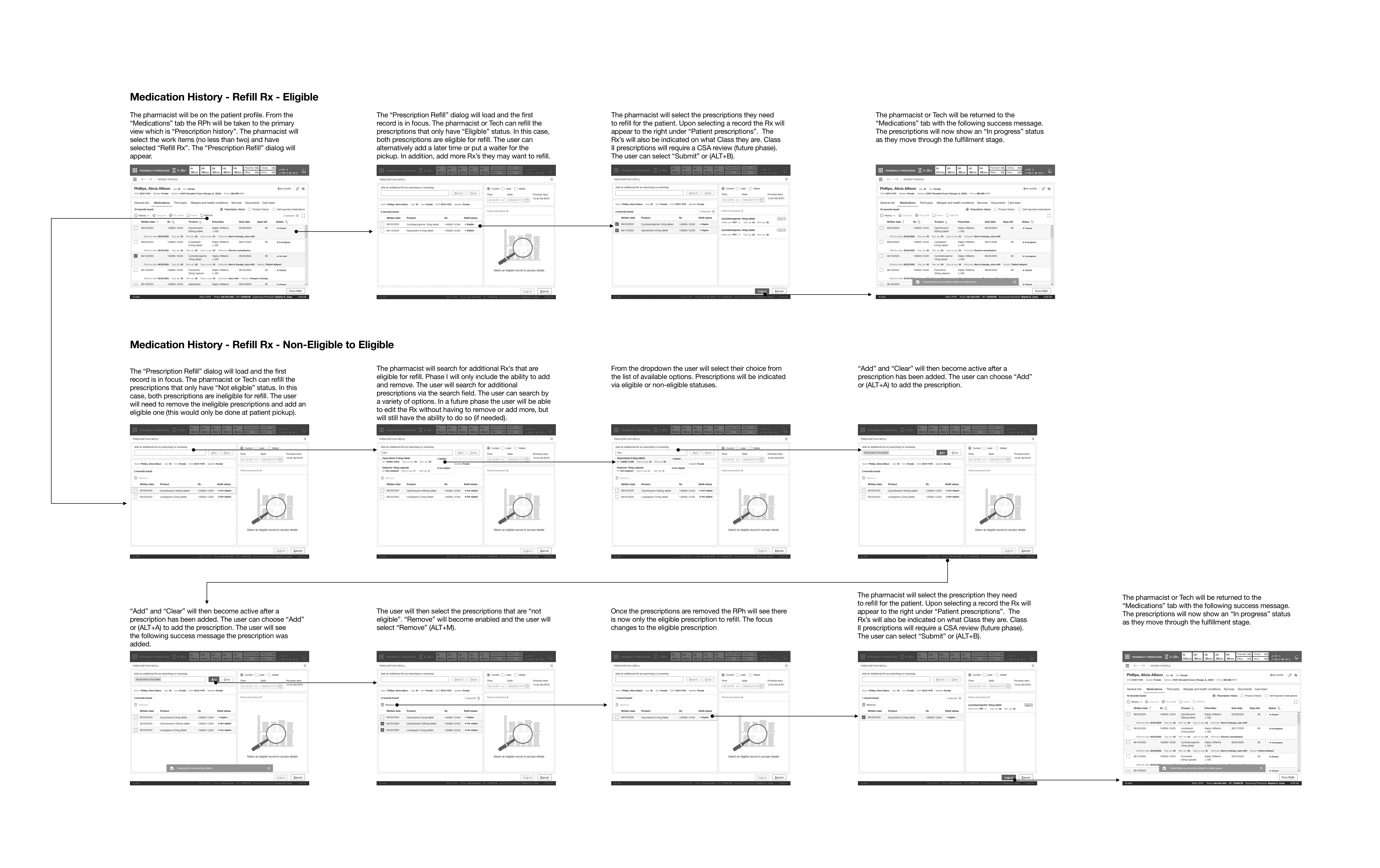

MEDICATIONS - CLOSE RX
This path indicated how a pharmacist closes a prescription if the patient no longer used the medication or if it was no longer available.
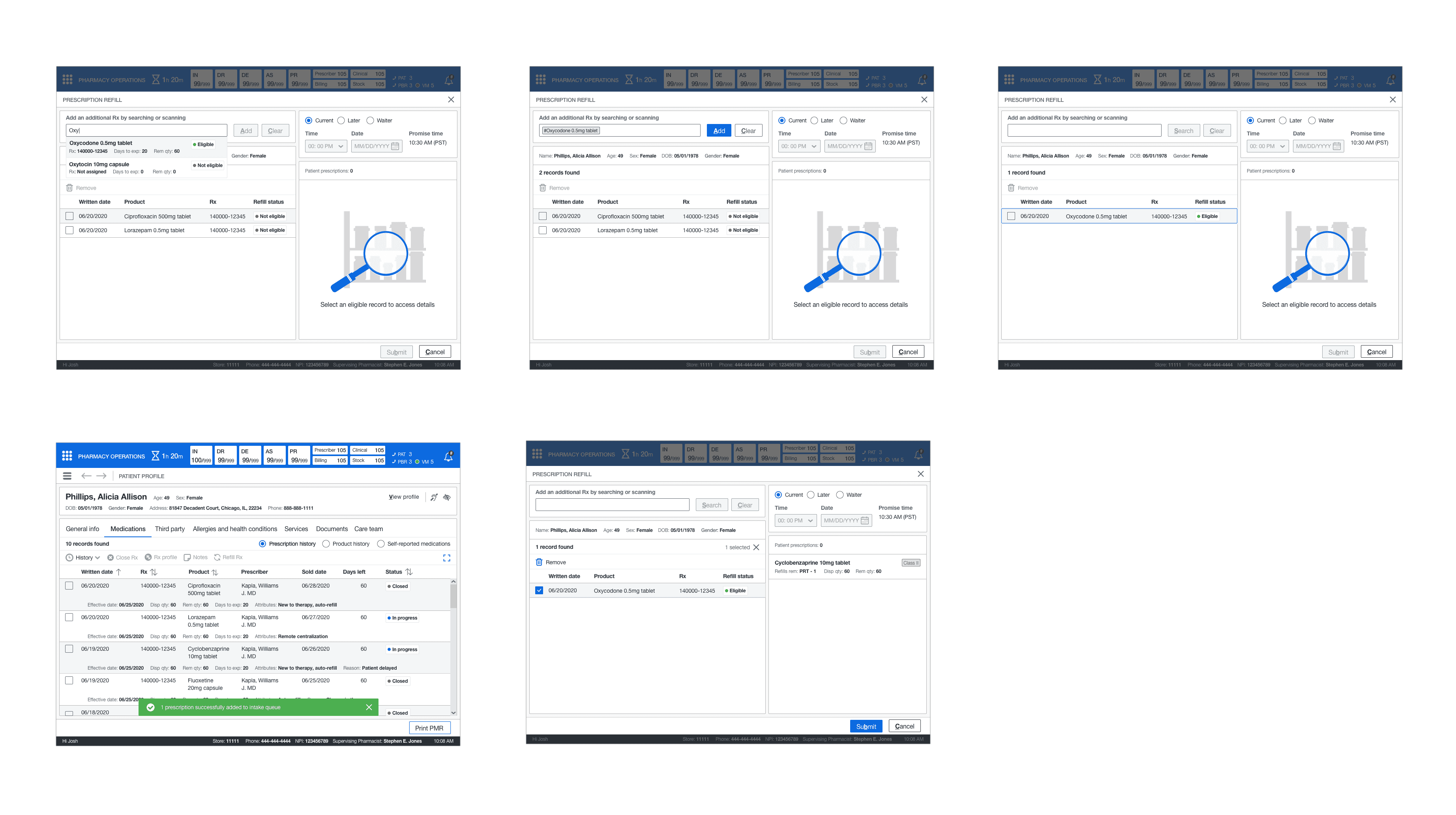
MEDICATIONS - REFILL ELIGIBLE RX
This path indicated how a pharmacist or technician could perform a standard refill of the patient's medications from their medication history. A standard refill could only be done if the prescriptions were eligible for a refill.
MEDICATIONS - REFILL NON-ELIGIBLE TO ELIGIBLE RX
This path indicated how a pharmacist or technician could not change a non-eligible refill to an eligible refill for a prescription. However, it showed how the pharmacist would find an eligible medication to refill and remove the non-eligible medications.

LEADERSHIP REVIEW #1
The first leadership review reviewed the patient medication history and subsequent screens. There was feedback to make adjustments to some of the order of secondary information in the table. The leadership team also wanted to see fill the history would scale if there were multiple billing methods. Also, to see the audit trail (read-only) information better structured into chronological order. I took this feedback and met with the junior designer. I provided direction on structuring the information in the fill history screens. While they worked on that, I completed implementing the other feedback for the core screens.


LEADERSHIP REVIEW #2
The second review was not as long. We reviewed the implemented feedback and the additional screens not examined in the first review. These screens included Close Rx and Refill Rx (eligible and non-eligible). There was no feedback for the existing and new screens other than moving the refill functionality into a dialog (mainly to keep the user within the patient profile). Refill Rx later changed to a page with the introduction of contextual workflow.
DETAILED DESIGN
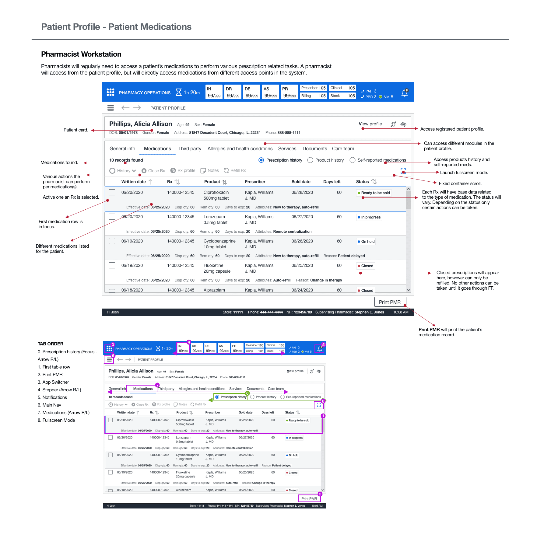
As I did with the previous topic, I utilized the design library to make pixel-perfect mockups of the core screens. Next, I tasked the junior designer with creating pixel-perfect screens for the screen variants. Then, I reviewed their work and had them make adjustments where needed. I took the completed screens and started the annotations and tab order.
ANNOTATIONS AND TAB ORDER
I created annotated wireframes and tab orders for all screens. These artifacts would aid engineers and technical architects in understanding the functionality and act as a blueprint for elaboration. Once I completed these artifacts, the executive leadership had an offline review, and they signed off on the UX. The offline check consisted of reviewing all annotated wireframes and Confluence docs.

DESIGN
DRUG HISTORY RECORD
The medical history record encompassed three different perspectives: one favored scheme of rotating among these views. This would get rid of the need to use third-party interfaces since all prescribed medication attributes would be readily available. I also developed a full-screen layout to tackle the issue of "restricted record visibility" in the previous system.
This display offered the functionality to collate several prescriptions without necessitating a manual lookup. The drug table featured a conventional table layout with a command bar to carry out the necessary user operations. I commenced working on the sequential screens. Subsequently, I entrusted further tidying up tasks to the assistant designer, and focused on sketching out the fill history wireframes. Lastly, I turned my attention towards the more urgent matter of clinical history.


FILL HISTORY
The junior designer needed some guidance on implementing a pattern from the sketches. This pattern would help display the information required but keep records in a simplified format. I recommended following a 60/40 grid design with a selection on the left and a display on the right. I lead the information structure and layout for the fill history screen (billing, audit details, and the drug card).
I tasked the junior designer with implementing the components from our library for the interactions. This new design would give all team members the billing and audit details and the historical dispense information over time for patient medication. On the integration side, it eliminated the draconian folder system. The junior designer continued cleaning up and adding the screens to the storyboard where I had left placeholders while I worked on clinical history.

CLINICAL HISTORY
This feature followed the same layout that was utilized for dispensing history. The key difference was I used cards instead as there was no tabular data. I had to design the information layout and structure for the expanded view. There was a global view that contained all clinical history for medication and its dispenses and clinical history at the individual dispense level. This gave the pharmacist the ability to understand why these different clinical interactions became added to the medication or dispense.

CLOSE RX
This feature applied the standard pattern of a dialog. The pharmacist or technician can close out the prescription from the dropdown and submit it for closure.

REFILL RX
This feature involved two standard use cases—the ability to refill an eligible medication by utilizing a 60/40 grid split that followed the other models. Interact on the left and display on the right. In addition, introduced search functionality should the pharmacist or technician remove ineligible prescriptions and add new ones for the patient's refill.


STORYBOARD
Next, I constructed the wireframes into a storyboard that showed the patient medications', Close Rx, and Refill Rx experiences.
MEDICATION HISTORY
This path indicated how a pharmacist or technician could access the patient's medication history to perform various actions such as refilling, closing, and accessing individual facets of patients' medication history. In addition, access the product history and if a patient had any self-reported medications.

MEDICATIONS - FILL HISTORY
This path indicated how a pharmacist or technician could access the patient's fill history from patient medication history and see the patient's previous dispenses, billing information, and clinical history (per dispense - RPh only).
MEDICATIONS - CLINICAL HISTORY
This path indicated how a pharmacist could access the patient's clinical history from patient medication history and see the patient's previous clinical interactions for all dispenses related to a specific medication OR access it at the dispense level.

MEDICATIONS - CLOSE RX
This path indicated how a pharmacist closes a prescription if the patient no longer used the medication or if it was no longer available.
MEDICATIONS - REFILL ELIGIBLE RX
This path indicated how a pharmacist or technician could perform a standard refill of the patient's medications from their medication history. A standard refill could only be done if the prescriptions were eligible for a refill.
MEDICATIONS - REFILL NON-ELIGIBLE
TO ELIGIBLE RX
This path indicated how a pharmacist or technician could not change a non-eligible refill to an eligible refill for a prescription. However, it showed how the pharmacist would find an eligible medication to refill and remove the non-eligible medications.

LEADERSHIP REVIEW #1
The first leadership review reviewed the patient medication history and subsequent screens. There was feedback to make adjustments to some of the order of secondary information in the table. The leadership team also wanted to see fill the history would scale if there were multiple billing methods. Also, to see the audit trail (read-only) information better structured into chronological order. I took this feedback and met with the junior designer. I provided direction on structuring the information in the fill history screens. While they worked on that, I completed implementing the other feedback for the core screens.


LEADERSHIP REVIEW #2
The second review was not as long. We reviewed the implemented feedback and the additional screens not examined in the first review. These screens included Close Rx and Refill Rx (eligible and non-eligible). There was no feedback for the existing and new screens other than moving the refill functionality into a dialog (mainly to keep the user within the patient profile). Refill Rx later changed to a page with the introduction of contextual workflow.
DETAILED DESIGN
As I did with the previous topic, I utilized the design library to make pixel-perfect mockups of the core screens. Next, I tasked the junior designer with creating pixel-perfect screens for the screen variants. Then, I reviewed their work and had them make adjustments where needed. I took the completed screens and started the annotations and tab order.
ANNOTATIONS AND TAB ORDER
I created annotated wireframes and tab orders for all screens. These artifacts would aid engineers and technical architects in understanding the functionality and act as a blueprint for elaboration. Once I completed these artifacts, the executive leadership had an offline review, and they signed off on the UX. The offline check consisted of reviewing all annotated wireframes and Confluence docs.

NEXT STEPS
ELABORATION
The next step was to have elaboration scheduled to clarify any outstanding questions or concerns. There were no significant questions other than the hotkey and confirmation of tab order. I explained all questions with the elaboration teams and then moved on to my next topic.
NEXT STEPS
ELABORATION
The next step was to have elaboration scheduled to clarify any outstanding questions or concerns. There were no significant questions other than the hotkey and confirmation of tab order. I explained all questions with the elaboration teams and then moved on to my next topic.
OUTCOMES
new workshop process
As the features grew larger and more complex, it led to incoherent or incorrect requirements. I collaborated with other senior designers and product managers and developed a more comprehensive workshop approach, allowing more time for discovery and defining requirements.
SINGLE system
The new system consolidated information and history—previously only available externally—into a single view. It eliminated the need for third-party UIs and reduced secondary procedures. Pharmacy team members noted that this allowed them to provide patient care to more customers each day.
LEARNINGS
PATIENT CARE PROCESS
It was mind-boggling how many UIs and information points a pharmacy team member had to reference when performing actions or assisting patients with their medications and providing patient care. Some pharmacies had designed their process and plugged it into the existing system to handle the volume of patients, especially in specialized pharmacies and larger pharmacy locations.
REFILLING PRESCRIPTIONS
Designing the base architecture for refilling a prescription was a learning experience. I learned first-hand from pharmacists and pharmacy managers the importance of seeing specific and correct information to fill a prescription successfully. This also included checking prior clinical history to ensure no patient care conflicts.