Professional Services
Walgreens's pharmacists and technicians provide vital patient care by engaging in consultations and interactions with patients, while also documenting their encounters.

GOALS
Design a way in which pharmacists resolve consultations or patient interactions during patient care without the need for third-party UIs and offline notation. Instead, provide the pharmacist with consultation history to understand previous discussions with the patient to provide proper consulting care. Document consultations during patient and non-patient meetings.
In specialized pharmacies where unspecialized pharmacists are dealing with complex patients with high-priority orders, design a system (through handheld) in which SpRPh can resolve consultations or patient interactions and add either of these professional services. Utilize the handheld system so that interns training to be an SpRPh can quickly learn how to provide these patient services while navigating a specialty center.
Add the ability for technicians and pharmacists to set up new consultations and patient interactions during the various fulfillment stages to provide more visibility into the service discussion and eliminate redundant manual additions of consultations (in the online/offline system) or interactions (in the online system). Lastly, Introduce the concept for a technician to defer a consultation if the pharmacist be unavailable to provide consultation services.
CHALLENGES
Eliminating a long-established offline notation, pharmacist log, and follow-up phone call for different locations.
Delegating and interfacing with multiple teams and assuring each group that the system dependency would not overload or impact their system's performance.
Connecting an extensive funneled process for providing patient care during consultations when each team and process was siloed and getting each team to align to the proposed process.
The professional service process for specialized pharmacies was unique and was often completed through handheld devices for specialized medications as it required a more direct approach.
Integrating with the campaign-management system to import and display previous consultation and patient interaction information in a clear and concise format (previous consultation history and consultations).
Get buy-in on the ability for a technician to defer a consultation and alleviate the concern to executive leadership that this new feature does not skip patient care inadvertently.
MY ROLE
Participate in meetings with crucial pharmacy stakeholders to understand the existing process, pivot to the new approach, and establish it.
Build storyboards and medium wireframes to illustrate the professional services process.
Analyze and create multiple user flows for professional services (both desktop and mobile).
Create annotated wireframes and tab order diagrams for the engineering and elaboration process (for final implementation).
Design pixel-perfect high-fidelity wireframes for prototype and usability testing purposes.
As a senior designer, I lead a series of design reviews and office hours for onshore and offshore designers while completing my design-related responsibilities for this topic.
WHAT I DELIVERED
5 User flows
90 Medium-fidelity wireframes
2 Storyboards
80 High-fidelity wireframes
80 Annotated wireframes
12 Tab order diagrams
RESEARCH
REACHING OUT
The previous workshops for this topic had provided a list of up-to-date business and functional requirements. The core team and I interfaced with multiple stakeholders in different groups. For each new workflow and feature that was built out; we would be presenting our work to that team which required a and then leadership approval before moving into the final phases. The first step was to meet with the different stakeholders to explain our process and strategy and expectations for the newly designed process
MEETING WITH THE CAMPAIGN MANAGEMENT TEAM
This team wanted to understand the impact and performance of their campaign management system for professional services, the introduction of new services (patient interactions), and manual additions (due to the documentation feature).
The PM explained the technical flow and had a technical architect explain there were no performance issues. I explained that the goal of the new design would have no impact on how the system populated the campaigns. The new documentation feature would also help keep all information stored in their approach and directly link to the operations.
MEETING WITH THE
CAMPAIGN MANAGEMENT TEAM
This team wanted to understand the impact and performance of their campaign management system for professional services, the introduction of new services (patient interactions), and manual additions (due to the documentation feature).
The PM explained the technical flow and had a technical architect explain there were no performance issues. I explained that the goal of the new design would have no impact on how the system populated the campaigns. The new documentation feature would also help keep all information stored in their approach and directly link to the operations..


MEETING WITH SPECIALTY TEAM
This team wanted to ensure that no personal information was seen or utilized other than by a specialized pharmacist. Mainly, technicians and interns did not have access to this part of the system unless the intern was trained in a specialty pharmacy program. In addition, handheld device performance would not be impacted in larger pharmacy centers. The PM/TA assured that no PII is seen by anyone other than a specialized pharmacist. I also explained that introducing the documentation process would eliminate offline notation and logging and keep all information in a single system.
MEETING WITH TECH POS/FULFILLMENT TEAM
This team was mainly concerned about the impacts of fulfillment commitments by allowing pharmacy team members to add either service from multiple points in the system and not block the point of sale. This ability did not exist in the current process. I explained this would not be the case as it would reduce the need for follow-up calls and give more flexibility and awareness in the documentation process. In addition, pharmacy managers (and leadership) wanted to make technicians would not utilize the defer consultation to prolong the consultation with the patient.
MEETING WITH THE TRAINING TEAM
The team and I were not originally scheduled to speak with this team. However, this team wanted to understand how the training process would train team members on these new processes in conjunction with the testing plan. I explained that feedback for this new process was handled through usability testing. Once feedback had been received and implemented, training specialists would coordinate the training. The stakeholders from these teams were happy with the presentation and wanted to meet again when we had designs to present.
RESEARCH
REACHING OUT
The previous workshops for this topic had provided a list of up-to-date business and functional requirements. The core team and I interfaced with multiple stakeholders in different groups. For each new workflow and feature that was built out; we would be presenting our work to that team which required a and then leadership approval before moving into the final phases. The first step was to meet with the different stakeholders to explain our process and strategy and expectations for the newly designed process
MEETING WITH THE CAMPAIGN MANAGEMENT TEAM
This team wanted to understand the impact and performance of their campaign management system for professional services, the introduction of new services (patient interactions), and manual additions (due to the documentation feature).
The PM explained the technical flow and had a technical architect explain there were no performance issues. I explained that the goal of the new design would have no impact on how the system populated the campaigns. The new documentation feature would also help keep all information stored in their approach and directly link to the operations.


MEETING WITH SPECIALTY TEAM
This team wanted to ensure that no personal information was seen or utilized other than by a specialized pharmacist. Mainly, technicians and interns did not have access to this part of the system unless the intern was trained in a specialty pharmacy program. In addition, handheld device performance would not be impacted in larger pharmacy centers. The PM/TA assured that no PII is seen by anyone other than a specialized pharmacist. I also explained that introducing the documentation process would eliminate offline notation and logging and keep all information in a single system.
MEETING WITH TECH
POS/FULFILLMENT TEAM
This team was mainly concerned about the impacts of fulfillment commitments by allowing pharmacy team members to add either service from multiple points in the system and not block the point of sale. This ability did not exist in the current process. I explained this would not be the case as it would reduce the need for follow-up calls and give more flexibility and awareness in the documentation process. In addition, pharmacy managers (and leadership) wanted to make technicians would not utilize the defer consultation to prolong the consultation with the patient.
MEETING WITH THE TRAINING TEAM
The team and I were not originally scheduled to speak with this team. However, this team wanted to understand how the training process would train team members on these new processes in conjunction with the testing plan. I explained that feedback for this new process was handled through usability testing. Once feedback had been received and implemented, training specialists would coordinate the training. The stakeholders from these teams were happy with the presentation and wanted to meet again when we had designs to present.
PLAN
WORKFLOW
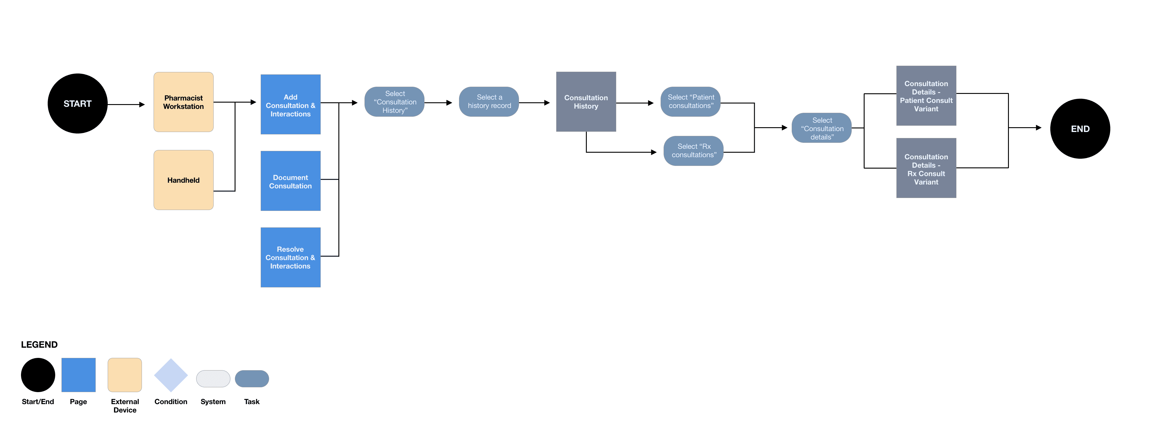
As a next step, the goal was to create user flows for each defined use case. Due to the size of the topic, the process was different for this topic. The process would be to create the workflows, move straight into designing medium-fidelity wireframes, and then storyboard it.
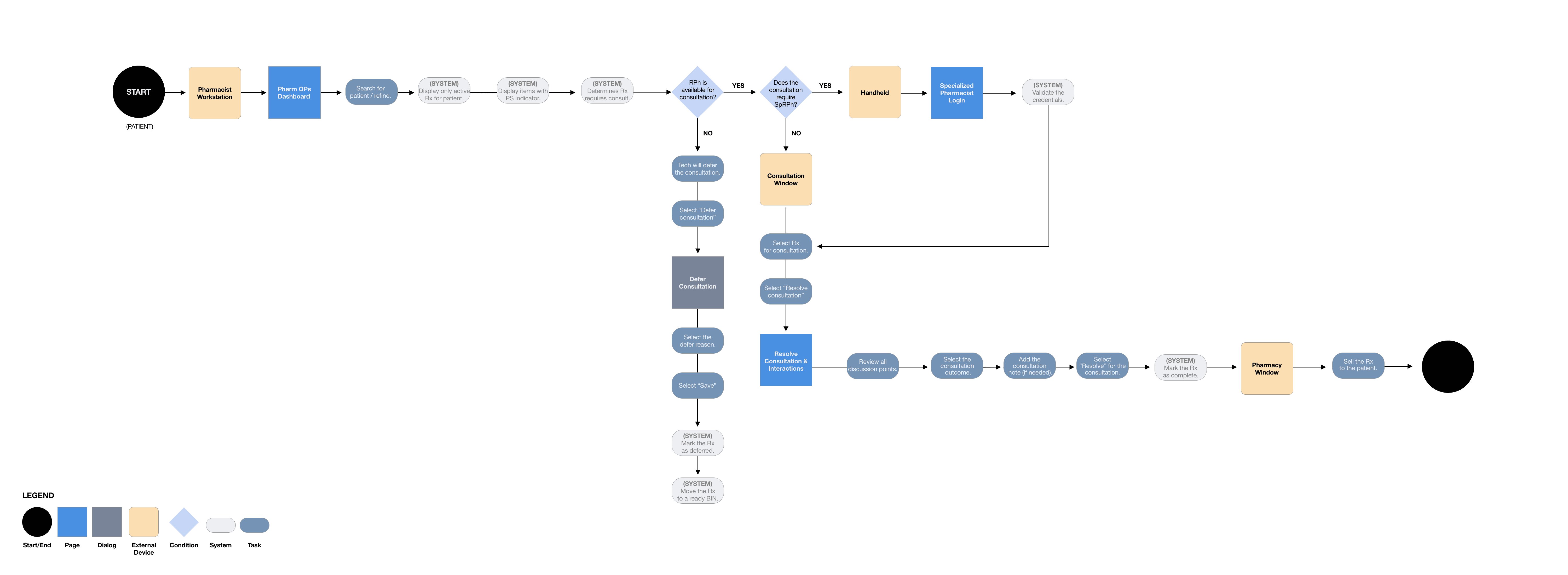
CONSULTATIONS: RESOLVE AND DEFER
I first started with the consultations workflow. This workflow involved resolving a consultation for both standard and specialized pharmacists and technicians to defer a consultation. In addition, this workflow handled how a pharmacist would complete the process from their workstation and their handheld device (for specialized pharmacists).
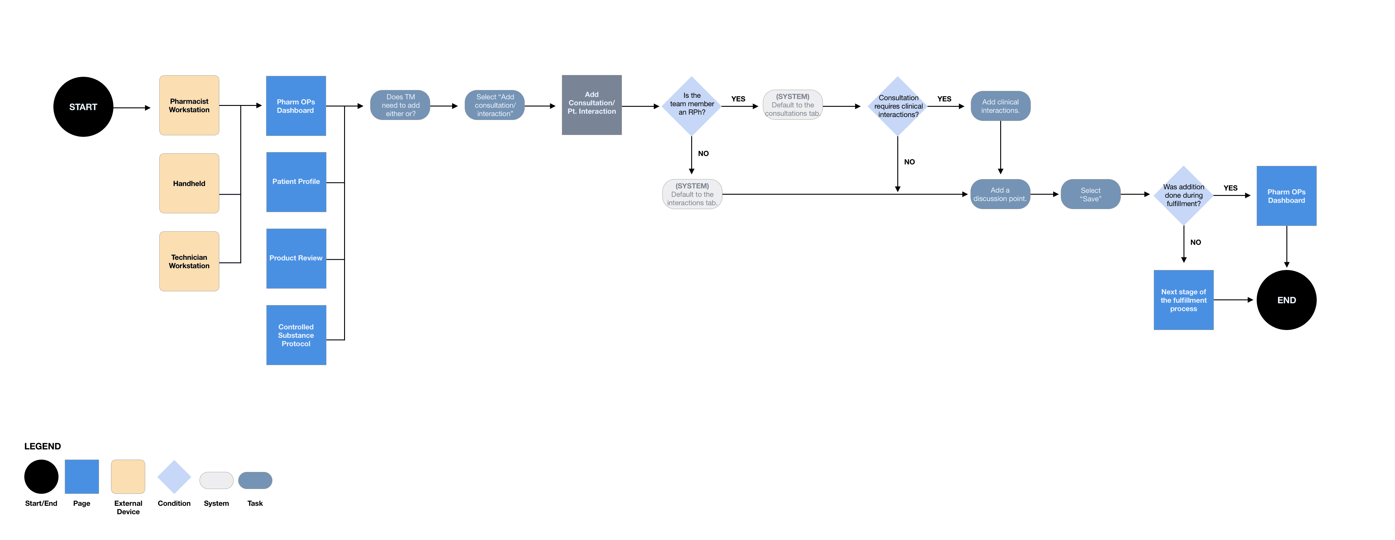
ADD CONSULTATIONS AND PATIENT INTERACTIONS
This path indicated how a pharmacist or technician could add a consultation or patient interaction depending on the scenario: pharmacist workstation, technician workstation, or handheld device.

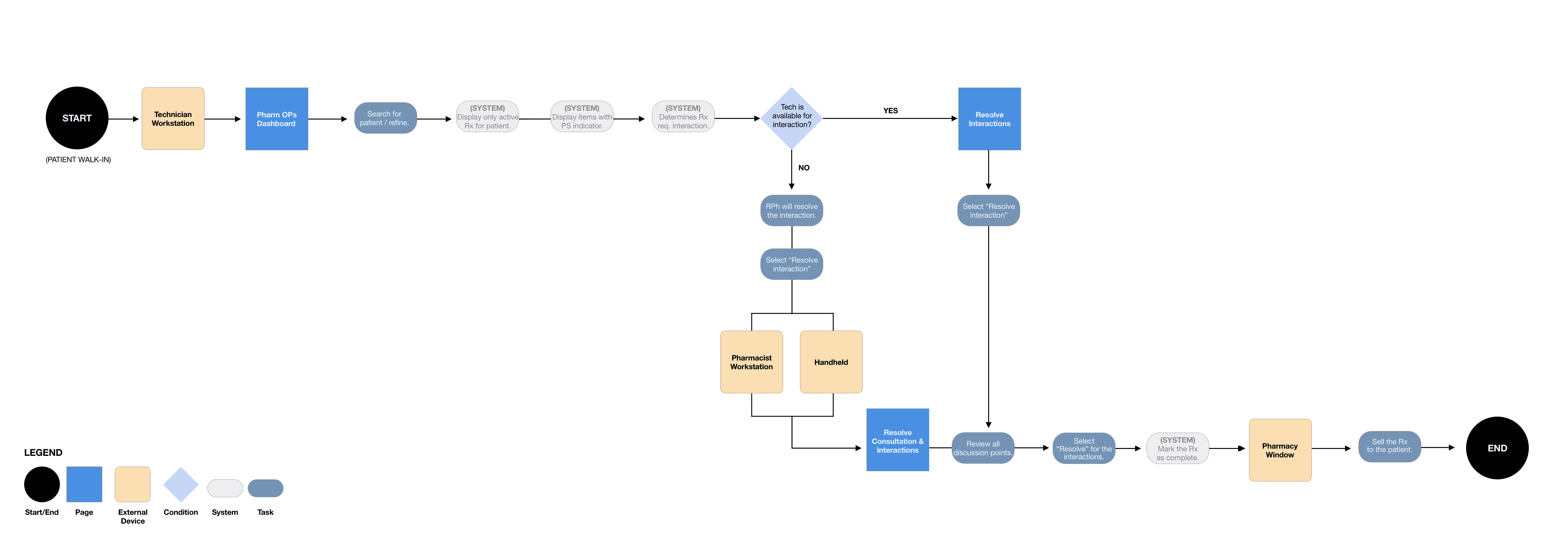
PATIENT INTERACTIONS: RESOLVE
This path indicated how a technician or pharmacist could resolve a patient interaction. The primary use case was to have technicians resolve the patient interaction. However, in some circumstances, a technician may be unavailable, and the pharmacist would need to determine it on their behalf. Or, if it fell under the CSP.

CONSULTATIONS: DOCUMENT
This path indicated how a pharmacist could document a consultation. Documenting could only be strictly done from a pharmacist workstation. Often, it was unspecialized pharmacists entering (ad-hoc) consultations.


CONSULTATION HISTORY
This path indicated how a pharmacist or specialized pharmacist could access consultation history and view previous consultation discussions for a specific patient from their pharmacist workstation or handheld device.

PLAN
WORKFLOW
As a next step, the goal was to create user flows for each defined use case. Due to the size of the topic, the process was different for this topic. The process would be to create the workflows, move straight into designing medium-fidelity wireframes, and then storyboard it.
CONSULTATIONS: RESOLVE AND DEFER
I first started with the consultations workflow. This workflow involved resolving a consultation for both standard and specialized pharmacists and technicians to defer a consultation. In addition, this workflow handled how a pharmacist would complete the process from their workstation and their handheld device (for specialized pharmacists).

ADD CONSULTATIONS
AND PATIENT INTERACTIONS
This path indicated how a pharmacist or technician could add a consultation or patient interaction depending on the scenario: pharmacist workstation, technician workstation, or handheld device.

PATIENT INTERACTIONS: RESOLVE
This path indicated how a technician or pharmacist could resolve a patient interaction. The primary use case was to have technicians resolve the patient interaction. However, in some circumstances, a technician may be unavailable, and the pharmacist would need to determine it on their behalf. Or, if it fell under the CSP.

CONSULTATIONS: DOCUMENT
This path indicated how a pharmacist could document a consultation. Documenting could only be strictly done from a pharmacist workstation. Often, it was unspecialized pharmacists entering (ad-hoc) consultations.

CONSULTATION HISTORY
This path indicated how a pharmacist or specialized pharmacist could access consultation history and view previous consultation discussions for a specific patient from their pharmacist workstation or handheld device.

DESIGN
RESOLVING CONSULTATIONS OR INTERACTIONS AS A RPH
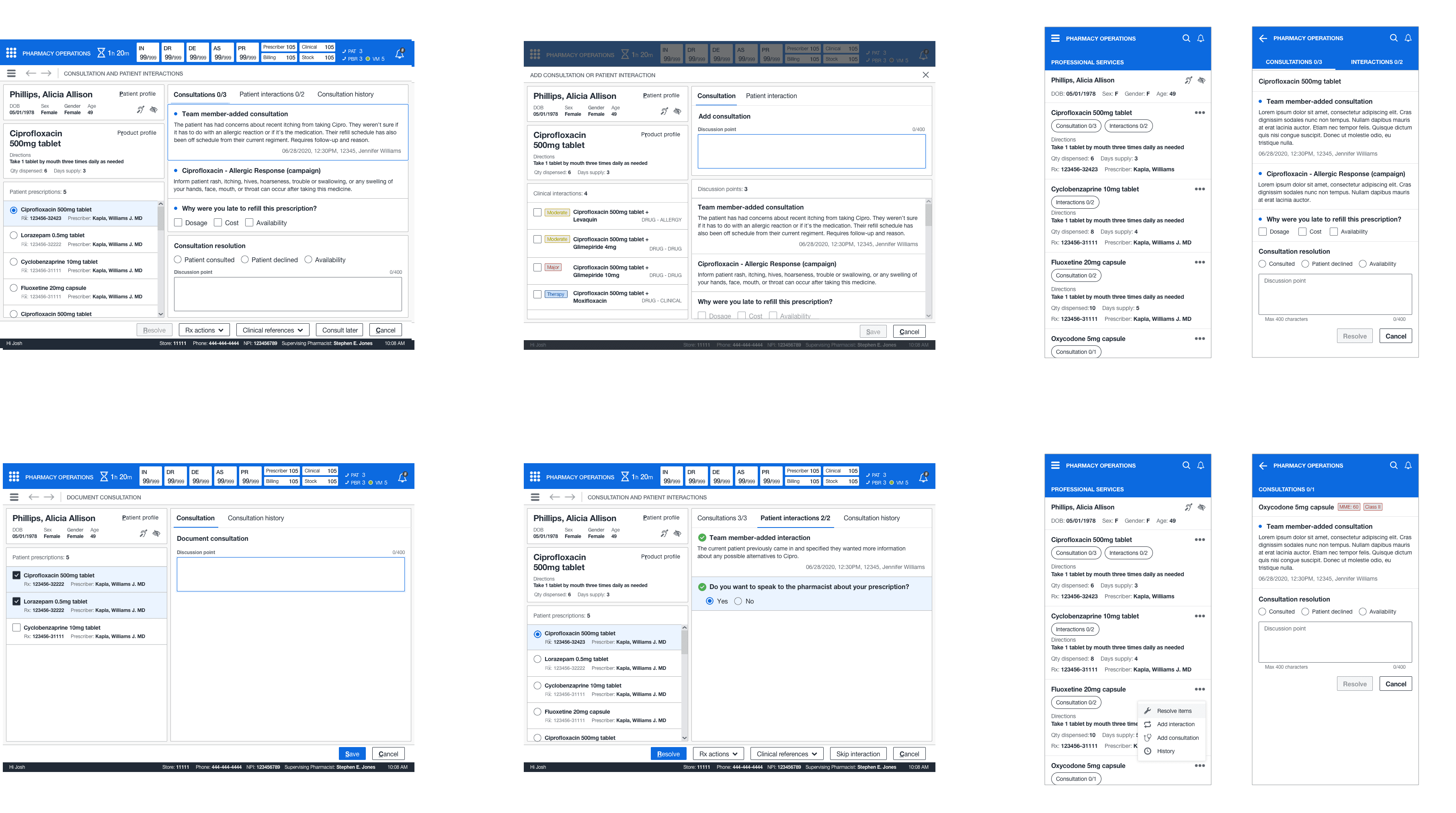
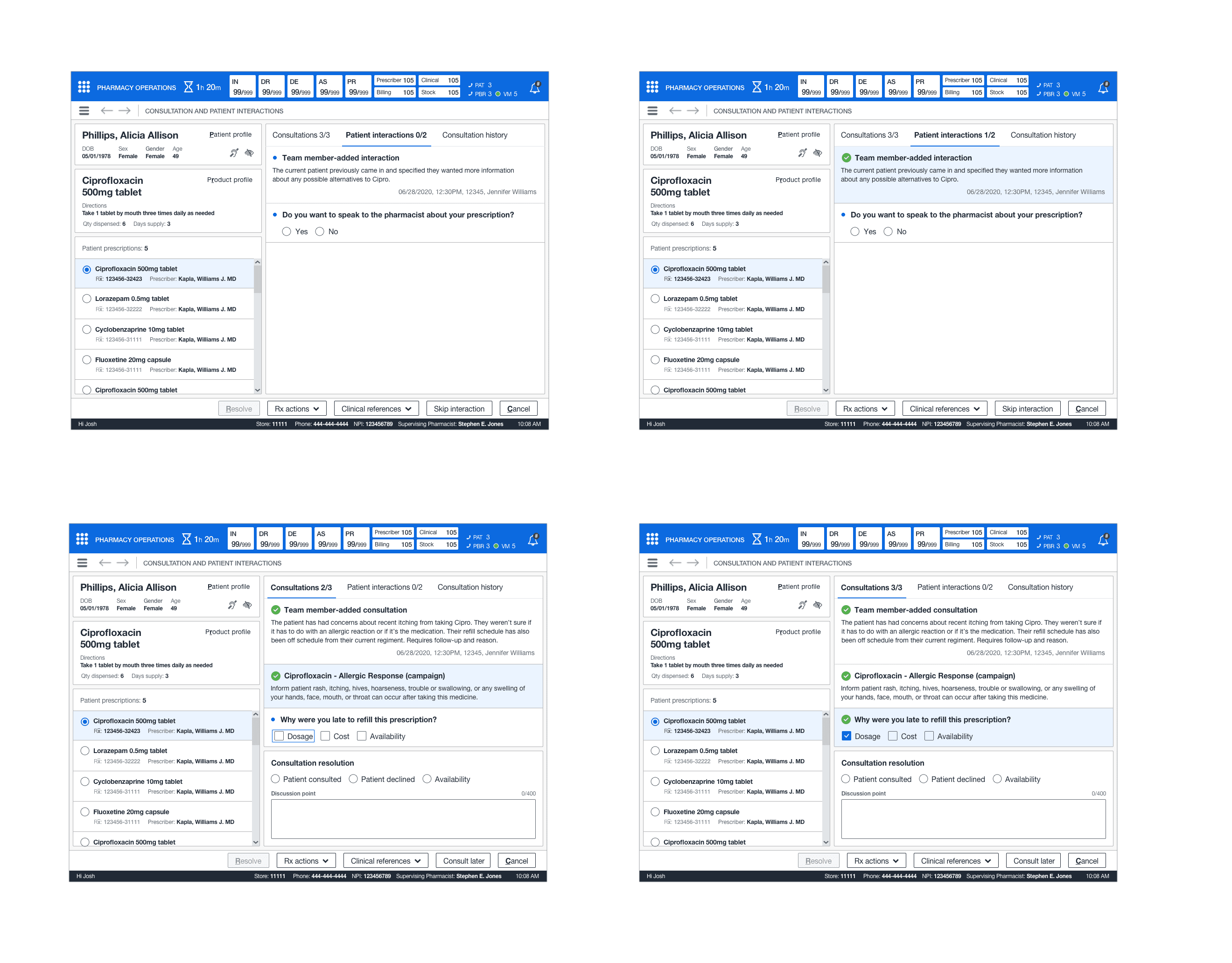
This feature introduced quite a few new patterns. It required the ability to switch between both professional services so pharmacists could understand what was unresolved at the time of patient care. In addition, understand the previous discussions that took palace with the patient. I created a mini queue pattern for the patient's prescriptions so the pharmacist could quickly cycle through each medication.
In addition, it indicated when a discussion point was resolved, a simple selection of attestation, and the optional discussion point text. Finally, the card structure showed what, who, and when for each discussion point, action, and response for campaign-generated consultations or patient interactions. No saved work would be lost due to a system failure or abandoning the task (for up to 48 hours).
RESOLVING CONSULTATIONS OR
INTERACTIONS AS A RPH
This feature introduced quite a few new patterns. It required the ability to switch between both professional services so pharmacists could understand what was unresolved at the time of patient care. In addition, understand the previous discussions that took palace with the patient. I created a mini queue pattern for the patient's prescriptions so the pharmacist could quickly cycle through each medication.
In addition, it indicated when a discussion point was resolved, a simple selection of attestation, and the optional discussion point text. Finally, the card structure showed what, who, and when for each discussion point, action, and response for campaign-generated consultations or patient interactions. No saved work would be lost due to a system failure or abandoning the task (for up to 48 hours).



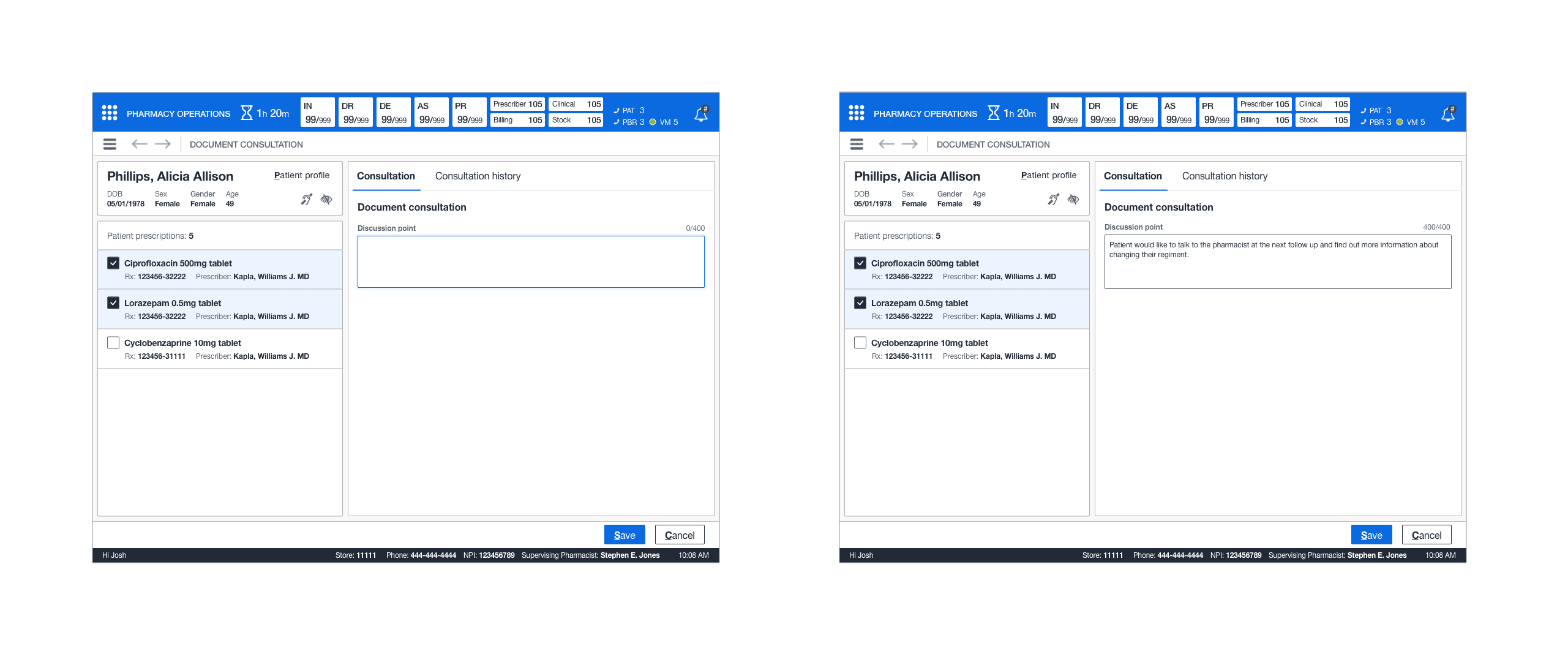
DOCUMENTING A CONSULTATION
This new feature brought about the new concept of documenting a consultation (ad-hoc) for the patient. In addition, a simple text box and the ability to associate multiple prescriptions through the multi-select pattern gave pharmacists the ability to abandon the offline notation and pharmacist log. This also eliminated the need to write down patient PII.

VIEWING PREVIOUS CONSULTATION INFORMATION
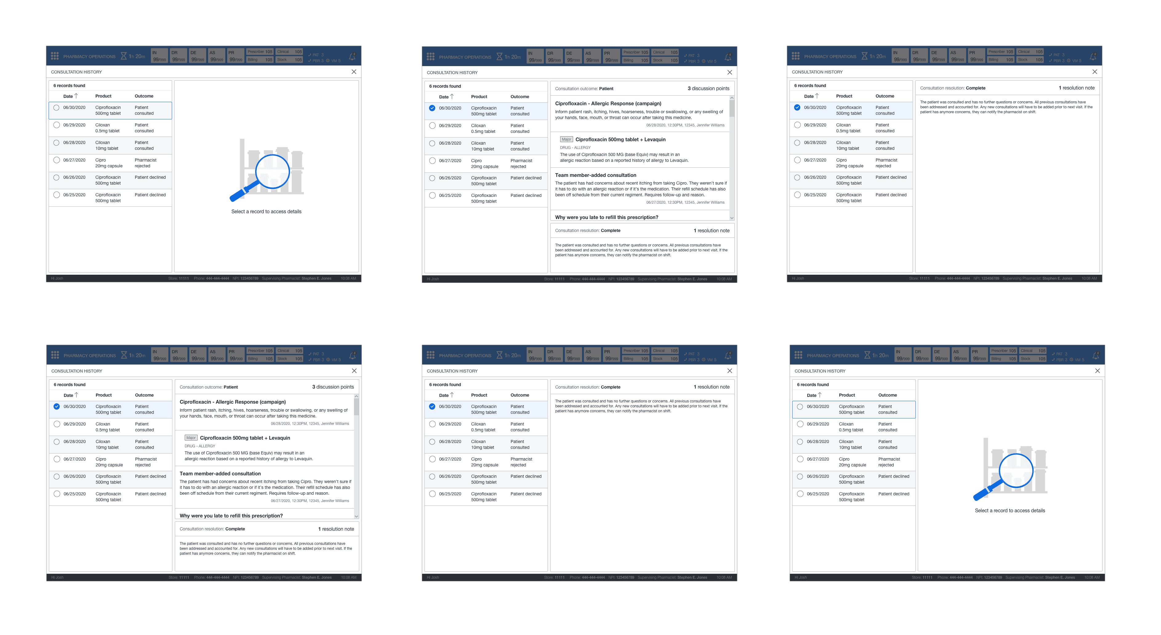
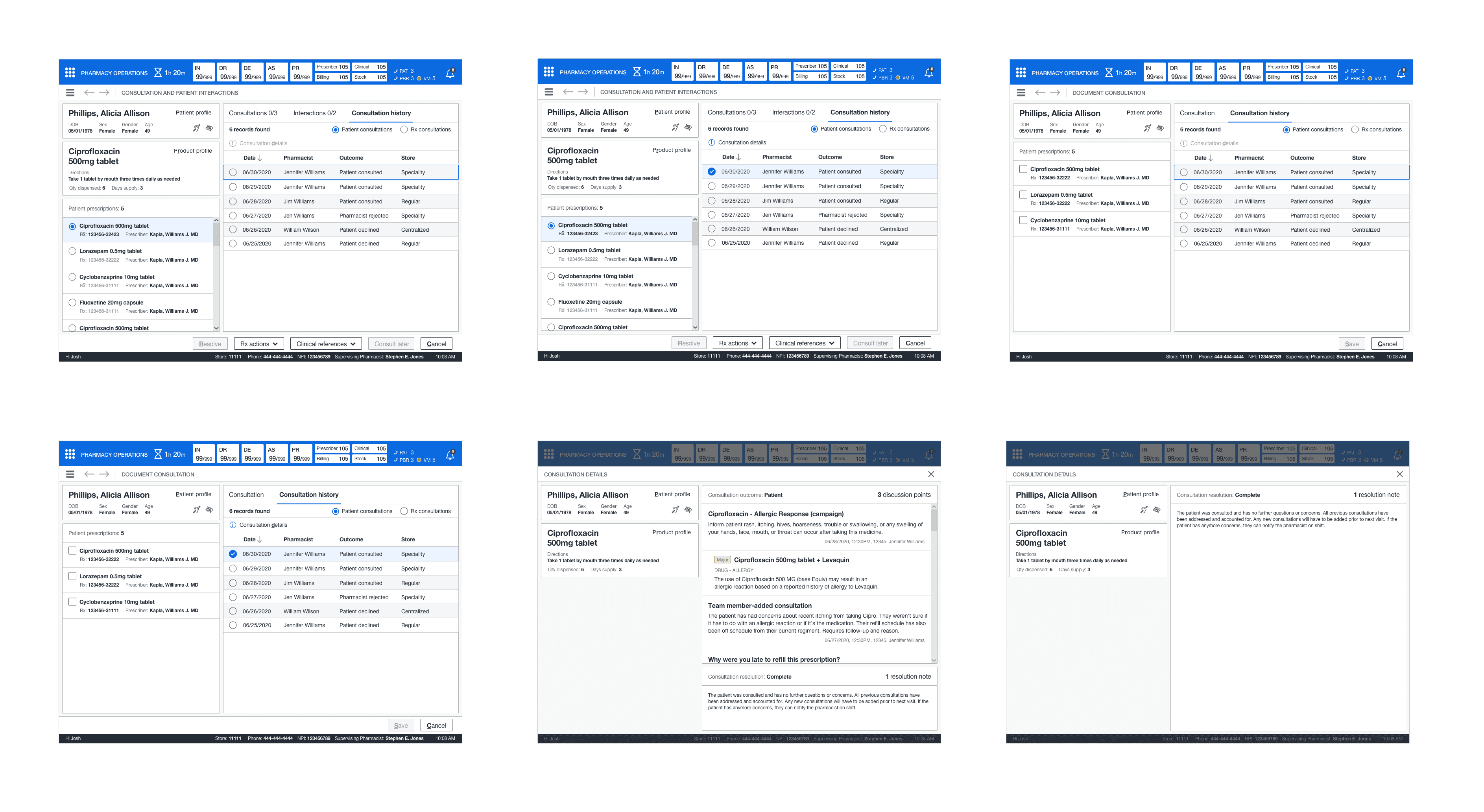
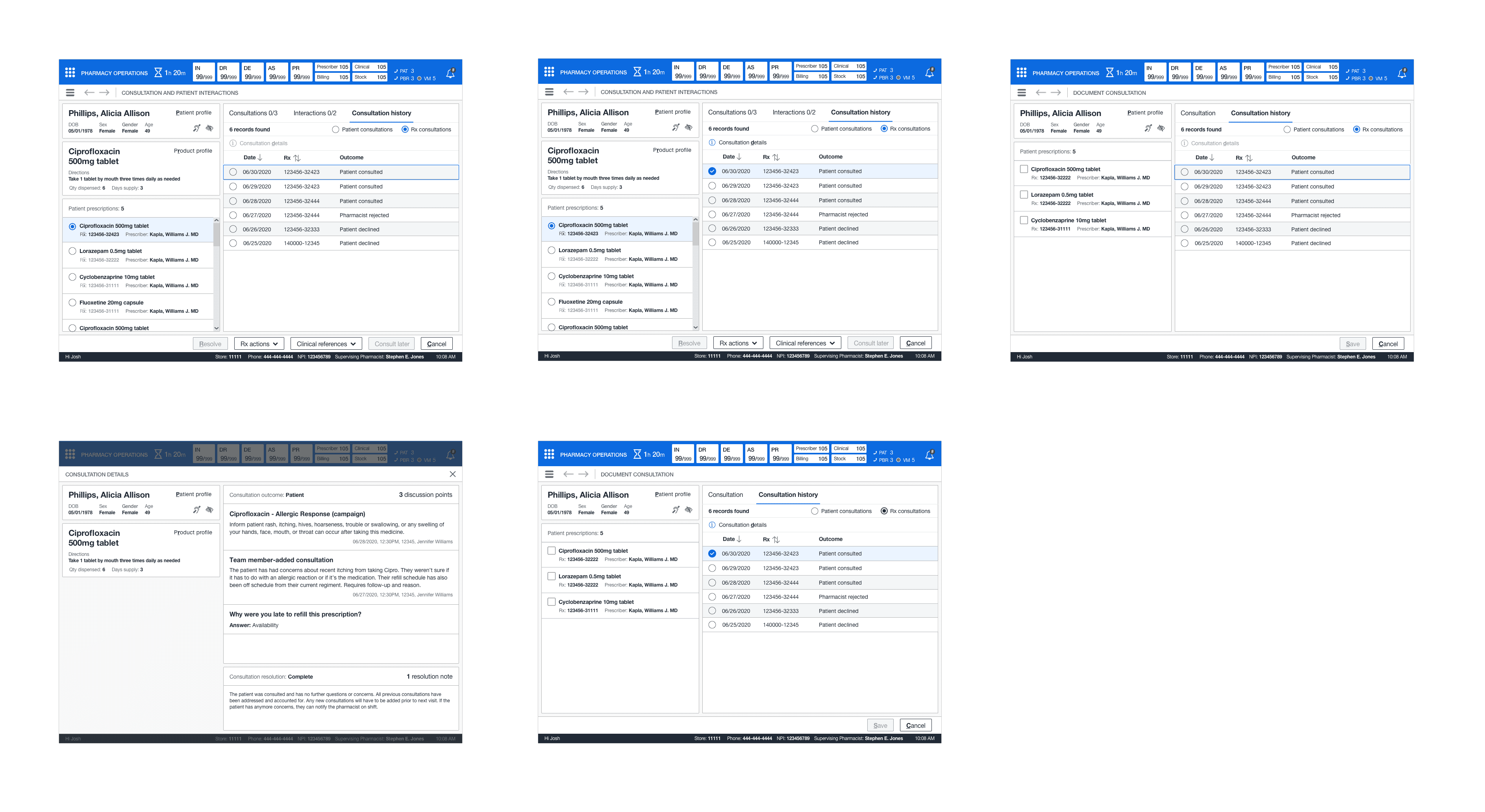
Enhanced professional services required a detailed documentation history of previous consultation outcomes and discussions between the patients and pharmacists. Consultation history needed to be accessed when resolving, adding, or documenting consultation history. To keep continuity within the UI, I designed a pattern schema that could be adapted to the different entry points in the system.
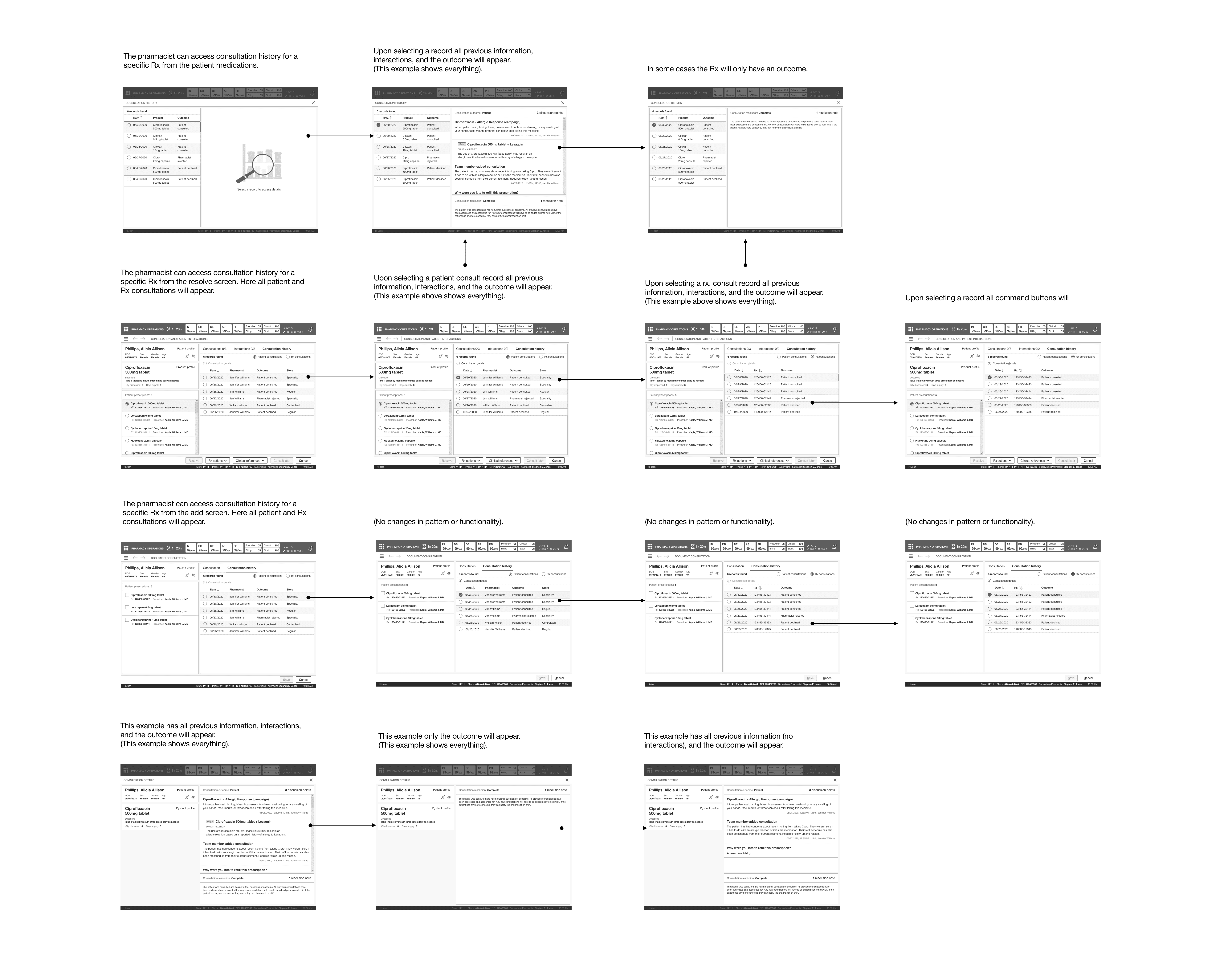
Through the single-select option, a pharmacist could view and be aware of the previous patient and prescription-related consultations discussed through the medication history for that patient. In some cases, consultations with associated clinical interactions.
Lastly, a pharmacist could perform a deep dive into the specific details of that record; the outcome, previous discussions, and the resolution. The consultation details introduced several new read-only patterns I designed for cards and lists and the fullscreen modal in a concise and clear format.



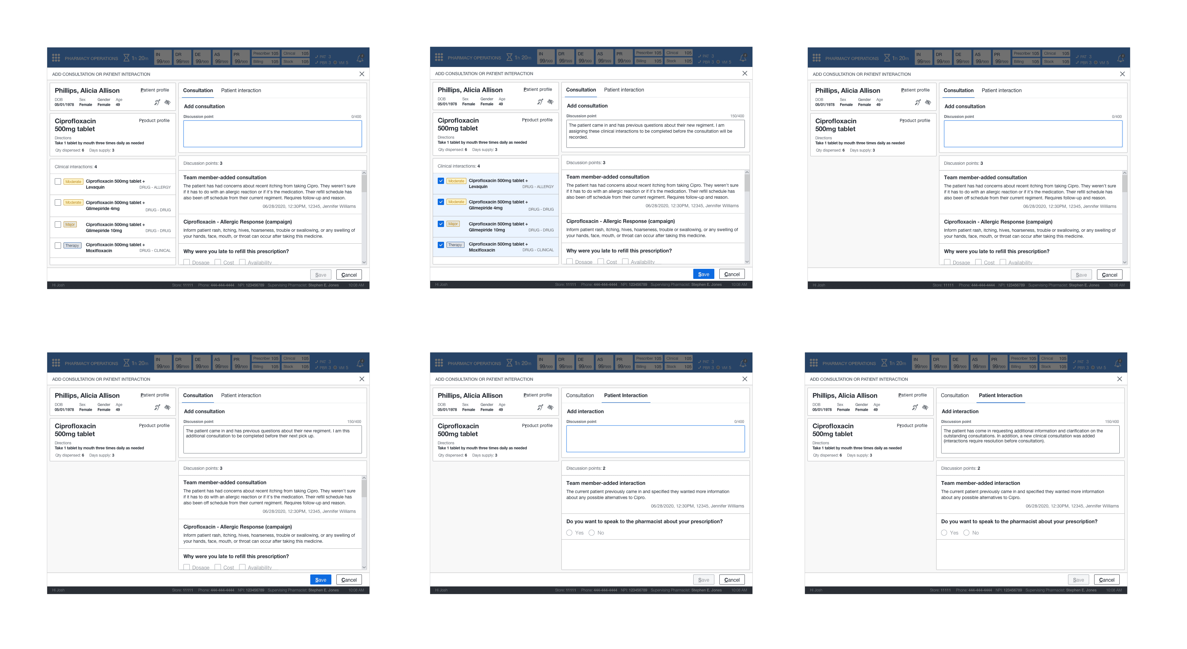
ADDING A CONSULTATION OR PATIENT INTERACTION
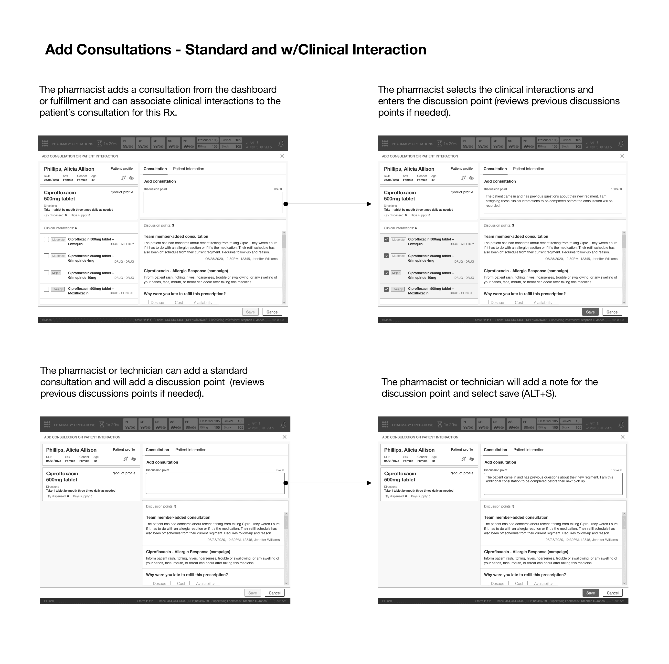
This new feature gave technicians and pharmacists a new way of adding a patient interaction or consultation depending on the scenario. This process adopted a similar pattern from documenting, except this process was done during different encounters and required a read-only design for discussion points with previous selections disabled (should a system-generated campaign) be previously resolved.
For example, if the consultation required clinical interactions, a pharmacist could select multiple clinical interactions when adding that specific type of consultation. The UI for technicians is replicated from the pharmacist's view. However, the exception technicians would not see consultation history and could not add clinical consultations.
ADDING A CONSULTATION OR
PATIENT INTERACTION
This new feature gave technicians and pharmacists a new way of adding a patient interaction or consultation depending on the scenario. This process adopted a similar pattern from documenting, except this process was done during different encounters and required a read-only design for discussion points with previous selections disabled (should a system-generated campaign) be previously resolved.
For example, if the consultation required clinical interactions, a pharmacist could select multiple clinical interactions when adding that specific type of consultation. The UI for technicians is replicated from the pharmacist's view. However, the exception technicians would not see consultation history and could not add clinical consultations.

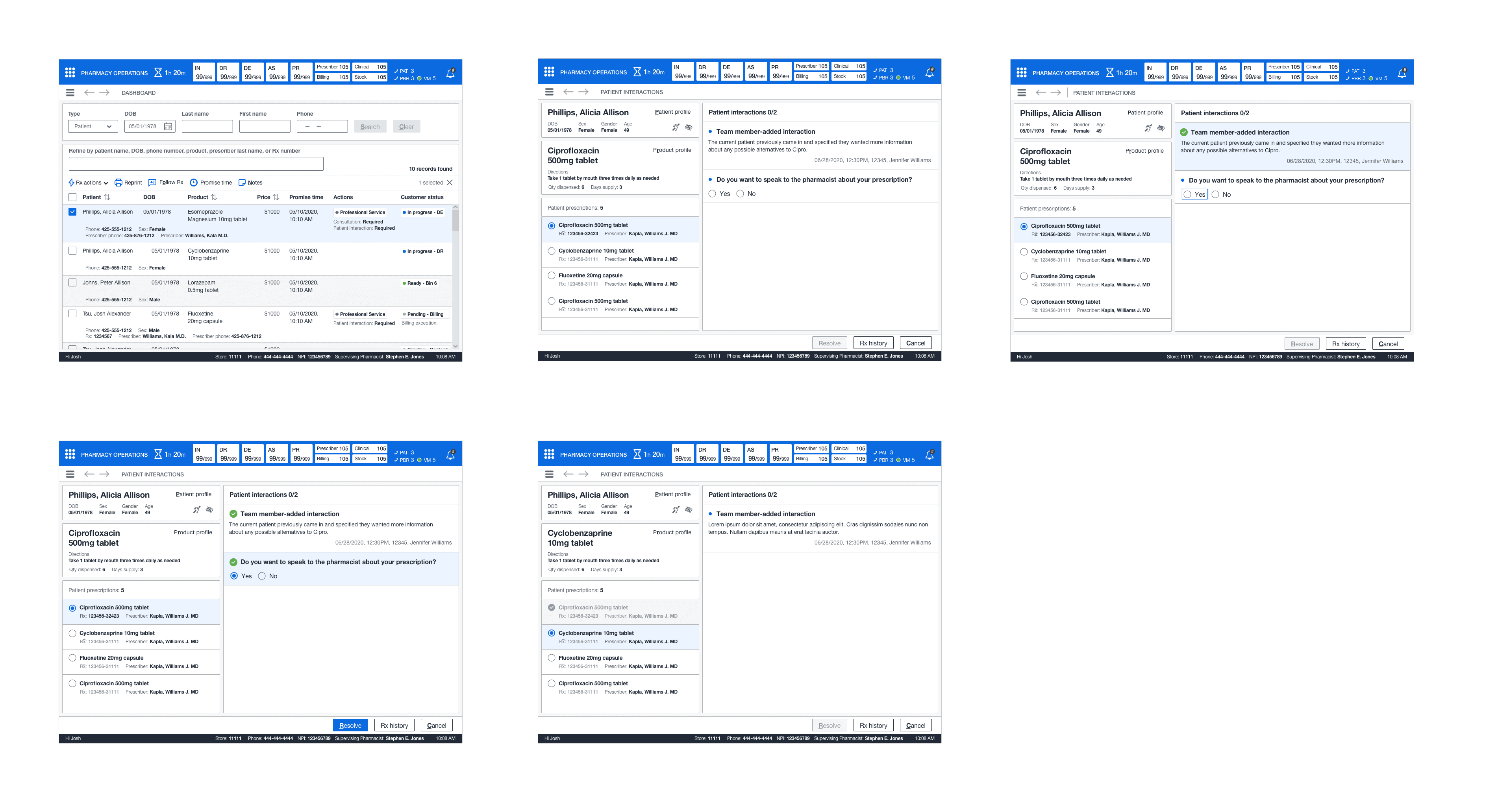
RESOLVING PATIENT INTERACTIONS AS A TECHNICIAN
This new feature was duplicated from the pharmacist's view, except that a technician could not access consultation history or consultations. Instead, they could add a patient interaction depending on their encounter with the patient.
RESOLVING PATIENT INTERACTIONS
AS A TECHNICIAN
This new feature was duplicated from the pharmacist's view, except that a technician could not access consultation history or consultations. Instead, they could add a patient interaction depending on their encounter with the patient.

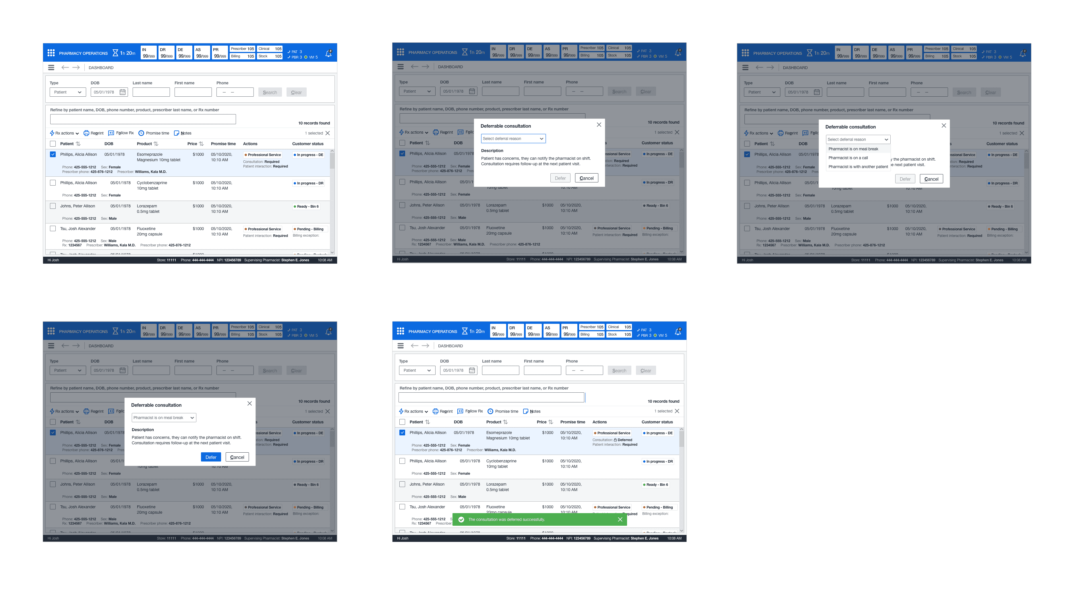
DEFERRING A CONSULTATION AS A TECHNICIAN
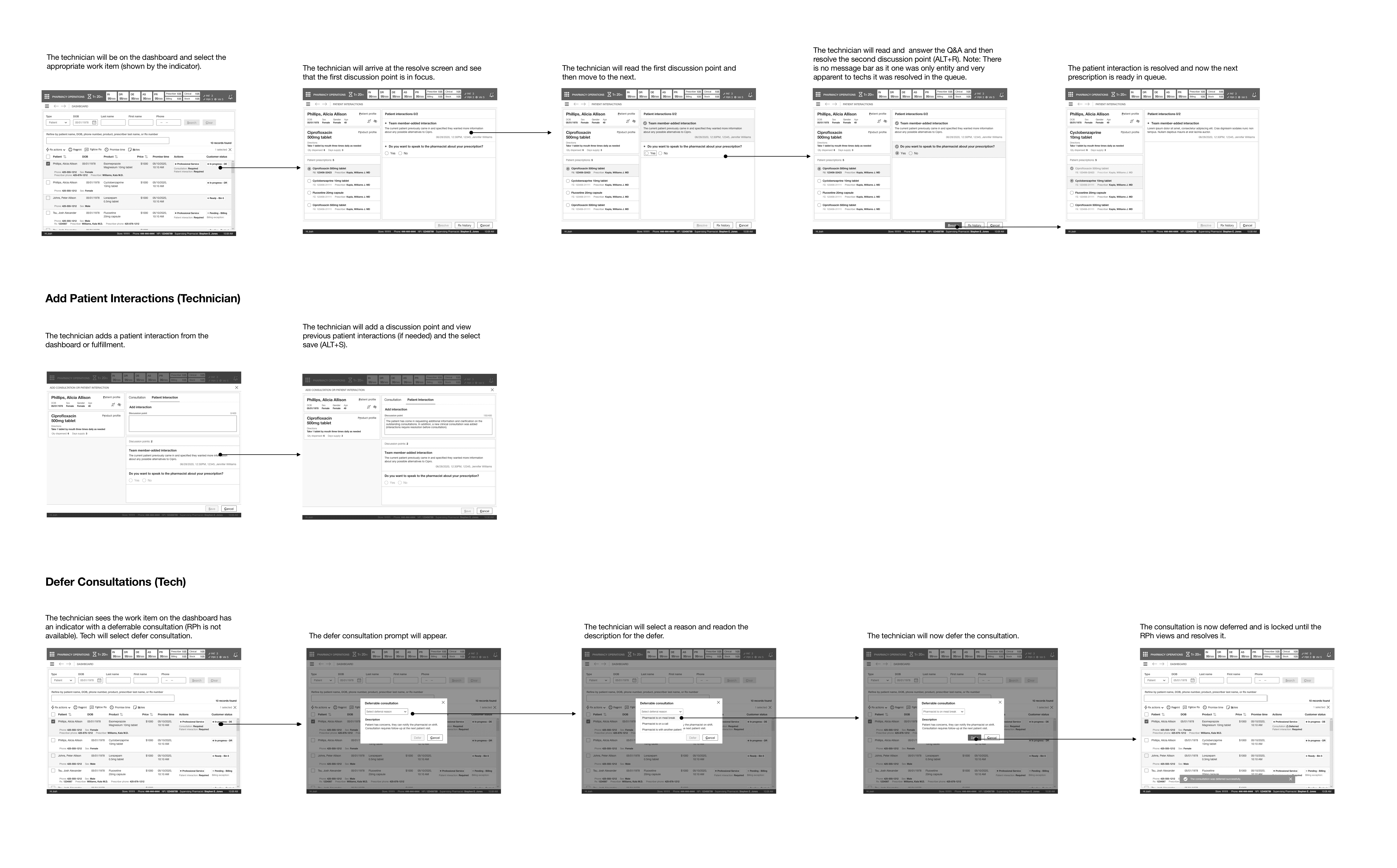
This new feature unveiled the ability for technicians to select a reason and understand why it was previously deferred on consultations that are deferrable quickly from the pharmacy dashboard. In addition, the status marker quickly indicates technicians of work items that are deferrable. System logic would help determine what previous consultations were deferrable and only allow it to be done once.

RESOLVING CONSULTATIONS AS A SPRPH OR AN INTERN
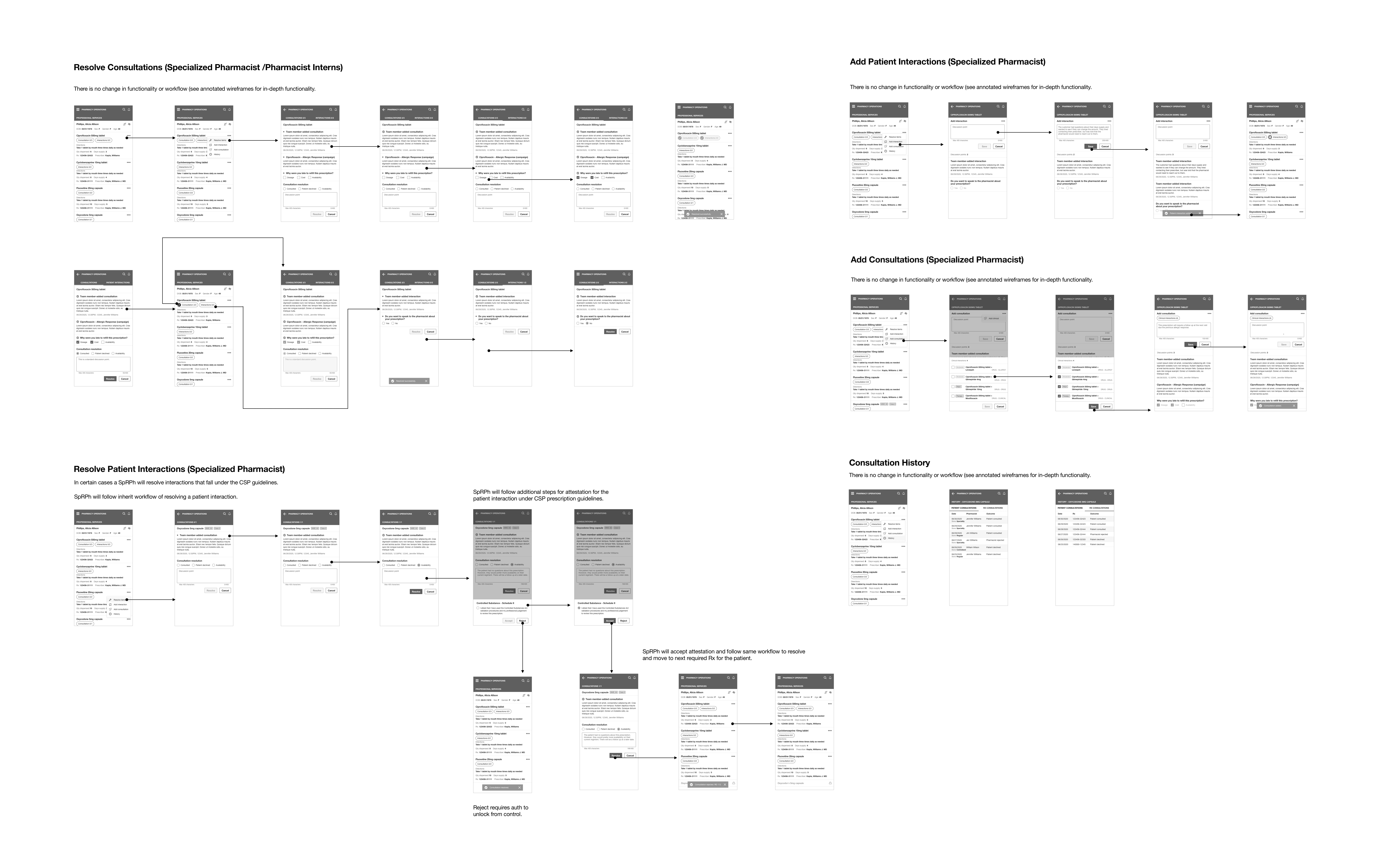
Handheld functionality is replicated from the primary pharmacist view for resolving consultations into a material UI design to accommodate their android handheld devices. This mobile UI displayed essential information that SpRPhs needed to perform consultations and patient caregiving. They could quickly access the various patient medications and resolve any outstanding consultations (and other services) from the list.
As previously mentioned, specialized pharmacists would require a more direct approach with complex patients when providing patient care in various areas for specialty medications. In addition, they often utilized these devices to train interns training in specialty areas, including dispensing, medication therapy management, patient advocacy, and therapy compliance.
Lastly, pharmacists could access previous consultation outcomes from the consultation history. Due to the limitations of integrations, it limited the ability to view previous discussions and information for each consultation; however, this still gave the SpRPHs incredible extensibility when providing patient care.
RESOLVING CONSULTATIONS AS A SPRPH
OR AN INTERN
Handheld functionality is replicated from the primary pharmacist view for resolving consultations into a material UI design to accommodate their android handheld devices. This mobile UI displayed essential information that SpRPhs needed to perform consultations and patient caregiving. They could quickly access the various patient medications and resolve any outstanding consultations (and other services) from the list.
As previously mentioned, specialized pharmacists would require a more direct approach with complex patients when providing patient care in various areas for specialty medications. In addition, they often utilized these devices to train interns training in specialty areas, including dispensing, medication therapy management, patient advocacy, and therapy compliance.
Lastly, pharmacists could access previous consultation outcomes from the consultation history. Due to the limitations of integrations, it limited the ability to view previous discussions and information for each consultation; however, this still gave the SpRPHs incredible extensibility when providing patient care.
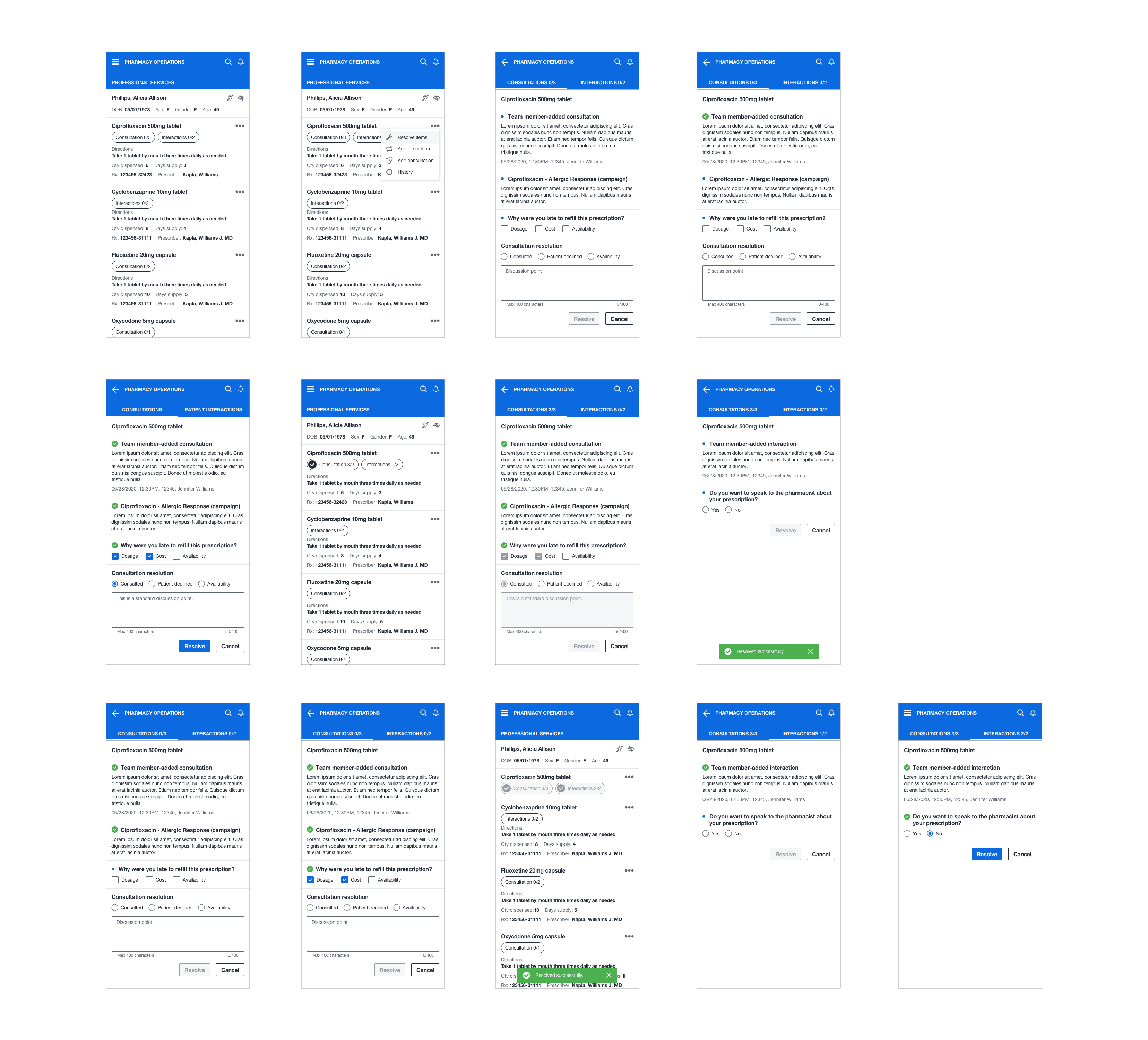

RESOLVE INTERACTIONS AS A SPRPH
In some circumstances, an SpRPH might have a patient using medication that falls under the CSP (controlled substance protocol). The existing resolving pattern was replicated to handle patient interactions and introduced using a drawer (control) to have the SpRPh confirm their attestation for the patient's medication and then resolve the exchange.
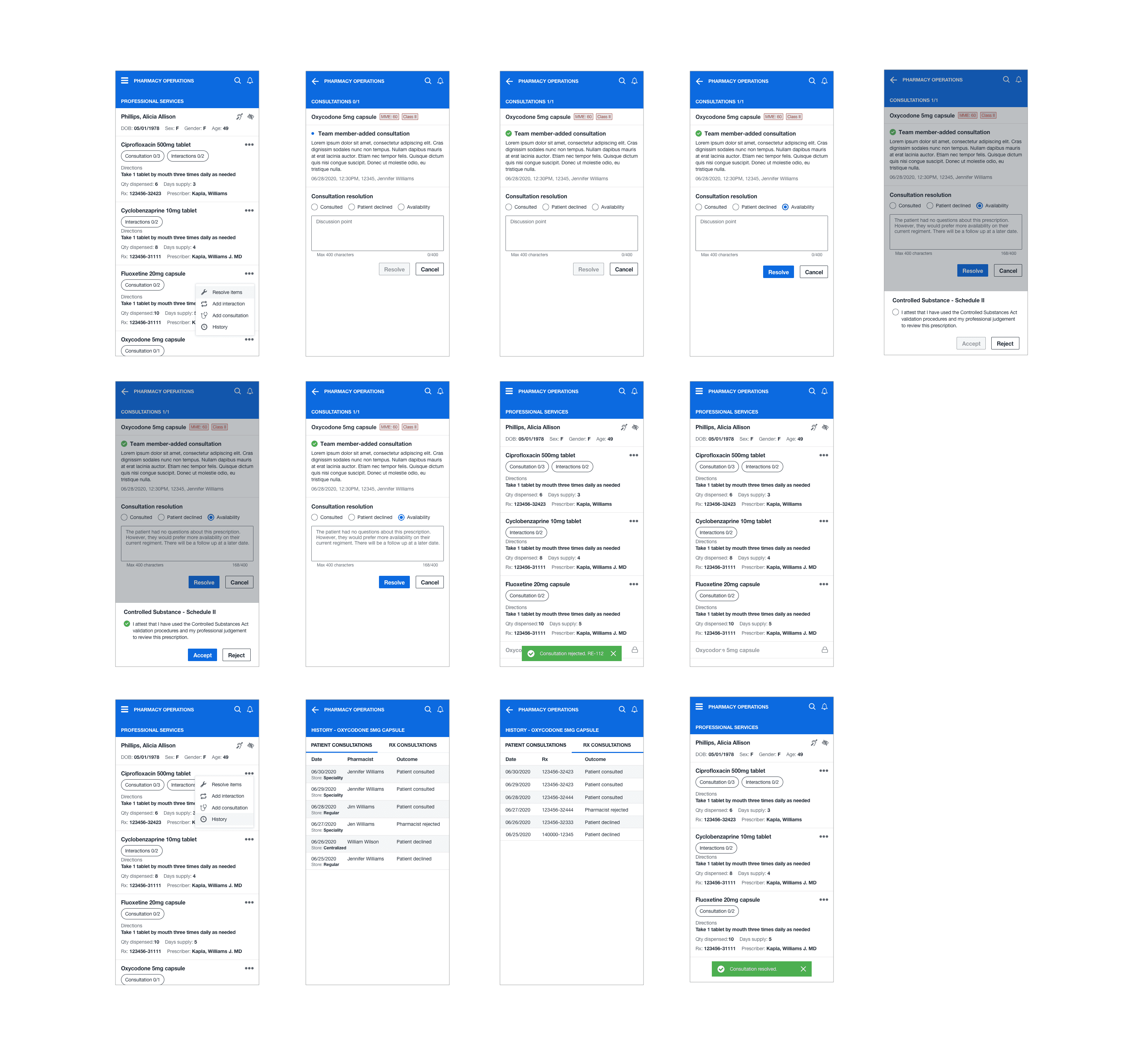

ADD PATIENT INTERACTIONS OR CONSULTATIONS AS A SPRPH
Specialized pharmacists needed to add either a consultation or patient interaction. The mobile pattern is replicated to offer the same functionality as the desktop application. When pharmacists add a clinical interaction to a consultation, they could select them from the drawer and then add the consultation.
ADD PATIENT INTERACTIONS OR
CONSULTATIONS AS A SPRPH
Specialized pharmacists needed to add either a consultation or patient interaction. The mobile pattern is replicated to offer the same functionality as the desktop application. When pharmacists add a clinical interaction to a consultation, they could select them from the drawer and then add the consultation.
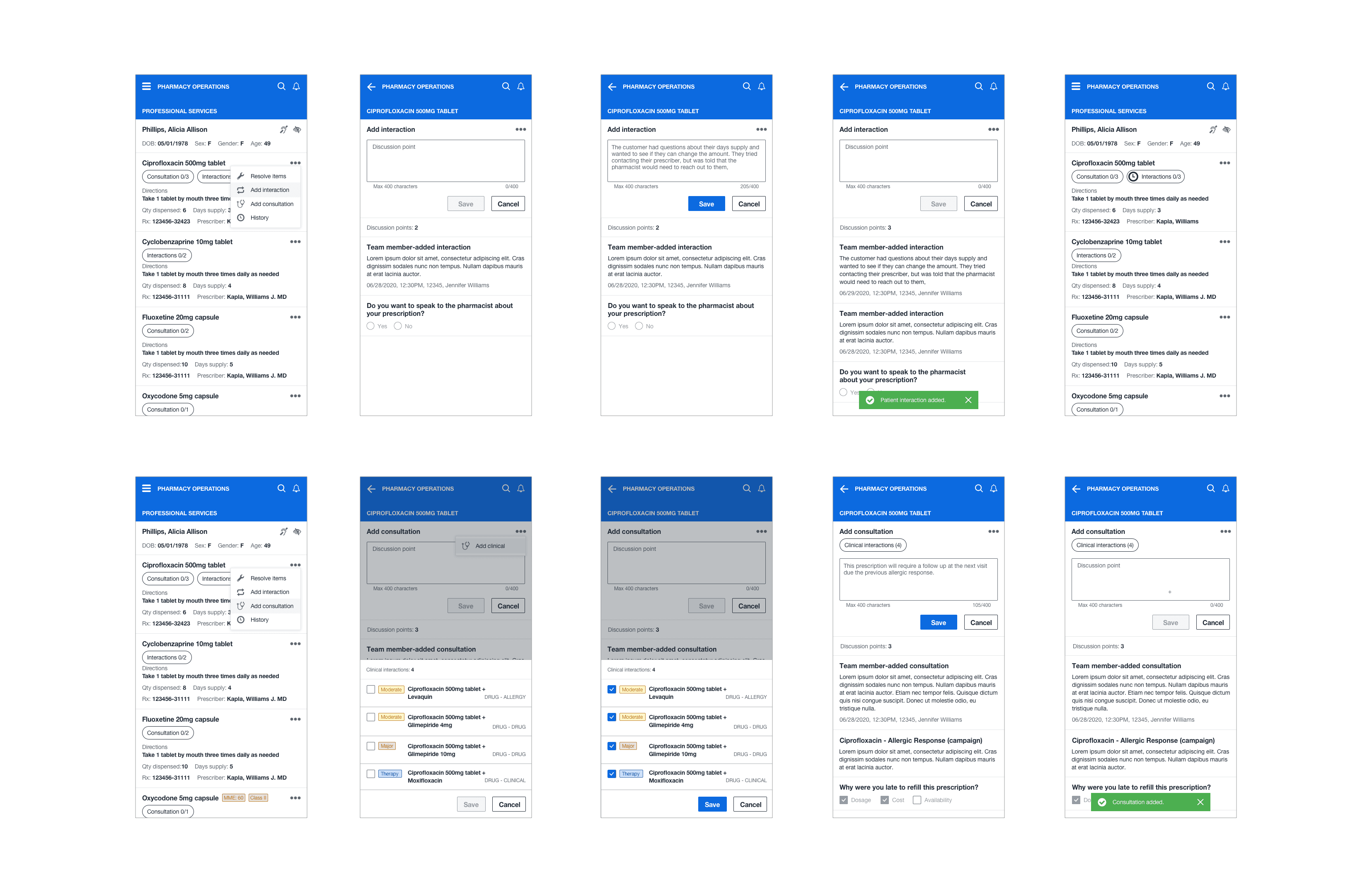

STORYBOARD
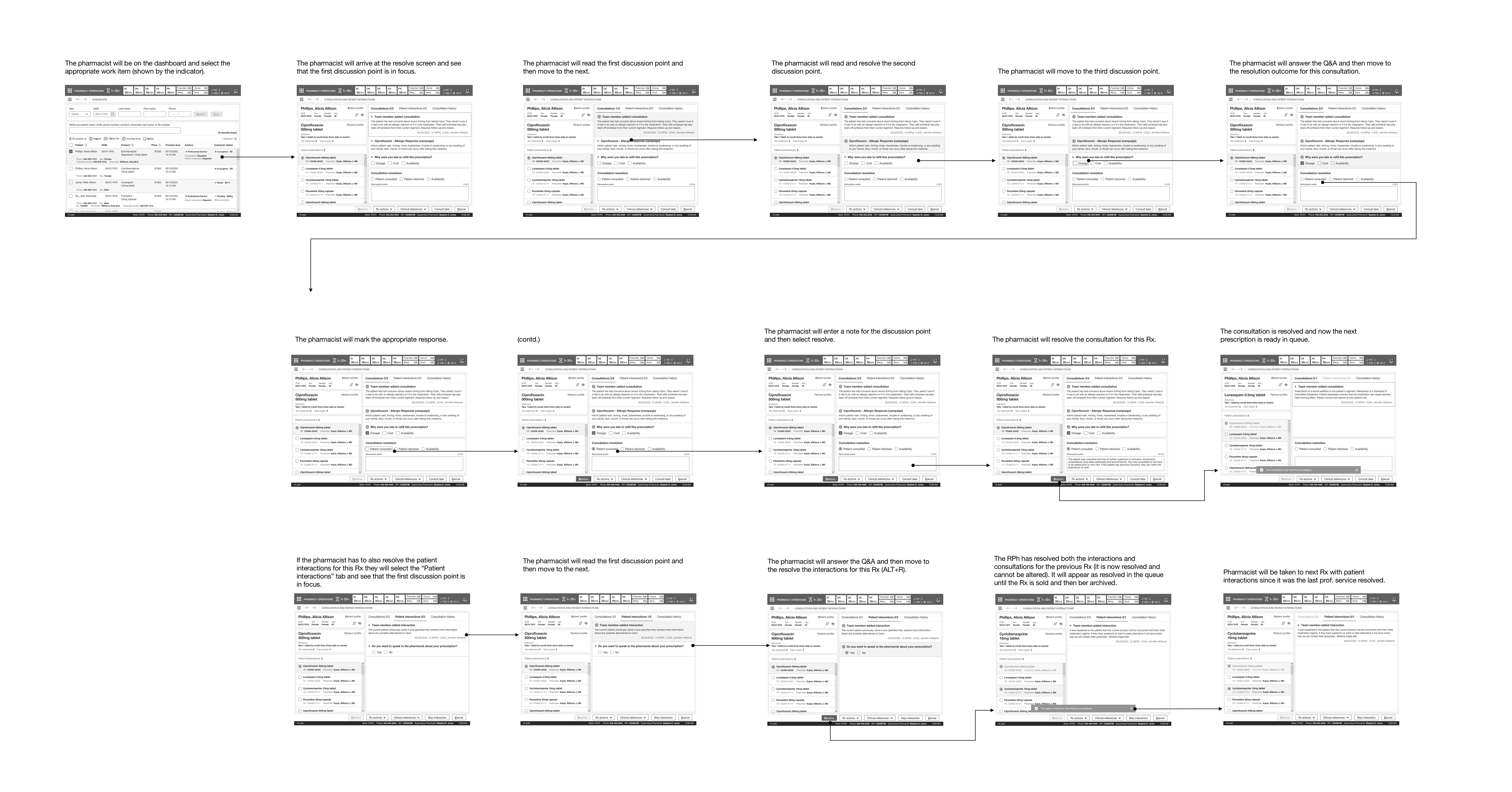
I constructed the wireframe (in grayscale) into a storyboard that showed the paths for the defined use cases and scenarios for a pharmacist, a specialized pharmacist/intern, and a technician. Grayscale was preferred. It deterred the reviews from going off on a tangent about the styling and colors (styling was already established in the library and was left for offline reviews).
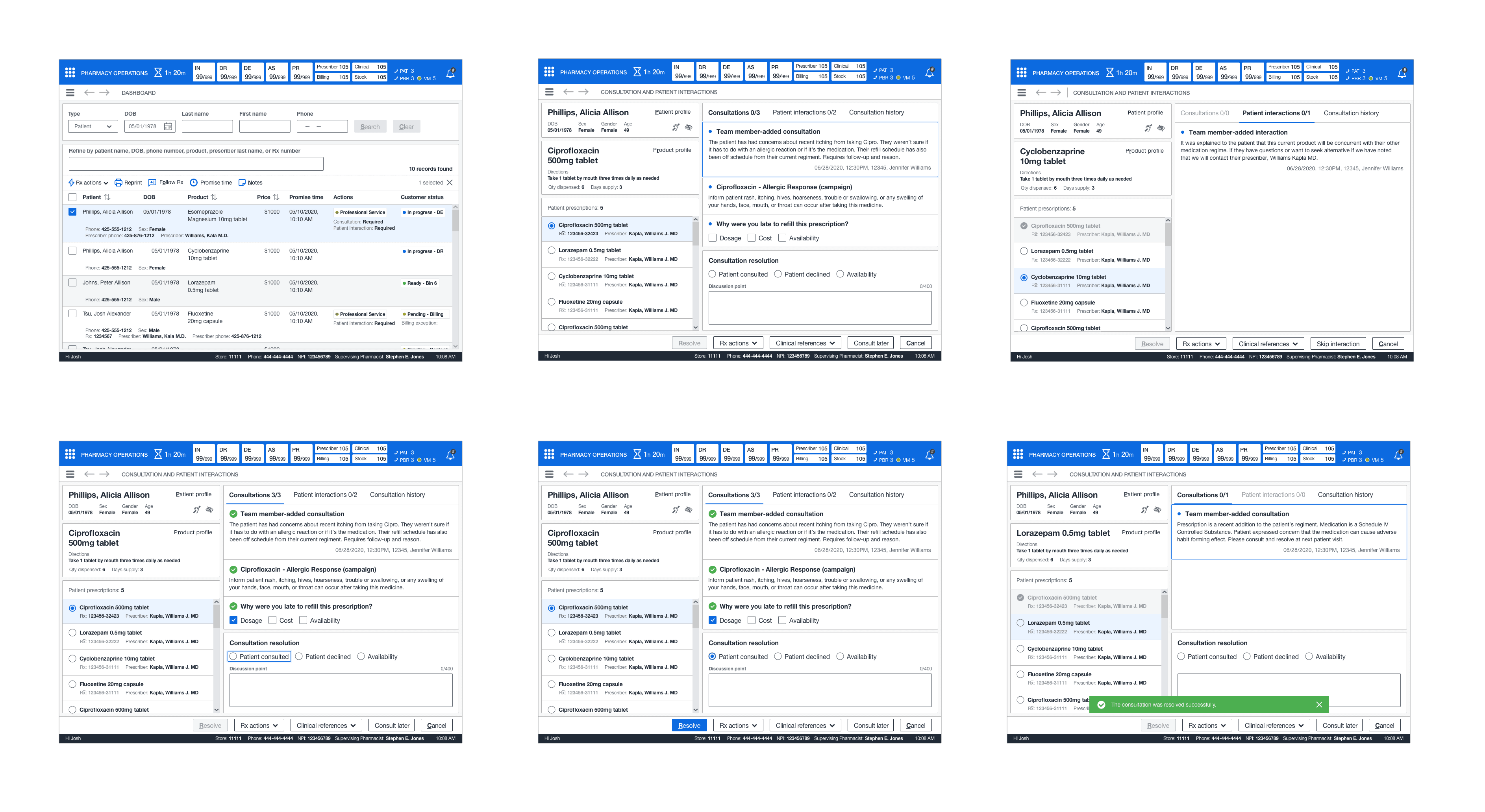
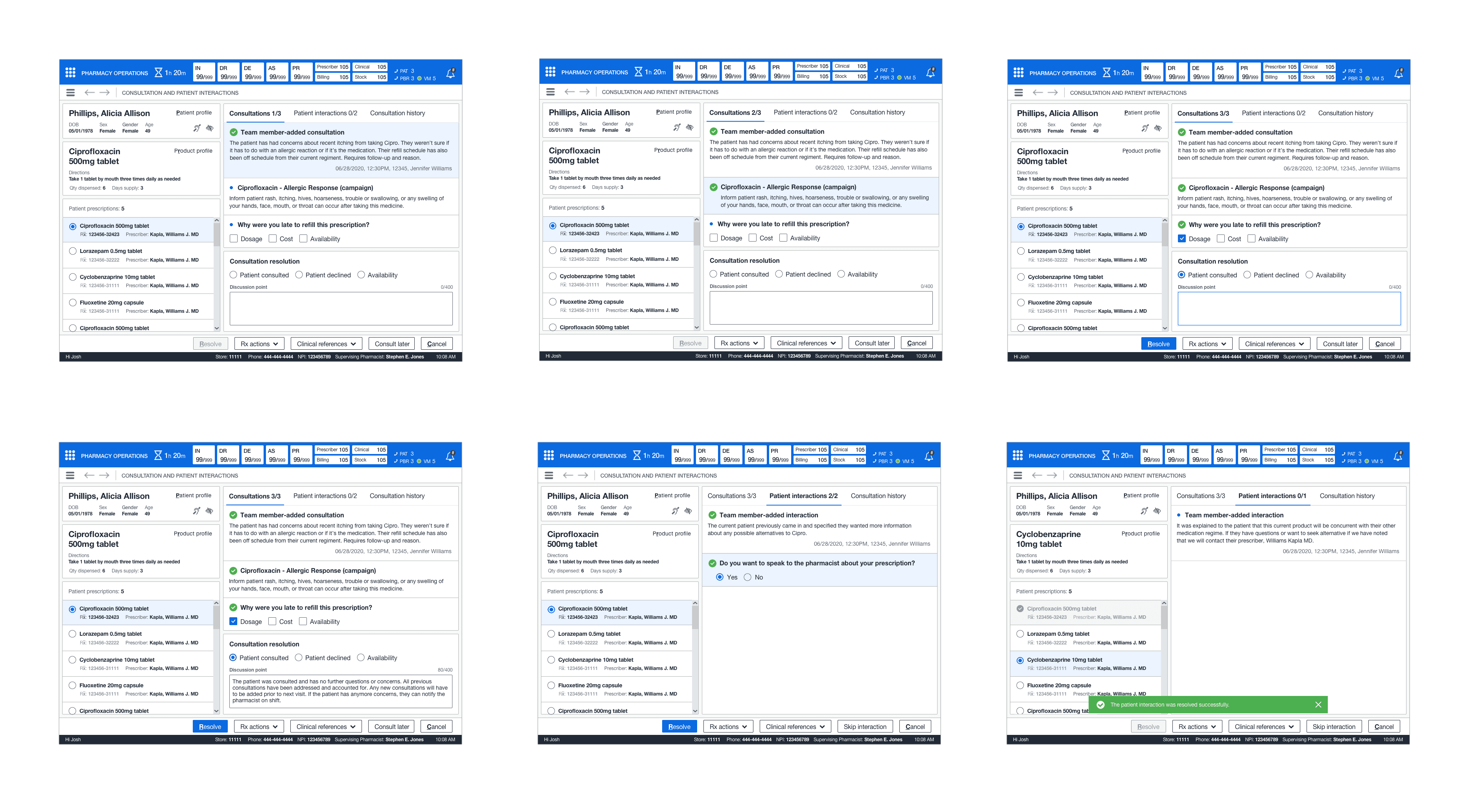
RESOLVE CONSULTATIONS AND PATIENT INTERACTIONS (PHARMACIST)
This path indicates how a pharmacist will resolve a consultation for a work item requiring a resolution from the dashboard. The pharmacist will select from the list of generated patient medications–view and read the discussion points for the consultations and then patient interactions (if needed), select an outcome and input a discussion note before resolving it. In addition, a pharmacist can skip this prescription, access clinical references, or cancel the operation entirely (while retaining their work).

ADD CONSULTATION AND PATIENT INTERACTION
This path indicates how a pharmacist can use their best professional judgment when a need arises to add either of the following services at any point during fulfillment before arbitration and point of sale for the patient's prescription. In most circumstances, technicians would be trained to add a patient interaction and likewise for a pharmacist concerning consultations.
A pharmacist can document a consultation for the patient (whether it was over the phone or in-person) and associate their relevant prescription to the ad-hoc consultation without writing down their information for the next pharmacist and recording it in the offline log (storyboard not required).

CONSULTATION HISTORY
This path indicates how a pharmacist would access previous consultation discussions at outcomes for a particular prescription when adding, resolving, or documenting a consultation.

ADD OR RESOLVE PATIENT INTERACTIONS (TECHNICIAN)
This path indicates how a technician would add a patient interaction during fulfillment or from the pharmacy dashboard, depending on the scenario.
DEFER CONSULTATION
This path indicates how a technician could defer a consultation if the pharmacist were unavailable or busy with another patient.

RESOLVE CONSULTATIONS (SPRPH/INTERN)
This path indicates how a specialized pharmacist from their handheld device would resolve consultations for complex patients with uncommon diseases or complications requiring a direct approach to patient care. In addition, train an intern looking to become a part of a specialized pharmacy program.
RESOLVE INTERACTIONS (SPRPH)
This path indicates how a specialized pharmacist from their handheld device would resolve interactions in certain circumstances, add a patient interaction following the CSP protocol, or their technicians being overwhelmed with inventory procedures.
ADD INTERACTIONS/CONSULTATIONS (SPRPH)
This path indicates how a specialized pharmacist could add either of these professional services from their handheld device under the same circumstances a standard pharmacist would.

SETTING UP THE FIRST REVIEW
I set up two meetings to review the storyboard and proposed designs before the team, showing this to the leadership team. The first meeting was with the campaign management team. The PM and technical architect presented their presentation and showcased no performance impacts and the increased response time in presenting the information.
Next, I showed them the improved documentation process, how a pharmacist (from anywhere) could access the previous discussions and outcomes (in a centralized and secure system), and how this would remove the offline notation pharmacist's logs. The team was thrilled with our presentation and had no feedback to implement.
PRIOR TO LEADERSHIP REVIEW
Next, the team and I met with the specialty team. I first presented my designs and explained the process in which an SpRPh or intern (training to be one) would access this from their handheld device. Next, I showed them the consultation history to access previous consultation outcomes. Next, I mentioned that an SpRPh could only see so much from their handheld device due to integration limitations.
Since handheld devices were keyed to the individual, this alleviated concerns about outside parties accessing a patient's PII. Lastly, the PM/TA explained that there would be expected performance issues in larger centers (this would require testing). The specialty team was pleased with the presentation but wanted to see how integrations could be improved in a future milestone.


SETTING UP THE SECOND REVIEW
The second meeting contained the ops/fulfillment team and the training team. This meeting was not as long as this only required me to present the new designs to the two groups. I explained that a technician would not add a further patient interaction after arbitration and that it would not block the point of sale. I showcased how there was no longer a need for follow-up calls and that the pharmacist would now document everything in the new and secure system. In addition, do away with the offline notation and pharmacist log. The training team's only concern was understanding how training would take place.
EXPLAINING THE PROCESS
I explained that once the testing was scheduled, I would coordinate the testing plans (set up by the researchers) with the training schedule, and the training specialists (on our side) would assist them in training on this new process. The teams were delighted with the presentation and had no further feedback to implement in terms of the designs. I received approval to meet with the leadership team and begin the review to showcase the designs. Since the topic was the largest of all the subjects, it required four leadership reviews and an offline check to view everything.
LEADERSHIP REVIEW #1
For the first leadership review, I went through the designs for pharmacists for how the resolve a consultation and patient interaction. I explained how the system determines to display the indicator and indicate to the pharmacist that at patient walk-in, there would be a consultation or patient interaction to resolve. I explained the simple read and acknowledgment process, selecting an outcome, and entering a discussion point.
I explained the auto-save process and how the pharmacist could quickly cycle through each prescription. Leadership agreed with this approach but wanted to see actual campaign examples instead of "lorem ipsum" for information in the cards. In addition, see the addition of secondary drug information in the cards.
CAPTURING FEEDBACK
The PM captured feedback, and I showed them how a pharmacist could document a consultation by associating the relevant prescriptions and entering a discussion point. I showed them the consultation history containing all previous discussions and outcomes. There were so many screens to review for just this portion I wanted to make sure they understood how the patterns retained continuity across the UI.
The leadership's only feedback for documenting the consultation was to ensure it was done from the patient's profile. Lastly, there was no feedback for consultation history. They were delighted with what they saw. They requested to know how to add a consultation or patient interaction and see the handheld screen.


LEADERSHIP REVIEW #2
This review would strictly showcase how a consultation or patient interaction was added and the handheld screens for specialized pharmacists and interns training to be an SpRPh. First, I showed how a pharmacist could add a consultation, add clinical interactions on prescriptions that required it, and then add a patient interaction. They understood this model originated from the documentation process. They wanted to see consistency in the naming convention for the textboxes in the modals.
EXPLAINING FUNCTIONALITY
Next, I explained that resolving a consultation did not change in terms of the interaction. An SpRPh would go through the discussion points, select an outcome, and enter a discussion point. I emphasized that an SpRPh could only access previous consultation outcomes for a prescription due to the integration limitations. It would require a re-design in technical architecture for that system (which the PM explained), or I explained it could be accessed from the pharmacist workstation. The leadership team wanted to table the technical discussion for a later milestone. For the first release, this functionality would suffice. There was no feedback to implement for the design.
ADDITIONAL CLARIFICATION
Furthermore, I showed how they would resolve patient interactions for complex patients under the controlled substance protocol—the addition of attestation (the only new addition), which requires a response to the CSP before resolution. Their feedback was CSP might relate more to consultations in the future depending on the clinical nature of the campaign. Last, I showed the process for adding a consultation or patient interaction from their handheld device. Again, this functionality did not differ from the desktop application.
LEADERSHIP REVIEW #3
This review consisted of reviewing the screens for technicians. These screens consisted of deferring a consultation, adding a patient interaction or consultation, and resolving a patient interaction. Consistency was pivotal in the proposed designs to inhibit or deter from an established interaction model. I first showed how the technician would add a consultation or patient interaction.
I explained the workflow did not differ other than a technician could not access consultation history nor associate clinical interactions to a consultation when adding them into the system. In addition, I explained that resolving patient interactions attributed the same restrictions for a technician as when adding.
CLOSING DETAILS
Lastly, I showed the leadership team how a technician would defer a consultation. It could only be completed if work items the system had marked could be deferrable based on the campaign requirements; a consultation could only be deferred once. There was still concern about the system possibly failing and not blocking the consultation from being deferred prior to arbitration. Leadership wanted to see full logic from the TA when the implementation phase was complete. The next task was to implement all feedback captured in the previous reviews and review it with the leadership team in the following review.


LAST LEADERSHIP REVIEW
The last leadership review consisted of reviewing the feedback I had implemented. I first went through the pharmacist screens for a standard pharmacist and then a specialized pharmacist. The leadership team was happy with the changes, and I moved forward to the detailed design phase.
DETAILED DESIGN
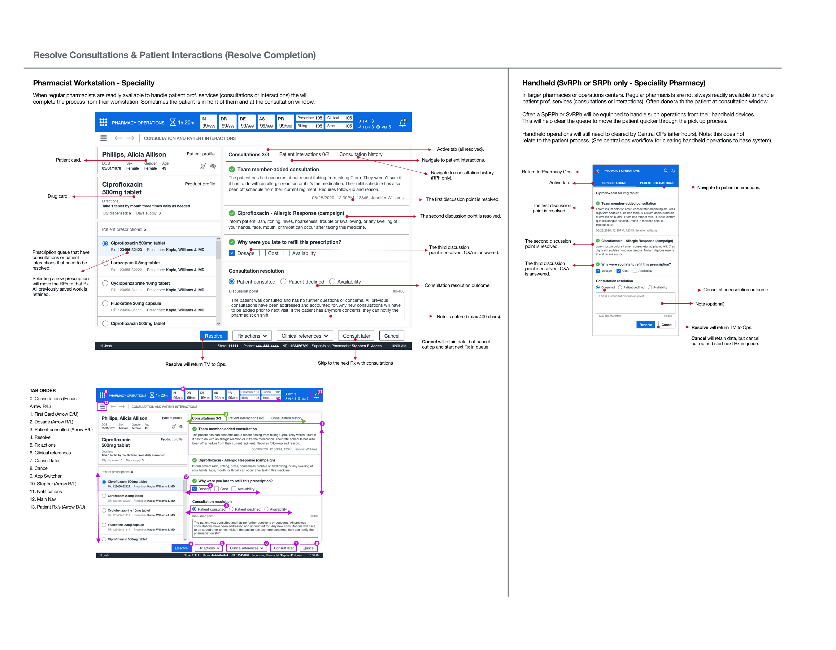
I utilized the design library to make pixel-perfect mockups of the core screens. I first completed the pharmacist screens and then the technician screens. Since the specialized pharmacist screens involved the handheld device, this utilized a separate library. I quickly familiarized myself with this library and applied the design rules to the handheld screens. Once the detailed design was complete, I took the completed screens and started the annotations and tab order.
ANNOTATIONS AND TAB ORDER
I created annotated wireframes and tab orders for all screens. These artifacts would aid engineers and technical architects in understanding the functionality and act as a blueprint for elaboration. Once I completed these artifacts, the executive leadership had an offline review, and they signed off on the UX. There was no tab order for the mobile screens as tabbing did not apply. The offline check consisted of reviewing all annotated wireframes and Confluence docs.

DESIGN
RESOLVING CONSULTATIONS OR INTERACTIONS AS A RPH
This feature introduced quite a few new patterns. It required the ability to switch between both professional services so pharmacists could understand what was unresolved at the time of patient care. In addition, understand the previous discussions that took palace with the patient. I created a mini queue pattern for the patient's prescriptions so the pharmacist could quickly cycle through each medication.
In addition, it indicated when a discussion point was resolved, a simple selection of attestation, and the optional discussion point text. Finally, the card structure showed what, who, and when for each discussion point, action, and response for campaign-generated consultations or patient interactions. No saved work would be lost due to a system failure or abandoning the task (for up to 48 hours).


DOCUMENTING A CONSULTATION
This new feature brought about the new concept of documenting a consultation (ad-hoc) for the patient. In addition, a simple text box and the ability to associate multiple prescriptions through the multi-select pattern gave pharmacists the ability to abandon the offline notation and pharmacist log. This also eliminated the need to write down patient PII.

VIEWING PREVIOUS CONSULTATION INFORMATION
Enhanced professional services required a detailed documentation history of previous consultation outcomes and discussions between the patients and pharmacists. Consultation history needed to be accessed when resolving, adding, or documenting consultation history. To keep continuity within the UI, I designed a pattern schema that could be adapted to the different entry points in the system.
Through the single-select option, a pharmacist could view and be aware of the previous patient and prescription-related consultations discussed through the medication history for that patient. In some cases, consultations with associated clinical interactions.
Lastly, a pharmacist could perform a deep dive into the specific details of that record; the outcome, previous discussions, and the resolution. The consultation details introduced several new read-only patterns I designed for cards and lists and the fullscreen modal in a concise and clear format.


ADDING A CONSULTATION OR PATIENT INTERACTION
This new feature gave technicians and pharmacists a new way of adding a patient interaction or consultation depending on the scenario. This process adopted a similar pattern from documenting, except this process was done during different encounters and required a read-only design for discussion points with previous selections disabled (should a system-generated campaign) be previously resolved.
For example, if the consultation required clinical interactions, a pharmacist could select multiple clinical interactions when adding that specific type of consultation. The UI for technicians is replicated from the pharmacist's view. However, the exception technicians would not see consultation history and could not add clinical consultations.

RESOLVING PATIENT INTERACTIONS
AS A TECHNICIAN
This new feature was duplicated from the pharmacist's view, except that a technician could not access consultation history or consultations. Instead, they could add a patient interaction depending on their encounter with the patient.

DEFERRING A CONSULTATION
AS A TECHNICIAN
This new feature unveiled the ability for technicians to select a reason and understand why it was previously deferred on consultations that are deferrable quickly from the pharmacy dashboard. In addition, the status marker quickly indicates technicians of work items that are deferrable. System logic would help determine what previous consultations were deferrable and only allow it to be done once.

RESOLVING CONSULTATIONS
AS A SPRPH OR AN INTERN
Handheld functionality is replicated from the primary pharmacist view for resolving consultations into a material UI design to accommodate their android handheld devices. This mobile UI displayed essential information that SpRPhs needed to perform consultations and patient caregiving. They could quickly access the various patient medications and resolve any outstanding consultations (and other services) from the list.
As previously mentioned, specialized pharmacists would require a more direct approach with complex patients when providing patient care in various areas for specialty medications. In addition, they often utilized these devices to train interns training in specialty areas, including dispensing, medication therapy management, patient advocacy, and therapy compliance.
Lastly, pharmacists could access previous consultation outcomes from the consultation history. Due to the limitations of integrations, it limited the ability to view previous discussions and information for each consultation; however, this still gave the SpRPHs incredible extensibility when providing patient care.

RESOLVE INTERACTIONS AS A SPRPH
In some circumstances, an SpRPH might have a patient using medication that falls under the CSP (controlled substance protocol). The existing resolving pattern was replicated to handle patient interactions and introduced using a drawer (control) to have the SpRPh confirm their attestation for the patient's medication and then resolve the exchange.

ADD PATIENT INTERACTIONS OR CONSULTATIONS AS A SPRPH
Specialized pharmacists needed to add either a consultation or patient interaction. The mobile pattern is replicated to offer the same functionality as the desktop application. When pharmacists add a clinical interaction to a consultation, they could select them from the drawer and then add the consultation.

STORYBOARD
I constructed the wireframe (in grayscale) into a storyboard that showed the paths for the defined use cases and scenarios for a pharmacist, a specialized pharmacist/intern, and a technician. Grayscale was preferred. It deterred the reviews from going off on a tangent about the styling and colors (styling was already established in the library and was left for offline reviews).
RESOLVE CONSULTATIONS AND PATIENT INTERACTIONS (PHARMACIST)
This path indicates how a pharmacist will resolve a consultation for a work item requiring a resolution from the dashboard. The pharmacist will select from the list of generated patient medications–view and read the discussion points for the consultations and then patient interactions (if needed), select an outcome and input a discussion note before resolving it. In addition, a pharmacist can skip this prescription, access clinical references, or cancel the operation entirely (while retaining their work).

ADD CONSULTATION AND
PATIENT INTERACTION
This path indicates how a pharmacist can use their best professional judgment when a need arises to add either of the following services at any point during fulfillment before arbitration and point of sale for the patient's prescription. In most circumstances, technicians would be trained to add a patient interaction and likewise for a pharmacist concerning consultations.
A pharmacist can document a consultation for the patient (whether it was over the phone or in-person) and associate their relevant prescription to the ad-hoc consultation without writing down their information for the next pharmacist and recording it in the offline log (storyboard not required).

CONSULTATION HISTORY
This path indicates how a pharmacist would access previous consultation discussions at outcomes for a particular prescription when adding, resolving, or documenting a consultation.

ADD OR RESOLVE PATIENT INTERACTIONS (TECHNICIAN)
This path indicates how a technician would add a patient interaction during fulfillment or from the pharmacy dashboard, depending on the scenario.
DEFER CONSULTATION
This path indicates how a technician could defer a consultation if the pharmacist were unavailable or busy with another patient.

RESOLVE CONSULTATIONS (SPRPH/INTERN)
This path indicates how a specialized pharmacist from their handheld device would resolve consultations for complex patients with uncommon diseases or complications requiring a direct approach to patient care. In addition, train an intern looking to become a part of a specialized pharmacy program.
RESOLVE INTERACTIONS (SPRPH)
This path indicates how a specialized pharmacist from their handheld device would resolve interactions in certain circumstances, add a patient interaction following the CSP protocol, or their technicians being overwhelmed with inventory procedures.
ADD INTERACTIONS/CONSULTATIONS (SPRPH)
This path indicates how a specialized pharmacist could add either of these professional services from their handheld device under the same circumstances a standard pharmacist would.

SETTING UP THE FIRST REVIEW
I set up two meetings to review the storyboard and proposed designs before the team, showing this to the leadership team. The first meeting was with the campaign management team. The PM and technical architect presented their presentation and showcased no performance impacts and the increased response time in presenting the information.
Next, I showed them the improved documentation process, how a pharmacist (from anywhere) could access the previous discussions and outcomes (in a centralized and secure system), and how this would remove the offline notation pharmacist's logs. The team was thrilled with our presentation and had no feedback to implement.
PRIOR TO LEADERSHIP REVIEW
Next, the team and I met with the specialty team. I first presented my designs and explained the process in which an SpRPh or intern (training to be one) would access this from their handheld device. Next, I showed them the consultation history to access previous consultation outcomes. Next, I mentioned that an SpRPh could only see so much from their handheld device due to integration limitations.
Since handheld devices were keyed to the individual, this alleviated concerns about outside parties accessing a patient's PII. Lastly, the PM/TA explained that there would be expected performance issues in larger centers (this would require testing). The specialty team was pleased with the presentation but wanted to see how integrations could be improved in a future milestone.


SETTING UP THE SECOND REVIEW
The second meeting contained the ops/fulfillment team and the training team. This meeting was not as long as this only required me to present the new designs to the two groups. I explained that a technician would not add a further patient interaction after arbitration and that it would not block the point of sale. I showcased how there was no longer a need for follow-up calls and that the pharmacist would now document everything in the new and secure system. In addition, do away with the offline notation and pharmacist log. The training team's only concern was understanding how training would take place.
EXPLAINING THE PROCESS
I explained that once the testing was scheduled, I would coordinate the testing plans (set up by the researchers) with the training schedule, and the training specialists (on our side) would assist them in training on this new process. The teams were delighted with the presentation and had no further feedback to implement in terms of the designs. I received approval to meet with the leadership team and begin the review to showcase the designs. Since the topic was the largest of all the subjects, it required four leadership reviews and an offline check to view everything.
LEADERSHIP REVIEW #1
For the first leadership review, I went through the designs for pharmacists for how the resolve a consultation and patient interaction. I explained how the system determines to display the indicator and indicate to the pharmacist that at patient walk-in, there would be a consultation or patient interaction to resolve. I explained the simple read and acknowledgment process, selecting an outcome, and entering a discussion point.
I explained the auto-save process and how the pharmacist could quickly cycle through each prescription. Leadership agreed with this approach but wanted to see actual campaign examples instead of "lorem ipsum" for information in the cards. In addition, see the addition of secondary drug information in the cards.
CAPTURING FEEDBACK
The PM captured feedback, and I showed them how a pharmacist could document a consultation by associating the relevant prescriptions and entering a discussion point. I showed them the consultation history containing all previous discussions and outcomes. There were so many screens to review for just this portion I wanted to make sure they understood how the patterns retained continuity across the UI.
The leadership's only feedback for documenting the consultation was to ensure it was done from the patient's profile. Lastly, there was no feedback for consultation history. They were delighted with what they saw. They requested to know how to add a consultation or patient interaction and see the handheld screen.


LEADERSHIP REVIEW #2
This review would strictly showcase how a consultation or patient interaction was added and the handheld screens for specialized pharmacists and interns training to be an SpRPh. First, I showed how a pharmacist could add a consultation, add clinical interactions on prescriptions that required it, and then add a patient interaction. They understood this model originated from the documentation process. They wanted to see consistency in the naming convention for the textboxes in the modals.
EXPLAINING FUNCTIONALITY
Next, I explained that resolving a consultation did not change in terms of the interaction. An SpRPh would go through the discussion points, select an outcome, and enter a discussion point. I emphasized that an SpRPh could only access previous consultation outcomes for a prescription due to the integration limitations. It would require a re-design in technical architecture for that system (which the PM explained), or I explained it could be accessed from the pharmacist workstation. The leadership team wanted to table the technical discussion for a later milestone. For the first release, this functionality would suffice. There was no feedback to implement for the design.
ADDITIONAL CLARIFICATION
Furthermore, I showed how they would resolve patient interactions for complex patients under the controlled substance protocol—the addition of attestation (the only new addition), which requires a response to the CSP before resolution. Their feedback was CSP might relate more to consultations in the future depending on the clinical nature of the campaign. Last, I showed the process for adding a consultation or patient interaction from their handheld device. Again, this functionality did not differ from the desktop application.
LEADERSHIP REVIEW #3
This review consisted of reviewing the screens for technicians. These screens consisted of deferring a consultation, adding a patient interaction or consultation, and resolving a patient interaction. Consistency was pivotal in the proposed designs to inhibit or deter from an established interaction model. I first showed how the technician would add a consultation or patient interaction.
I explained the workflow did not differ other than a technician could not access consultation history nor associate clinical interactions to a consultation when adding them into the system. In addition, I explained that resolving patient interactions attributed the same restrictions for a technician as when adding.
CLOSING DETAILS
Lastly, I showed the leadership team how a technician would defer a consultation. It could only be completed if work items the system had marked could be deferrable based on the campaign requirements; a consultation could only be deferred once. There was still concern about the system possibly failing and not blocking the consultation from being deferred prior to arbitration. Leadership wanted to see full logic from the TA when the implementation phase was complete. The next task was to implement all feedback captured in the previous reviews and review it with the leadership team in the following review.

LAST LEADERSHIP REVIEW
The last leadership review consisted of reviewing the feedback I had implemented. I first went through the pharmacist screens for a standard pharmacist and then a specialized pharmacist. The leadership team was happy with the changes, and I moved forward to the detailed design phase.
DETAILED DESIGN
I utilized the design library to make pixel-perfect mockups of the core screens. I first completed the pharmacist screens and then the technician screens. Since the specialized pharmacist screens involved the handheld device, this utilized a separate library. I quickly familiarized myself with this library and applied the design rules to the handheld screens. Once the detailed design was complete, I took the completed screens and started the annotations and tab order.
ANNOTATIONS AND TAB ORDER
I created annotated wireframes and tab orders for all screens. These artifacts would aid engineers and technical architects in understanding the functionality and act as a blueprint for elaboration. Once I completed these artifacts, the executive leadership had an offline review, and they signed off on the UX. There was no tab order for the mobile screens as tabbing did not apply. The offline check consisted of reviewing all annotated wireframes and Confluence docs.

NEXT STEPS
ELABORATION
The next step was to have elaboration scheduled to clarify any outstanding questions or concerns. For example, there were significant questions around the scenario in which a pharmacist would handle a session takeover from another station. Still, the discussion was tabled for a future topic expansion that dealt with these types of permissions. Next, I clarified the rest of the functionality, including the hotkey and confirmation of tab order. Finally, I explained all questions with the elaboration teams and then moved on to my next topic.
OUTCOMES
enhanced consultations and p
With the introduction of separating patient interactions and consultations provided pharmacists and specializd pharmacists more time with the patient and document their findings. It resulted in more daily and effective patient care, espeically in the speciality centers.
BACKUP METHOD
Pharmacy managers reported that the new option to create patient interactions or consultations during various fulfillment phases helped technicians reduce the workload on pharmacists. This change minimized duplication and reduced the need for manually entered consultations.
LEARNINGS
EXISTING PROCESS
I learned that the current process depends on third-party UIs, offline notations, and pharmacist logs. As a result, most team members implemented their method to handle these complex tasks, sometimes initiating follow-up phone calls that bogged down their workstream. Also, SpRPhs in larger volume centers utilized their handheld more than their pharmacist station for this patient service.
TEAM IMPACT
It was interesting to learn that these services impacted multiple internal teams and how dependent the entire funnel was on each team to ensure adequate patient care. Yet, the process was so disconnected and siloed within separate groups. Connecting the dots and providing a single omnichannel solution was challenging and rewarding.
TRAINING AND TESTING
Learning to coordinate a heavy training schedule with usability testing plans between multiple stakeholders required me to design a process to connect researchers with the correct stakeholders to set up their tests and give clear directions as to which use cases are associated with which workflow. Previously, there had not been a process to handle larger topics.