Product Review
Walgreens's pharmacists needed an enhanced method for scanning or manually inputting medications to ensure accurate dispensing of patient medications.
GOALS
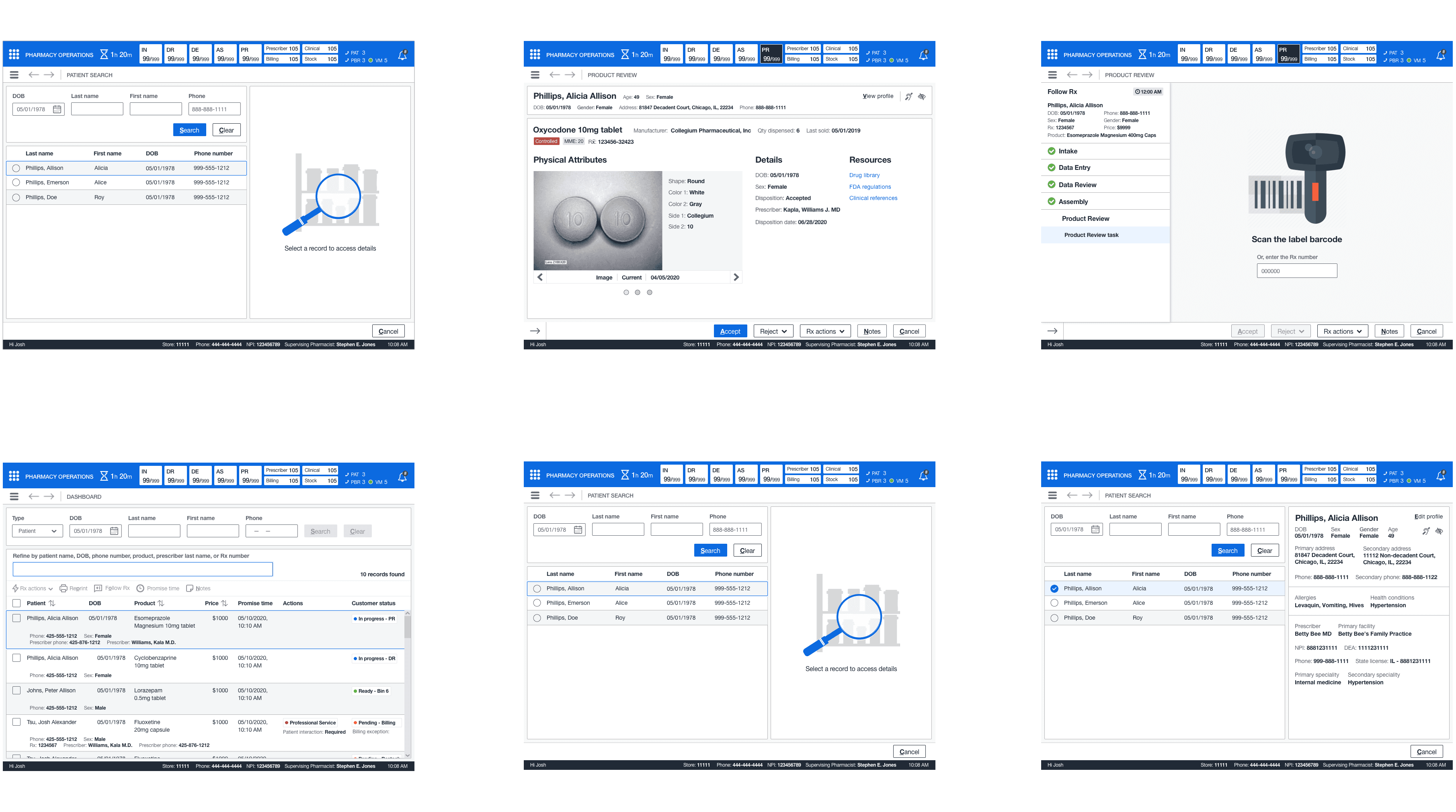
Design a way pharmacists can accurately review and dispense a patient's medications. Reduce or eliminate incorrect dispensed medications. Provide a primary way to scan or manually input an Rx number to access Product Review. In addition, provide a secondary path to bypass an Rx number scan.
CHALLENGES
Pharmacists relied heavily on prescription images as the primary method for a product review (which might result in incorrect dispenses).
Providing the correct information as the current process did not have readily available information.
Reducing the number of excess scans of the vial label for a product review in the current business process.
MY ROLE
Participate in product and business team workshops to gather and define requirements.
Build a storyboard and medium wireframes to illustrate the product review process.
Analyze and create a user flow for this pharmacy process.
Create annotated wireframes and tab order diagrams for the engineering and elaboration process (for final implementation).
Design pixel-perfect high-fidelity wireframes for prototype and usability testing purposes.
WHAT I DELIVERED
1 User flow
2 Medium-fidelity wireframes
1 Storyboard
11 High-fidelity wireframes
12 Annotated wireframes
2 Tab order diagrams
RESEARCH
Product review
There was only one workshop to gather and define requirements for this topic. The workshop consisted of the core team and multiple business stakeholders (pharmacists, technicians, and pharmacy managers). Their input gave insight into this pharmacy process for properly reviewing and ensuring the correct dispensed medications.
Defining requirements
Business rules determined the functional requirements, and the priority was based on the existing business process and what SMEs and PMs determined to be in-scope. The product manager decided these requirements to be in-scope: scan functionality, accept and reject, patient and drug information, the ability to manually access the product review, and scan bypass.


RESEARCH
Product review
There was only one workshop to gather and define requirements for this topic. The workshop consisted of the core team and multiple business stakeholders (pharmacists, technicians, and pharmacy managers). Their input gave insight into this pharmacy process for properly reviewing and ensuring the correct dispensed medications.
Defining requirements
Business rules determined the functional requirements, and the priority was based on the existing business process and what SMEs and PMs determined to be in-scope. The product manager decided these requirements to be in-scope: scan functionality, accept and reject, patient and drug information, the ability to manually access the product review, and scan bypass.

PLAN
Use Case
As a pharmacist, I do not have all the prescription information to verify the product is ready without consulting a third-party system. When I have a tote of two hundred prescriptions to fill, this takes up too much of my time
Functional: On the product review screen, the team members need to have all information readily available, including the image, attributes, and additional links, to make a quick and precise review.
Examining Workflow
I examined the functional requirements, and I constructed a user flow. Then, I went over the product review user flow with my team and made the adjustments I received before the next meeting. In the meeting, my team and I reviewed the changes. The user flow was approved and I moved to the ideation phase.


Ideation phase
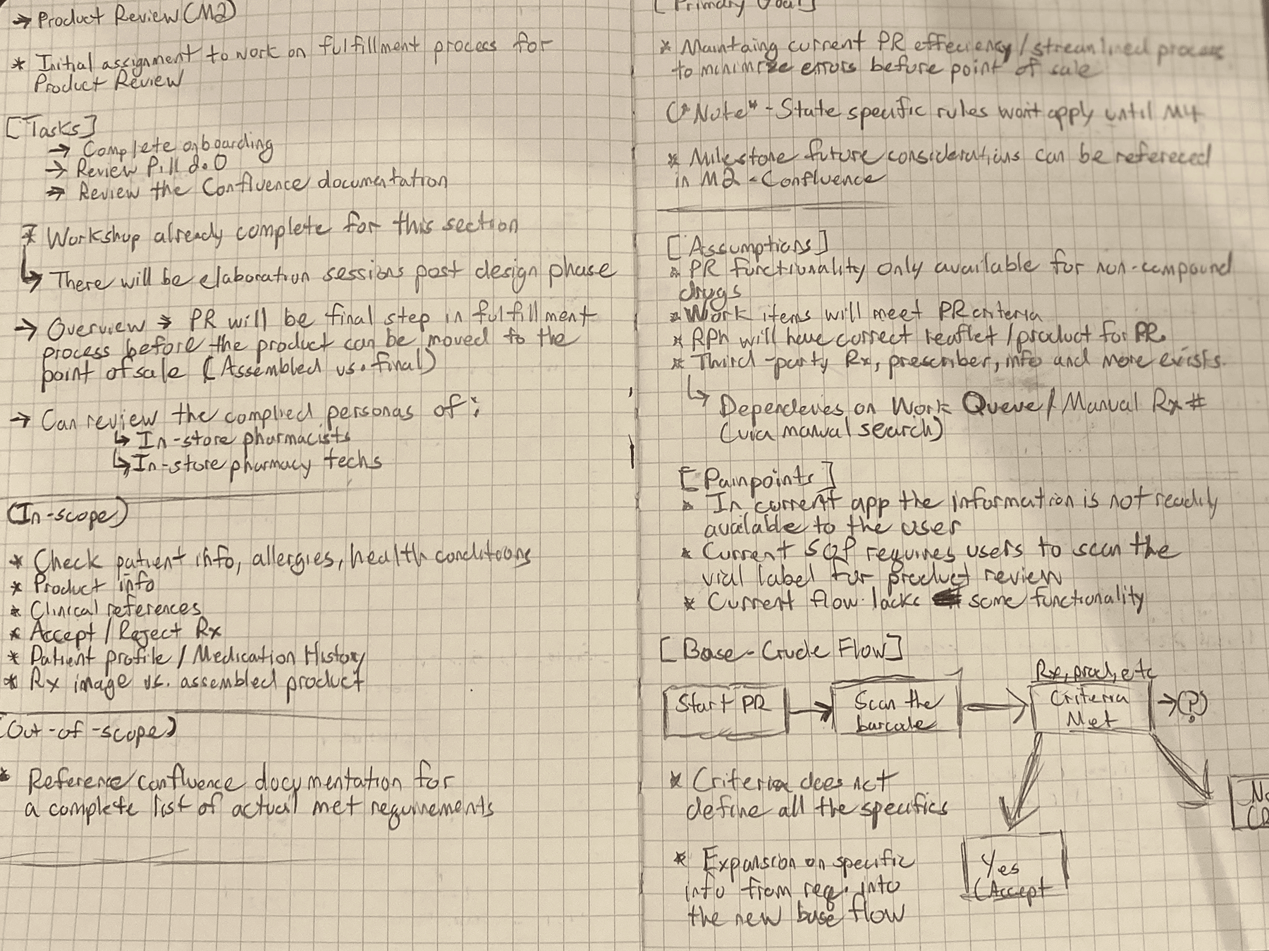
I created some initial sketches that showed the concept of how team members would access the product review page and utilize it. The team members would access the product review page from the landing page, whether scanning or inputting an Rx number.
Upon landing on the product page, they could accept, reject, or cancel based on the available criteria and use their judgment before dispensing the product for point of sale. Next, I expanded with more sketches and moved to medium-fidelity wireframes from the sketches.

Dashboard
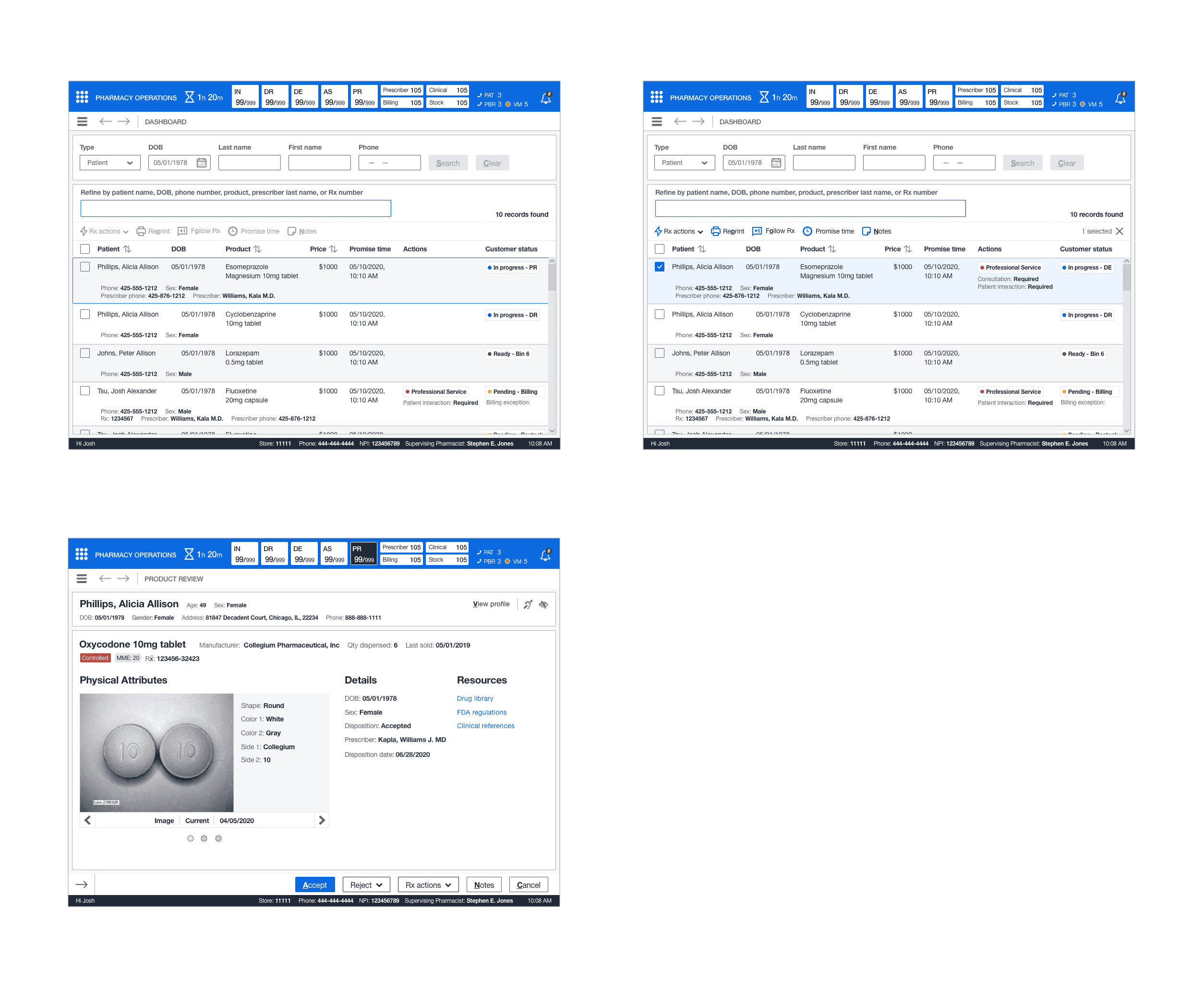
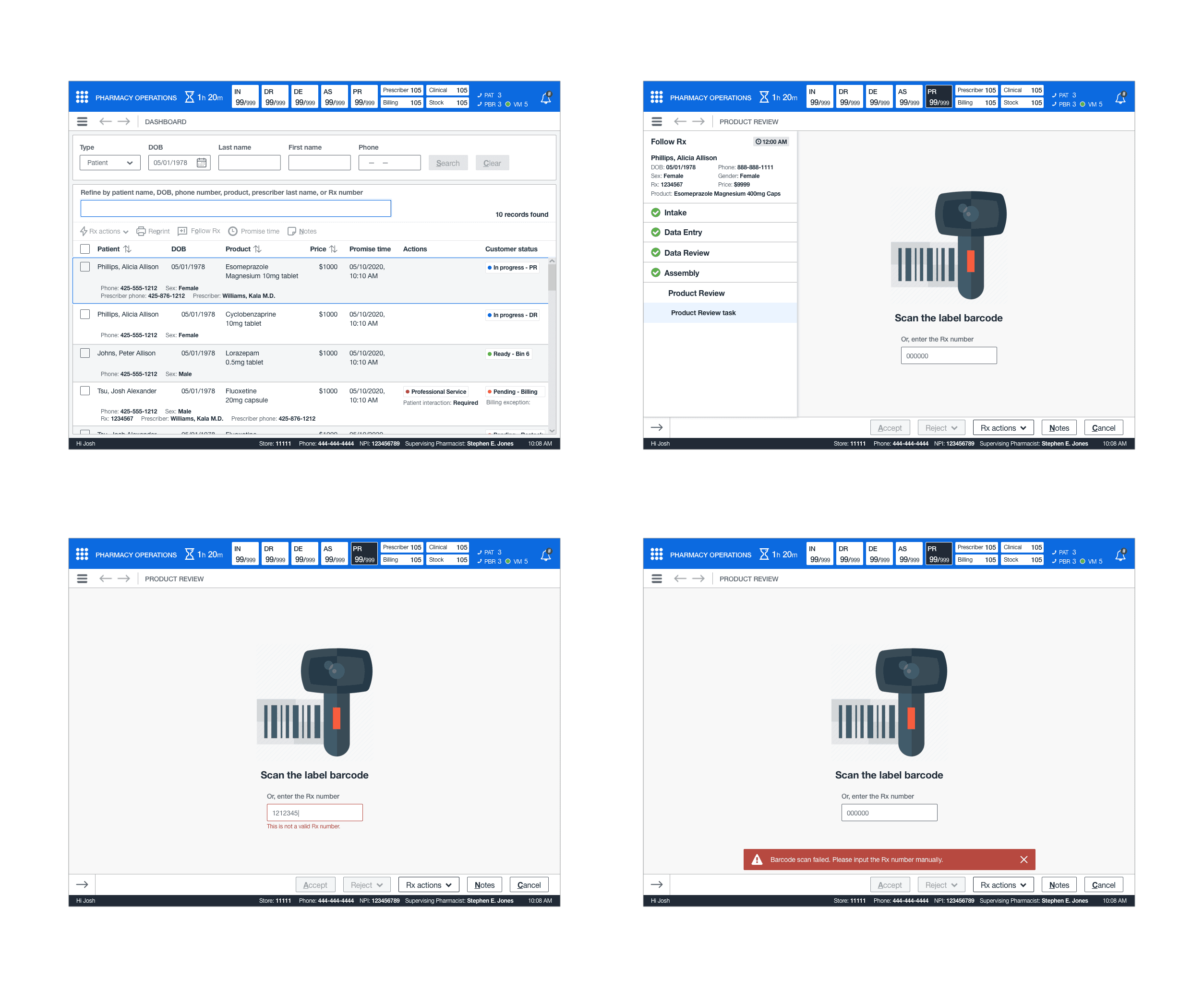
Pharmacists and other pharmacy employees required a centralized, easy-to-use dashboard where they could search, refine, and perform various actions to find a patient or medication. This dashboard included a fulfillment stepper to quickly access the productivity queue for working in real-time with the patient.
Product review
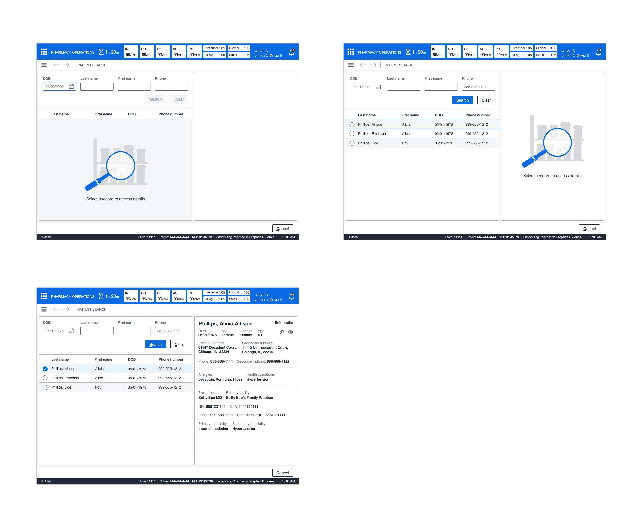
Product review consisted of multiple screens for accessing it from various points in the system. The primary way was through the dashboard, which would quickly show the product review screen with all information present and available to perform the review accurately. Additionally, I provided a landing page to scan or input the Rx number and access it from the productivity queue and perform their entry that way. Lastly, a way to bypass the scan was to search and quickly retrieve patient results.
Storyboard
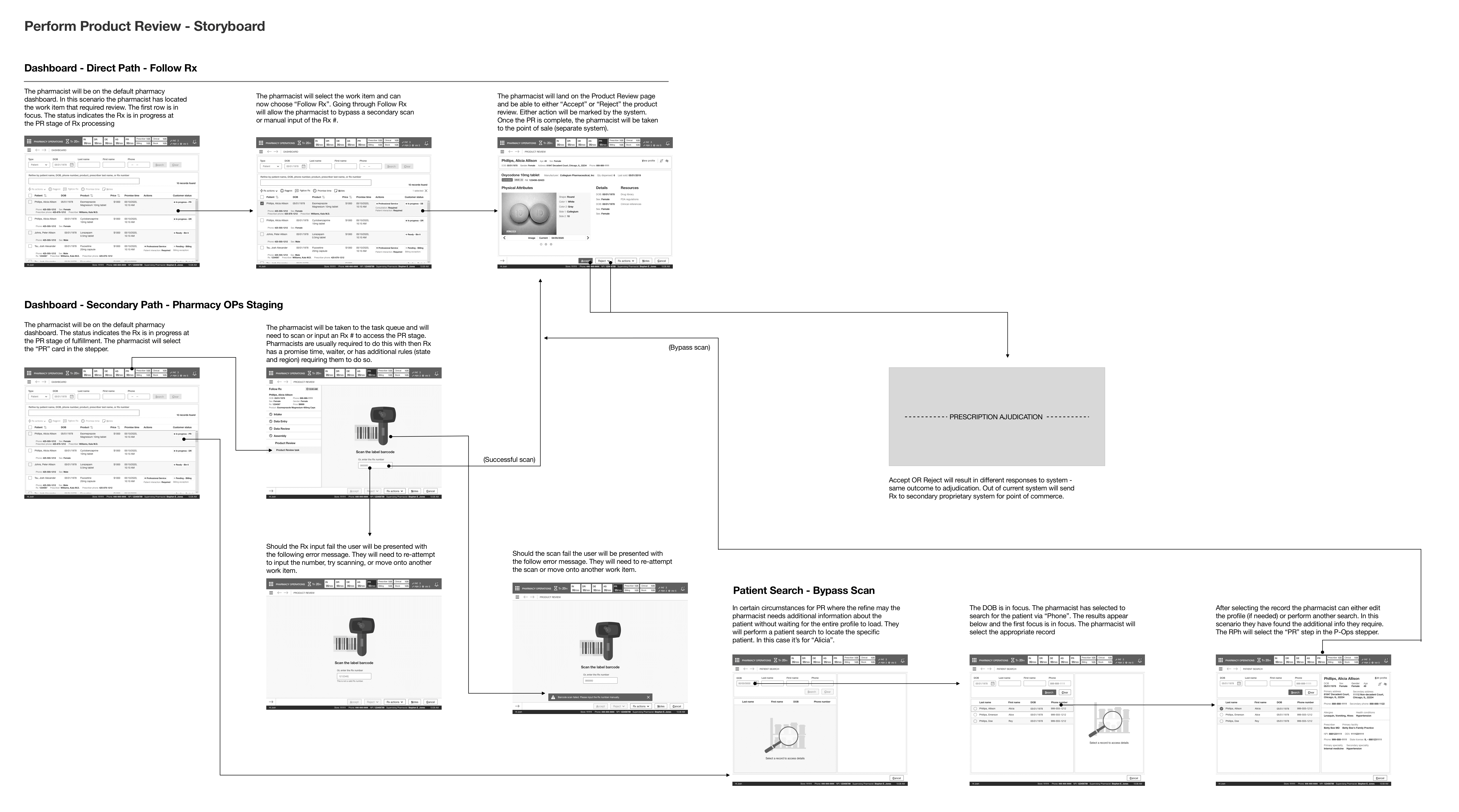
I constructed the wireframes into a storyboard which showed the entirety of the product review experience. I solicited feedback from the product manager and SMEs, which included minor adjustments to the information structure in the "details" column. Once these changes were complete, the team and I scheduled our first leadership review.

PLAN
Use Case
As a pharmacist, I do not have all the prescription information to verify the product is ready without consulting a third-party system. When I have a tote of two hundred prescriptions to fill, this takes up too much of my time
Functional: On the product review screen, the team members need to have all information readily available, including the image, attributes, and additional links, to make a quick and precise review.
Examining Workflow
I examined the functional requirements, and I constructed a user flow. Then, I went over the product review user flow with my team and made the adjustments I received before the next meeting. In the meeting, my team and I reviewed the changes. The user flow was approved and I moved to the ideation phase.

Ideation phase
I created some initial sketches that showed the concept of how team members would access the product review page and utilize it. The team members would access the product review page from the landing page, whether scanning or inputting an Rx number.
Upon landing on the product page, they could accept, reject, or cancel based on the available criteria and use their judgment before dispensing the product for point of sale. Next, I expanded with more sketches and moved to medium-fidelity wireframes from the sketches.

Dashboard
Pharmacists and other pharmacy employees required a centralized, easy-to-use dashboard where they could search, refine, and perform various actions to find a patient or medication. This dashboard included a fulfillment stepper to quickly access the productivity queue for working in real-time with the patient.
Product review
Product review consisted of multiple screens for accessing it from various points in the system. The primary way was through the dashboard, which would quickly show the product review screen with all information present and available to perform the review accurately. Additionally, I provided a landing page to scan or input the Rx number and access it from the productivity queue and perform their entry that way. Lastly, a way to bypass the scan was to search and quickly retrieve patient results.
Storyboard
I constructed the wireframes into a storyboard which showed the entirety of the product review experience. I solicited feedback from the product manager and SMEs, which included minor adjustments to the information structure in the "details" column. Once these changes were complete, the team and I scheduled our first leadership review.

DESIGN
Dashboard - Direct Path - Follow Rx
This path was the ideal path a pharmacist would take when reviewing and dispensing medication. Usually, this would be at the time of sale and require a search for the patient prescription. A pharmacist would perform a quick review before the patient receives their medication.

Dashboard - Secondary Path - Pharmacy Ops Staging
This path had to consider when a pharmacist may be conducting multiple product reviews in a particular BIN. These medications could be picked up later, delayed, or shipped out. Pharmacists would often primarily scan but, in some cases, would need a manual method should their scan fail. Upon successful entry, they could conduct their review and process multiple medications.

Patient Search - Bypass Scan
This path accounted for pharmacists not being familiar with this patient and their medications or a new patient at the pharmacy. As a result, pharmacists required a way to bypass the scan, find the patient through a quick search, and then review before dispensing medication.

Leadership review
Leadership reviews involved myself, multiple business/product stakeholders and executive account leadership. This topic only required one leadership review. I walked all the stakeholders through the workflow and then showed them the storyboard and high-fidelity mockups. The feedback was positive, and minor requests were clarified in the elaboration phase.
Detailed design
For detailed design, all screens had to be high-fidelity and pixel-perfect. The UI engineers and client UX team had designed and organized a base component library (this library was built and iterated upon throughout the project's entirety). This library was the mechanism for moving from medium to high-fidelity.
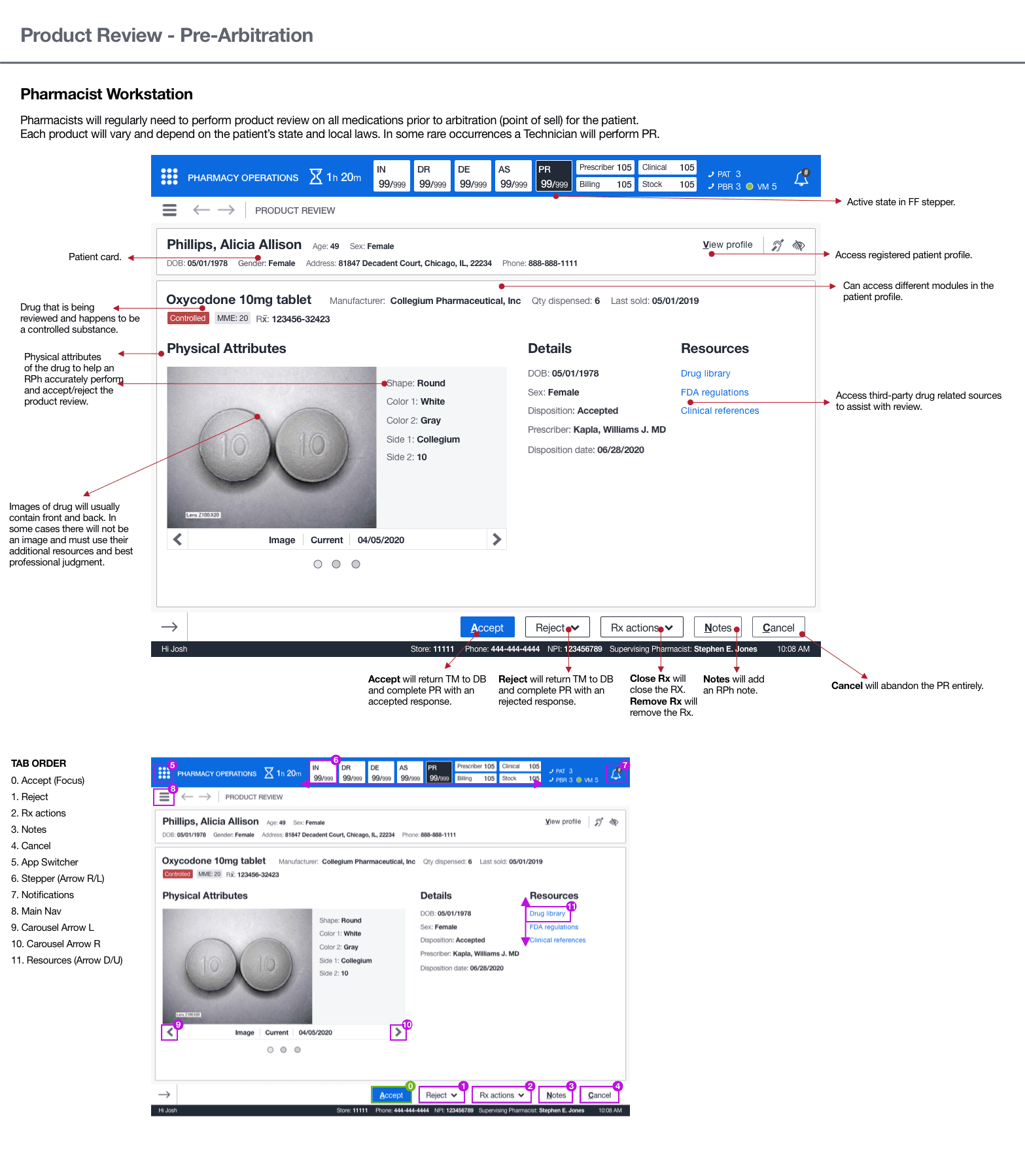
Annotations and tab order
This application primarily relied on the keyboard instead of the mouse. As part of the final deliverable, I created annotated wireframes and tab orders for critical screens. These artifacts would aid engineers and technical architects in understanding the functionality and act as a blueprint for elaboration. Once I completed these artifacts, the executive leadership had an offline review, and they signed off on the UX. The offline check consisted of reviewing all annotated wireframes and Confluence docs.

DESIGN
Dashboard - Direct Path - Follow Rx
This path was the ideal path a pharmacist would take when reviewing and dispensing medication. Usually, this would be at the time of sale and require a search for the patient prescription. A pharmacist would perform a quick review before the patient receives their medication.

Dashboard - Secondary Path - Pharmacy Ops Staging
This path had to consider when a pharmacist may be conducting multiple product reviews in a particular BIN. These medications could be picked up later, delayed, or shipped out. Pharmacists would often primarily scan but, in some cases, would need a manual method should their scan fail. Upon successful entry, they could conduct their review and process multiple medications.

Patient Search - Bypass Scan
This path accounted for pharmacists not being familiar with this patient and their medications or a new patient at the pharmacy. As a result, pharmacists required a way to bypass the scan, find the patient through a quick search, and then review before dispensing medication.

Leadership review
Leadership reviews involved myself, multiple business/product stakeholders and executive account leadership. This topic only required one leadership review. I walked all the stakeholders through the workflow and then showed them the storyboard and high-fidelity mockups. The feedback was positive, and minor requests were clarified in the elaboration phase.
Detailed design
For detailed design, all screens had to be high-fidelity and pixel-perfect. The UI engineers and client UX team had designed and organized a base component library (this library was built and iterated upon throughout the project's entirety). This library was the mechanism for moving from medium to high-fidelity.
Annotations and tab order
This application primarily relied on the keyboard instead of the mouse. As part of the final deliverable, I created annotated wireframes and tab orders for critical screens. These artifacts would aid engineers and technical architects in understanding the functionality and act as a blueprint for elaboration. Once I completed these artifacts, the executive leadership had an offline review, and they signed off on the UX. The offline check consisted of reviewing all annotated wireframes and Confluence docs.

NEXT STEPS
ELABORATION
The next step was to have elaboration scheduled to clarify any outstanding questions or concerns. Then, I described the rest of the functionality, including the hotkey and confirmation of tab order. Finally, I explained all questions with the elaboration teams and then moved on to my next topic.
NEXT STEPS
ELABORATION
The next step was to have elaboration scheduled to clarify any outstanding questions or concerns. Then, I described the rest of the functionality, including the hotkey and confirmation of tab order. Finally, I explained all questions with the elaboration teams and then moved on to my next topic.
OUTCOMES
effective SCANning
Successfully and accurately syncing the pharmacists mobile device with the scan screen increased their effectiveness in preparing dispensed medications.
FASTER process
The new patient search and product review made it quicker for the pharmacist to find a patient medication and dispense it.
LEARNINGS
Pharmaceutical industry
This industry was a new and complex industry to understand and learn the fundamentals quickly. This is because there are so many processes, laws, regulations, use cases, and precautions to take when performing activities in a pharmacy environment (large or small).
Pharmaceutical industry
This industry was a new and complex industry to understand and learn the fundamentals quickly. This is because there are so many processes, laws, regulations, use cases, and precautions to take when performing activities in a pharmacy environment (large or small).
Pharmacy PR process
The product review process that is completed in the pharmacy environment is complex. Each pharmacy is different, and some pharmacists work at a different pace than others when multitasking throughout the workday. The various volumes of products they scan and verify each day were astonishing.
LEARNINGS
Pharmaceutical industry
This industry was a new and complex industry to understand and learn the fundamentals quickly. This is because there are so many processes, laws, regulations, use cases, and precautions to take when performing activities in a pharmacy environment (large or small).
Pharmacy PR process
The product review process that is completed in the pharmacy environment is complex. Each pharmacy is different, and some pharmacists work at a different pace than others when multitasking throughout the workday. The various volumes of products they scan and verify each day were astonishing.